
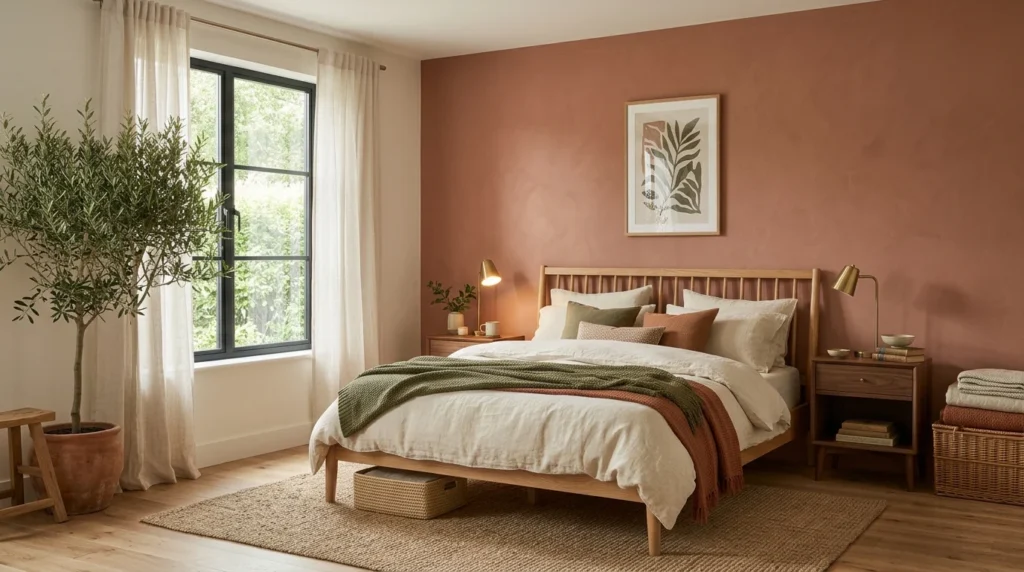
I started sleeping better about two months after repainting my bedroom, and for a while I genuinely didn’t connect the two things. I’d been dealing with a stretch of restless nights that I chalked up to work stress, and it wasn’t until a friend visiting for the weekend commented on how “settled” the room felt that I actually stopped to consider whether the color on the walls had anything to do with it. I can’t say for certain it was the paint alone, sleep is complicated and plenty of other things were happening in my life around that time too, but the timing was hard to ignore, and it sent me down a genuine rabbit hole of researching and testing earthy color palettes for the rest of my house afterward, including a fair number of samples that didn’t make the cut before I landed on the ones below.
1. Warm Terracotta With Cream Accents
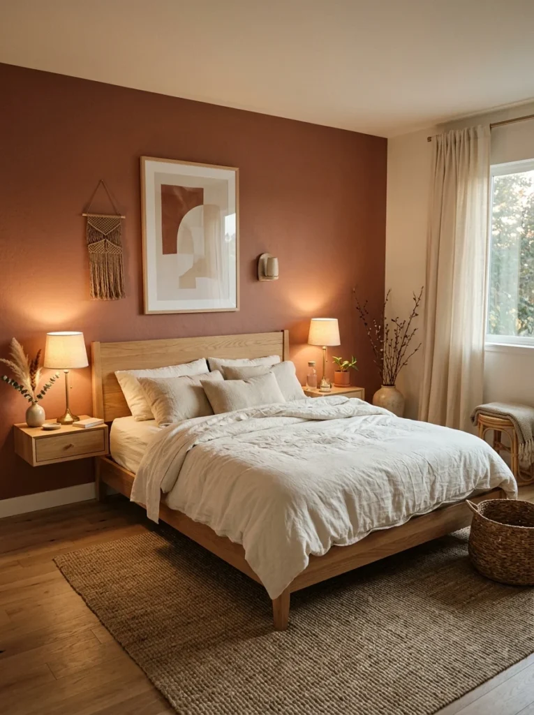
My own bedroom landed on a muted terracotta on one accent wall, paired with cream bedding and trim. It’s warm without being intense, and it’s held up well across both bright mornings and dim evenings, which wasn’t true of a bolder orange I’d tested first.
2. Deep Clay Brown as a Full-Room Color
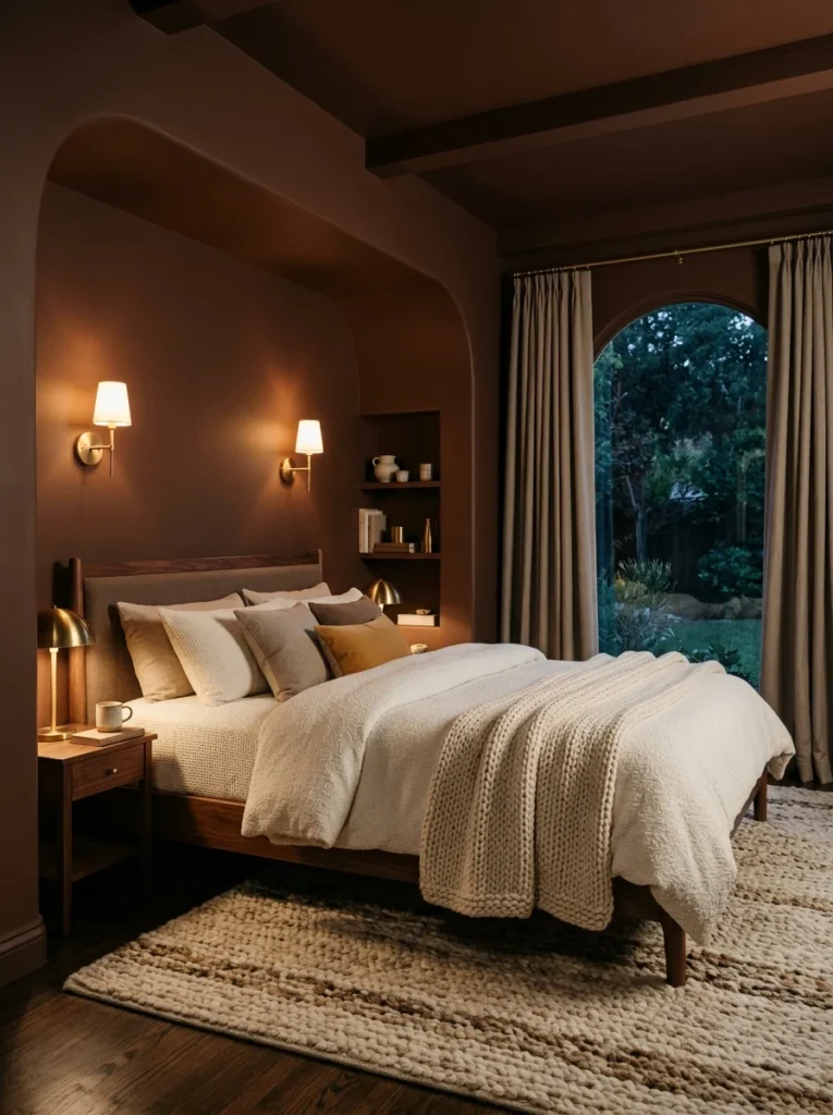
A friend painted her entire bedroom, walls, ceiling included, in a deep clay brown, and rather than feeling cave-like as I’d worried it might, the room felt enveloping and cocoon-like in a way that made it one of the more genuinely restful spaces I’ve been in.
3. Sage Green Paired With Natural Linen
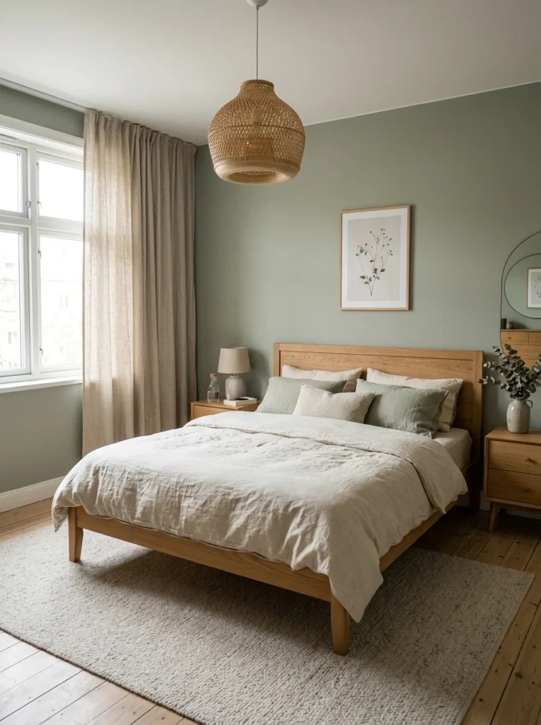
Sage walls with linen bedding and curtains in a slightly lighter, warmer tone kept a friend’s bedroom from feeling too cool or clinical, which is a risk with green if it’s not balanced against warmer textures elsewhere in the room.
4. Warm Taupe as a Neutral Base
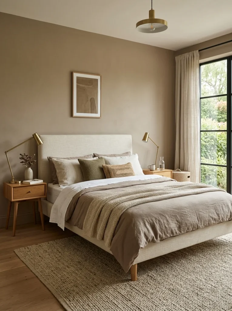
Taupe walls gave my guest room a grounded, calm base that’s flexible enough to swap out accent colors seasonally without needing to repaint. It’s less committal than some of the bolder earthy tones, which makes it a good starting point for anyone hesitant about a stronger color.
5. Rust Orange Balanced With Charcoal Accents
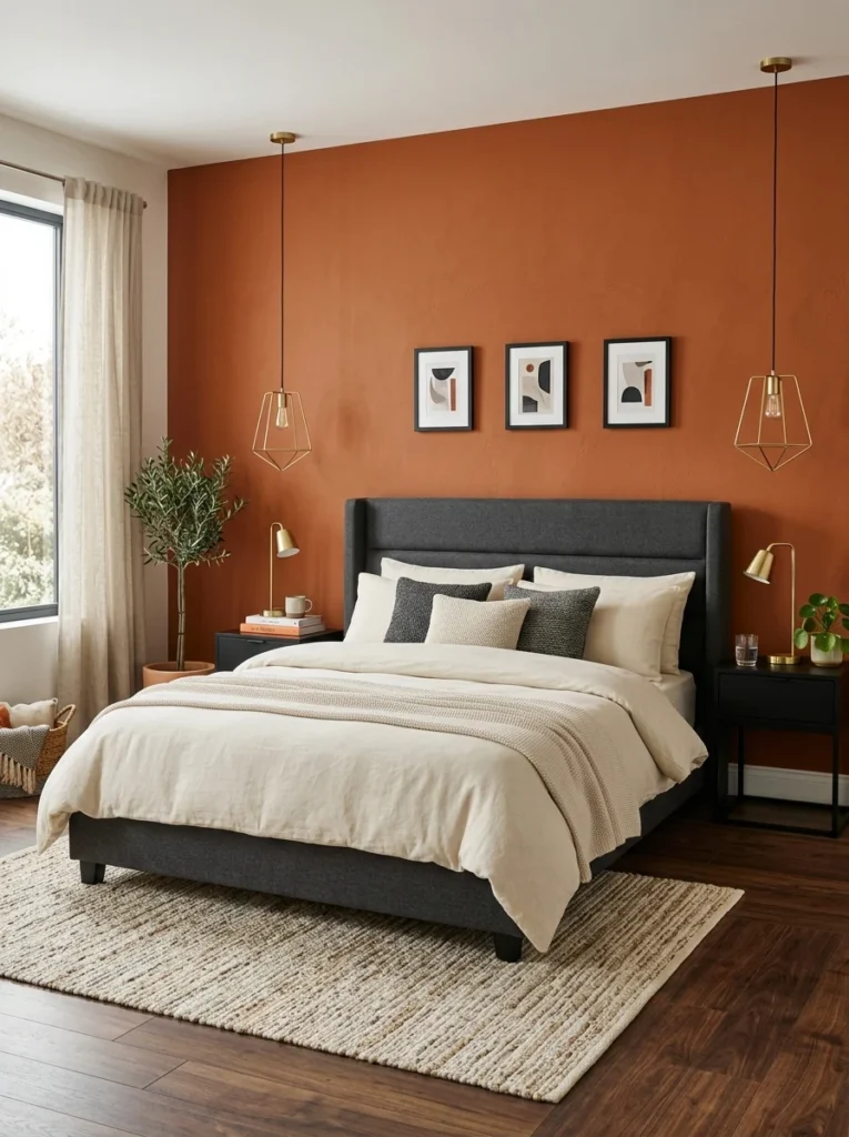
A bolder rust tone on one wall, balanced by charcoal gray on furniture and a few textiles, created enough contrast to keep the room from feeling flat while still staying firmly within an earthy, grounded palette overall.
6. Olive Green With Brass Hardware
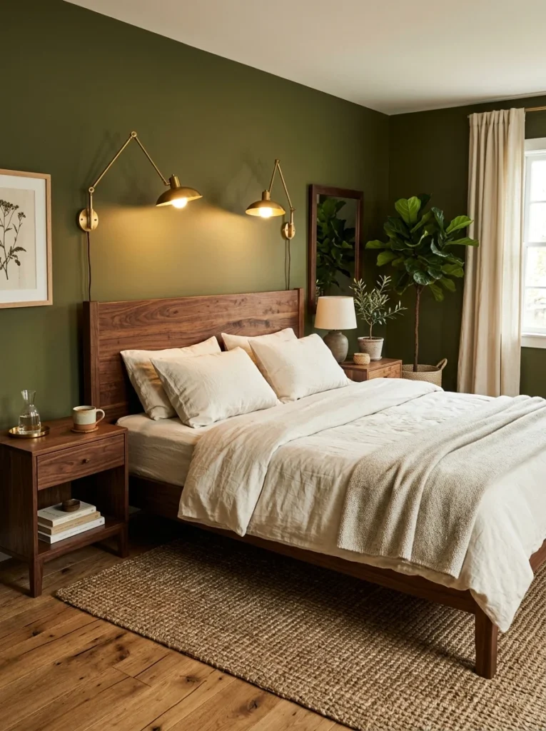
Olive walls paired with brass drawer pulls and light fixtures added a slightly richer, more saturated earthy tone than sage, and the warm brass tones kept it from leaning too cool or muted the way olive sometimes can in the wrong lighting.
7. Soft Ochre for a Sun-Warmed Feel
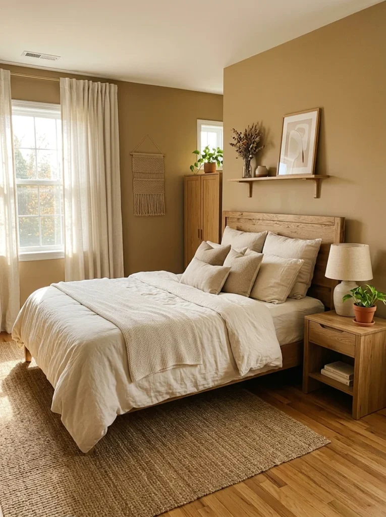
A muted, dusty ochre yellow on the walls of a south-facing bedroom I visited gave the room a warm, almost perpetually sun-lit feeling, even on overcast days, which the homeowner specifically chose because that room got less natural light than the rest of the house.
8. Warm Gray-Brown Known as “Greige”
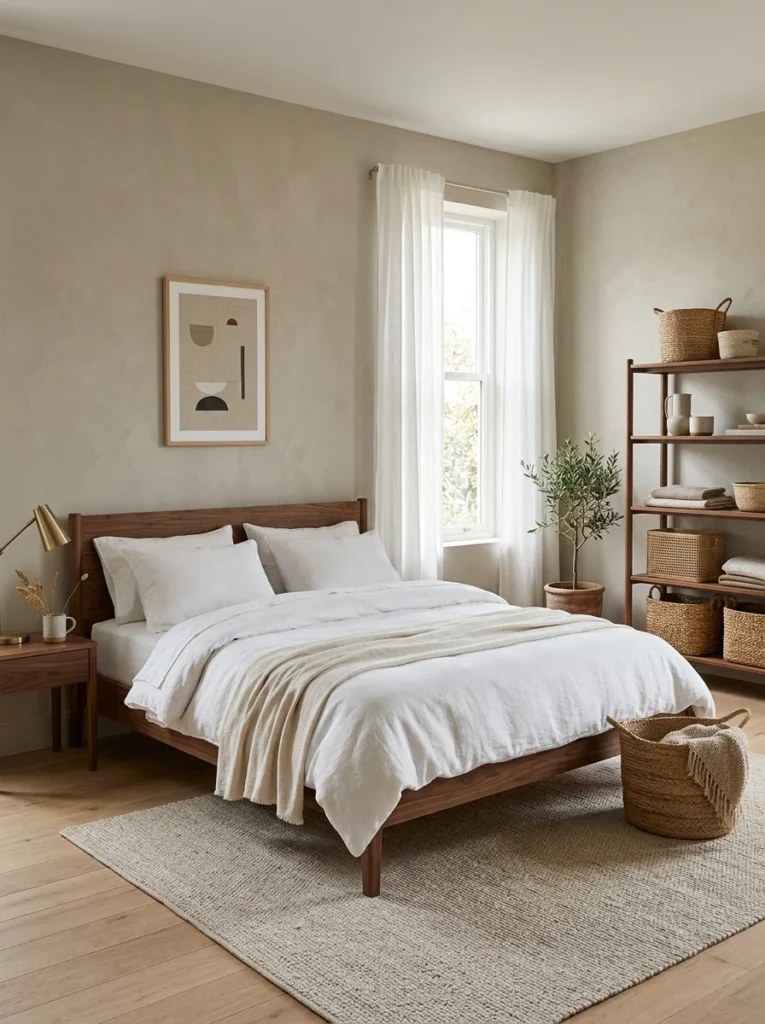
This in-between tone, part gray, part beige, has become one of the most requested neutral options among people I know who’ve recently repainted, since it reads as calm and grounded without leaning too warm or too cool in either direction.
9. Deep Forest Green With Warm Wood Furniture
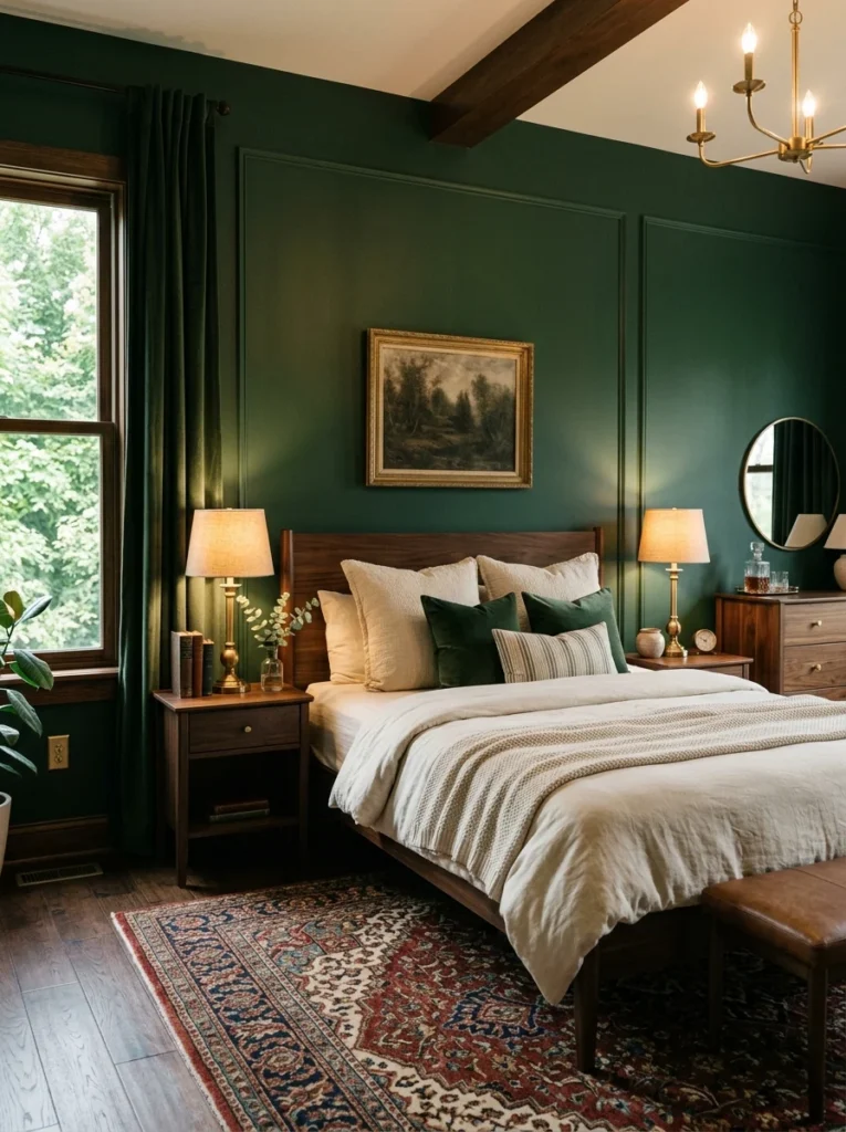
A darker, more saturated forest green paired with warm wood furniture and brass accents gave one bedroom I saw a rich, enveloping feel at night while still reading as fresh and grounded during the day with natural light coming through.
10. Dusty Rose as an Earthy, Not Sweet, Pink
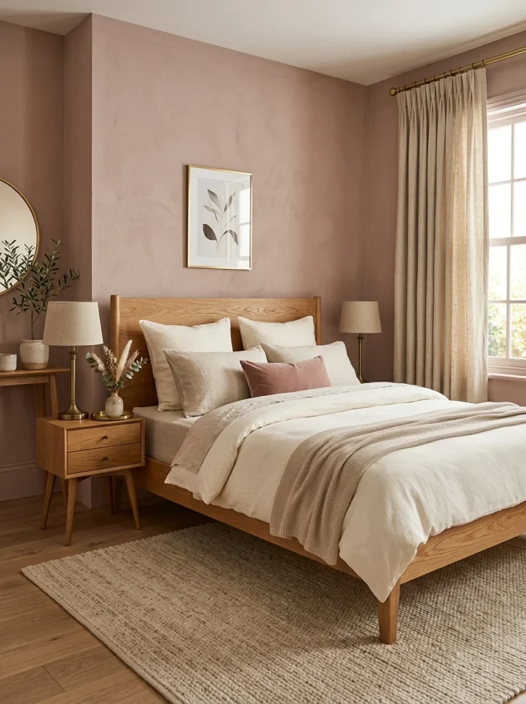
This isn’t a bright or overtly feminine pink, but a muted, dusty rose that reads more as an earthy neutral than a typical pastel. Paired with warm wood tones, it avoided feeling overly sweet or themed the way brighter pinks tend to in a bedroom setting.
11. Warm Camel or Tan for a Cozy, Enveloping Feel
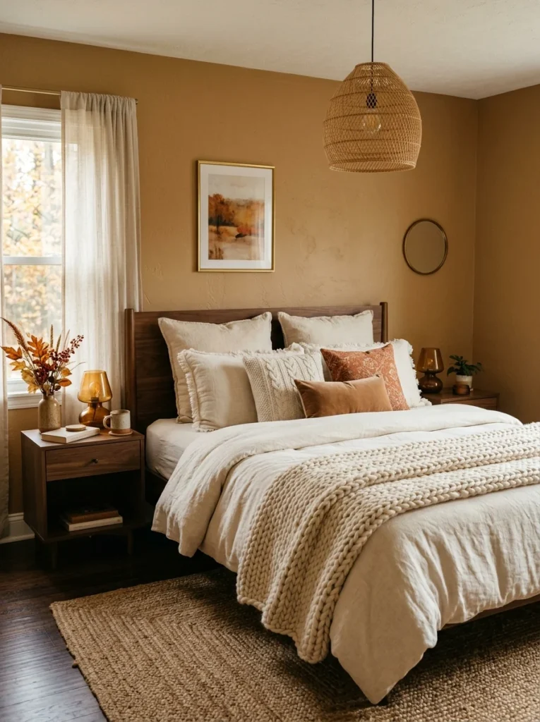
Camel-toned walls in a friend’s bedroom gave the space a cozy, almost suede-like warmth that photographed beautifully but felt even better in person, especially layered with soft textured throws in a similar tonal range.
12. Charcoal With Warm Wood Accents for Depth
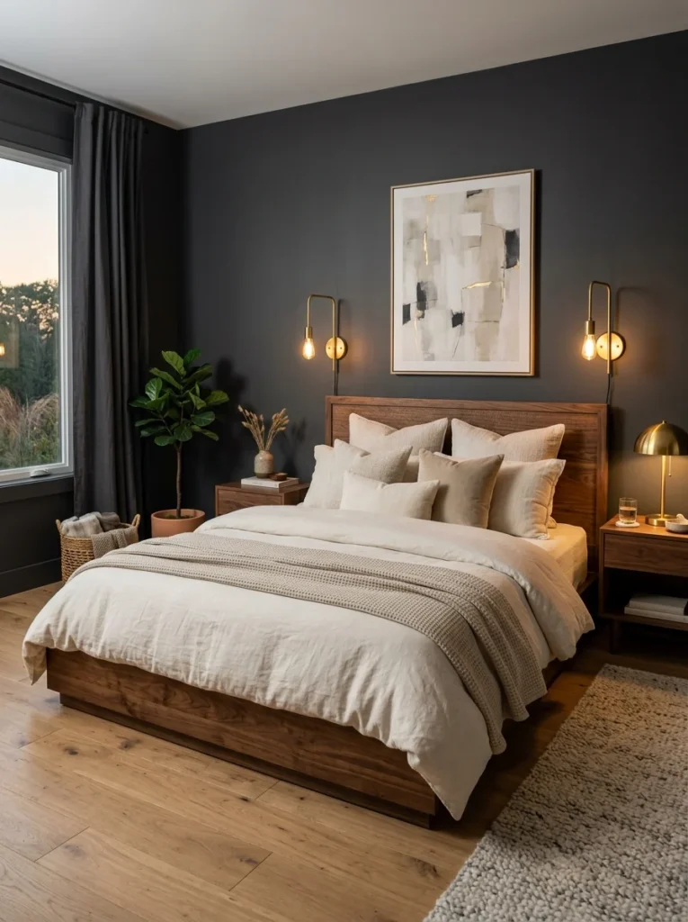
A full charcoal bedroom sounds intense, but balanced with warm wood furniture, brass lighting, and cream linens, it read as deep and cozy rather than dark and heavy, especially once the room’s lighting was adjusted to layer warmer, softer sources throughout.
13. Warm White With Earthy Textiles Doing the Work
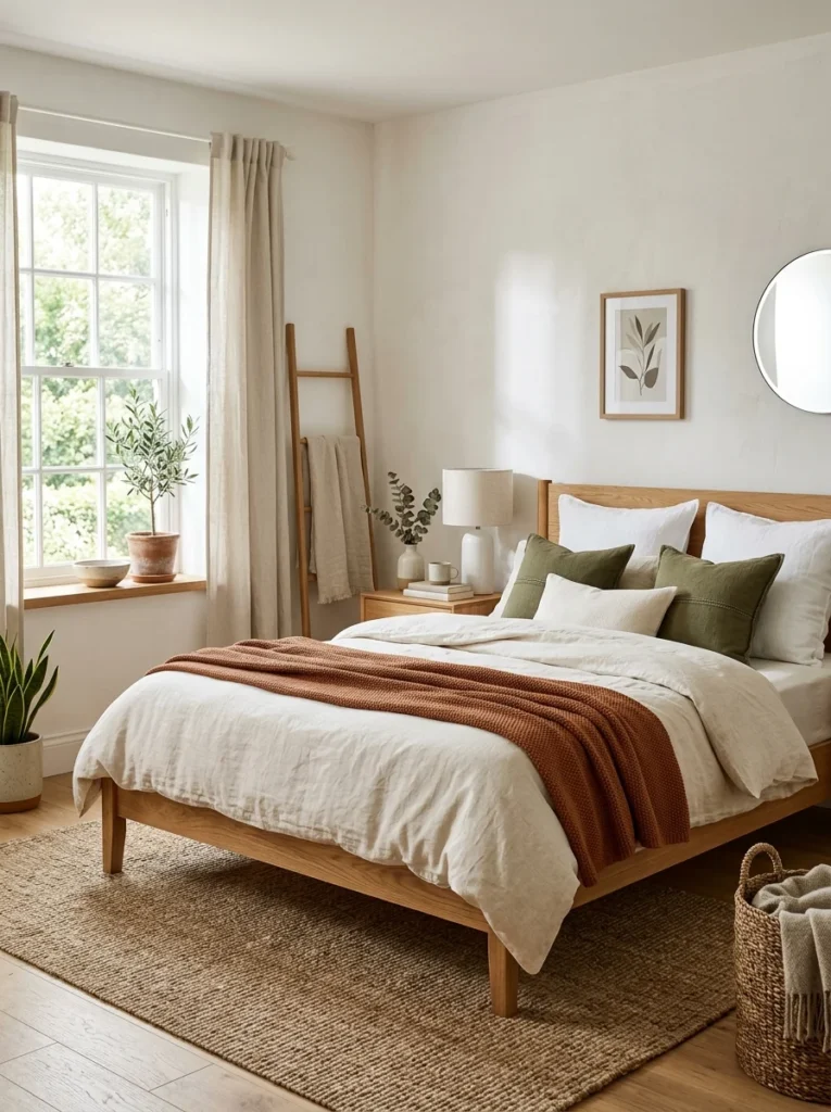
Rather than color on the walls at all, one bedroom I visited kept the walls a warm off-white and let earthy textiles, a terracotta throw, a woven jute rug, wooden furniture, carry the grounded feeling instead. It’s a good option for renters who can’t repaint but still want that same overall effect.
14. Mocha Brown for a Rich, Warm Neutral
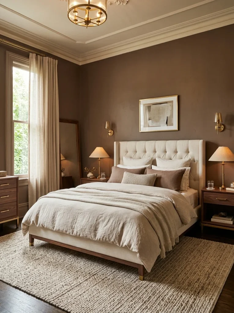
A muted mocha brown, warmer and softer than a true chocolate brown, gave one bedroom a rich but still calming base that worked well with both warm and cooler accent colors layered on top of it.
15. Muted Terracotta Ceiling With Neutral Walls
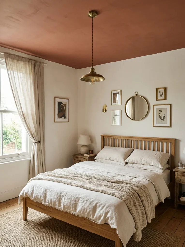
Rather than an accent wall, painting just the ceiling a muted terracotta while keeping the walls a warm white created an unexpected sense of coziness looking upward, an approach I hadn’t considered until I saw it done in a friend’s guest room and found myself unexpectedly drawn to lying there looking up at it.
16. Warm Stone Gray for a Softer Alternative to Greige
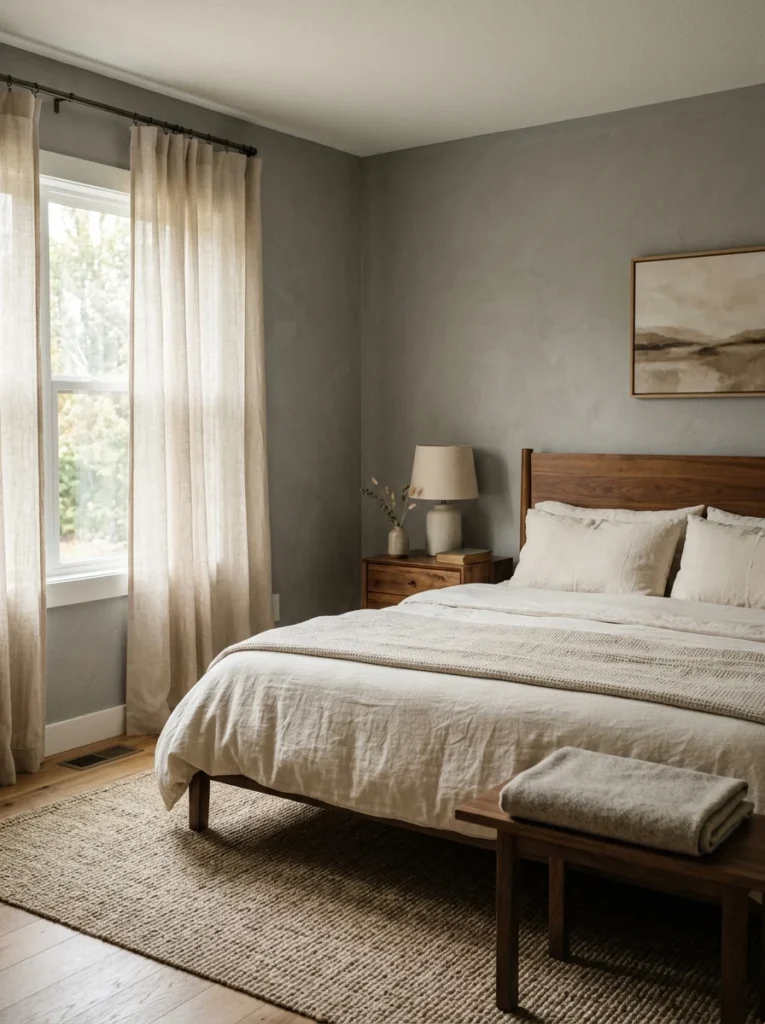
A stone-toned gray, slightly warmer and softer than a typical cool gray, gave one bedroom a calm, grounded neutral base without leaning as brown as greige does, which suited a homeowner who wanted something in between the two options.
17. Layered Earth Tones Without a Single Dominant Color
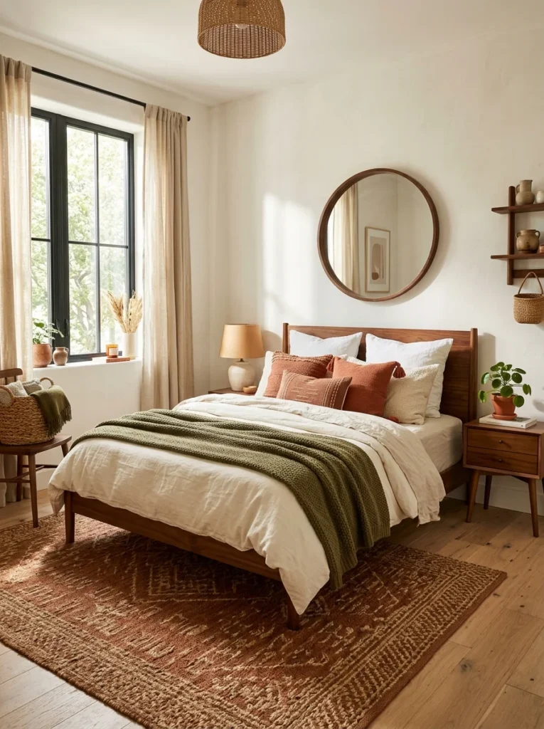
Rather than choosing one earthy shade to anchor the whole room, one bedroom I visited layered several muted earth tones together, terracotta pillows, an olive throw, a rust-toned rug, over simple warm white walls, letting the textiles carry the color story instead of the paint.
The Colors I Tested and Rejected First
Before landing on the muted terracotta, I went through two other samples that didn’t make the final cut, and I think the reasons they failed are useful context. The first was a brighter, more orange terracotta that looked warm and inviting on the sample card but turned almost fluorescent under my bedroom’s evening lamp light, which runs slightly warmer than my old daytime bulbs did. The second was a deep rust that tested beautifully during the day but felt oppressively dark once the sun went down and only lamps were lighting the room, which is exactly the opposite of the calm, grounded feeling I was going for at night specifically. That experience taught me to test any earthy tone under both daytime and evening lighting before committing, since a color that reads as grounded in one light can just as easily read as either garish or heavy in the other.
How I’d Approach Choosing a Color for Someone Else’s Room
A few friends have since asked me to help them pick a similar palette for their own bedrooms, and my process now starts with a question rather than a color chart: what time of day does this room actually get used most, and what’s the primary light source during that window. A north-facing bedroom that’s mostly used in the evening under warm lamp light can handle a deeper, richer earthy tone than a south-facing room flooded with cool daylight for most of the day. Skipping this step and picking a shade purely because it looked good in a photo online is, in my experience, the single most common reason people end up repainting an earthy bedroom color within the first year.
Why Texture Ended Up Mattering as Much as the Color Itself
Something I didn’t expect going into this was how much the texture of the paint finish and surrounding materials affected how “earthy” a color actually felt in person. A flat or matte paint finish read as noticeably calmer and more grounded than the same exact color in a satin or semi-gloss finish, which tended to look slightly more polished and less organic no matter how earthy the underlying shade was. Pairing the wall color with natural materials nearby, a wooden bed frame, a woven jute rug, linen rather than synthetic bedding, reinforced the earthy feeling in a way that the paint color alone couldn’t fully carry. I tested this somewhat by accident when I temporarily had synthetic, slightly shiny curtains up in my terracotta room while waiting for linen ones to arrive, and the room genuinely felt less calm and more like a hotel room during those few weeks, despite the wall color being identical the whole time.
What I Actually Changed in My Own Room
Beyond the terracotta accent wall, I want to be specific about what else shifted around the same time as my sleep improved, since I don’t think the wall color alone explains everything. I also switched from bright white bedding to a warmer cream, swapped a cool-toned overhead light for warmer bulbs in my bedside lamps, and removed a few pieces of bold, patterned art that had been hanging near the bed. Looking back, it wasn’t really one single earthy color that changed the room, it was a broader shift away from cool, high-contrast choices toward something warmer and more muted across nearly everything in the space, with the wall color being just the most visible part of that shift.
Whether the Science Backs This Up, or Whether It’s Just Me
I’ll admit I haven’t found rigorous research specifically proving that earthy wall colors improve sleep quality, and I’d be skeptical of anyone claiming a definitive causal link based on paint alone. What does seem to hold up more broadly is that muted, low-contrast environments tend to feel calmer than bright, high-contrast ones, and earthy tones naturally fall into that lower-contrast category compared to stark whites or bold, saturated colors. Whether that translated into measurably better sleep for me specifically, or whether I was simply noticing my mood shift alongside a stressful period resolving on its own, is honestly hard to untangle with complete confidence. What I can say is that two years later, the room still feels the same calm way it did that first week, regardless of what was actually driving the original improvement, and I’ve since applied the same layered approach, muted color plus natural texture plus warm lighting, to two other rooms in the house with results that felt consistent enough to make me trust the pattern, even without a controlled experiment to prove it definitively.