
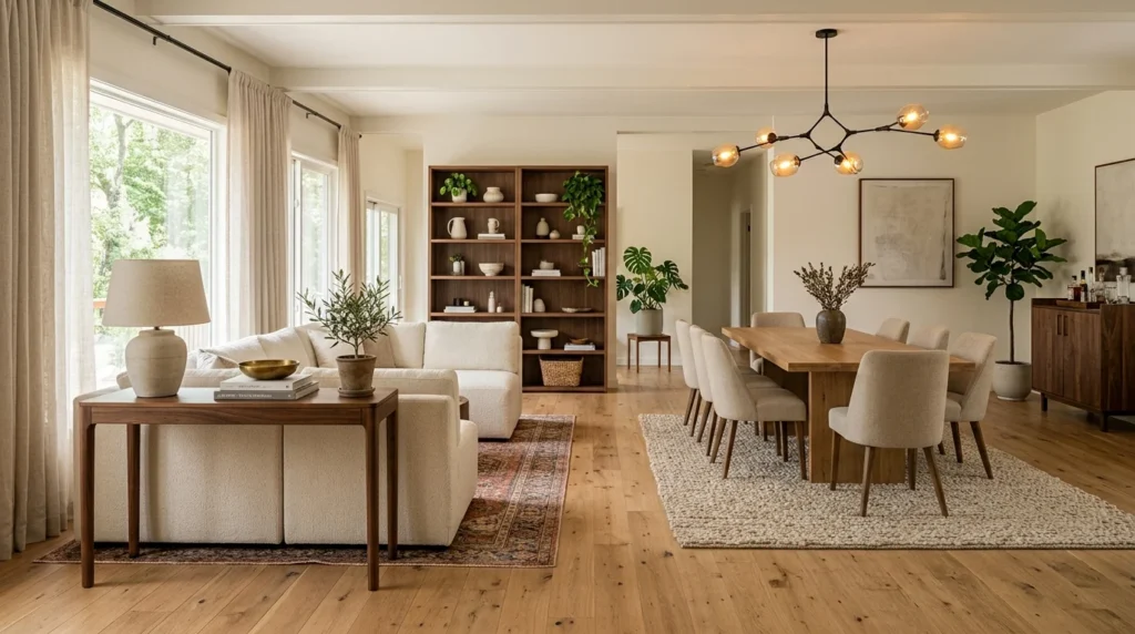
The realtor called it “great room living” when we toured this house, which sounded appealing in the moment but turned out to just mean one long rectangular space that had to somehow function as both a living room and a dining room without any actual guidance on how to split it. We moved in during a hectic stretch of changing jobs and didn’t get around to seriously addressing the layout for almost a year, which meant we lived with a combo space that genuinely didn’t work for longer than I’d like to admit, defaulting to whatever arrangement we’d thrown together the week we moved boxes in rather than anything actually planned. The dining table sat awkwardly close to the couch, the TV was visible from the dinner table in a way that made every meal feel like eating in front of a screen whether we wanted to or not, and guests routinely commented that they weren’t sure where the “living room” actually ended. Fixing it taught me more about combo spaces than any single design article had managed to before, mostly because it forced us to actually live in and observe the problems rather than solve them abstractly on paper first.
1. Anchor Each Zone With Its Own Rug
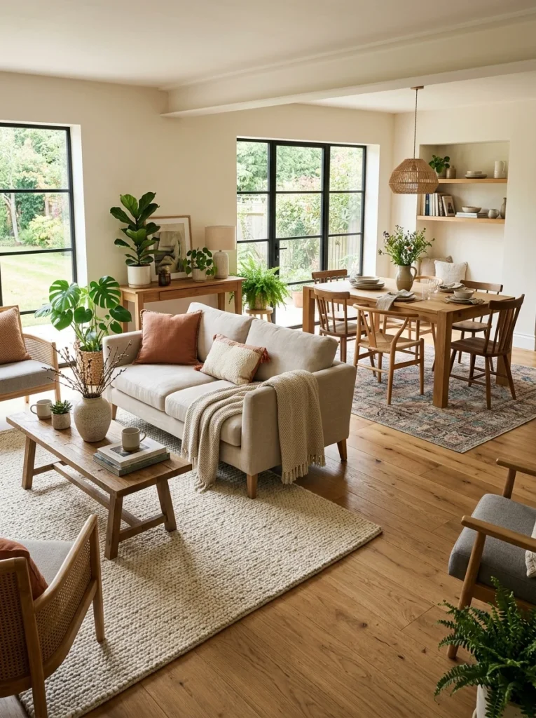
The single biggest change came from adding two separate rugs, one under the seating area and one under the dining table, rather than one large rug covering the whole space or no rugs at all. It gave each zone a defined boundary that the eye could register instantly, even though there’s no wall separating them.
2. Use Furniture Placement to Create a Natural Divider
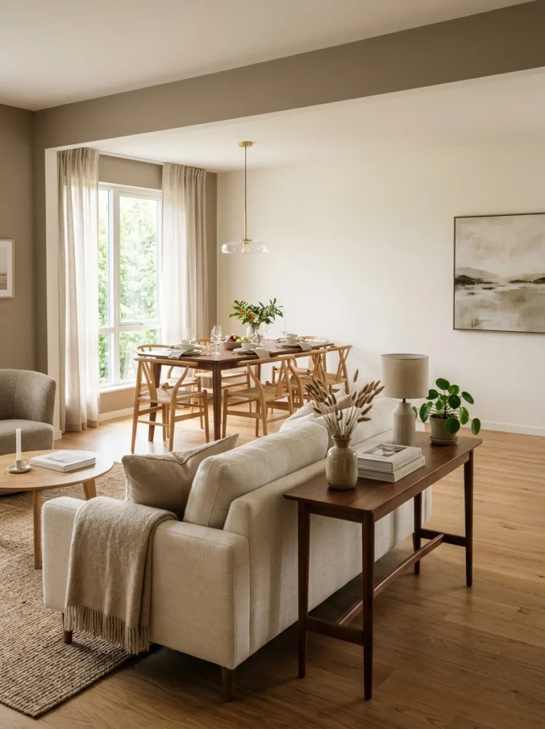
Rather than pushing every piece against the walls, we positioned our sofa with its back facing the dining area, which created a soft, furniture-based boundary between the two zones without blocking sightlines or conversation between people in either area.
3. Choose a Pendant Light Specifically for the Dining Zone
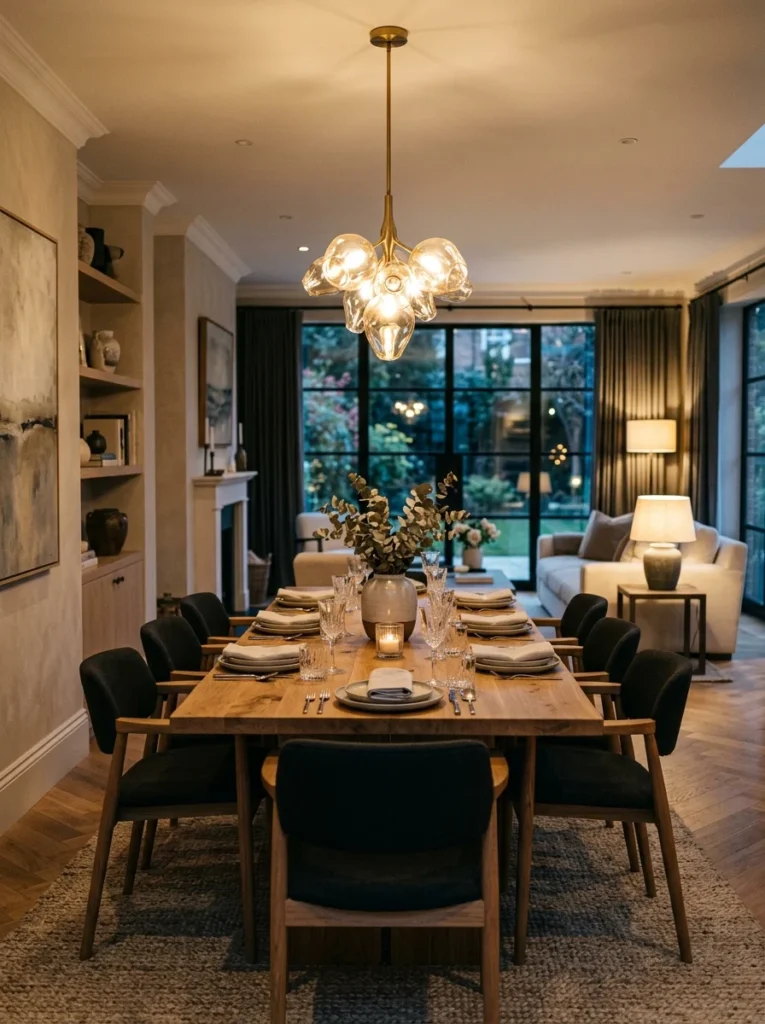
Before adding a dedicated pendant light over the table, the whole room shared one lighting source, which meant there was no visual cue signaling “this is the dining area” versus the rest of the room. A distinct fixture over the table gave that zone its own identity within the larger space.
4. Keep the TV Out of Direct Sightline From the Dining Table
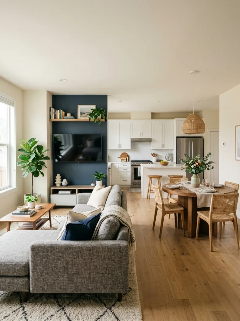
This was our biggest early mistake. Our first TV placement was directly visible from every seat at the dining table, which meant dinner conversations kept getting pulled toward whatever was on screen even when nobody intended to watch anything. Repositioning the TV to a wall angled away from the table solved this completely.
5. Use a Console Table as a Soft Boundary Behind the Sofa
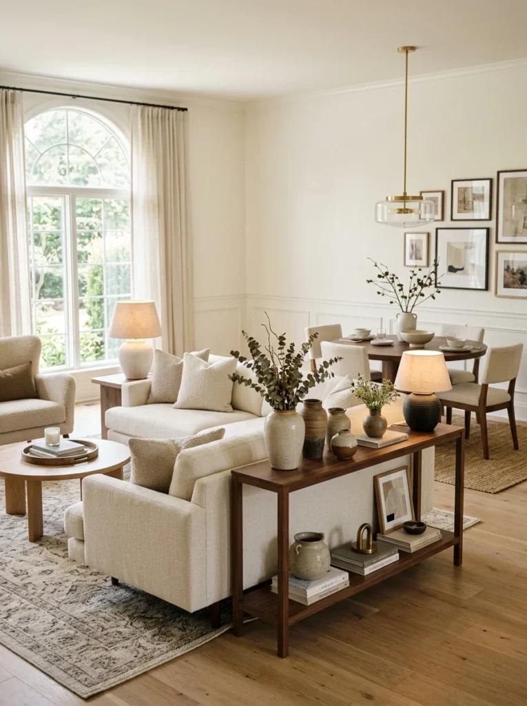
A narrow console table positioned behind our sofa, facing the dining area, created a subtle physical marker between the two zones while also giving us a functional surface for setting things down on the way through the space.
6. Coordinate, But Don’t Match, Furniture Finishes Between Zones
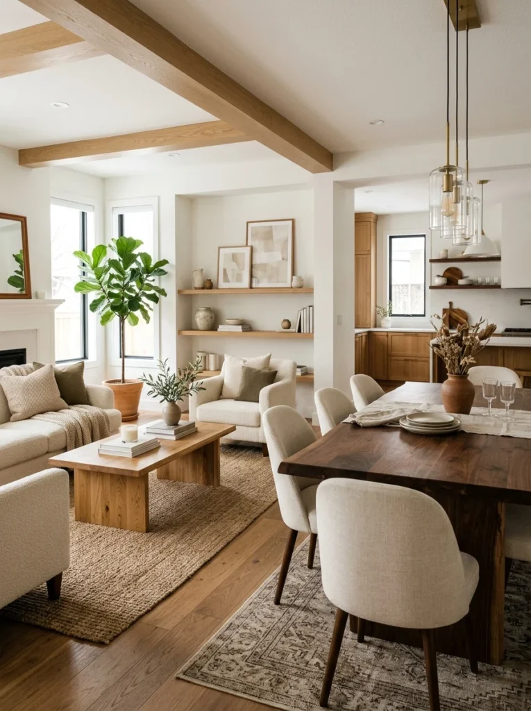
I initially worried our dining table and living room furniture needed to match closely to feel cohesive. Choosing complementary but not identical wood tones instead kept the space feeling connected without looking like a single furniture set purchased all at once.
7. Let a Bookshelf or Cabinet Define the Transition Point
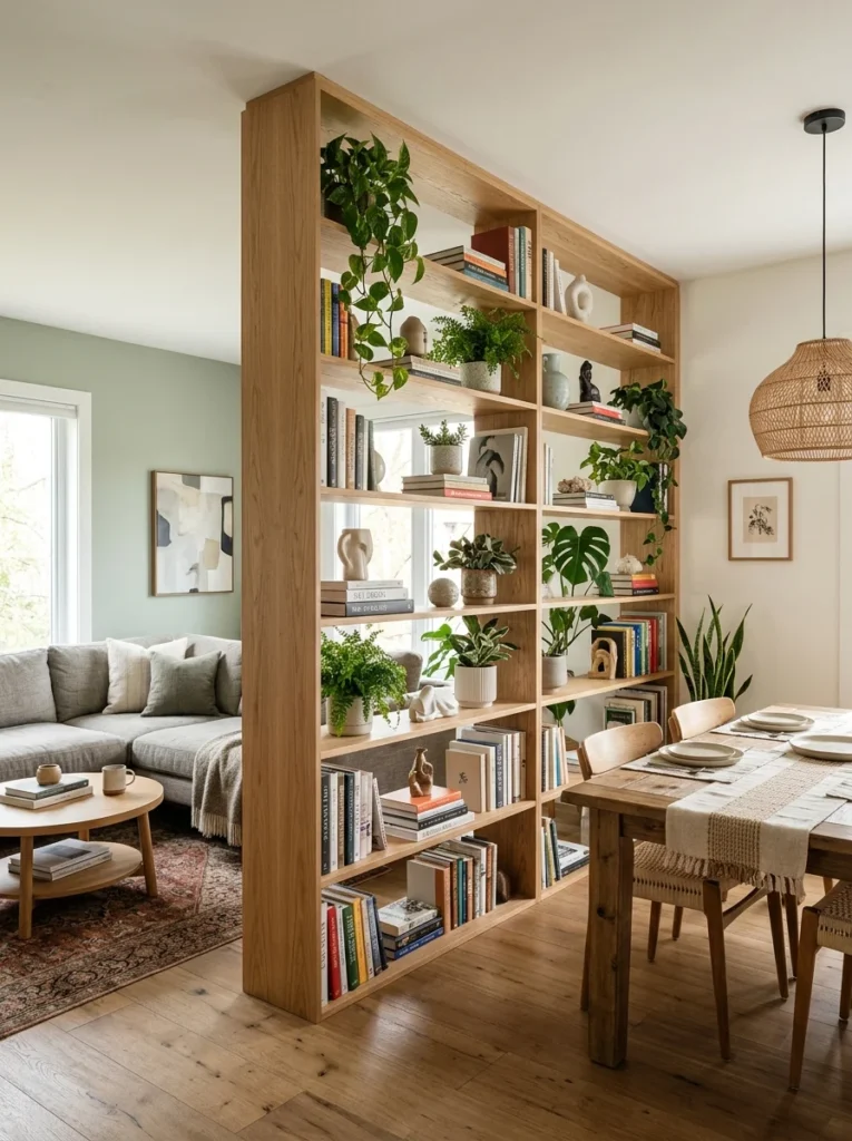
Placing a tall bookshelf perpendicular to the wall at roughly the midpoint of the room created a natural transition point between the two zones, something guests now use almost instinctively as a visual cue for where one area ends and the other begins.
8. Vary Ceiling or Wall Treatment Between the Two Areas
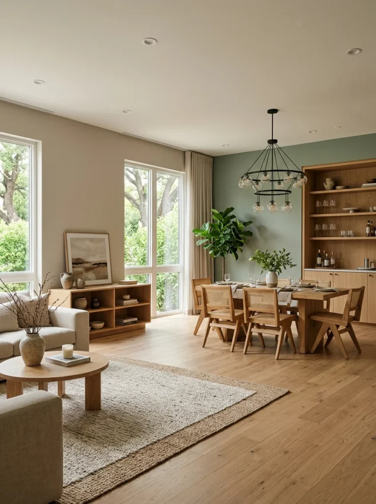
We couldn’t add structural changes to the ceiling, but painting a slightly different, complementary shade on the wall behind the dining table compared to the living room wall added just enough visual distinction to reinforce the sense of two separate zones sharing one room.
9. Choose Seating That Doesn’t Block the Path Between Zones
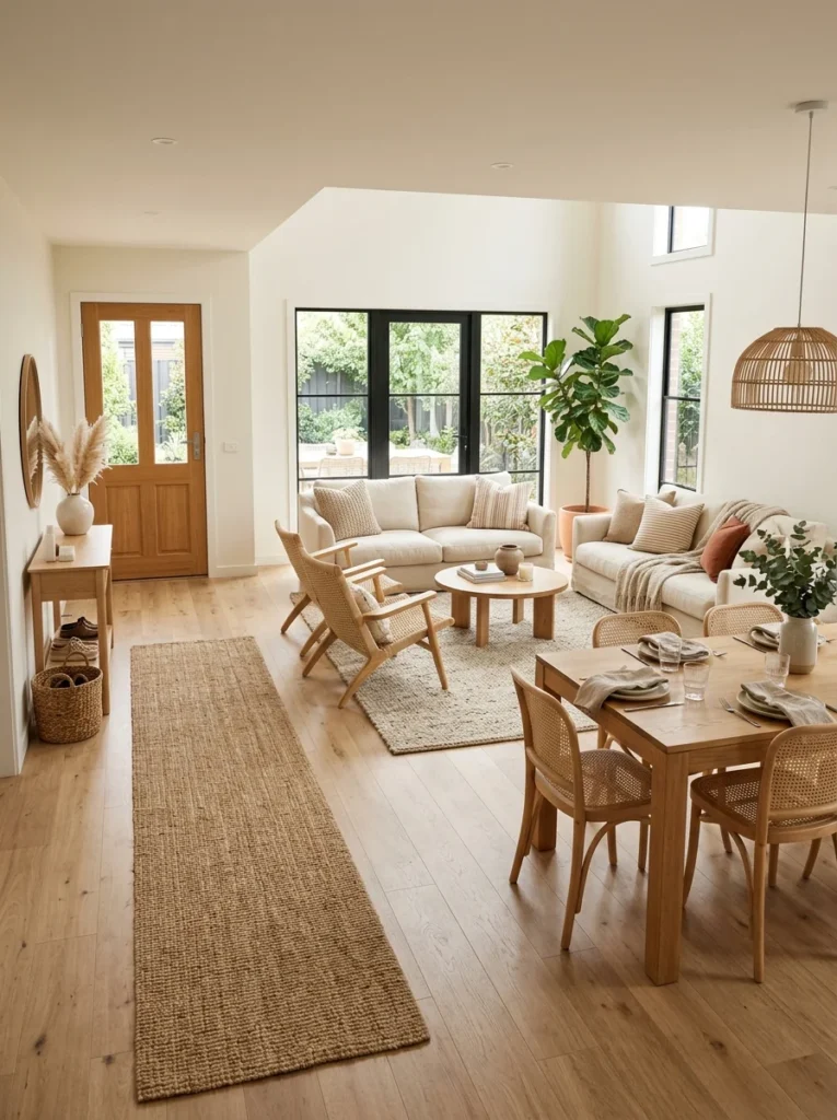
Our first armchair placement blocked the most direct walking path from the front door to the dining area, which meant guests constantly had to awkwardly maneuver around it. Repositioning it against a side wall instead opened up a clear, natural path through the space.
10. Use a Statement Light Fixture as a Focal Point for Each Zone
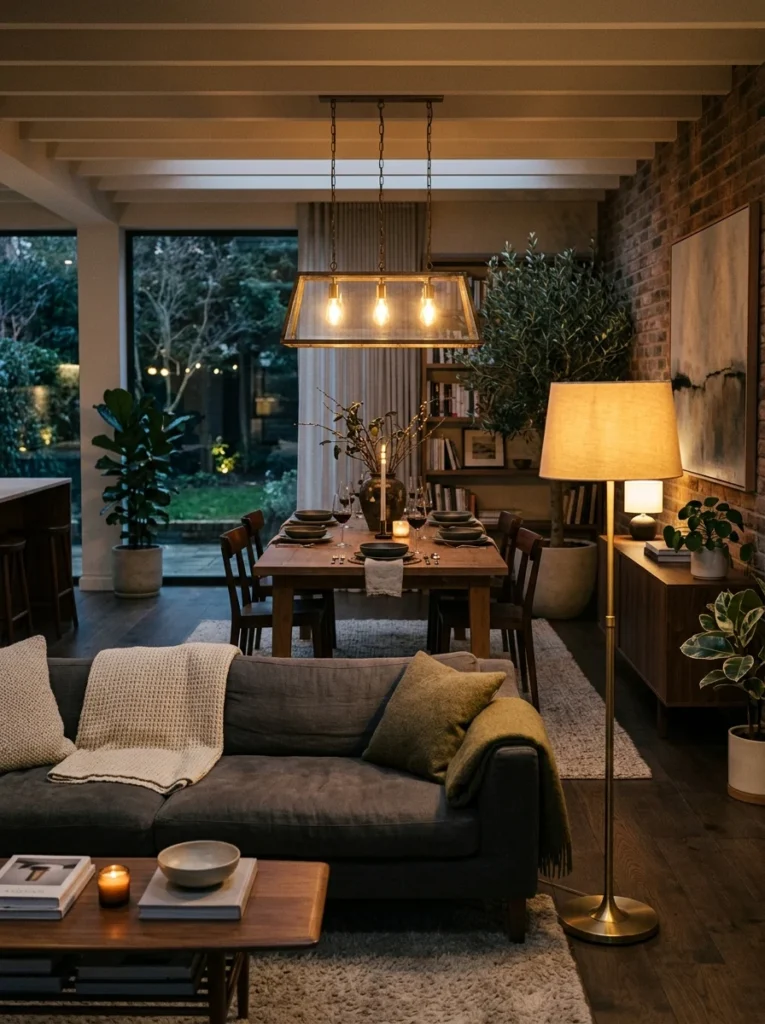
Beyond the dining pendant, adding a distinct floor lamp as the living room’s own lighting focal point gave both zones a visual anchor of their own, rather than one lighting scheme trying to serve the entire elongated room uniformly.
11. Keep a Consistent Color Palette Across Both Zones
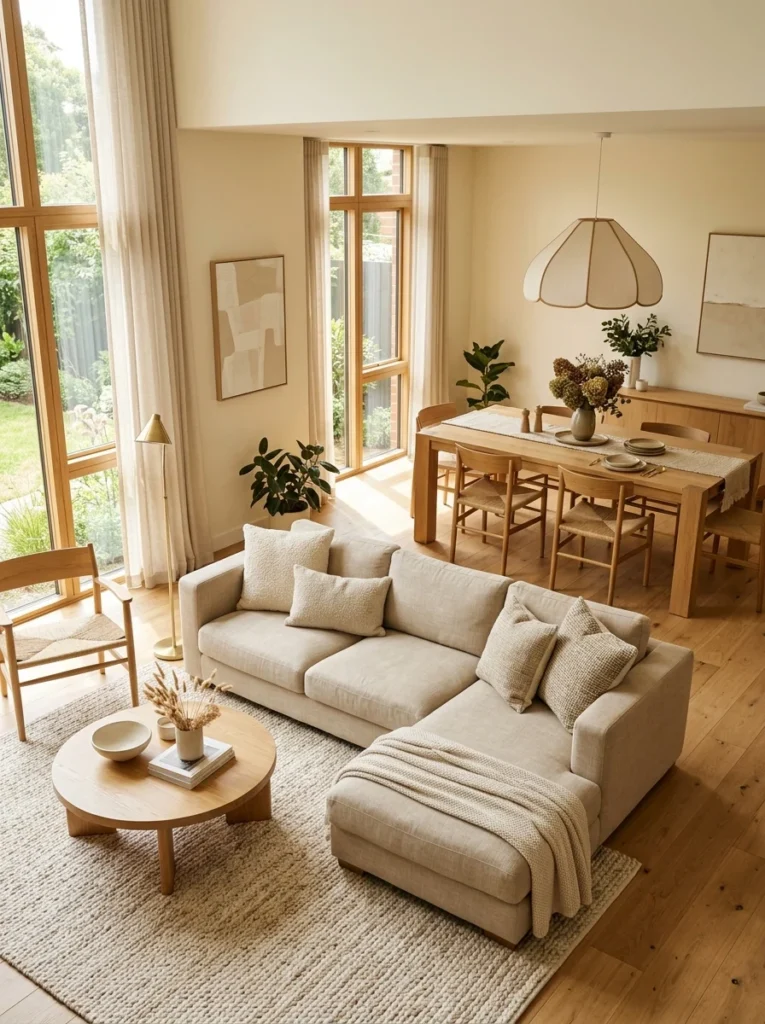
Even with distinct rugs and slightly different wall treatments, we kept the overall color palette consistent across both areas, muted neutrals with warm wood accents throughout, which kept the whole space feeling like one cohesive room despite the zone-specific details layered on top.
12. Add a Room Divider or Open Shelf Unit for More Definition
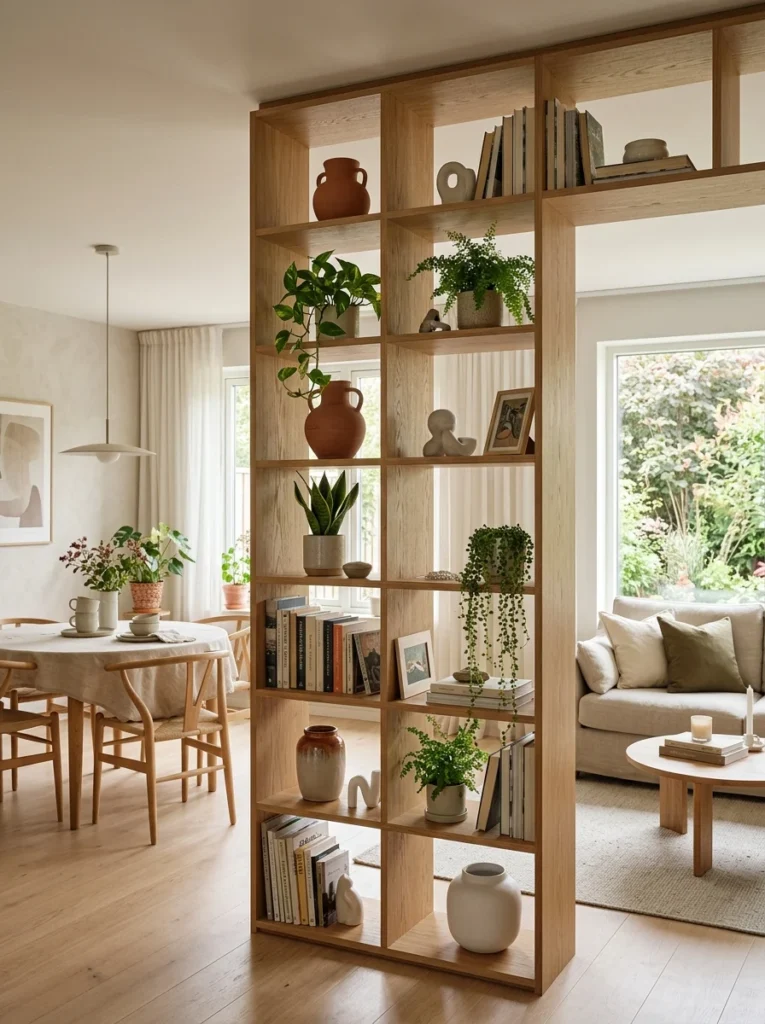
For anyone wanting a stronger boundary than furniture placement alone provides, an open shelving unit positioned perpendicular to the room’s length can divide the space more definitively while still allowing light and sightlines to pass through, unlike a solid wall or curtain would.
13. Position the Dining Table Closer to the Kitchen Than the Living Room
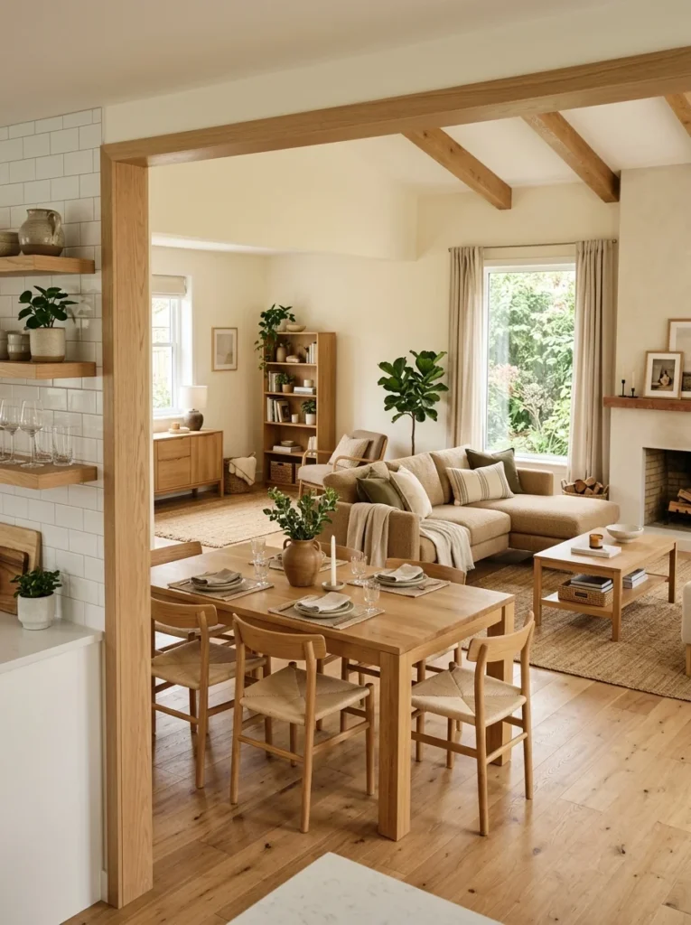
We initially centered our dining table in the middle of the elongated room, roughly equidistant from both the kitchen and the seating area. Shifting it closer to the kitchen side made more practical sense, since most trips to and from the table involve carrying food, and it reinforced the zone’s connection to meals rather than leaving it feeling like a stray table in the middle of the living space.
14. Use Curtains or Drapery to Add a Soft Visual Break
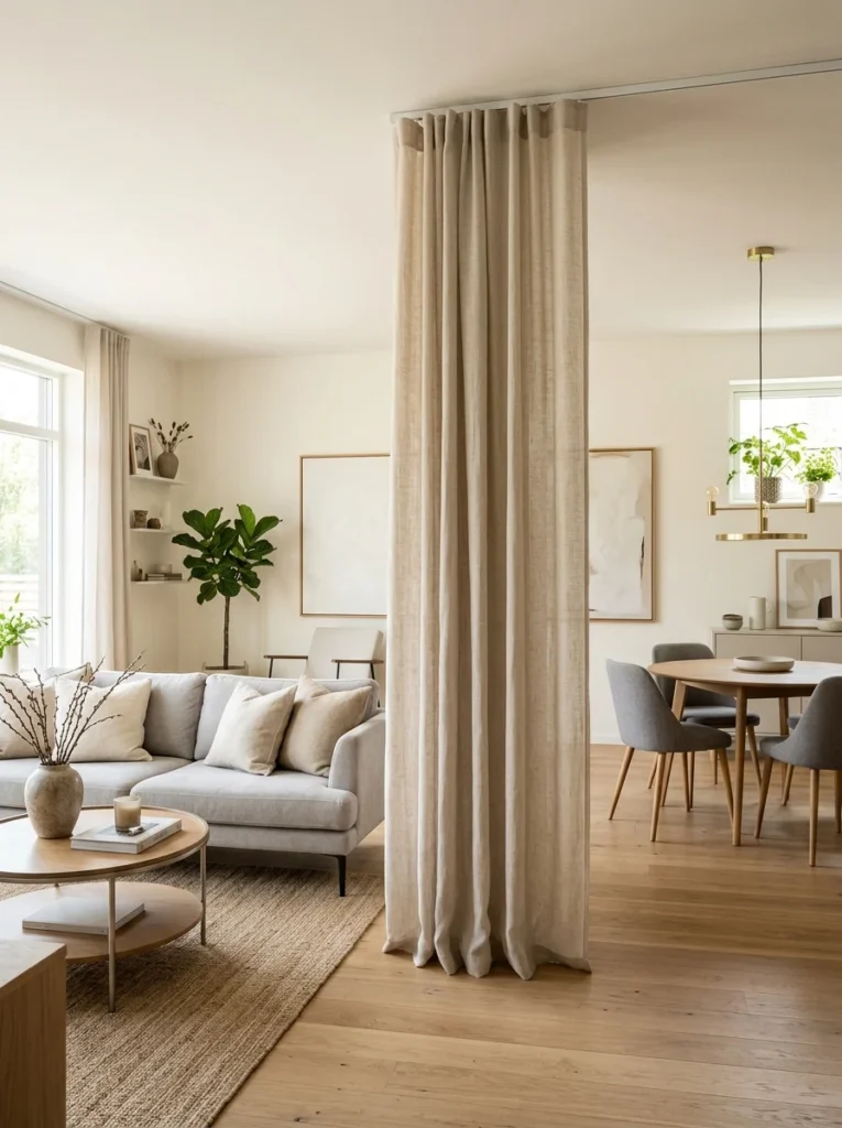
A floor-to-ceiling curtain hung from a ceiling-mounted track near the transition point between zones gave us the option of a fuller visual break when wanted, for guests staying over or during movie nights, while staying fully open the rest of the time for normal daily use.
15. Layer Lighting Differently for Each Zone’s Purpose
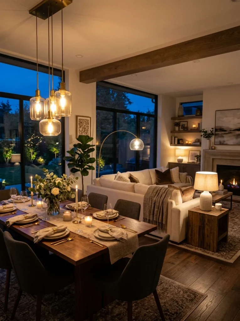
The dining area needs brighter, more direct lighting for actual meals, while the living room benefits from softer, more ambient lighting for relaxing in the evening. Treating these two lighting needs differently, rather than lighting the whole space uniformly, reinforced the sense of two distinct areas even without any physical divider.
16. Give the Combo Space Time Before Committing to a Final Layout
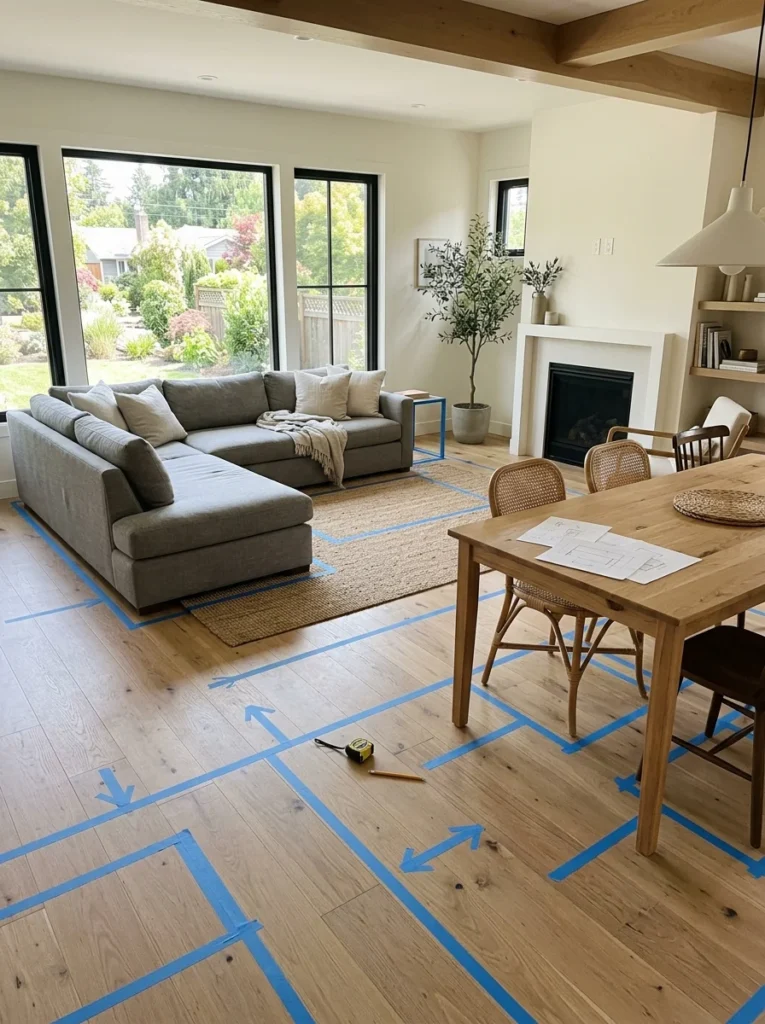
We rearranged furniture in this space no fewer than five times over that first difficult year before landing on something that actually worked. Living with a temporary arrangement and paying attention to what specifically felt wrong about it, rather than trying to get the perfect layout on the first attempt, ended up being the most valuable part of the whole process.
A Mistake I Didn’t Catch Until a Guest Pointed It Out
Even after the fifth rearrangement, one problem stayed hidden from me for months simply because I’d stopped noticing it myself. A friend visiting for dinner mentioned, almost offhandedly, that she felt like she was sitting with her back to the front door the entire meal, which apparently made her subtly uneasy in a way she couldn’t quite explain until she said it out loud. I hadn’t considered sightlines to the entry at all when arranging the dining chairs, focused entirely on the TV and kitchen relationships instead. Swapping two chairs so that no seat directly backed onto the main entry solved a problem I hadn’t even realized existed, and it’s made me much more attentive to entry sightlines in every room since, not just this one — it’s the kind of detail that only reveals itself once someone unfamiliar with the space actually sits in it and reacts honestly, rather than something you’re likely to catch on your own after living there long enough to stop seeing the room with fresh eyes.
How the Two Zones Handle Noise Differently Than I Expected
One thing that surprised me after the layout was finalized was how much the acoustics of a shared, undivided space affected daily life beyond just visual zoning. Conversation at the dining table carries noticeably into the living room in a way it wouldn’t in a fully separated room, which meant we had to be more intentional about timing, if someone’s watching something with dialogue-heavy audio, dinner conversation on the other side of the room competes with it more than either of us expected going in, especially during the winter months when we spend more evenings indoors with both zones actively in use at the same time. Adding a slightly thicker rug under the dining area than we might have chosen for pure aesthetics ended up helping here too, absorbing some of the chair-scraping and general noise that had been bouncing more freely across the open space before, a benefit I hadn’t even considered when originally shopping for rugs based purely on color and pattern.
What Our First Year of Trial and Error Actually Looked Like
I mentioned five rearrangements, and I think it’s worth being specific about what each one taught us, since the wins didn’t come from one flash of insight but from a slow process of elimination. The first arrangement kept everything pushed against the walls, which left a huge, undefined gap of empty floor in the center of the room with no clear purpose. The second attempt moved the dining table to the far end of the room, which solved the TV sightline problem but made carrying food from the kitchen a genuinely long walk every single meal. The third and fourth attempts were mostly minor adjustments to rug placement and furniture angles that, in hindsight, weren’t addressing the actual underlying issues with sightlines and zoning. It wasn’t until the fifth attempt, when we finally addressed the TV placement and added the two separate rugs at the same time, that the room started to feel genuinely resolved rather than just slightly better than before.
The Cost of Getting This Right
Most of what fixed this space wasn’t expensive. The two rugs together cost around four hundred dollars, the dining pendant light was roughly two hundred, and repositioning existing furniture cost nothing beyond the time and mild frustration of moving heavy pieces around repeatedly. The one genuine expense was professionally mounting the TV on a different wall, which required running new cable and outlet access behind drywall, and came out to close to six hundred dollars once everything was said and done. Looking back, that TV relocation was probably the single change that made the biggest functional difference in how the room actually felt to live in day to day, which makes it easy to justify in hindsight even though it was also the most expensive individual item on this whole list. It’s worth noting, too, that we spread these expenses out over several months rather than tackling them all at once, partly for budget reasons and partly because living with each incremental change for a few weeks before making the next one helped us confirm whether it was actually solving the problem we thought it was, rather than just shifting the same issue somewhere else in the room.
What I’d Tell Someone Just Moving Into a Similar Layout
If you’ve just moved into a home with this kind of open, undivided living and dining space, my advice is to resist the urge to fully furnish and decorate it right away. Live with a rough, adjustable arrangement for at least a few weeks, pay close attention to where conversations naturally happen, where the TV pulls focus from, and where people instinctively walk through the space, and let those observations guide the more permanent decisions rather than starting from a specific layout you saw online. It’s a slower process than just committing to a Pinterest board on move-in day, but based on our own five rounds of trial and error, it’s the only approach that actually accounted for the specific quirks of our particular room, the entry sightline, the acoustics between zones, the walking path to the kitchen, none of which any generic layout guide could have predicted for our exact space. Our combo space works now, genuinely well, but it took real trial and error to get there, and I don’t think we would have landed on the right answer nearly as quickly if we’d committed to a fully decorated layout on day one. Looking back at that first, hurried arrangement we threw together during a busy move, it’s a little embarrassing how many of the eventual fixes were things we could have anticipated with a bit more patience upfront. But I also think there’s something to be said for actually living with the friction of a combo space that isn’t quite working, rather than theorizing about it, since it was the daily annoyances themselves, not any design principle I read about beforehand, that pointed us toward every genuine fix on this list.