
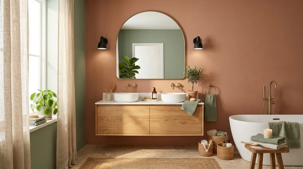
I painted my bathroom white four separate times before admitting to myself that the problem wasn’t the specific shade of white, it was white itself. Each time, I’d convince myself I’d finally found the right one, slightly warmer, slightly cooler, a hint of gray undertone, and each time the room ended up feeling exactly as flat and forgettable as it had before, which in hindsight should have been a clearer signal that the specific shade was never really the variable that mattered. It took a conversation with my sister, who’d just finished a small but genuinely striking powder room in her own house, to make me question the assumption I’d been operating under the whole time, that “safe” and “resale-friendly” meant the color had to be some version of white or beige. What I’ve landed on since, after finally repainting a fifth time, taught me a lot about how to add real color to a small, high-moisture room without it feeling like a risky or dated decision five years down the line.
1. Deep Emerald Green for a Small Powder Room
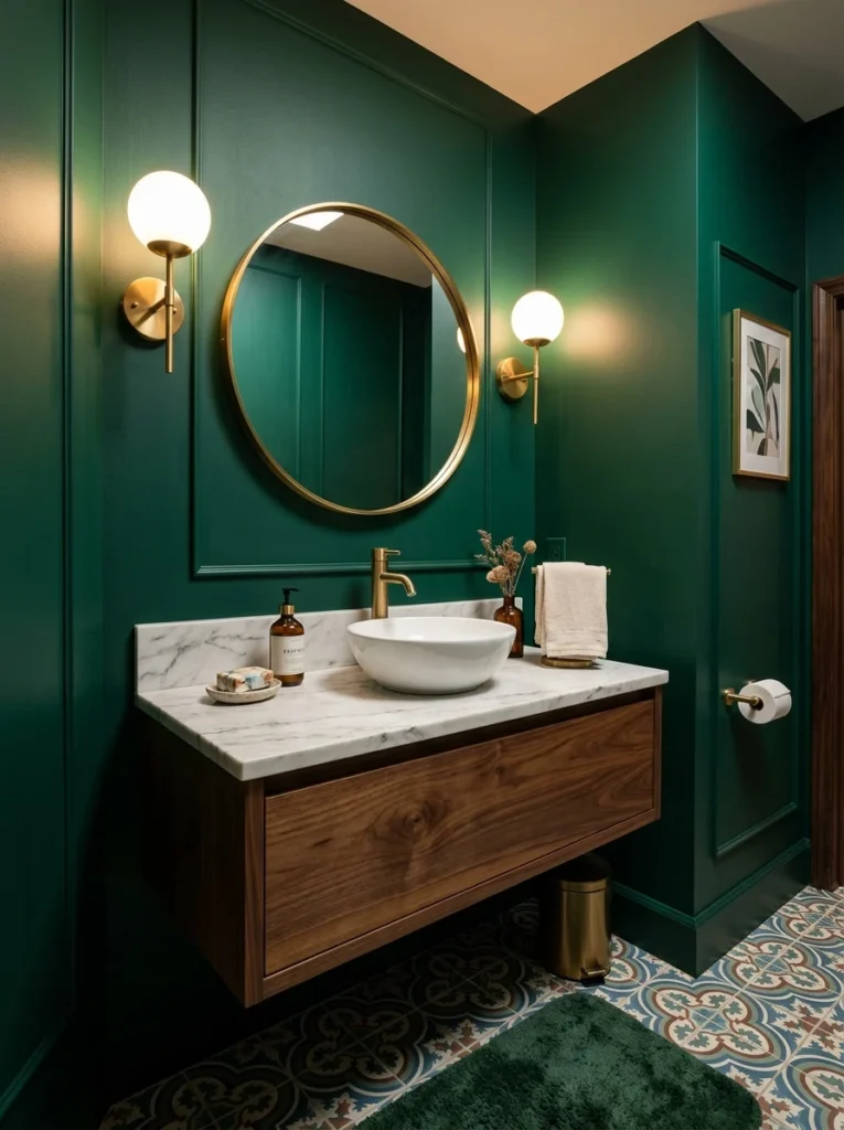
My sister’s powder room ended up a deep, saturated emerald, and in a room with no natural competition from other colors, it read as genuinely luxurious rather than overwhelming. Small, low-traffic bathrooms are the ideal place to take a risk like this, since the commitment feels lower than it would in a full family bathroom used constantly.
2. Warm Terracotta for a Sun-Washed Feel
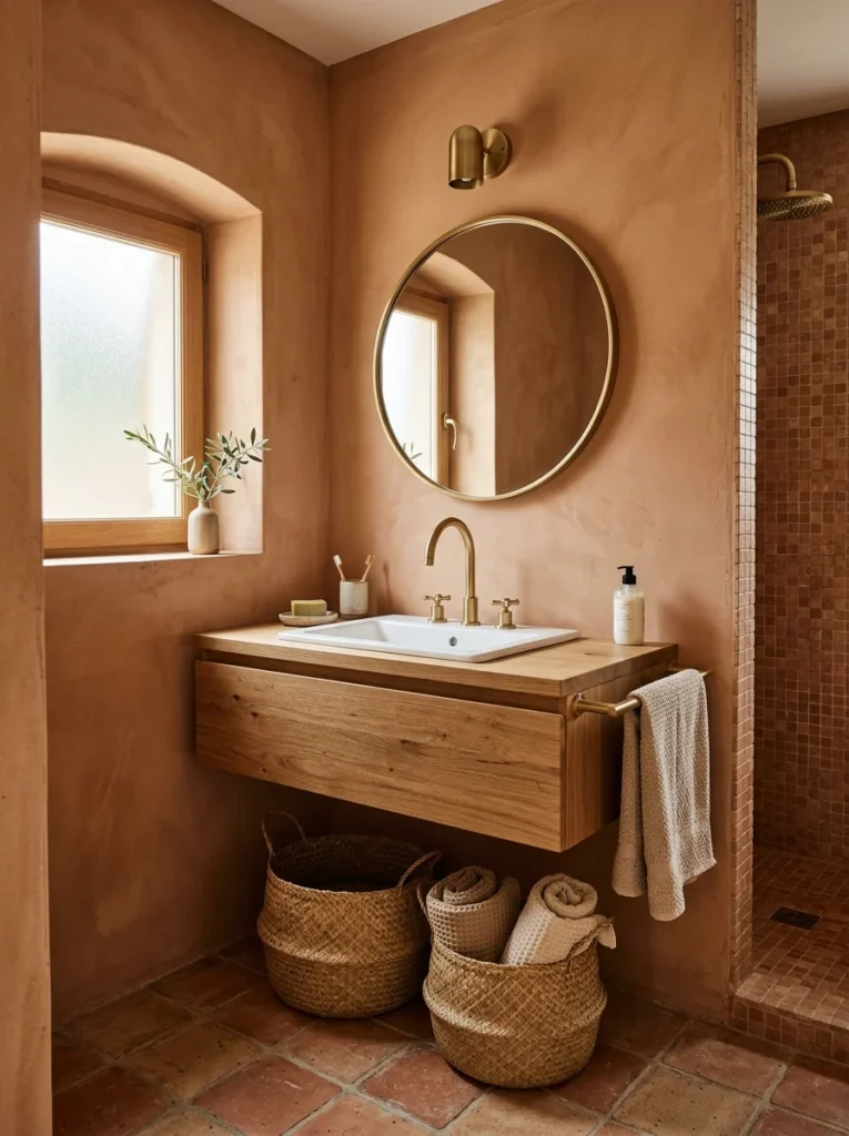
I eventually landed on a muted terracotta for my own bathroom, paired with white fixtures and warm brass hardware. It gives the room a warm, almost perpetually sun-lit quality even though the window is small and doesn’t get much direct light most of the day.
3. Dusty Blue for a Calming, Spa-Like Effect
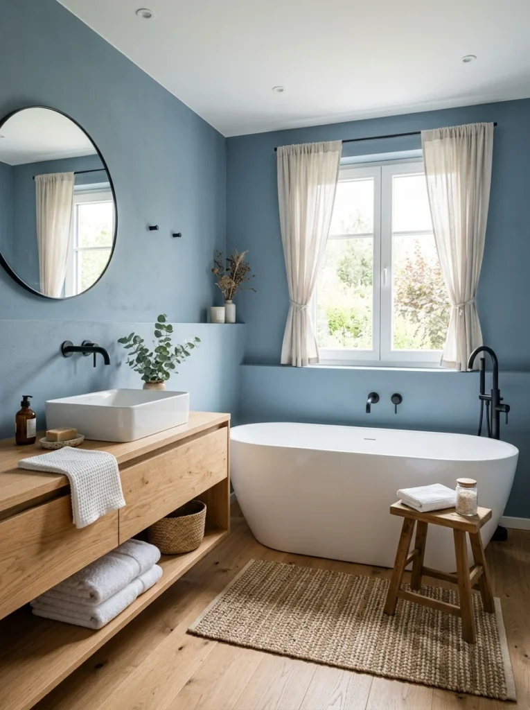
A friend’s main bathroom uses a soft, grayed-down blue that reads as calm rather than cold, largely because she balanced it with warm wood accents and a woven bath mat rather than letting the blue stand entirely on its own against white tile.
4. Bold Yellow for a Cheerful, Energizing Space
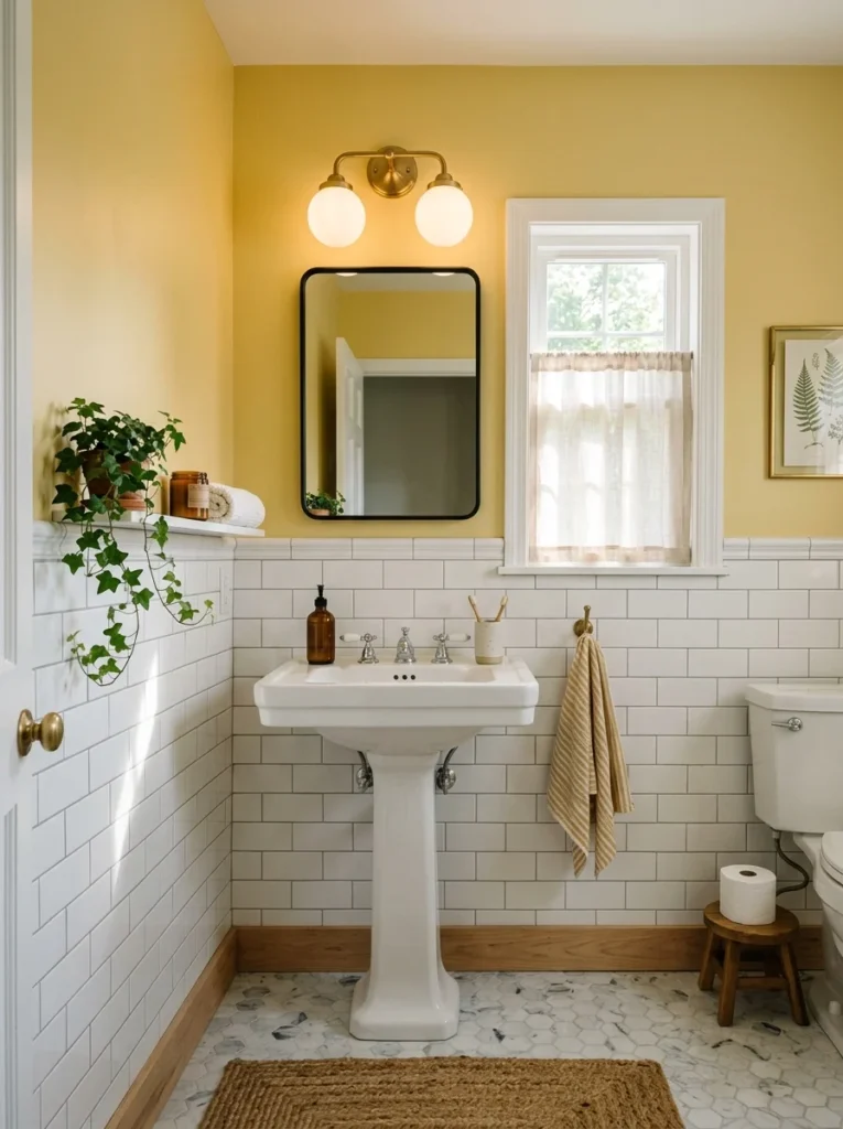
Yellow in a full bathroom can feel like a lot, but a friend used it specifically in a small guest bathroom that gets morning light, and the combination genuinely brightens the space in a way that’s become one of the more complimented rooms in her house.
5. Charcoal for a Moody, Dramatic Bathroom
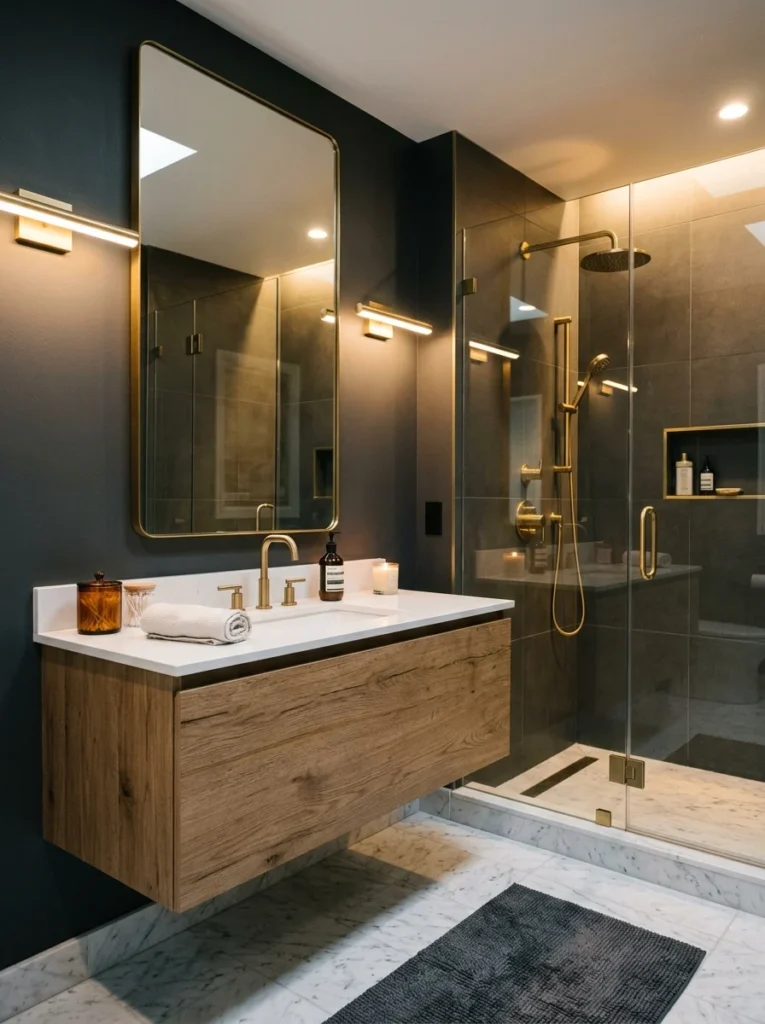
Charcoal walls paired with brass fixtures and a lighter tile floor gave one bathroom I’ve seen a genuinely dramatic, almost hotel-like feel, proving that dark doesn’t have to mean cramped as long as there’s enough contrast elsewhere in the room to keep it from feeling like a cave.
6. Sage Green for an Earthy, Grounded Neutral
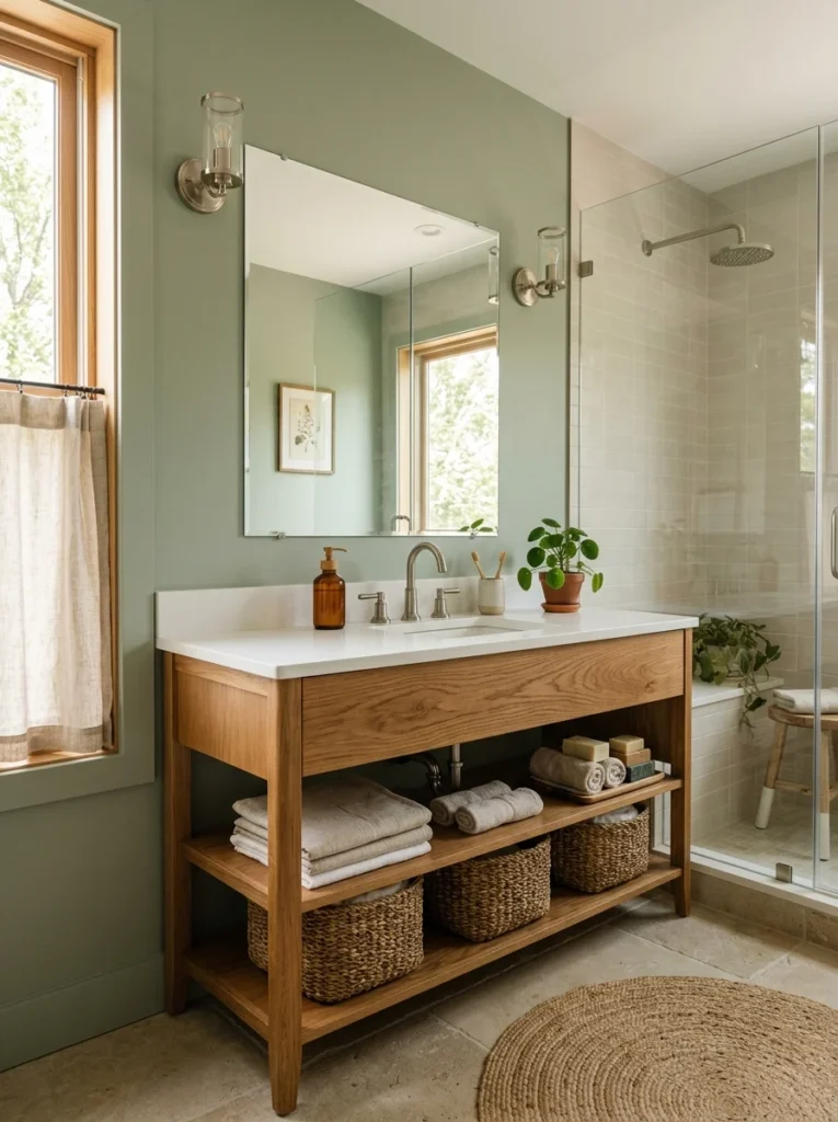
Sage has become a genuinely popular bathroom choice for good reason, it reads as close enough to neutral to feel safe while still offering real color, unlike a straightforward white or beige. It pairs easily with both warm and cool-toned fixtures, which makes it more flexible than some of the bolder options on this list.
7. Coral or Salmon for a Playful, Unexpected Choice
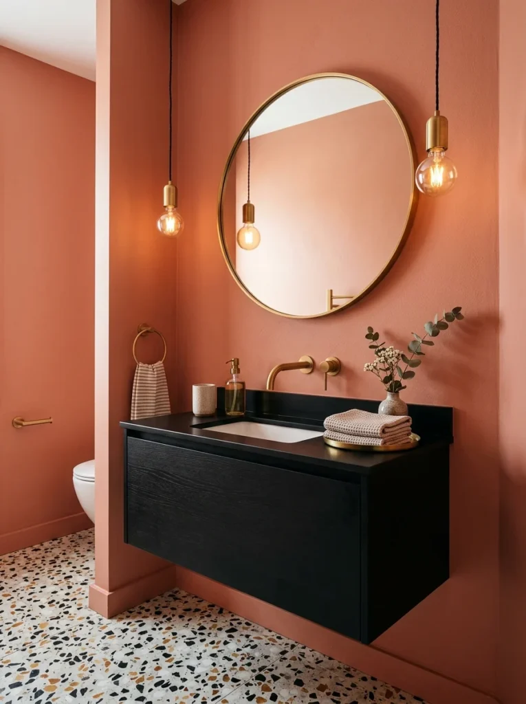
A coral-toned powder room I saw recently managed to feel playful without veering into anything childish, largely because it was paired with more sophisticated black and brass fixtures rather than anything overtly whimsical.
8. Deep Navy With Gold Accents for a Classic, Elegant Look
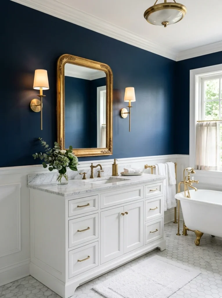
Navy walls paired with gold-toned mirror frames and light fixtures gave one bathroom a genuinely timeless, almost nautical-but-elevated feel that’s held up in style far longer than some of the trendier color choices from the same era.
9. Warm Blush for a Softer Alternative to Bright Pink
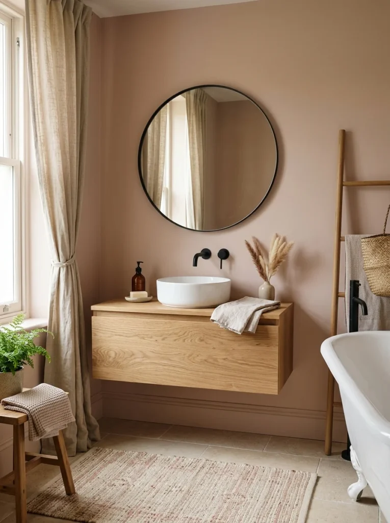
This isn’t a bright, obviously pink shade, but a muted, warm blush that reads more as a soft neutral than a themed color choice. It’s a good option for anyone wanting a hint of warmth and color without committing to something as bold as coral or true pink.
10. Olive Green for an Earthy, Slightly Moodier Alternative to Sage
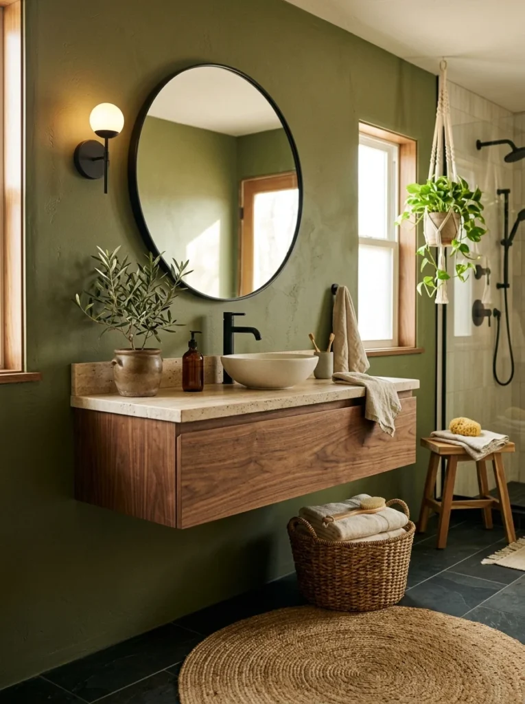
Olive is a step bolder and more saturated than sage, and it works particularly well paired with black fixtures and natural wood accents for a more grounded, earthy bathroom that still reads as intentional rather than dated.
11. Two-Tone Walls With a Chair Rail or Tile Line
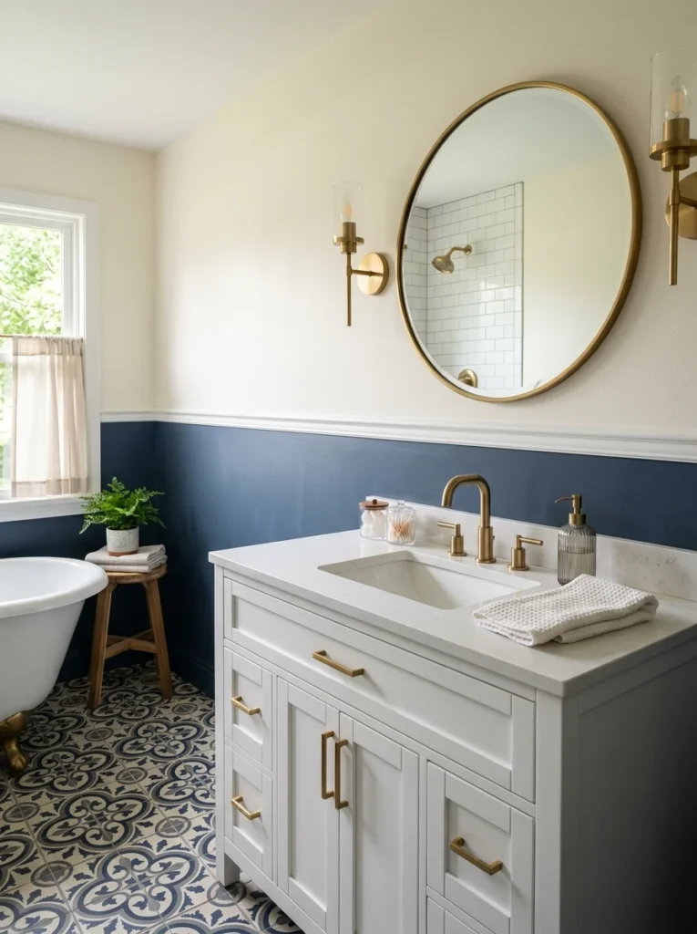
Rather than a single color, pairing a bolder tone on the lower half of the wall with a lighter, calmer shade above a tile or chair rail line adds visual interest without fully committing an entire wall to a saturated color.
12. Muted Mustard for a Warm, Vintage-Inspired Feel
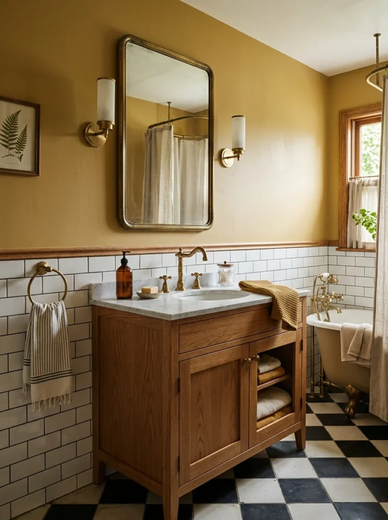
Mustard sounds like a bold, potentially dated choice, but in a muted, less saturated form, it gave one bathroom a warm, slightly retro character that felt intentional and considered rather than like a trend chased without thought.
13. Deep Burgundy for a Rich, Jewel-Toned Powder Room
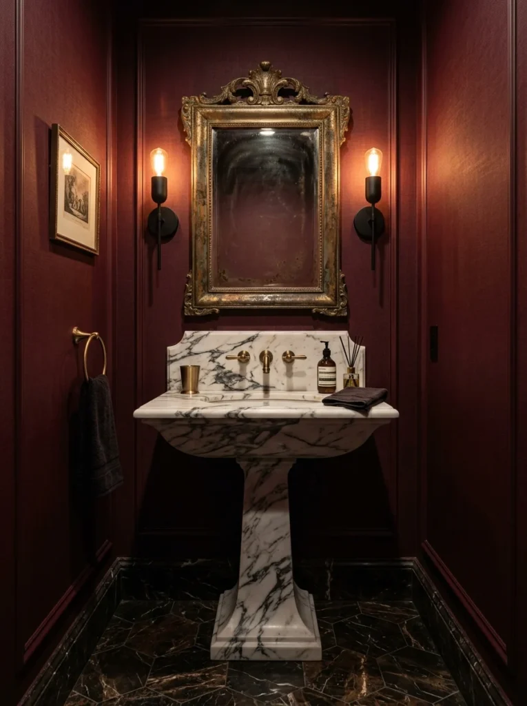
A small powder room I visited used a deep burgundy on all four walls, and the low-traffic, low-natural-light nature of the space meant the boldness felt appropriate rather than overwhelming, the kind of color choice that works specifically because of the room’s size and function.
14. Warm Gray-Green for a Balanced, Flexible Neutral
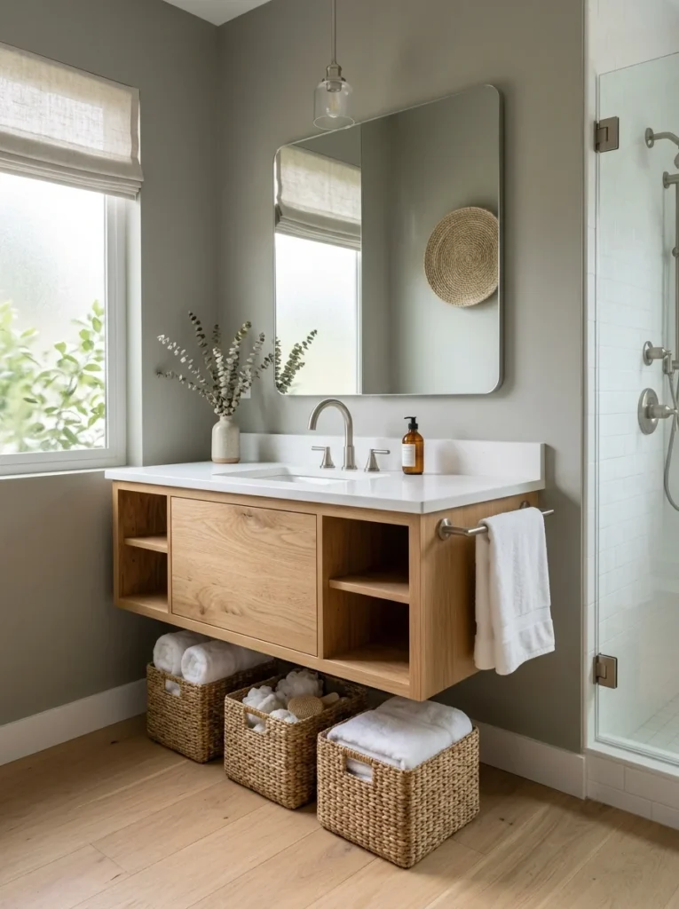
This tone sits between sage and a true gray, reading as more neutral than sage in different lighting while still offering more visual interest than a plain gray. It’s become a popular choice for people wanting color without fully committing to an obviously “colorful” bathroom.
15. Rust Orange for a Bold, Autumnal Statement
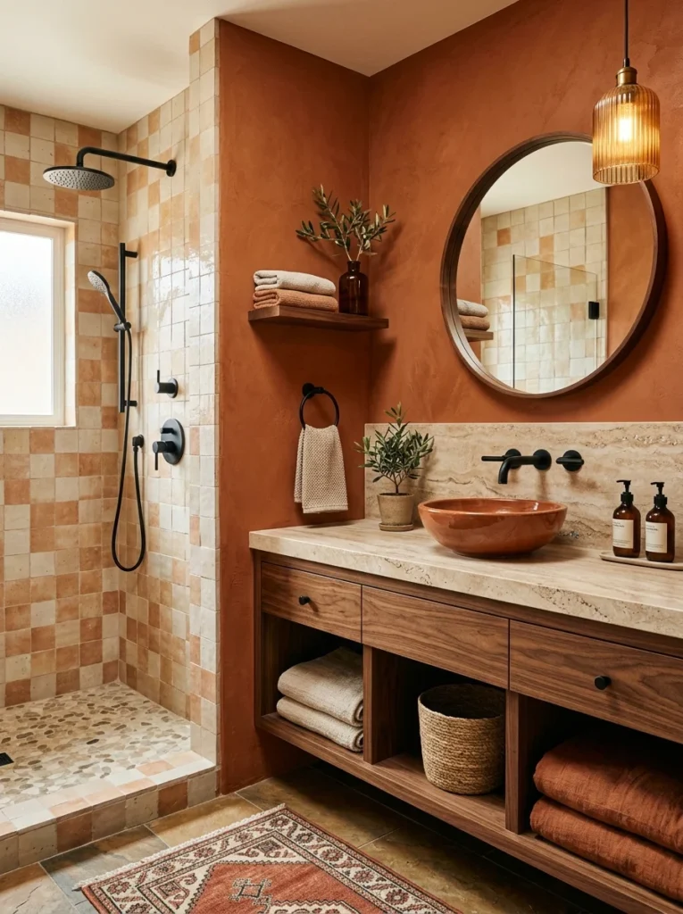
A bolder, more saturated cousin of terracotta, rust orange gave one bathroom genuine warmth and personality, particularly effective when paired with black fixtures and natural stone accents that kept the overall palette from feeling too playful or casual.
16. Soft Lavender for a Subtle, Unexpected Choice
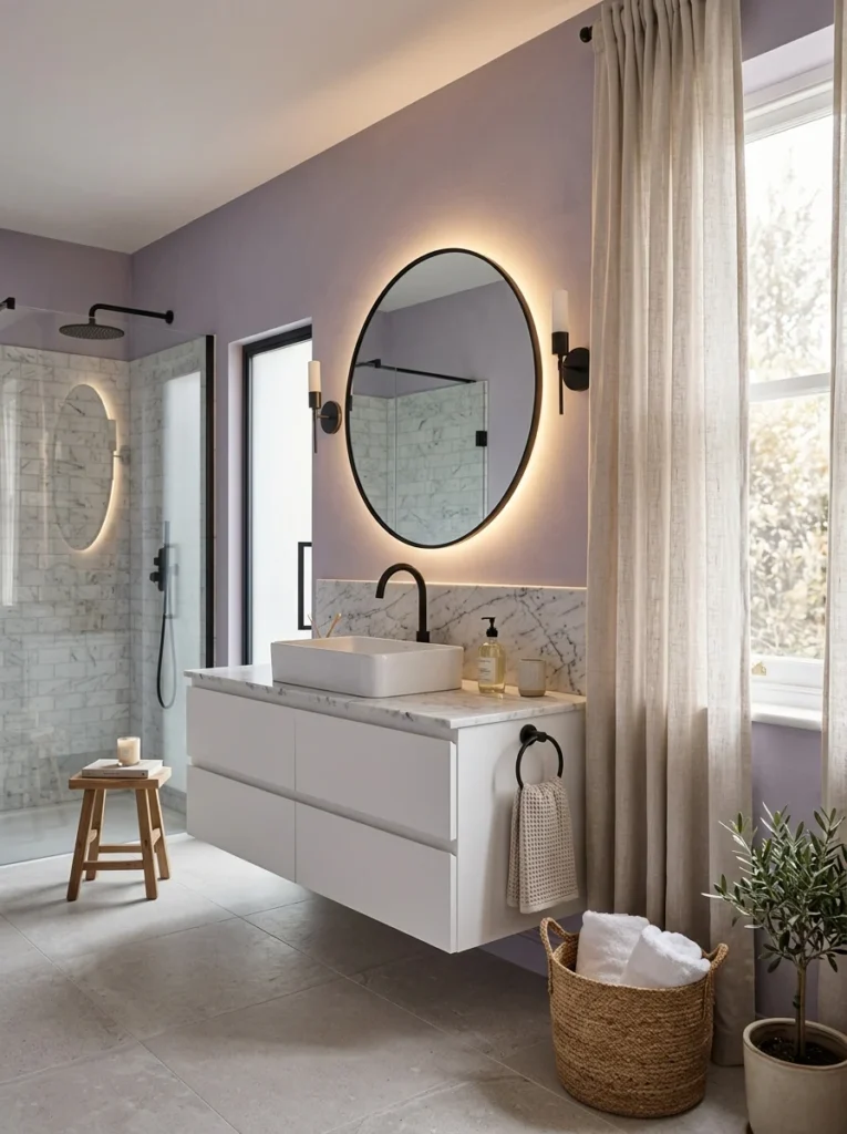
Lavender risks feeling overly sweet or dated if it leans too pastel, but a more muted, grayed-down version gave one bathroom a subtle, sophisticated character that reads as considered rather than themed, especially paired with matte black fixtures for contrast.
17. Two Complementary Colors Split Between Wall and Ceiling
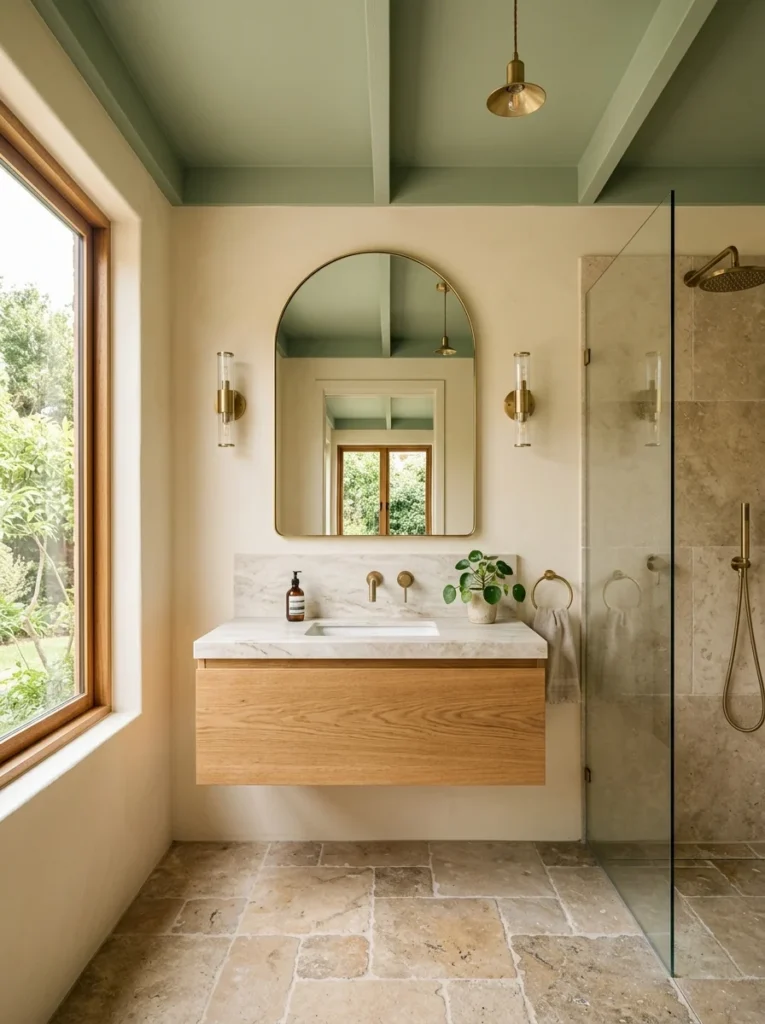
Rather than choosing just one bold color, painting the ceiling a complementary but distinct shade from the walls, a soft sage ceiling over warm cream walls, for instance, added an unexpected layer of visual interest that most bathrooms never think to use.
What My Second and Third Attempts Actually Got Wrong
It’s worth being specific about why the four white repaints failed, since “white didn’t work” is vague advice on its own. My second attempt used a paint that was technically warm-toned on the sample card but read distinctly gray once it covered the walls under my bathroom’s specific mix of natural and vanity lighting, a mismatch I didn’t catch until the whole room was finished. The third attempt overcorrected with a genuinely warm, almost cream-leaning white, which solved the gray problem but left the room feeling flat and slightly dingy rather than crisp, especially against the cooler-toned tile that was already installed. By the fourth attempt, I’d essentially proven to myself that no version of white was going to solve the actual problem, which was never really about undertone at all, it was that a small, low-natural-light bathroom with white tile needed genuine color to feel finished rather than merely a better-calibrated version of the same non-color. That realization took four separate cans of paint and a fair amount of wasted weekends to arrive at, which is exactly why I’m laying it out here in this much detail rather than just saying “white didn’t work” and moving on.
Addressing the Resale Fear Directly
Since the resale worry was what kept me stuck on white for so long, I think it’s worth addressing head-on rather than dismissing it. Real estate agents I’ve talked to since generally agree that a well-executed, tasteful color choice in a secondary bathroom or powder room is rarely a dealbreaker for buyers, and can even function as a memorable, positive detail during a showing, provided the rest of the room’s finishes are neutral enough to let a future owner easily repaint if they want to. The riskier move, based on that same feedback, tends to be an oddly saturated or poorly chosen color paired with equally bold, harder-to-change fixtures or tile, rather than color on the walls alone, which remains one of the cheapest and easiest things in any home to update later if a future buyer genuinely dislikes it. A gallon of paint and a weekend is a far smaller ask of a future owner than replacing tile, fixtures, or a vanity they don’t care for, which is worth remembering the next time a color choice feels bigger and riskier than it actually is in practical terms.
Why I Kept Choosing White in the First Place
Looking back at my own four failed white repaints, I think the real issue wasn’t a lack of good color options, it was an assumption I’d absorbed somewhere along the way that resale value depended on keeping bathrooms neutral, and that “neutral” specifically meant white or beige rather than any muted, earthy, or jewel-toned option. My sister’s powder room was actually what broke that assumption for me, since it’s one of the first things buyers comment on positively whenever she has people over, not a liability she needs to apologize for or plan to repaint before selling, and hearing that directly from her, rather than reading it as generic design advice online, was what finally made the idea feel credible enough to actually try in my own house.
What Finally Convinced Me to Commit to Terracotta
The conversation that actually got me to stop repainting white was less about color theory and more about a simple question my sister asked: what did I actually want the room to feel like when I walked in each morning. I realized I’d been so focused on avoiding a wrong choice that I’d never actually answered that question for myself. Once I did, warm, sun-lit, a little bit cozy despite the room’s small size and limited natural light, the terracotta became an obvious answer rather than a risky one, and it’s the first bathroom color in this house that’s actually matched an intention rather than just avoided a mistake.
A Practical Note on Testing Bold Bathroom Colors
Bathrooms present a specific testing challenge that other rooms don’t, since lighting conditions shift dramatically between a bright midday shower and a dim evening routine with only a vanity light on. I learned to test my terracotta sample at both times of day before committing, after one of my earlier white attempts looked noticeably different under warm evening lighting than it had during a bright afternoon test. Moisture and steam from regular showers can also affect how a finish reads over time, so a satin or semi-gloss finish, which handles humidity better than a flat matte, is worth prioritizing regardless of which color you ultimately choose. I’d also recommend painting a large enough sample, at least two feet square, directly on the actual wall rather than relying on a small card held up nearby, since bathrooms tend to have more reflective surfaces, tile, mirrors, chrome fixtures, bouncing light around in ways that can shift how a color reads compared to a plainer room with fewer reflective materials.
Where This Leaves My Bathroom Now
Six months into living with the terracotta, I haven’t once regretted moving past the white repaints that came before it. If anything, I regret not asking myself that basic question, what do I actually want this room to feel like, before the first three attempts rather than the fourth. Bold bathroom color doesn’t have to mean a design risk you’ll need to undo before selling the house someday. In a room this small, used this often, a color that actually makes you glad to walk in each morning is worth far more than one chosen purely to avoid standing out, and I’ve come to think the years I spent avoiding that risk cost me more in daily enjoyment of the space than any hypothetical resale downside I was so worried about ever would have. If you’re standing in front of paint swatches right now, stuck in the same loop I was in for years, my honest suggestion is to skip straight to asking yourself what you actually want the room to feel like, rather than starting from what you think a future stranger might prefer. That question alone would have saved me three repaints and a fair amount of wasted paint, and I suspect it would save a lot of other people standing in that same aisle, staring at forty nearly identical shades of white, convinced the right one is somewhere in there if they just keep looking a little longer.