
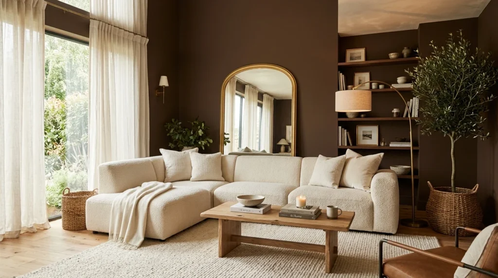
Someone in an online design forum once told me brown was “a color from the 90s that needs to stay there,” which is a sentence I thought about for way too long before eventually ignoring it entirely and painting my own living room a deep chocolate brown anyway. Eighteen months later, it’s the room in my house that gets the most genuine, unprompted compliments, usually from people who walk in expecting it to feel dark or dated and are visibly surprised that it doesn’t. Getting there wasn’t as simple as just picking a brown paint chip, though, and there was a genuinely uncomfortable week early on where I nearly repainted the whole thing out of panic. There’s a real difference between a brown room that feels enveloping and cozy and one that feels like a cave, and the gap between those two outcomes came down to several specific decisions I made almost by accident during the process.
1. Choose a Warm Brown Over a Cool, Gray-Leaning One
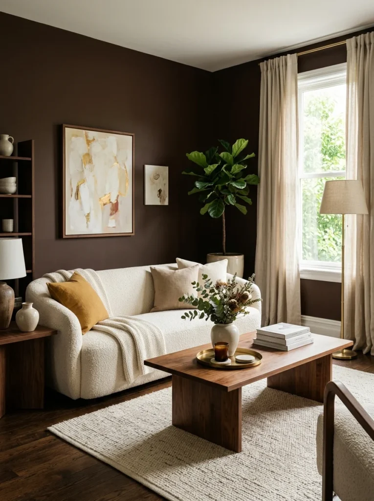
My first sample was a gray-brown that read as muddy and slightly cold once it covered a full wall. Switching to a warmer, more chocolate-toned brown with almost no gray undertone made an immediate difference in how inviting the room felt.
2. Keep the Ceiling Lighter to Prevent the Room From Feeling Boxed In
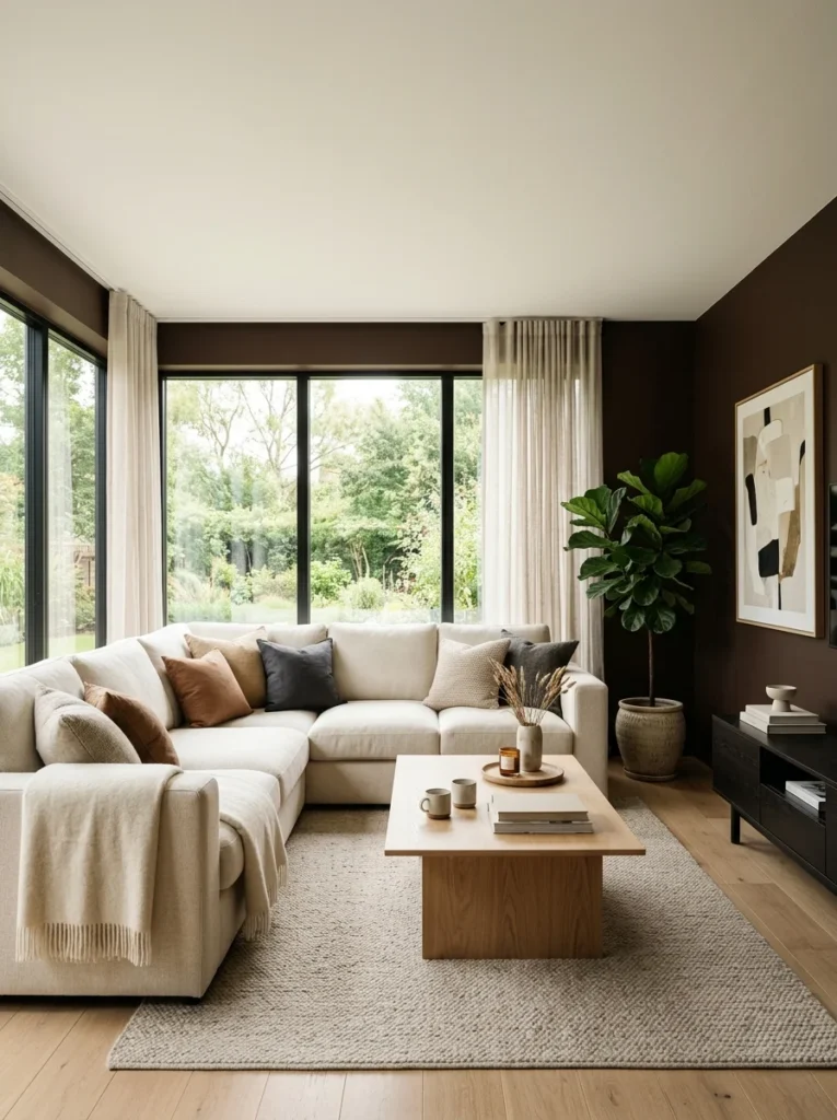
I painted the ceiling in the same brown as the walls during my first attempt, and the room felt noticeably smaller and heavier as a result. Repainting the ceiling a warm white while keeping the walls brown opened the room back up considerably.
3. Layer in Cream and Ivory Textiles for Contrast
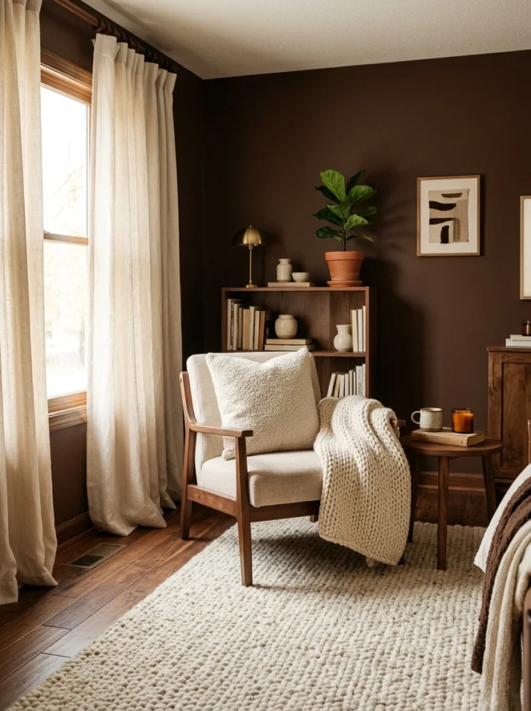
A brown room without any lighter contrast anywhere risks feeling like a single dark block. Cream throw pillows, an ivory area rug, and a light-colored curtain against the brown walls gave the eye somewhere to rest and kept the space from feeling uniformly heavy.
4. Use Brass or Gold Accents to Add Warmth and Light
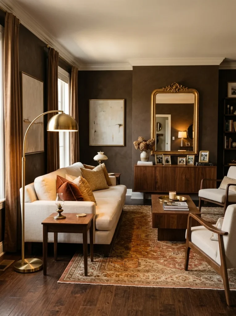
Brass lamp bases, picture frames, and a gold-rimmed mirror added small pops of reflective warmth throughout the room, which helped bounce light around in a way that flat, dark walls alone tend to absorb.
5. Maximize Natural Light Wherever Possible
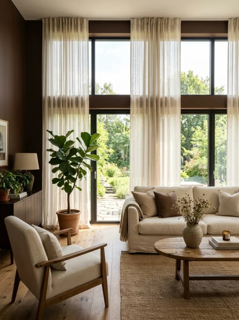
I removed heavy, dark curtains that had been blocking a significant portion of my windows and replaced them with a sheer, lighter fabric that still provided some privacy without sacrificing daylight. In a brown room specifically, natural light does more work than it would in a lighter space to keep things from feeling dim.
6. Choose a Brown With a Slight Red or Orange Undertone
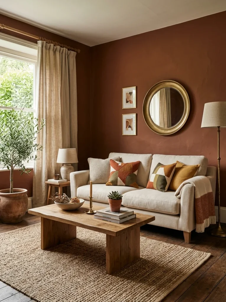
A brown that leans slightly warmer, closer to a deep terracotta-brown than a true chocolate, reads as cozier and more inviting than one that leans toward gray or black. This subtle undertone difference was something I hadn’t considered until testing several samples side by side.
7. Add Layered Lighting Rather Than Relying on One Overhead Fixture
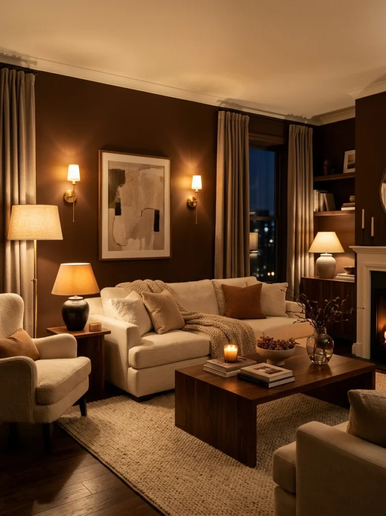
A single overhead light in a brown room creates flat, uneven shadows that can make the space feel darker than it actually is. Adding floor lamps and table lamps at different heights distributed light more evenly and made the room feel brighter overall, even with the same wall color.
8. Use Wood Furniture in a Lighter Tone Than the Walls
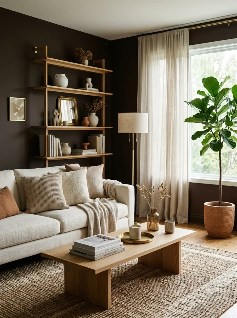
My original plan involved dark wood furniture to match the walls, which I quickly abandoned once I saw how heavy the combination felt in person. Lighter, warmer wood tones on my coffee table and shelving created contrast against the walls instead of blending into them.
9. Introduce Greenery for a Living, Fresh Contrast
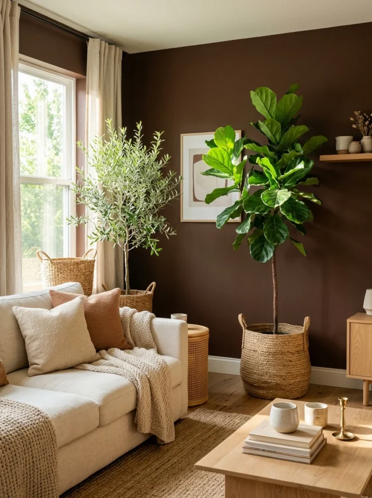
A few plants scattered through the room added a living, textural contrast against the flat brown walls that no static decor item quite replicated. It’s a small addition that makes a noticeable difference in how “alive” the room feels overall.
10. Keep Flooring Lighter If You Have Any Say in the Matter
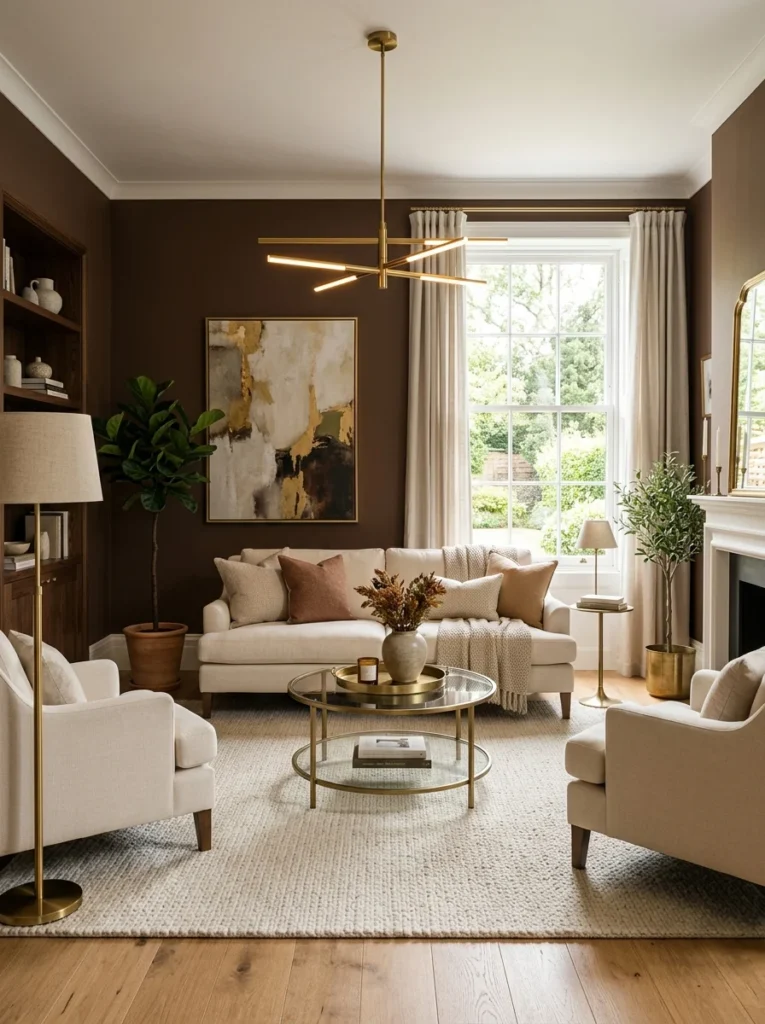
My existing hardwood floor was a medium warm tone, which turned out to be a lucky match for the brown walls. If you’re choosing flooring specifically for a brown-walled room, I’d lean toward something on the lighter side to avoid the whole room reading as one uninterrupted block of dark tones from floor to ceiling.
11. Add Textured Fabrics Like Velvet or Boucle for Depth
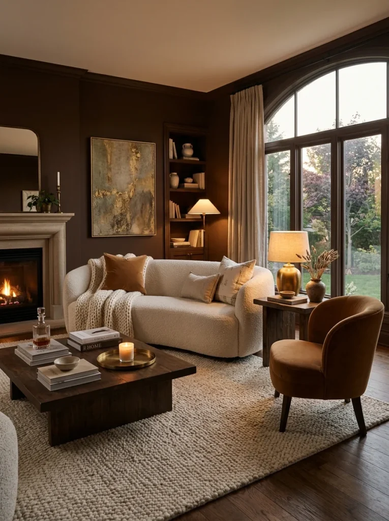
A velvet accent chair and a boucle throw pillow added tactile richness that flat, smooth fabrics couldn’t achieve on their own. Texture became almost as important as color contrast in keeping the room from feeling one-dimensional.
12. Use Mirrors to Bounce Light Around the Room
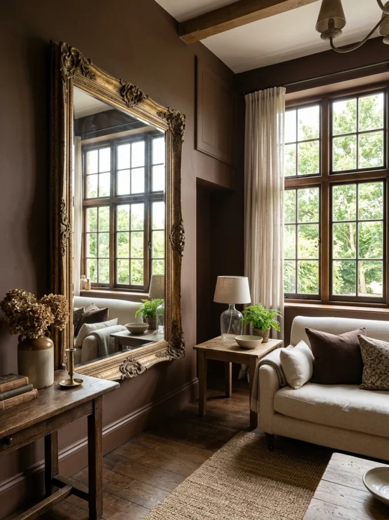
A large mirror positioned across from my main window reflects daylight back into the room, doing real, measurable work in a space that could otherwise feel dim given how much light darker walls tend to absorb compared to lighter ones.
13. Choose an Accent Wall Instead of Committing All Four Walls
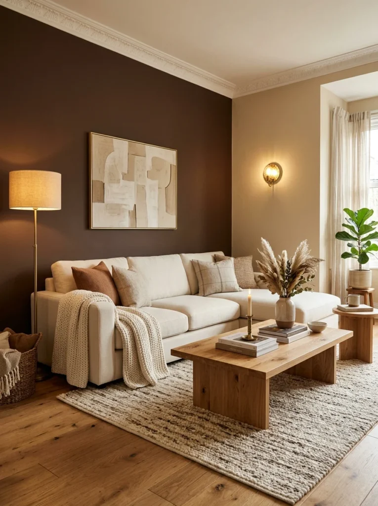
For anyone hesitant about a fully brown room, painting just one wall in a deep brown while keeping the others a lighter neutral offers a lot of the same cozy, grounded feeling without the full commitment, and it’s an easier change to reverse later if needed.
14. Balance Brown With Black Sparingly, Not Heavily
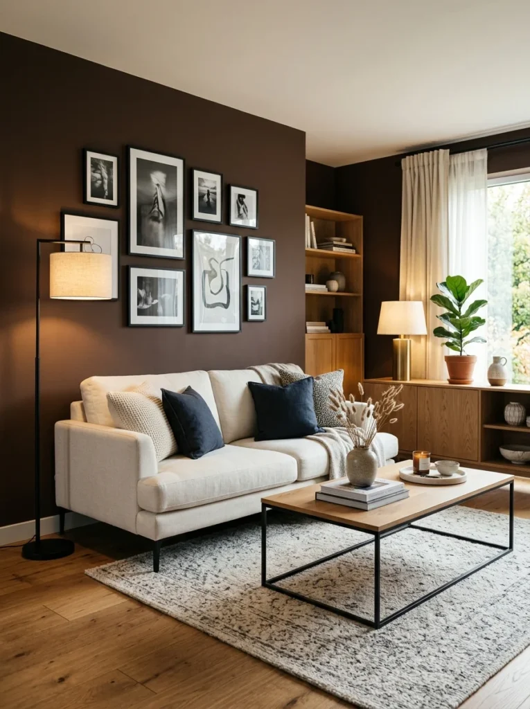
A few black accents, a picture frame, a lamp base, added definition and contrast against the brown walls, but I learned quickly that too much black in the same room as brown pushed the whole space toward feeling heavier and darker than intended.
15. Add a Statement Piece of Art With Lighter Tones
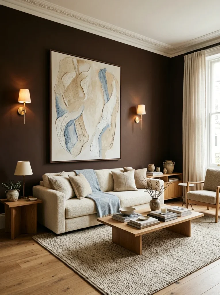
A large piece of art with predominantly cream and soft blue tones became a focal point against the brown wall behind my sofa, giving the eye a clear, lighter area to land on rather than letting the entire wall read as one uninterrupted expanse of dark color.
16. Use Warm-Toned Bulbs Exclusively Throughout the Room
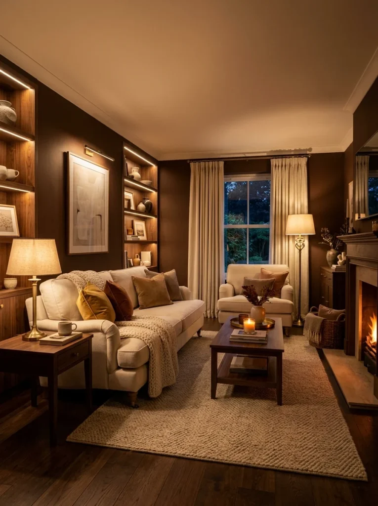
Switching every bulb in the room to a warm color temperature, rather than mixing warm and cool tones across different fixtures, kept the lighting consistent and reinforced the cozy feeling rather than fighting against it with any colder-toned light source.
17. Give the Room Time Before Deciding It’s “Too Dark”
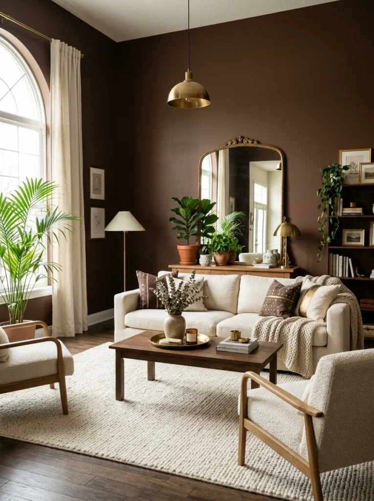
My initial reaction to the freshly painted walls, before any of the lighter textiles, brass accents, or furniture were back in place, was genuine panic that I’d made a serious mistake. It wasn’t until the room was fully furnished again, with all the contrasting and reflective elements in place, that the actual balance of the space became clear, which taught me that judging a bold color choice from bare walls alone is almost never a fair assessment.
How Many Samples It Actually Took to Get the Right Brown
I want to be specific about the testing process, since “test your samples” is advice I’d read plenty of times before and still managed to get wrong on my first attempt. I ended up painting five different large swatches directly on the wall before settling on the final color, and the differences between them were subtler than I expected walking into the process. Two leaned distinctly gray and made the room feel cold rather than cozy, one leaned so far into orange that it read almost as a burnt sienna rather than a true brown, and one was close but tested oddly yellow under my living room’s evening lamp light despite looking neutral during the day, a shift I only caught because I made a point of checking each sample after dark, something I hadn’t bothered doing on previous paint projects in other rooms of the house. The fifth sample was the one that held up consistently across both morning daylight and evening lamp light, which became my actual criteria for a final decision rather than how any single sample looked under one specific lighting condition. In hindsight, I wish I’d started with that two-lighting-condition test from the very first sample rather than treating it as a tiebreaker only after four attempts had already failed for other reasons, since it would have narrowed the field considerably faster and saved a fair amount of paint and patience along the way.
What the Full Project Cost, Beyond Just the Paint
The paint itself was a relatively small expense, but achieving the balanced, cozy version of this room rather than the dark, heavy version required the brass accents, updated lighting, and lighter furniture pieces I mentioned throughout the list above, and those additions added up to a more significant total than I’d initially budgeted for. Between the new lamps, the mirror, the lighter wood coffee table, and the velvet accent chair, the full project came to roughly eighteen hundred dollars beyond the paint itself, spread out over about four months as I made incremental changes and lived with each one before deciding what still felt missing. Looking back at that total, I don’t think I could have arrived at the right combination of pieces any faster by planning it all out in advance on paper, since several of these additions, the mirror especially, were direct responses to specific problems I only noticed once I was actually sitting in the finished, painted room rather than something I could have predicted from a mood board beforehand.
The Forum Comment I Couldn’t Stop Thinking About
I mentioned that comment about brown belonging in the 90s at the start of this, and I think it’s worth explaining why it stuck with me the way it did. It wasn’t really about brown specifically, it was about how easily a confident, dismissive opinion online can talk you out of something you’d genuinely wanted, before you’ve even tried it yourself. I very nearly repainted a safer gray instead, purely based on that one comment, and I’m genuinely glad I didn’t, because the finished room bears almost no resemblance to the dated, heavy brown rooms that comment was presumably picturing when they wrote it, likely without any of the lighter contrast, reflective accents, or layered lighting that ended up making the actual difference in my own space.
What My First Panicked Week With Bare Walls Taught Me
Those first few days with freshly painted brown walls and none of the balancing elements in place were genuinely uncomfortable to live with, and if I’m honest, I nearly repainted over it before giving the full plan a chance to come together. What got me through that period was reminding myself that I’d made this decision deliberately, based on real research into undertones and contrast, rather than on impulse, and that panicking during an incomplete stage of any renovation project is a pretty normal experience that doesn’t necessarily mean the underlying choice was wrong. My partner, to his credit, talked me out of repainting on at least two separate evenings during that week, pointing out each time that judging a half-finished room was setting myself up to make a decision I’d regret. Looking back, I think that patience, resisting the urge to immediately “fix” a scary-looking bare wall, was almost as important as any of the specific design decisions on this list.
Where the Room Stands Today
Eighteen months in, this remains the room in my house I get asked about most often, usually by people surprised that a fully brown living room can feel this warm and inviting rather than heavy or dated. I think the lesson that’s traveled furthest from this project, beyond any single brown paint recommendation, is that a bold color choice rarely fails because of the color itself. It usually fails because of everything surrounding that color, the lighting, the contrast, the texture, that either supports it or works against it. Brown was never really the risk. Building the room around it without those supporting elements would have been.
If I’m honest, that forum comment still crosses my mind occasionally, usually when I’m sitting in this room in the evening with the lamps on and the brass catching the light, and I find myself thinking that whoever wrote it had probably only ever seen brown done badly, walls and furniture and flooring all the same flat, heavy tone with no contrast anywhere to break it up. That version of brown does deserve some of the reputation it’s gotten. This version, built deliberately around lightness, texture, and warmth rather than in spite of them, doesn’t have much in common with it at all, and I think that distinction matters more than the specific color anyone ends up choosing.