
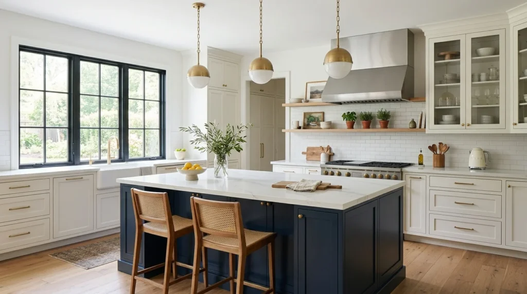
When I first started planning my kitchen renovation, I was completely set on all-white cabinets, mostly because that’s what every kitchen in my neighborhood seemed to have and it felt like the safe, obviously correct choice. It was my contractor, of all people, who casually mentioned during our second meeting that a lot of his more recent clients had been mixing two cabinet colors instead, and something about the way he described it, a darker island against lighter surrounding cabinets, stuck with me for weeks afterward. By the time we actually started demolition, I’d completely abandoned my original all-white plan in favor of a two-tone approach, and looking at my kitchen now, it’s hard to imagine I almost talked myself out of it.
If you’re on the fence about two-tone cabinets the way I was, here are 19 ideas, each explained in detail, based on my own renovation experience and what I’ve researched and observed in other two-tone kitchens since.
1. Start With a Darker Island Against Lighter Perimeter Cabinets
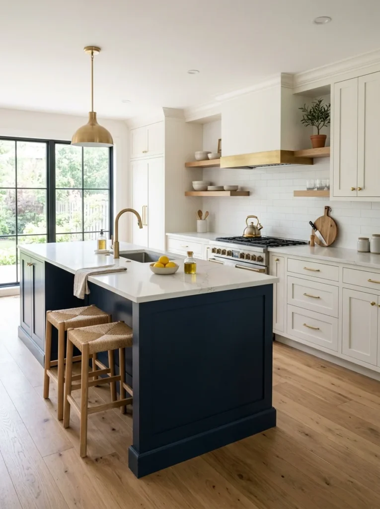
This is genuinely the most common and most approachable two-tone combination, and it’s exactly what I ended up choosing for my own kitchen, a deep navy island surrounded by warm white perimeter cabinets. The island becomes a natural focal point using this approach, since it already tends to draw the eye as the room’s central piece of furniture, and the darker color reinforces that visual weight rather than fighting against it. This combination also has a practical benefit worth considering, since darker cabinets on just the island show fewer fingerprints and daily smudges in the area that typically gets the most direct hand contact from cooking, prepping, and general kitchen activity. I’d recommend choosing your darker island color first if you’re taking this approach, since it’s easier to select a complementary lighter perimeter shade to pair with a specific darker tone than to work in the opposite direction, trying to match a dark color afterward to an already-chosen lighter shade.
2. Reverse It With a Lighter Island Against Darker Perimeter Cabinets
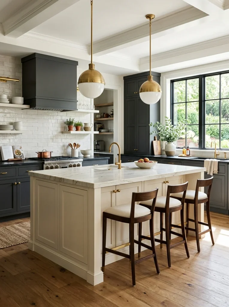
Flipping the more common combination, a lighter island surrounded by darker perimeter cabinetry, creates a different but equally striking effect, and I’ve seen this done particularly well in a friend’s kitchen where a soft cream island sits within a surrounding sea of deep charcoal cabinets. This approach tends to make the island feel more like a piece of standalone furniture rather than simply another cabinet run, since the lighter tone visually separates it more distinctly from the walls of cabinetry surrounding it. It also works particularly well in kitchens with a lot of natural light, since the darker perimeter cabinets can handle the deeper saturation without making the room feel dim, while the lighter island still catches and reflects available light rather than everything in the room absorbing it. I’d recommend this specific combination for kitchens that already receive strong, consistent natural light throughout the day, since darker perimeter cabinets in a naturally dim kitchen can sometimes tip the room toward feeling cave-like rather than intentionally dramatic.
3. Separate Upper and Lower Cabinets by Color
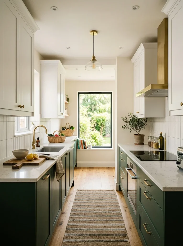
Rather than distinguishing the island from the rest of the kitchen, another popular two-tone approach keeps upper and lower cabinets in different colors throughout the entire kitchen, typically lighter uppers paired with darker lowers, which visually grounds the room while keeping the space feeling open near the ceiling. My sister-in-law used this approach in her galley kitchen specifically, white upper cabinets paired with deep forest green lower cabinets throughout, and the effect makes her relatively narrow kitchen feel considerably taller and more open than a single uniform color would have achieved. This combination works particularly well in smaller kitchens where visual weight needs careful management, since keeping the upper portion of the room lighter prevents the space from feeling closed in, while the darker lower cabinets still provide grounding and visual interest without overwhelming the room’s more limited square footage. I’d recommend this approach specifically for kitchens where ceiling height or overall openness is a genuine concern, since the lighter-on-top, darker-on-bottom configuration is one of the more reliable ways to maintain that airy feeling while still incorporating a bolder color choice somewhere in the room.
4. Use Color to Define Distinct Zones
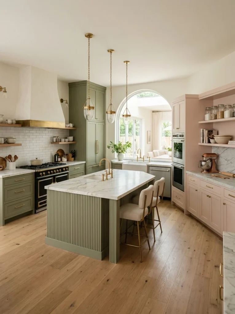
Beyond the island-versus-perimeter or upper-versus-lower approaches, some kitchens use two cabinet colors to distinguish genuinely different functional zones, a baking station in one color, a coffee and beverage area in another, particularly in larger kitchens with enough distinct areas to justify this more elaborate zoning. A friend with a particularly large kitchen used this approach, keeping her main cooking wall in a warm sage green while a separate baking nook along an adjacent wall uses a soft blush pink, and the color distinction genuinely helps signal, almost subconsciously, where different activities happen throughout the room. This approach requires a genuinely large kitchen with distinct functional areas to work well, since attempting to zone a smaller kitchen this way can result in a choppy, overly busy appearance rather than the intentional, purposeful zoning it’s meant to achieve in a larger space. I’d recommend this specifically for larger kitchens with at least two clearly distinct functional areas, mapping out where each activity actually happens before deciding where the color transition should occur within the overall cabinet layout.
5. Pair Wood Tone With Painted Cabinetry
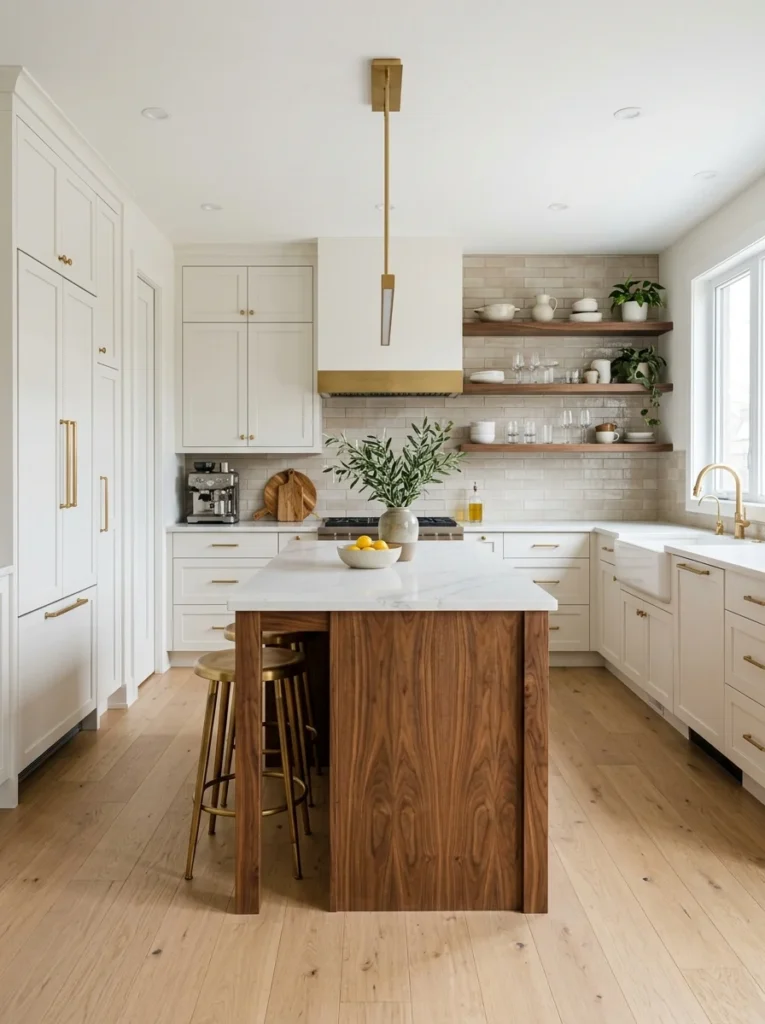
Rather than combining two different paint colors, pairing natural wood cabinetry with painted cabinets elsewhere in the kitchen introduces genuine material contrast alongside color contrast, adding an extra layer of visual interest that two painted finishes alone don’t achieve. My own kitchen actually uses this approach on my island specifically, a warm walnut wood finish left unpainted, surrounded by painted white perimeter cabinets, and the combination of a painted, matte surface against natural wood grain adds a textural dimension that I genuinely didn’t anticipate would matter as much as it does. This works particularly well if you already have wood flooring or other wood elements elsewhere in your kitchen or adjacent rooms, since the wood cabinetry can echo and reinforce those existing tones rather than introducing a completely unrelated material into the space. I’d recommend choosing a wood species and stain that complements your flooring specifically, since a mismatch between your wood cabinetry and wood flooring tones can look more jarring than an intentional two-paint-color combination would.
6. Choose Complementary Colors From the Same Family
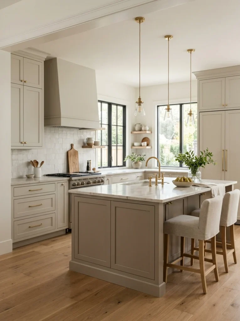
For a more subtle, cohesive two-tone effect rather than a dramatic contrast, selecting two colors from the same general family, a soft sage paired with a deeper forest green, or a warm cream paired with a richer camel tone, creates visual interest without the more dramatic statement that a stark light-dark or complementary color pairing achieves. I’ve seen this done beautifully in a friend’s kitchen using two closely related warm neutrals, a soft greige on the perimeter and a slightly deeper taupe on the island, and the subtlety genuinely reads as sophisticated rather than simply indecisive between two similar options. This approach tends to age well and feel less trend-driven than more dramatic color contrasts, making it a good choice for anyone nervous about committing to a bold two-tone look but still wanting more visual depth than a single flat color throughout the entire kitchen. I’d recommend testing your two chosen shades side by side in your actual kitchen’s lighting before committing, since colors from the same family can sometimes read as more different, or less different, than expected depending on your specific lighting conditions.
7. Contrast Warm and Cool Tones Intentionally
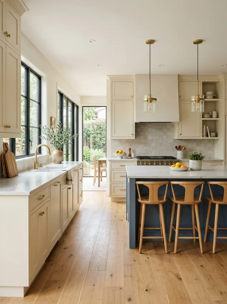
While complementary same-family colors create subtlety, intentionally pairing a warm tone with a cool tone, a warm cream against a cool slate blue, for example, creates more dramatic visual interest while still maintaining balance if executed thoughtfully rather than randomly. My own kitchen’s navy and white combination technically falls into this category, since the navy leans cool while my white perimeter cabinets have a warm undertone, and that intentional temperature contrast is part of what gives the space its visual energy without feeling chaotic or mismatched. I’d recommend choosing your warm and cool tones with roughly similar saturation levels or depth, since pairing a very muted, soft warm tone against a highly saturated, bold cool color can feel unbalanced, with one color visually dominating the other rather than the two working together as genuine partners in the overall design. This approach generally requires slightly more careful planning and testing than same-family color pairings, since the greater contrast means mistakes are also more visually noticeable once the cabinets are actually installed and painted.
8. Use a Neutral Base With a Bold Accent Color
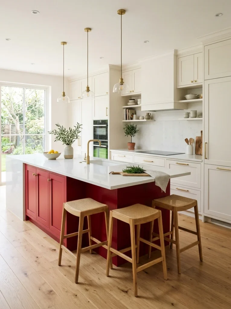
Rather than two fully committed colors throughout equal portions of the kitchen, using a predominantly neutral base color for the majority of your cabinetry with a single bold accent color reserved for a smaller feature, just the island, or even just a section of open shelving, lets you experiment with a genuinely daring color choice without the full commitment of covering your entire kitchen in it. A friend used this approach with white perimeter cabinets throughout and a single bold red island, and the smaller footprint of that bold color choice makes it feel like a confident design statement rather than an overwhelming, potentially regrettable decision if her taste changes down the road. This is generally a lower-risk way to incorporate a color you’re genuinely excited about but not entirely confident committing to at full scale, since repainting a single island down the road, if your taste eventually shifts, represents a considerably smaller project than repainting an entire kitchen’s worth of cabinetry. I’d recommend this specifically if you’ve been drawn to a bold color in inspiration photos but have hesitated due to the scale of committing to it throughout an entire kitchen.
9. Match Your Two Tones to Your Hardware Finish
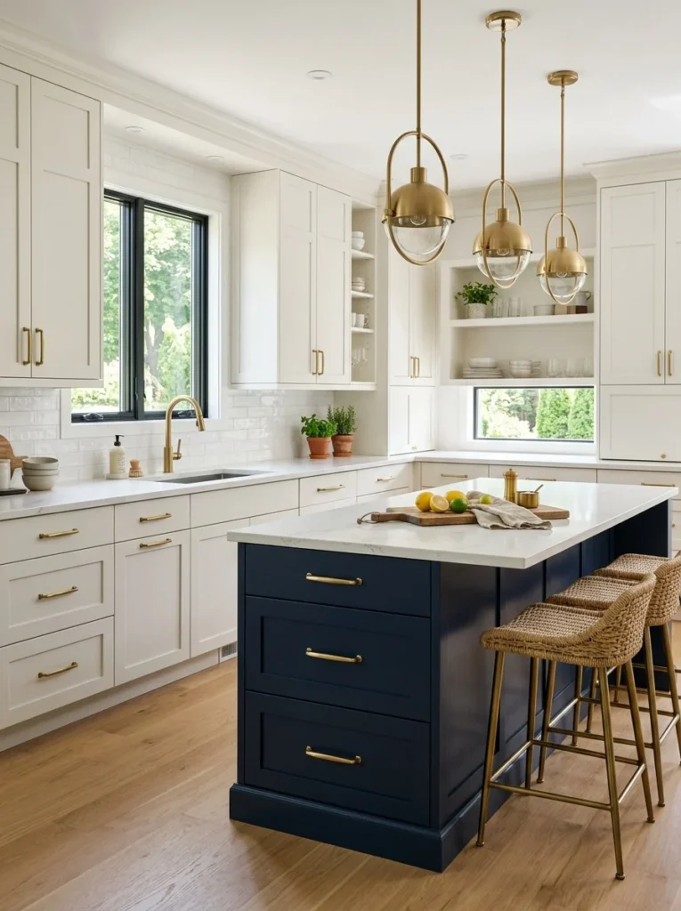
Once you’ve chosen your two cabinet colors, selecting hardware that complements both, rather than clashing with one or the other, ties the entire two-tone scheme together into a cohesive whole rather than two separate color zones that happen to share the same room. I chose brushed brass hardware throughout my kitchen specifically because it reads beautifully against both my white perimeter cabinets and my navy island, providing a consistent visual thread that connects the two otherwise distinct color zones. This is a detail worth testing with actual hardware samples held against both of your chosen paint colors before committing to a full hardware order, since some metal finishes genuinely read differently, sometimes surprisingly so, against different background colors, particularly darker versus lighter cabinet tones. I’d recommend prioritizing hardware that works well against your bolder or darker color choice specifically, since that’s typically where hardware finish differences become most visually apparent, then confirming the same hardware also looks appropriate against your lighter or more neutral color before finalizing the decision.
10. Extend the Contrast Color to Open Shelving
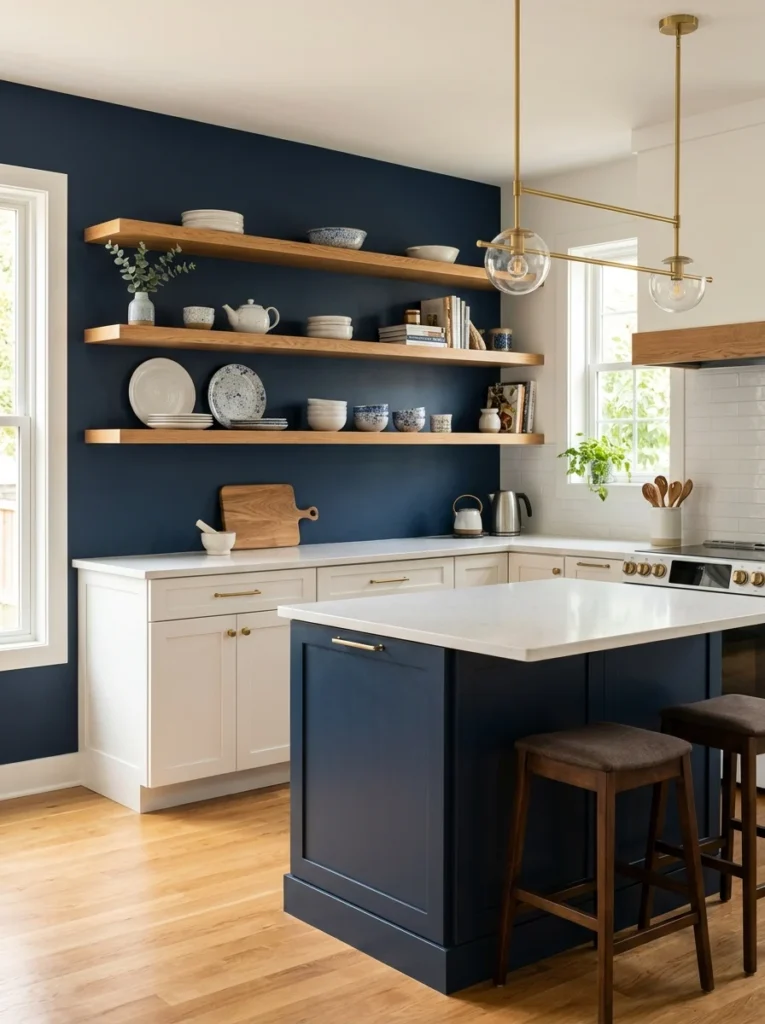
If part of your kitchen includes open shelving in addition to closed cabinetry, extending your accent or contrast color to the shelving’s backing or bracket hardware, rather than keeping shelving entirely within your primary neutral color scheme, reinforces the two-tone concept throughout the room rather than isolating it purely to the closed cabinet doors. I painted the back wall behind my open shelving section in the same navy as my island, and that repeated color creates a visual connection across the room, tying the shelving area into the same overall color story as the more dominant island feature. This is a relatively low-cost, low-commitment way to extend your two-tone scheme beyond just cabinet doors, since it typically only requires paint rather than any additional cabinetry or hardware investment. I’d recommend this specifically if your open shelving is positioned somewhere visually connected to your bolder color choice, since the repetition reads as more intentional when there’s a clear visual relationship between the two elements rather than scattered, disconnected instances of the same color throughout unrelated parts of the kitchen.
11. Consider a Painted Range Hood as the Contrast Element
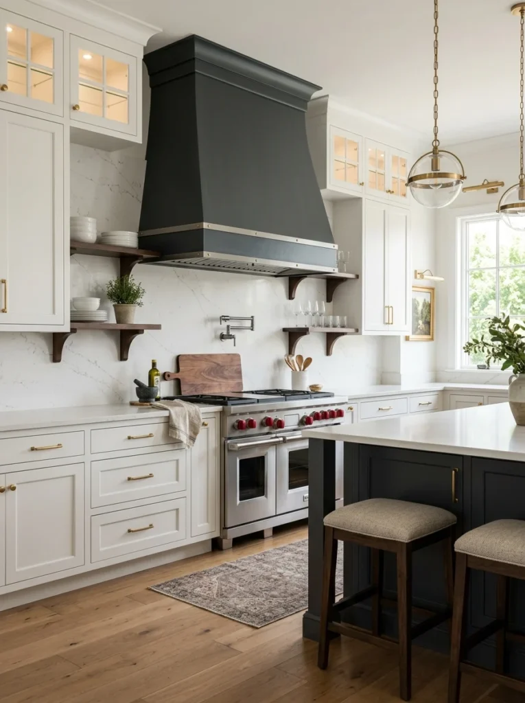
Rather than distinguishing an entire cabinet run or island, painting just your range hood, particularly if it’s a custom or semi-custom design built into your cabinetry, in a contrasting color creates a smaller, more contained two-tone moment that still adds genuine visual interest without the scale of a full second cabinet color throughout the room. A friend painted her custom plaster-finished range hood a deep charcoal against otherwise entirely white cabinetry, and that single contrasting element became the kitchen’s clear focal point without requiring a second color anywhere else in the space. This is a good option for anyone wanting to dip a toe into two-tone design without the larger commitment of an entire island or cabinet run in a different color, since a range hood typically represents a considerably smaller surface area to commit to a bolder choice. I’d recommend this specifically if your range hood is already a custom or semi-custom build rather than a simple stock stainless steel unit, since a painted finish works considerably better and looks more intentional on cabinetry-style range hoods than on a standard metal appliance hood.
12. Use Color to Highlight a Built-In Hutch or Buffet
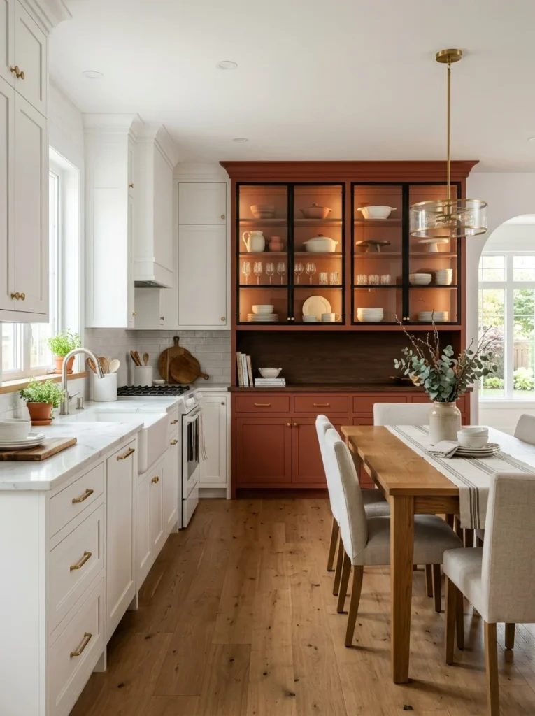
If your kitchen includes a built-in hutch, buffet, or china cabinet section distinct from your main working cabinetry, painting that specific feature in a contrasting color treats it almost like a genuine piece of furniture rather than simply another section of matching cabinets, giving it its own visual identity within the larger room. My own kitchen doesn’t include this feature, but I’ve seen it done beautifully in an open-concept kitchen and dining space, where a built-in hutch along the dining room side was painted a deep terracotta against the kitchen’s otherwise white cabinetry, creating a natural visual transition between the two connected spaces. This works particularly well in open-concept homes specifically, since the color distinction helps define where the kitchen functionally ends and the dining or living space begins, even without any actual wall separating the two areas. I’d recommend this specifically if your kitchen includes a genuinely distinct architectural feature like a built-in hutch, since applying this same principle to a standard cabinet run without that architectural distinction tends to look more like an arbitrary color change than an intentional design choice.
13. Balance Bold Choices With a Neutral Backsplash
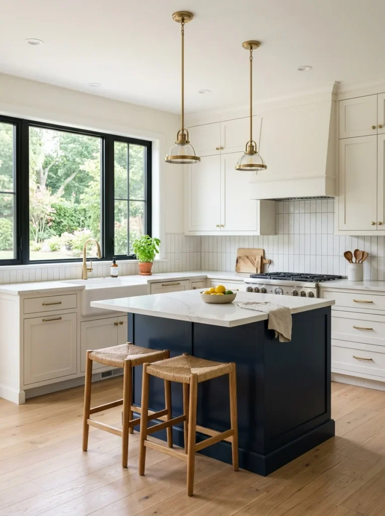
When committing to a genuinely bold two-tone cabinet combination, keeping your backsplash relatively simple and neutral, rather than adding a third competing pattern or color, prevents the overall kitchen from feeling visually overwhelming with too many competing design elements fighting for attention simultaneously. I chose a simple white subway tile backsplash specifically because my navy and white cabinets already provide plenty of visual interest on their own, and a busier, more patterned backsplash would have competed with rather than supported that existing color statement. This is a broader design principle that applies well beyond just two-tone cabinets, generally choosing one or two elements in a room to serve as the bold, statement-making features while keeping surrounding elements comparatively simple and supportive rather than trying to make every single surface and material in the room compete for attention. I’d recommend this specifically if you’re already committing to a genuinely dramatic two-tone cabinet contrast, treating your backsplash, countertop, and flooring as supporting neutral elements that let the cabinetry itself remain the room’s clear focal point.
14. Choose a Countertop That Bridges Both Colors
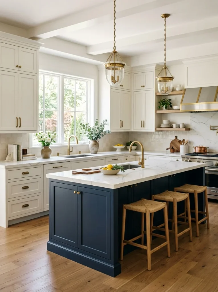
Selecting a single countertop material and color that reasonably complements both of your chosen cabinet tones, rather than one that clearly favors or matches only one of the two colors, helps the whole kitchen feel unified rather than visually split into two disconnected halves. My white quartz countertop with subtle grey veining works well against both my white perimeter cabinets and my navy island specifically because the grey veining picks up enough of the navy’s cool undertone to feel connected to both cabinet colors rather than exclusively matching just one. I’d recommend bringing physical samples of both your chosen cabinet colors directly to a stone or quartz showroom, holding them against various countertop options in person, since countertop veining and undertones can be difficult to accurately judge from small photos or digital renderings alone. This is one of the more important material decisions in a two-tone kitchen specifically because the countertop physically touches and visually bridges both cabinet colors throughout the room, making its role in unifying the overall look more significant than it might be in a single-color kitchen.
15. Add a Third Neutral Color Sparingly
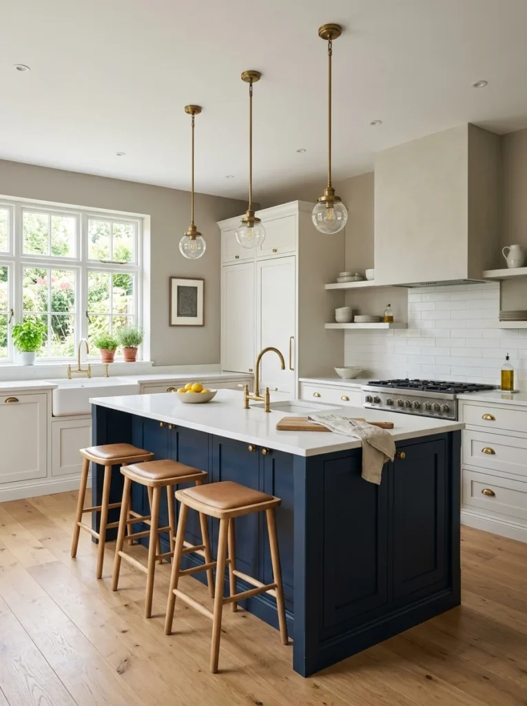
While the core concept is genuinely two-tone, most successful two-tone kitchens actually incorporate a third neutral color somewhere in the room, typically through wall paint, trim, or ceiling color, that supports without competing against the two primary cabinet colors. My kitchen walls are a soft warm white, distinct enough from both my navy island and my slightly different white cabinet tone to read as its own intentional choice, providing a neutral backdrop that lets the actual cabinetry remain the room’s focal point. I’d recommend choosing this supporting third color carefully in relation to your two cabinet colors, generally erring toward something considerably more muted and neutral than either primary cabinet tone, since this background color’s job is specifically to support rather than compete with your more deliberate two-tone cabinet statement. This is a detail that’s easy to overlook when planning a two-tone kitchen, since so much of the planning focus naturally goes toward the cabinet colors themselves, but the wall color surrounding those cabinets significantly affects how the whole combination ultimately reads once everything is actually installed and painted.
16. Use Two-Tone Cabinets to Correct Proportions
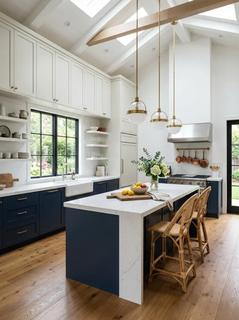
Beyond pure aesthetic preference, two-tone cabinetry can be used strategically to visually correct or improve a kitchen’s existing proportions, using darker tones to ground an overly tall space or lighter tones to open up a cramped one, similar to the upper-versus-lower approach mentioned earlier but applied more specifically to address a particular room’s proportional challenges. My own kitchen has unusually high ceilings for its relatively modest square footage, and my contractor specifically recommended keeping the upper cabinets in a lighter tone extending all the way to the ceiling, which helps that considerable height feel more intentional and less oddly disproportionate to the room’s actual floor space. I’d recommend consulting with a designer or experienced contractor specifically about your kitchen’s particular proportional quirks before finalizing which areas should be lighter versus darker, since this kind of strategic color placement genuinely benefits from professional experience with how color affects the perceived scale and proportion of a specific room’s unique dimensions.
17. Test Large Samples Before Committing’

Regardless of which specific two-tone combination you’re considering, painting large sample boards, at least two feet by two feet for each color, rather than relying on small paint chips, and observing them in your actual kitchen’s lighting throughout different times of day is essential before committing to a full cabinet repainting or ordering new custom cabinetry. I made this mistake initially, choosing my navy based on a small paint chip that looked noticeably different once painted at full scale on an actual sample board in my kitchen’s specific lighting conditions, requiring me to select a second, slightly different navy shade before finalizing my actual order. This step matters even more in a two-tone kitchen specifically because you’re evaluating not just how each individual color looks in isolation, but how the two colors actually interact and balance against each other once both are physically present in the same room together. I’d recommend propping both sample boards up simultaneously in the actual locations where each color will ultimately be used, evaluating the combination together rather than assessing each color separately and simply assuming they’ll work well together based on how they look independently.
18. Consider Resale Value and Longevity
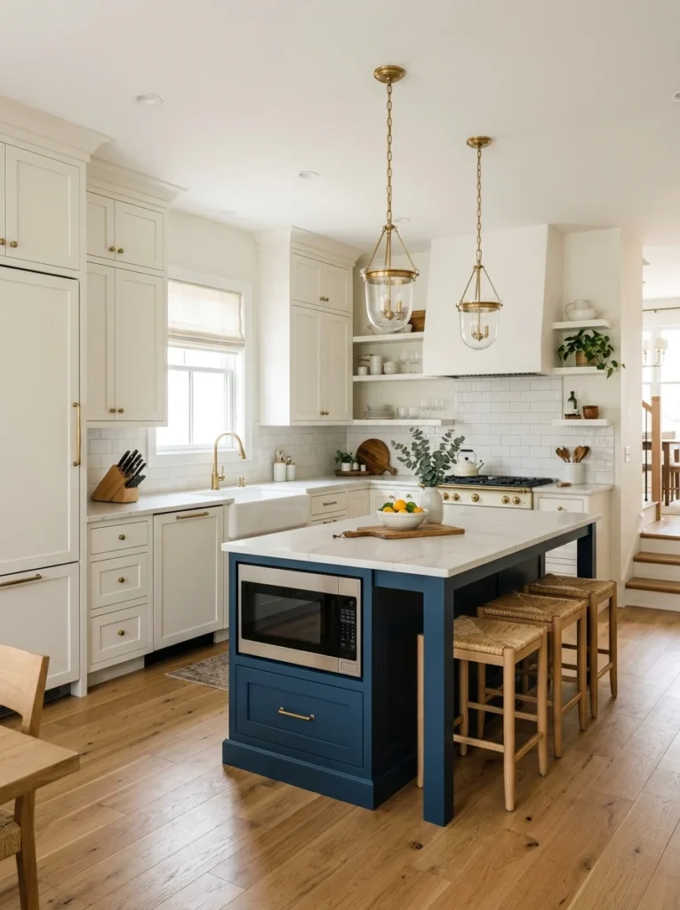
While personal style should genuinely drive most of your decisions, it’s worth honestly considering how a bolder two-tone combination might affect your home’s resale value or appeal to future buyers, particularly if you’re not planning to stay in the home for many years and want to avoid needing to repaint before selling. My contractor mentioned that a moderate two-tone approach, like my navy island against white perimeter cabinets, tends to appeal to a broader range of buyers than a more dramatic combination throughout the entire kitchen, since the white perimeter provides a neutral foundation that most buyers respond well to, while the single bolder island element adds character without fully committing the entire kitchen to a specific, potentially polarizing aesthetic. This doesn’t necessarily mean you should avoid a bolder combination entirely if that’s genuinely what you want in your own home, but it’s a reasonable factor to weigh alongside personal preference, particularly for a renovation representing a significant financial investment that ideally serves you well both during your time in the home and at eventual resale. I’d recommend discussing this specifically with a local real estate agent or your contractor if resale value is a genuine practical concern in your particular market and circumstances.
19. Commit Fully Once You’ve Decided
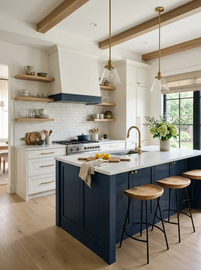
The final piece of advice, and one I genuinely had to remind myself of during my own renovation, is committing fully to your chosen two-tone combination once you’ve made the decision, rather than second-guessing or hedging with an overly cautious, watered-down version of the contrast you actually wanted. I nearly chose a much lighter, more muted navy specifically out of nervousness about committing to a bolder color, and it was actually my contractor who encouraged me to trust my original instinct toward the deeper, more saturated tone I’d initially been drawn to in inspiration photos. Two-tone kitchens genuinely work best when the contrast between the two colors is clear and intentional rather than so subtle it barely reads as a deliberate choice at all, which sometimes means pushing slightly further toward boldness than your initial instinct suggests, provided you’ve done the proper sample testing mentioned earlier to confirm the combination genuinely works well together. I’d recommend trusting the research and testing you’ve already done by the time you reach this final decision point, resisting the urge to water down your chosen combination out of last-minute nervousness, since a confidently executed, clearly intentional two-tone kitchen tends to look considerably more polished than a hesitant, overly subtle version of the same basic concept.
Final Thoughts
Looking back at how close I came to defaulting into an entirely white kitchen simply because it felt like the safe, expected choice, I’m genuinely grateful my contractor mentioned the two-tone approach when he did. Between all 19 of these ideas, the underlying theme is really about using color intentionally to create focal points, define zones, and correct proportions, rather than treating cabinet color as a single, uniform decision made without much additional strategic thought.
If you’re currently planning your own kitchen renovation and considering a two-tone approach, I’d suggest starting with the island-versus-perimeter combination covered in the first idea, since it’s genuinely the most approachable and forgiving starting point for anyone new to this concept. From there, layer in the supporting decisions, hardware, countertop, backsplash, that help tie the whole combination together, the same way I gradually worked through my own kitchen’s design, until the final result felt like a genuinely cohesive, intentional space rather than two separate colors that simply happened to end up in the same room.