
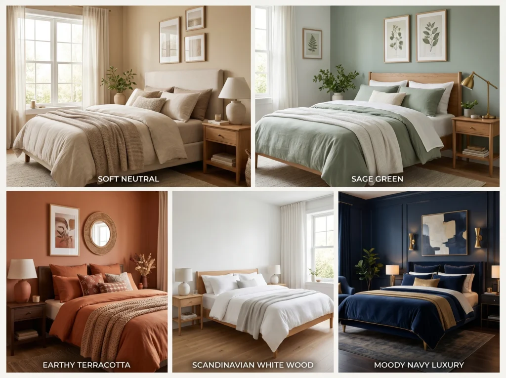
Choosing a bedroom color is one of the most important decorating decisions you will make, and it is also one of the easiest to get wrong. Most people pick a wall color they like in isolation — a paint chip that looks beautiful in the store — and then wonder why the finished room still feels off. The walls are the right color, the furniture is fine, the bedding is decent, but something does not come together the way they imagined.
The reason is almost always the same. A color scheme is not a wall color. It is the relationship between every color in the room — walls, ceiling, furniture, flooring, bedding, curtains, and accessories — working together as one cohesive system. Interior designers do not choose a paint color and then fill the room around it. They build a complete palette from the beginning, where every element supports every other element.
This guide breaks down seven bedroom color schemes that professional interior designers return to repeatedly because they work in real homes, for real budgets, across a wide range of styles. Each scheme includes the specific colors involved, the materials and textures that complement them, the mood they create, and the common mistakes to avoid when using them.
Understanding Color Schemes Before You Start
Before choosing a specific palette, it helps to understand the basic framework that designers use to build any color scheme. The most reliable system is the 60-30-10 rule.
Sixty percent of the room is the dominant color. This is typically the walls and the largest piece of furniture — usually the bed frame or upholstered headboard. Thirty percent is the secondary color. This appears in curtains, the rug, an accent chair, or a feature wall. Ten percent is the accent color. This lives in cushions, artwork, lamps, decorative objects, and small accessories.
This ratio keeps a room visually balanced. Too much of one color creates monotony. Too many competing colors create chaos. The 60-30-10 framework gives each color a clear role so the room reads as intentional and cohesive rather than random.
The second concept worth understanding is warm versus cool tones. Warm colors — creams, beiges, terracottas, warm whites, golden yellows — create a cozy, intimate, and grounded feeling. Cool colors — greys, blues, greens with grey undertones, crisp whites — create a calm, fresh, and airy feeling. Neither is better than the other, but knowing which mood you want in your bedroom helps you choose the right starting point.
Color Scheme 1: Soft Neutral — The Timeless Foundation
The Colors: Warm white or ivory walls, warm beige or greige secondary tones, natural wood accents, cream or oatmeal bedding.
The Mood: Calm, grounded, effortlessly elegant. This scheme never dates and works in virtually any bedroom regardless of size, style, or architecture.
Soft neutral schemes are the most widely used bedroom palette for a reason — they create a sense of warmth and rest without any visual stress. The room feels like a place where the mind slows down, which is exactly what a bedroom should feel like.
The key to making a neutral scheme feel rich rather than bland is layering texture. When all the colors are close in tone, texture becomes the primary source of visual interest. Linen bedding with a slight rumple, a woven wool rug, a chunky knit throw, a rattan bedside table, and a raw wood headboard all add depth and warmth to what could otherwise feel flat.
Best wall color examples: Benjamin Moore White Dove, Farrow and Ball Elephant’s Breath, Dulux Natural Calico.
Furniture recommendation: Natural oak or warm walnut wood tones. Avoid cold grey-toned wood, which conflicts with the warmth of the palette.
Common mistake: Using too many bright whites alongside warm neutrals. A cool bright white duvet with warm ivory walls creates an unwanted contrast. Keep all whites in the same temperature family — all warm or all cool, never mixed.
Best for: Any bedroom size. Particularly effective in smaller rooms where a busy color scheme would feel overwhelming.
Color Scheme 2: Cool Grey and Soft Blue — The Most Calming Combination
The Colors: Soft grey walls, dusty blue or slate blue accents, white bedding, warm wood or charcoal accessories.
The Mood: Serene, sophisticated, and deeply restful. This is the palette most closely associated with spa environments and premium hotel rooms.
Grey and blue work together in bedrooms because both colors have a naturally calming effect on the nervous system. Research in color psychology consistently finds that cool blues and soft greys reduce heart rate and create an environment conducive to rest. This is why the combination appears so frequently in professionally designed master bedrooms.
The challenge with cool grey and blue is preventing the room from feeling cold or clinical. The solution is warmth through material choices. Warm wood tones — walnut, oak, or teak — on the bed frame, bedside tables, or flooring counterbalance the coolness of the grey and blue. Textured bedding in white or cream adds softness. A rug in a warm grey or a muted caramel introduces ground-level warmth.
A specific example that works beautifully: Soft grey walls such as Farrow and Ball Mole’s Breath or Dulux Mineral Mist, paired with white linen bedding, walnut bedside tables, a dusty blue velvet cushion set, and warm-toned oak flooring. The result is a room that feels calm, complete, and genuinely luxurious without being cold.
Accent colors that work: Dusty blue, soft navy, warm charcoal, aged brass in hardware and light fixtures.
Common mistake: Using too many cool tones without any warm counterbalance. An all-grey room with grey walls, grey bedding, and grey accessories feels institutional rather than restful. Introduce at least one warm material — wood, warm-toned rug, brass hardware — to bring the scheme to life.
Best for: Master bedrooms, larger rooms with good natural light. Also works well in bedrooms that receive a lot of direct sunlight, where the cool tones prevent the room from feeling overheated visually.
Color Scheme 3: Earthy Warm Tones — The Most Popular Current Trend
The Colors: Terracotta, warm rust, olive green, warm brown, and cream as a base.
The Mood: Grounded, organic, deeply cozy. This is the palette that defines contemporary interior design right now and is appearing in high-end interiors and accessible homes equally.
Earthy palettes became dominant in interior design because they connect the indoor environment to the natural world. Terracotta echoes clay and earth. Olive green references foliage. Warm brown brings in the texture of bark and stone. Together they create a bedroom that feels both modern and timeless — rooted in something real rather than a passing trend.
The palette works particularly well in bedrooms because the warmth of the colors creates a sense of being embraced and sheltered. Unlike cool palettes that feel open and airy, earthy palettes feel enclosed in the best possible way — like a nest.
A specific example: Terracotta-toned walls such as Little Greene Tuscan Red diluted to 25 percent strength, paired with deep olive green linen bedding, a warm brown jute rug, cream cotton curtains, and natural wood furniture. A single large botanical artwork or a dried pampas grass arrangement in a simple vase completes the look with no additional color needed.
Accent colors that work: Burnt orange, deep rust, muted mustard, forest green.
Common mistake: Going too dark with the earthy tones in a small bedroom. Full-strength terracotta or deep rust on all four walls in a small room can feel oppressive. In smaller spaces, use earthy tones on a single feature wall behind the bed and keep the remaining walls in a lighter cream or warm white.
Best for: Medium to large bedrooms, rooms with warm natural light, people who want a bedroom that feels genuinely cozy rather than simply clean and minimal.
Color Scheme 4: Soft Sage Green — The Sleep-Friendly Palette
The Colors: Sage green walls, warm white bedding, natural wood furniture, cream or warm beige soft furnishings.
The Mood: Quietly restorative, natural, and fresh without being energizing. Sage green is the green that belongs in bedrooms — not the bright, stimulating greens that belong in kitchens and playrooms.
Green is the color the human eye requires the least effort to process, making it naturally restful. Sage green specifically carries the added quality of being muted and grey-toned enough that it does not read as energetic or stimulating — it reads as calm and organic. Interior designers increasingly recommend sage green for bedrooms precisely because it creates a restful environment while still bringing genuine color to the space.
The palette pairs most naturally with warm white bedding and natural wood furniture. The combination of sage, white, and wood recalls a forest clearing — light filtering through leaves, pale bark, and open sky — which is one of the most universally calming visual environments human beings respond to.
A specific example that works perfectly: Sage green walls in a tone such as Farrow and Ball Mizzle or Dulux Pistachio Cream, with a natural oak bed frame, white cotton bedding with a linen duvet cover, a cream wool rug, and wooden floating shelves styled with a few small plants and a simple lamp with a warm-toned shade.
Accent colors that work: Warm terracotta as a single accent cushion adds unexpected warmth. Dusty blush pink works for a softer, more romantic feel. Warm brass in hardware and light fittings is the metal choice that elevates this palette most effectively.
Common mistake: Using green with cool-toned whites or grey-toned furniture. Sage green has warm undertones and needs warm companions. A cool grey duvet or a white with blue undertones creates a clash that is subtle but noticeable. Keep everything warm-toned.
Best for: Any bedroom size. Particularly effective in rooms that feel slightly dark, as sage green reads lighter than it appears on a paint chip while still delivering real color.
Color Scheme 5: Warm White and Natural Wood — The Scandinavian Classic
The Colors: Warm white walls, natural light wood furniture, white or off-white bedding, soft texture through linen and wool.
The Mood: Clean, ordered, peaceful, and warm. This is the palette of Scandinavian design — stripped back to essentials but never cold or sterile because of the warmth that wood and texture provide.
This scheme works because of its commitment to simplicity. There are no competing colors, no pattern clashes, and no visual noise. The room communicates rest and order the moment you walk in. The warmth comes entirely from material quality — the honey tones of natural oak, the texture of linen bedding, the softness of a wool throw — rather than from any color on the walls.
What makes this palette challenging to execute well is that it requires genuine quality in the materials. When the palette is this simple, every piece is visible and every piece matters. A cheap plastic lamp base or synthetic bedding in a synthetic white disrupts the warmth that the scheme depends on. Natural materials — wood, linen, cotton, wool, ceramic — are essential.
A specific example: White walls with a warm undertone such as Dulux Timeless or Farrow and Ball All White, a light oak platform bed, white linen bedding with a textured woven throw in natural oat, a simple wool rug in warm off-white or light grey, and bedside tables in matching light oak. One large plant in a simple terracotta pot and a ceramic lamp with a linen shade complete the room.
Accent colors that work: Muted black as a graphic accent in artwork or a lamp base. Warm terracotta in a single ceramic object or cushion. Both should be used sparingly — this palette is most beautiful when it remains predominantly white and wood.
Common mistake: Using cool-toned or bright white paint. This is the most common error in Scandinavian-style bedrooms. Cool white walls combined with natural wood look stark rather than warm. Always choose whites with warm or neutral undertones — never cool.
Best for: Any bedroom. Particularly powerful in rooms with good natural light, where the warmth of the wood is amplified.
Color Scheme 6: Moody Deep Tones — For Those Who Want Drama
The Colors: Deep navy, forest green, charcoal grey, or rich burgundy as the dominant tone, paired with warm brass accents, rich textiles, and warm lighting.
The Mood: Dramatic, intimate, luxurious, and deeply enveloping. This is the bedroom palette that feels like a five-star hotel suite — dark, rich, and completely immersive.
The most common fear about dark bedroom colors is that they will make the room feel smaller and more oppressive. This fear is understandable but largely unfounded when the scheme is executed correctly. Dark colors in bedrooms work by creating a cocoon-like atmosphere that actually enhances the sense of shelter and rest. The room does not feel smaller — it feels more intentional, more private, and more luxurious.
The key to making a dark scheme work is light and material quality. Warm, layered lighting is essential — a room painted in deep navy with cold overhead lighting will feel unwelcoming. The same room with warm bedside lamps, a reading lamp, and perhaps a small pendant creates a completely different and deeply appealing atmosphere. Rich materials — velvet cushions, a heavy linen duvet, a thick wool rug — amplify the sense of luxury.
A specific example: Deep navy walls such as Farrow and Ball Hague Blue or Little Greene Dark Lead, paired with a warm brass pendant light above the bedside tables, white or cream bedding for contrast, a navy velvet cushion set, dark walnut furniture, and a thick wool rug in charcoal. Artwork in a warm gold frame and a mirror with a brass surround complete the look.
Accent colors that work: Warm brass is the perfect metal tone for dark bedroom schemes — it adds warmth and richness that chrome or brushed nickel cannot. Burnt orange, deep terracotta, or dusty rose as cushion accents add unexpected warmth without disrupting the dramatic quality of the palette.
Common mistake: Painting only one wall in the dark color and keeping the rest white. This approach — the “feature wall” solution — rarely works well with deep tones. It tends to look unresolved, as though the painting was not finished. Dark schemes work best when the dominant color wraps the room. If all four walls feel too much, paint three walls and use a lighter shade or a complementary texture on the fourth.
Best for: Master bedrooms, rooms with limited natural light where the darkness becomes an asset rather than a drawback, and people who genuinely love spending time in their bedroom and want it to feel like a real sanctuary.
Color Scheme 7: Blush Pink and Warm Neutrals — Soft, Romantic, and Timeless
The Colors: Dusty blush pink as accent or secondary tone, warm ivory or cream walls, natural wood, soft white bedding.
The Mood: Soft, romantic, and quietly feminine without being overly sweet or childish. Dusty blush — as opposed to bright or candy pink — is a grown-up, sophisticated color that works across a wide range of ages and styles.
The reason dusty blush works so well in bedrooms is that it carries genuine warmth — it is essentially a very diluted terracotta with a rosy quality — and pairs naturally with the neutral and earthy tones that dominate current interior design. Used as an accent or secondary color rather than a dominant wall color, blush adds femininity and softness without taking over the space.
This scheme works particularly well in bedrooms that want warmth and softness but feel nervous about committing to the full earthy palette. Blush sits between the neutral and the earthy world, offering warmth and color while remaining gentle and approachable.
A specific example: Warm ivory walls such as Dulux Natural Calico or Benjamin Moore Linen White, a natural oak or rattan bed frame, white cotton bedding with a dusty blush linen cushion set and a matching blush throw, a warm jute rug, and bedside tables in light wood with warm brass hardware. A single piece of artwork in warm tones — a botanical print or an abstract with terracotta and blush — ties the room together.
Accent colors that work: Warm terracotta deepens the warmth of the blush without clashing. Sage green creates a beautiful nature-inspired combination. Warm brass is the ideal metal tone throughout.
Common mistake: Using bright or cool-toned pink instead of dusty blush. Bright pink or baby pink shifts the scheme from sophisticated to overtly sweet. Always choose a blush with brown, grey, or terracotta undertones rather than a pure or bright pink.
Best for: Any bedroom. Works particularly well in bedrooms where the occupant wants genuine color and warmth without the commitment of a bolder palette.
How to Test a Color Scheme Before You Commit
Choosing a color scheme is one thing. Committing to it before you have seen it in your actual room is a different matter entirely. Paint colors look completely different in different rooms — different natural light conditions, different artificial lighting, different flooring and furniture — and the only reliable way to know how a color will look is to test it in your specific space.
The best method is to paint two or three large swatches — at least twelve by twelve inches — of each wall color you are considering directly on the wall. Leave them for at least 48 hours and observe them at different times of day: in the morning with natural light, in the afternoon with full sun if your room gets it, in the evening under artificial light, and at night with lamps only. The same color can look dramatically different across these conditions.
For the full palette, create a simple mood board by gathering physical samples — a paint swatch, a scrap of the bedding fabric, a piece of the rug material, a wood sample if possible — and laying them together on a flat surface. This physical assembly of materials gives you a far more accurate sense of how the scheme will look than any digital tool or color wheel can provide.
Several digital tools also allow you to visualize paint colors in a room using photos. Farrow and Ball, Dulux, and Benjamin Moore all offer color visualization tools on their websites. While these tools are not perfectly accurate, they can help narrow down choices before committing to physical samples.
Conclusion
The right bedroom color scheme is not the one that looks best on a paint chip or in a design magazine — it is the one that creates the mood you want to feel every morning when you wake up and every evening when you go to sleep. Rest, calm, warmth, and a sense of personal shelter are what a bedroom is for, and color is the most powerful tool you have to create those qualities.
Start by deciding on a mood — do you want your bedroom to feel light and airy, warm and cozy, calm and serene, or dramatically intimate? Once the mood is clear, the palette follows naturally. Use the 60-30-10 framework to build every color in the room around the dominant wall color, test your choices with large physical samples before committing, and layer texture throughout to add depth and richness.
A bedroom with a well-chosen, cohesive color scheme feels like a place that was designed with intention — not just decorated with whatever was available. That sense of intention, more than any individual color choice, is what makes a bedroom feel genuinely beautiful.