
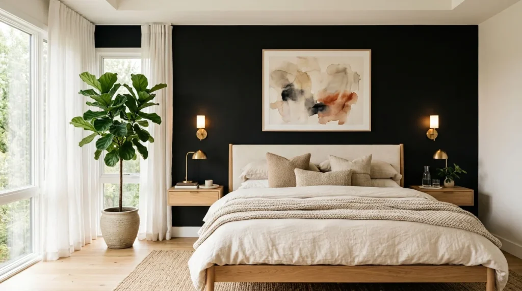
My mother stood in my bedroom doorway, looked at the freshly painted black wall behind my bed, and said, “Well, I hope you’re not planning on selling this house anytime soon.” That was almost three years ago, and I still think about that comment every time someone new sees the room and reacts with genuine surprise that it feels calm and cozy rather than the moody, cave-like space they’d apparently expected from the words “black accent wall” alone, usually followed by some version of the same question: how did you know this would actually work rather than just look like a dark, oppressive mistake once it was finished. Getting there wasn’t as simple as picking a can of black paint. There’s a real gap between a black wall that feels intentional and elegant and one that just feels like a dark mistake, and the specific choices that separate those two outcomes are what I want to walk through here.
Start With True Black, Not a Near-Black Substitute
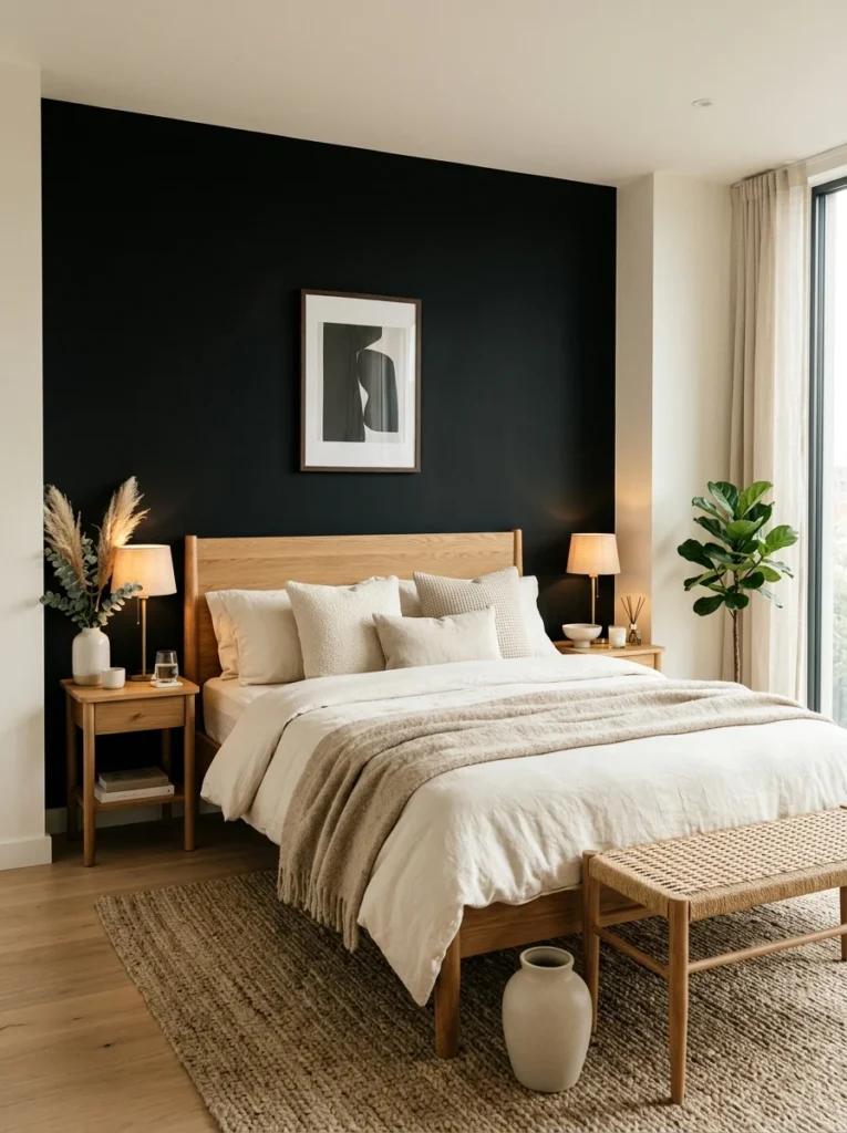
My first instinct, driven by a bit of nervousness, was to choose a very dark charcoal instead of true black, thinking it would be a safer, easier-to-live-with compromise. In practice, the charcoal read as an oddly murky, slightly indecisive color once it was on the wall, neither confidently dark nor genuinely neutral. When I eventually committed to an actual true black, the wall read as intentional and dramatic in a way the charcoal never quite managed, which taught me that the “safer” in-between choice isn’t always actually the safer choice in terms of how a room reads once finished.
Choose the Right Wall, Not Just Any Wall
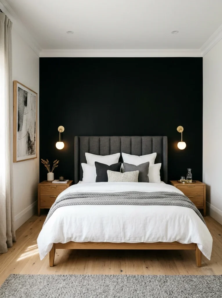
The wall behind my headboard was the obvious choice, and I think that’s true in most bedrooms for a specific reason: it’s the wall you see least often while actually in the room, since you’re typically facing away from it while lying in bed, but it’s the first thing you see walking in. That combination, high visual impact from the doorway, low direct exposure during actual use, is part of why this particular wall tends to handle a bold, dark color better than a wall you’d be facing constantly.
Balance It With Genuinely Light Surrounding Walls
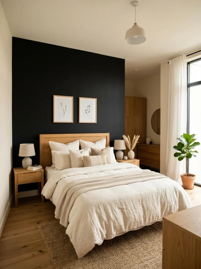
The three other walls in my bedroom stayed a warm off-white, and that contrast is doing more work than the black wall itself in keeping the room from feeling oppressive. A black accent wall surrounded by other mid-toned or dark walls loses the dramatic contrast that makes this look actually work, and the room risks feeling uniformly heavy instead of intentionally accented.
Keep the Ceiling Light to Prevent the Room From Closing In
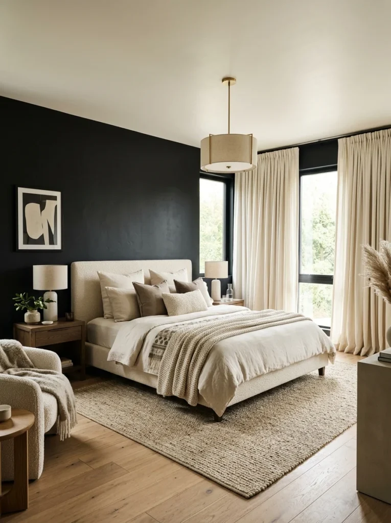
I painted the ceiling the same warm off-white as the three lighter walls rather than extending the black upward at all. This kept the room feeling appropriately tall and open despite the boldness of the accent wall, since a dark ceiling combined with a dark wall would have started pulling the whole room toward that cave-like feeling I’d been specifically trying to avoid.
Add Warm Wood Tones to Soften the Starkness
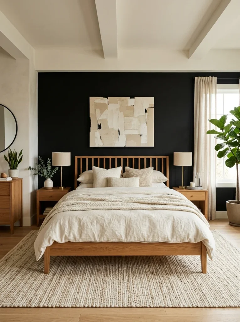
My bed frame and nightstands are both a warm, medium-toned wood, which sits against the black wall with enough contrast to avoid disappearing into it while still feeling connected rather than jarring. A colder, grayer wood tone against the same black wall read noticeably harsher when I tested it briefly with a borrowed piece of furniture before committing to my current pieces.
Use Brass or Gold Metals Rather Than Chrome or Silver
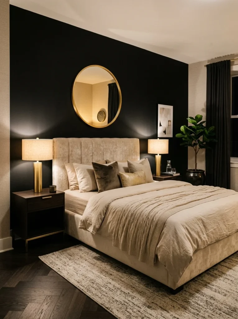
Warm metal accents, in my case brass lamp bases and a gold-framed mirror, catch and reflect light against the black wall in a way that adds warmth and visual movement. Cooler-toned metals like chrome or silver, by comparison, tend to emphasize the coldness some people worry about with black walls rather than counteracting it.
Layer in Warm, Textured Fabrics
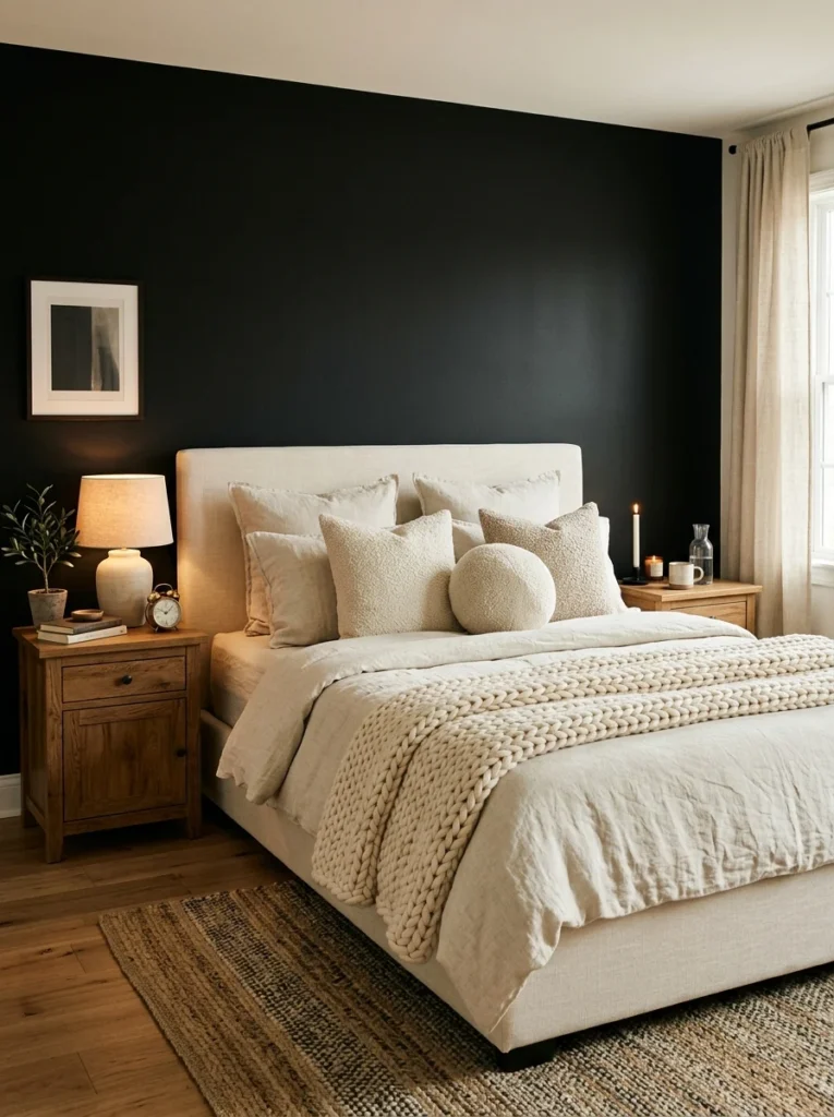
Linen bedding in a warm cream tone, along with a chunky knit throw and a couple of textured pillows, added tactile softness against the flat, matte black behind them. This textile layer does a lot of the work in keeping the room feeling like a bedroom rather than a gallery space or a statement piece with a bed in front of it.
Prioritize Strong, Layered Lighting More Than You Would in a Lighter Room
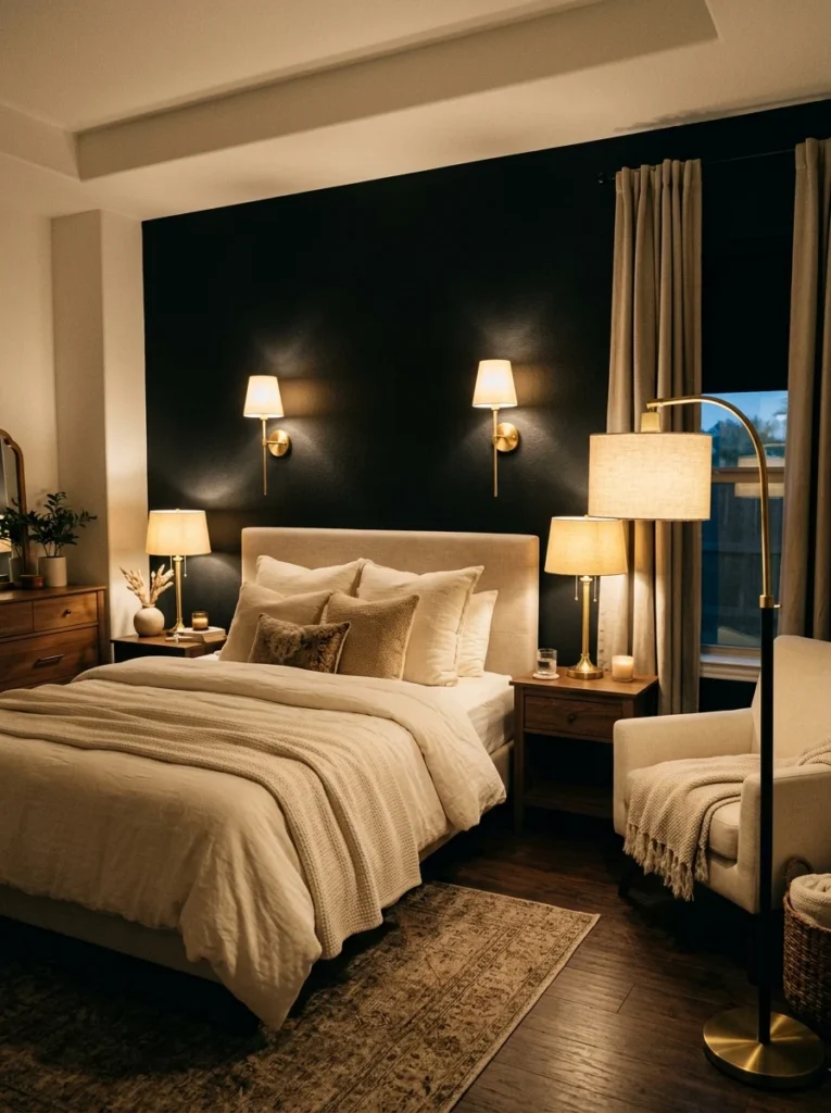
Black walls absorb more light than lighter colors do, which means lighting decisions matter more here than in a typical bedroom. I use a combination of two nightstand lamps and a floor lamp in the corner, all with warm-toned bulbs, rather than relying on a single overhead fixture that would leave the black wall looking flat and the room generally underlit.
Choose a Matte Finish Over Anything Glossy
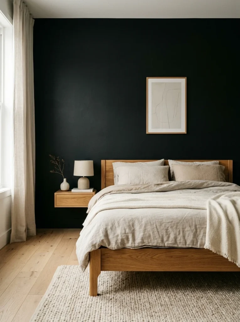
A glossy black finish reflects light unpredictably and tends to show every imperfection in the wall’s surface, from small dents to uneven drywall texture. A flat or matte black finish absorbs light more evenly and reads as more sophisticated and intentional, without drawing attention to any surface flaws underneath.
Test the Color at Different Times of Day Before Committing
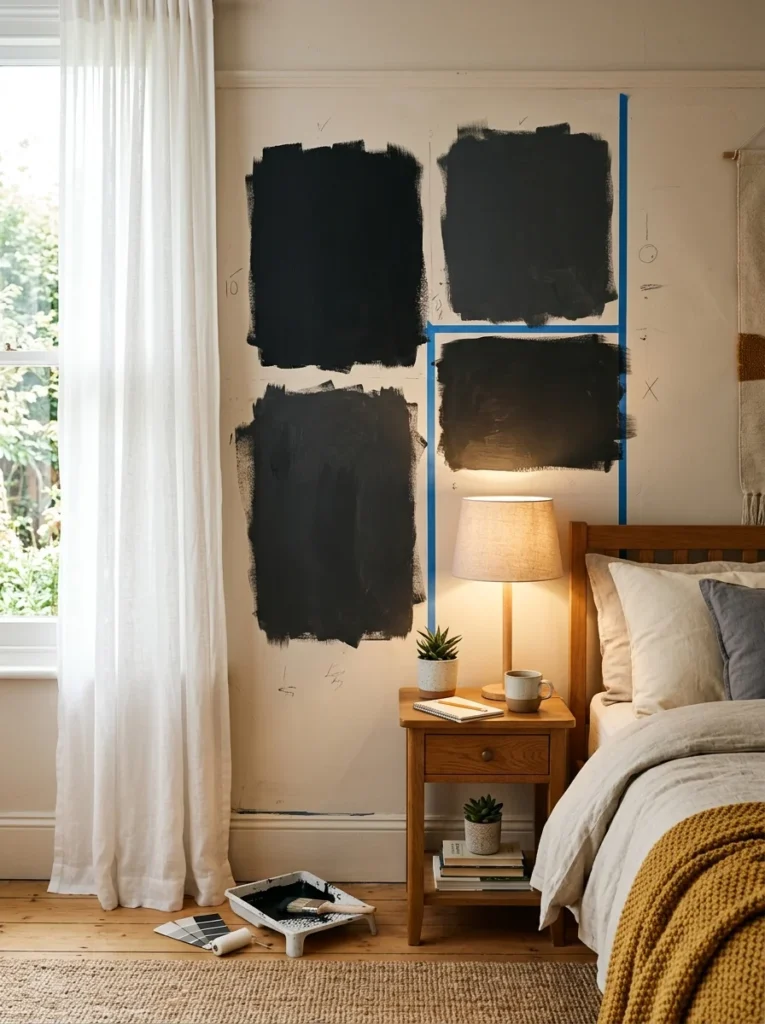
I painted a large sample directly on the wall and specifically checked how it looked during the day with natural light, in the early evening with just lamps on, and late at night with only a single bedside lamp lit. The color read noticeably differently across those three conditions, and confirming I liked all three before committing to the full wall saved me from a potential regret months into living with a fully painted room.
Add Greenery for a Living Contrast Against the Dark Backdrop
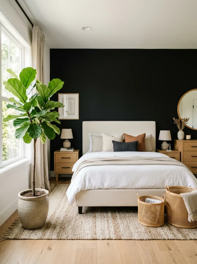
A single larger plant in the corner near the window adds a living, organic element against the black wall that no static decor piece quite replicates. It’s become one of the details people notice without necessarily being able to articulate why it makes the room feel more alive rather than static.
Keep Window Treatments Light to Maximize Natural Light
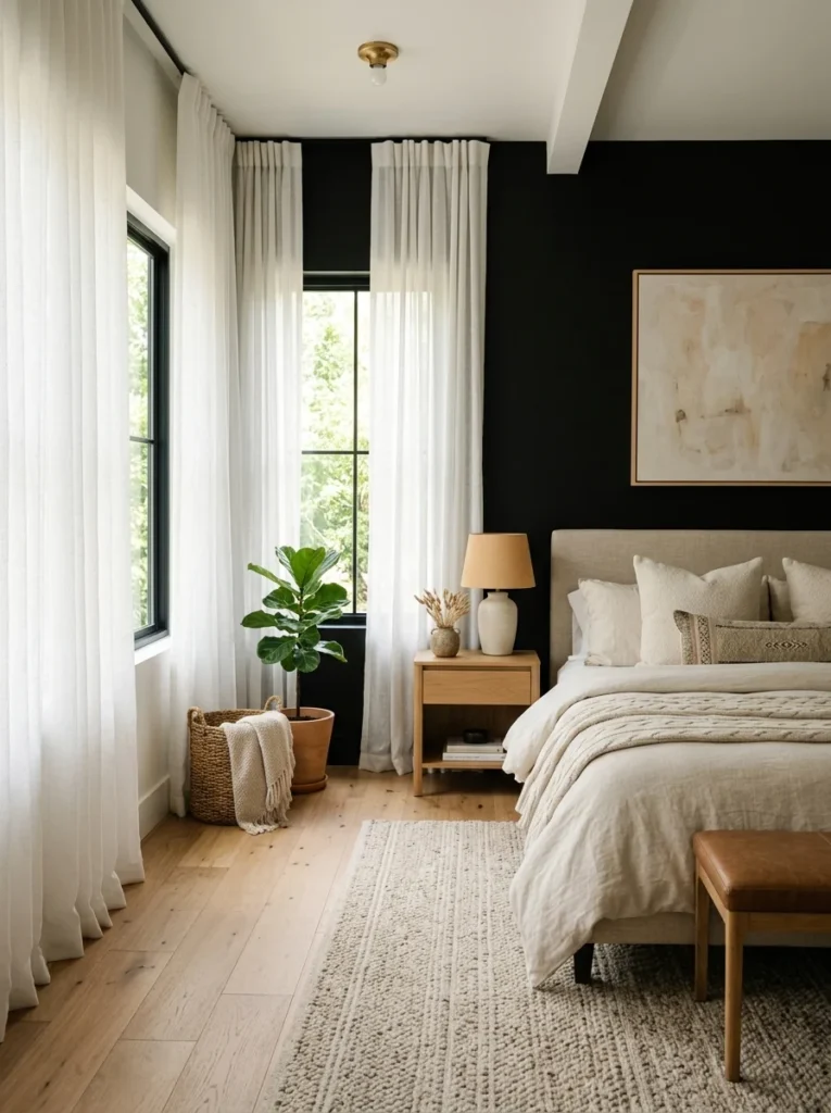
Heavy, dark curtains would have compounded the room’s overall darkness in a way that worked against the balance I was trying to strike. A soft, sheer white curtain lets in significantly more natural light during the day, which helps offset how much the black wall itself absorbs.
Consider Where the Wall Falls Relative to Your Windows
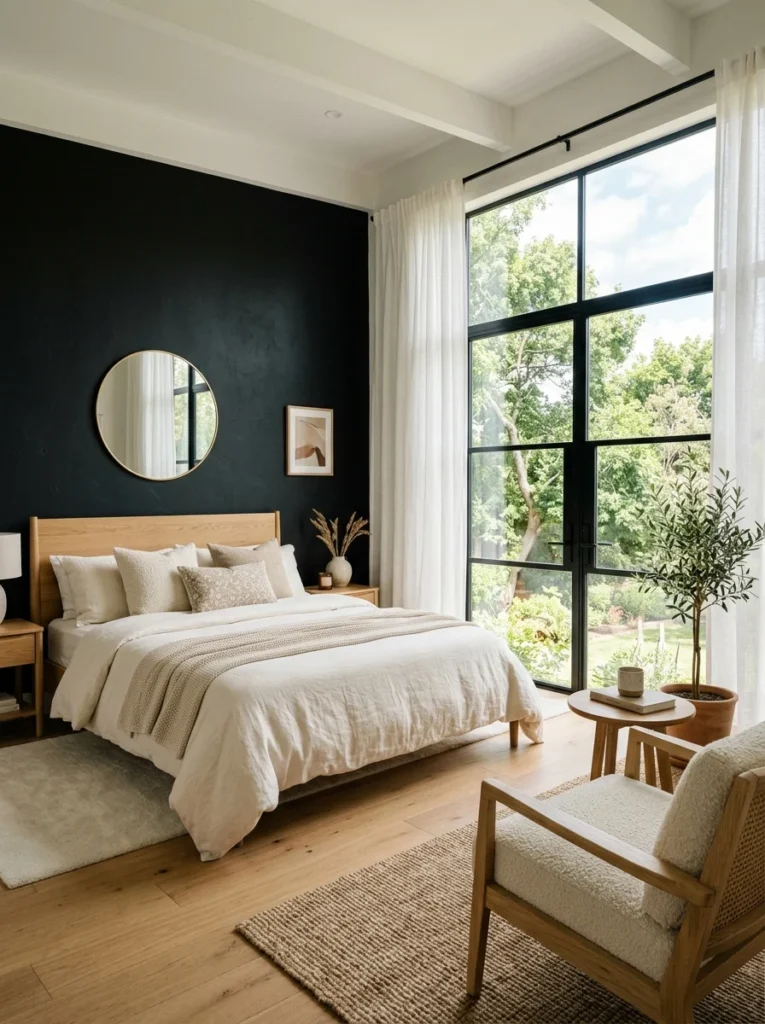
My accent wall doesn’t include or border either of my bedroom’s windows, which meant the wall’s darkness never directly competes with or blocks incoming natural light. If your intended accent wall does include a window, it’s worth thinking through how that affects the room’s overall light levels before committing to the full paint job.
Don’t Skip Art or Decor Just Because the Wall Is Already Bold
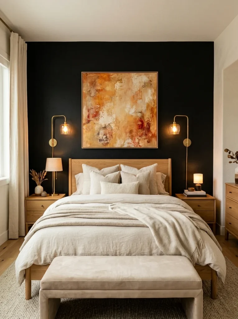
I was initially tempted to leave the black wall entirely bare, assuming any additional decor would clutter what should be a clean, dramatic statement. In practice, one large piece of warm-toned abstract art above the headboard gave the wall a focal point and kept it from feeling like an unfinished, empty expanse of dark paint.
A Few Things I Got Wrong Before Getting It Right
Beyond the charcoal-versus-true-black mistake I mentioned earlier, I made a couple of other missteps worth sharing. I initially hung a large mirror on the black wall itself, assuming it would help bounce light back into the room the way mirrors typically do. Instead, it mostly reflected the dark wall behind it back into the room, which added very little brightness and looked oddly recursive rather than helpful. Moving that same mirror to one of the lighter walls, positioned to reflect a window instead, solved the actual lighting goal I’d been going for in the first place. I also underestimated how much furniture placement would matter, initially pushing my nightstands flush against the black wall in a way that made them nearly disappear into it in dim evening light. Pulling them out just slightly and adding the brass lamps gave them enough presence to stay visually distinct from the wall behind them.
What It Actually Cost to Get This Right
The paint itself was inexpensive, under a hundred dollars for enough true black paint and primer to properly cover one accent wall. The bulk of the actual project cost went toward the supporting elements rather than the wall itself, the warm wood furniture, the brass lighting fixtures, and the abstract art piece above the headboard, which together came to just under nine hundred dollars. Looking back, that ratio feels about right for anyone considering this kind of project. The wall color is genuinely the cheapest part of the whole equation, while the furniture, lighting, and decor decisions surrounding it are what actually determine whether the final result reads as intentional or like an unfinished, overly dark room.
What My Mother’s Comment Actually Got at, Underneath the Joke
I’ve thought about that doorway comment more than I probably should have over the past three years, and I don’t think it was really about resale value specifically, even though that’s how she framed it. I think it was about genuine uncertainty, the same uncertainty I felt myself before committing to this project, about whether a bold, dark choice in a bedroom specifically, the room where you’re supposed to relax and unwind, could actually work rather than just feel like an aesthetic risk taken too far. It’s a fair question to ask before painting an entire wall black, and I don’t think the answer is obvious until you’ve actually seen it done well versus done poorly, which is exactly the gap this list is trying to close for anyone standing where I was three years ago.
The One Test That Would Have Saved Me the Most Uncertainty
If I could go back and give myself one piece of advice before starting this project, it would be to visit a paint store or design showroom that had a true black wall already painted somewhere, rather than trying to imagine the effect purely from a small chip or a photo online. Seeing the color at full scale, in a real room with real lighting, before committing to my own wall would have resolved most of the anxiety I felt during the planning phase far faster than any amount of research or sample testing at home managed to on its own, and it likely would have shortened the several weeks I spent second-guessing the decision before finally picking up a paintbrush.
Where the Room Stands Three Years Later
The wall still looks exactly as intentional and calm as it did the week we finished it, which I think is the clearest evidence that the specific balance of contrast, warmth, and lighting actually worked rather than just looking good in the excitement of a freshly finished project. My mother, for what it’s worth, has since admitted the room feels much cozier in person than she expected from that first doorway glance, though she still brings up resale value every time she visits, mostly, I suspect, because she enjoys reminding me she said it first.
If you’re standing at the edge of a similar decision right now, staring at a black paint sample and wondering if it’s a genuinely good idea or just a phase you’ll regret, I’d say the answer really does come down to the supporting details rather than the wall color itself. A black wall surrounded by cold light, mismatched metals, and heavy dark curtains will absolutely feel like the cave everyone worries about. The same black wall, balanced with warmth, texture, and enough contrast from the rest of the room, tends to surprise people the same way it surprised my mother that first day, and has continued to surprise nearly everyone who’s walked through that doorway since.