
Color is the element that determines how a living room feels before anything else registers. Before the furniture quality is noticed, before the artwork is appreciated, before the lighting is evaluated, color sets the emotional tone of the room. Walk into a living room painted in a warm, well-chosen palette and the room feels welcoming before you have consciously processed a single detail. Walk into one where the colors are fighting each other and the room feels unsettled regardless of how much was spent furnishing it.
Most people approach living room color the way they approach bedroom color — they choose a wall paint they like and then try to make everything else work around it. This approach creates more problems than it solves. A wall color chosen in isolation, without reference to the sofa, the rug, the curtains, and the flooring, is a guess rather than a decision. Sometimes the guess works. More often it produces a room that looks reasonable in photographs but feels slightly off in person — the colors are all individually acceptable but they do not work together as a cohesive whole.
The approach that consistently produces living rooms that feel complete — rooms where everything seems to belong together effortlessly — is building a palette rather than choosing individual colors. A palette is a system of colors that have been selected for how they work in relationship with each other, not for how any single one looks in isolation. Every element in the room — walls, sofa, rug, curtains, cushions, and accessories — belongs to the palette, and the palette determines how all of them look together.
This guide covers the complete process of building a living room color palette, from the foundational framework that professional designers use to the specific palette families that work most reliably across a range of living room styles and sizes. Seven distinct palette families are covered in full, each with specific color recommendations, material guidance, and the common mistakes to avoid.
The Framework: How to Build a Living Room Color Palette
The 60-30-10 Rule Applied to Living Rooms
The 60-30-10 rule is the most reliable framework for building a balanced color palette in any room, and it is particularly useful in living rooms where the number of elements — walls, large upholstered furniture, flooring, window treatments, cushions, and accessories — can feel overwhelming to coordinate.
The rule divides the room’s color content into three tiers. Sixty percent of the room is the dominant color. In a living room, this is typically the wall color and the color of the largest piece of upholstered furniture — usually the sofa. These two elements together cover the most visual surface area in the room and establish the overall character of the palette.
Thirty percent is the secondary color. In a living room, the secondary color appears in the rug, the curtains, and any accent chairs or loveseats. These elements occupy less visual space than the walls and the sofa but are substantial enough to influence the overall feeling of the room significantly.
Ten percent is the accent color. The accent color appears in cushions, throws, artwork, lamps, decorative objects, and small accessories. These elements occupy the smallest visual space in the room but they provide the color moments that make a palette feel finished and intentional rather than safe and flat.
The value of this framework is that it prevents the most common color mistakes. A room where three or four colors are used in roughly equal proportions looks busy and unresolved. A room where one color dominates absolutely — walls, sofa, rug, and curtains all in the same color — looks flat and unfinished. The 60-30-10 ratio creates the balance between dominance and variety that makes a palette feel both cohesive and interesting.
Warm Versus Cool: Choose Your Direction First
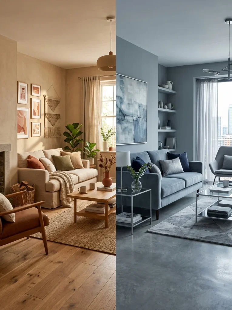
Before selecting any specific colors, decide whether your living room palette will be primarily warm or primarily cool. This single decision simplifies every subsequent color choice because it establishes a clear direction that all elements can be evaluated against.
Warm palettes — built around creams, beiges, terracottas, warm whites, golden yellows, and warm browns — create living rooms that feel cozy, intimate, and inviting. They are well suited to rooms with limited natural light because the warmth of the colors compensates for the lack of sunlight, and they suit households that use the living room primarily as a relaxed, social space.
Cool palettes — built around greys, blues, greens with grey undertones, and crisp whites — create living rooms that feel calm, spacious, and refined. They are well suited to rooms with generous natural light where the cool colors prevent the room from feeling overheated visually, and they suit households that prefer a more ordered and serene living environment.
The mistake to avoid is mixing warm and cool colors without a clear dominant direction. A warm cream sofa, cool grey walls, warm terracotta cushions, and cool blue curtains creates a palette that pulls in multiple directions simultaneously. Choosing a direction — predominantly warm or predominantly cool — and then selecting every element from within that direction produces a cohesive result that the mixed approach cannot achieve.
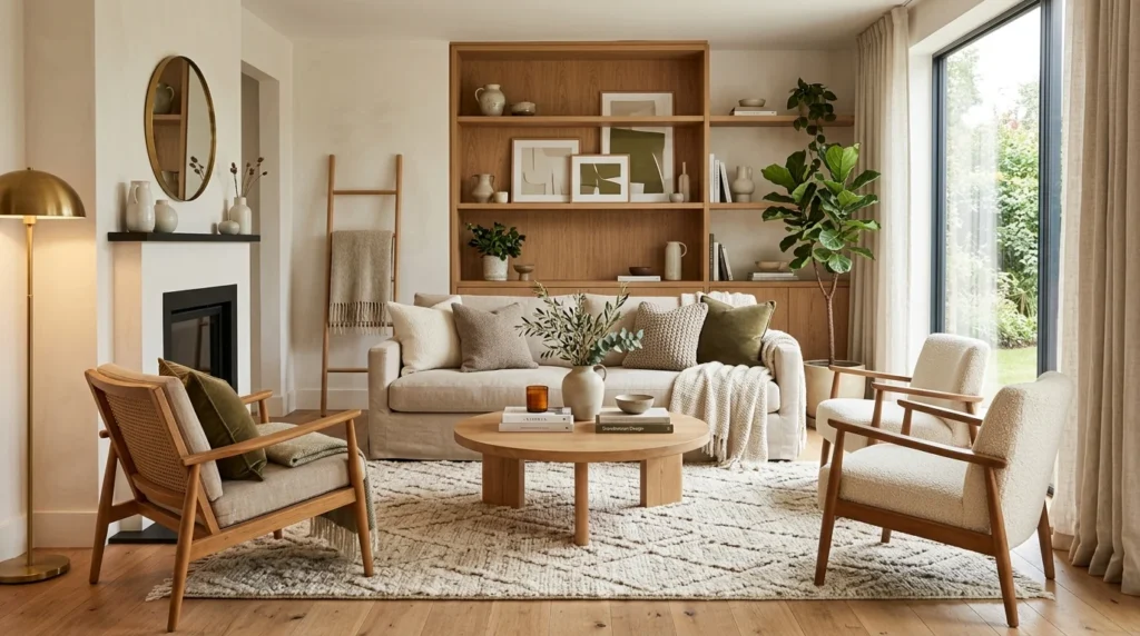
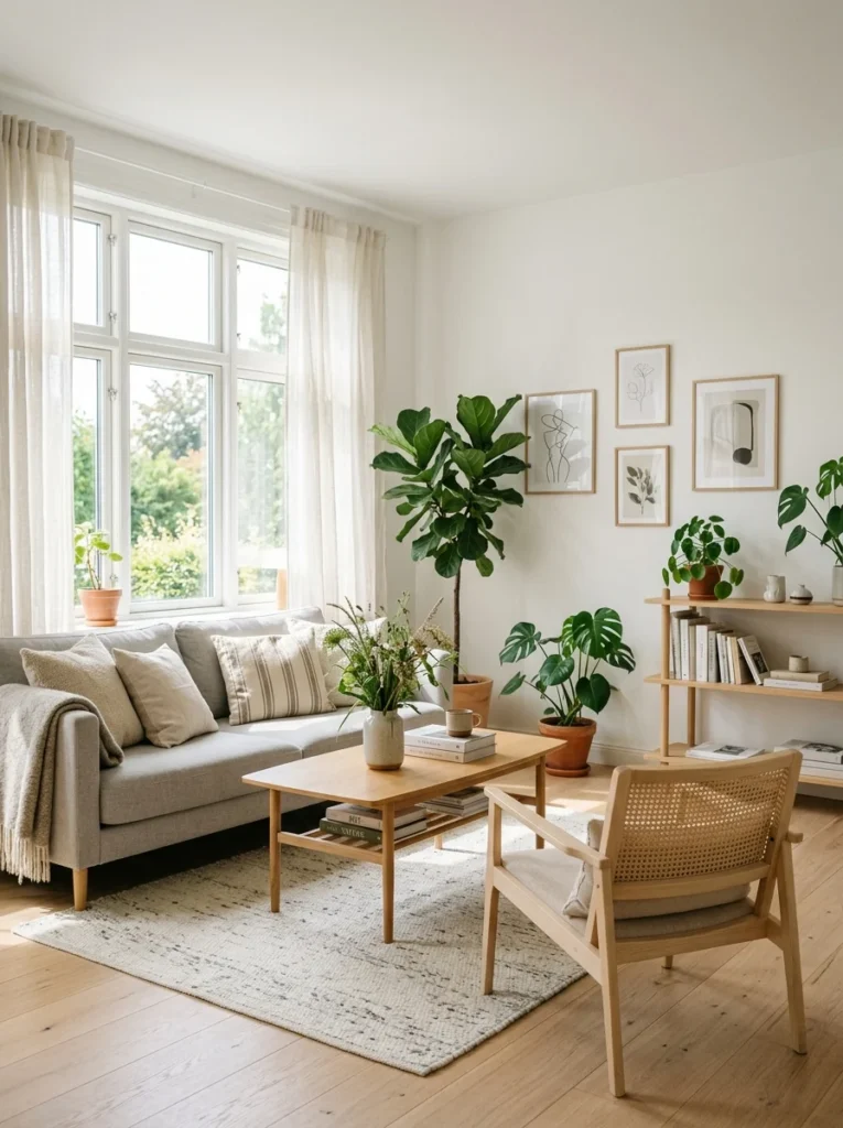
Living Room Color Palette 1: Warm Neutral — Timeless, Versatile, and Always Welcoming
The Colors: Warm white or soft ivory walls, warm beige or greige sofa, natural wood tones throughout, cream or oatmeal textiles.
The Mood: Effortlessly welcoming, calm, and timeless. The warm neutral palette is the most universally appealing living room palette because it creates a space that feels immediately comfortable without any specific style allegiance — it suits traditional, contemporary, and transitional living rooms equally well.
The warm neutral palette works by building depth and visual interest through texture and material variation rather than color contrast. When all the colors are close in tone — warm white walls, a beige sofa, a cream rug, oatmeal curtains — the eye reads the room as unified and calm. The interest comes from the difference in surface quality between a linen sofa, a wool rug, a woven cushion, a smooth plaster wall, and a raw wood coffee table. All of these surfaces exist in the same color family but each one reads completely differently because of its texture.
Wall color recommendations: Benjamin Moore White Dove, Farrow and Ball Pointing, Dulux Natural Calico. All three are warm whites with enough depth to read as a color rather than a blank white while remaining light enough to keep the room open and airy.
Sofa color: A sofa in warm beige, light camel, soft greige, or warm oatmeal anchors the palette at the sixty percent level. Avoid sofas in cool grey or pure white within a warm neutral palette — both create a temperature conflict with the warm wall color that is subtle but persistent.
Rug: A natural fiber rug — jute, sisal, or a wool blend in a warm neutral — grounds the seating area and adds the most important textural element in the room. A patterned rug in warm tones — a soft geometric or a traditional pattern in cream, camel, and warm brown — introduces visual interest within the palette without introducing a competing color direction.
Curtains: Linen or linen-weave curtains in a warm off-white or soft cream hang from ceiling to floor to add height and softness. The weight and texture of linen contributes significantly to the layered, settled quality that makes warm neutral living rooms feel so comfortable.
Accent color at ten percent: Warm terracotta in a cushion or a ceramic vase adds a touch of earthiness that prevents the palette from feeling too safe. Warm brass in light fixtures, picture frames, and small accessories adds a metallic warmth that elevates the palette toward something more considered and elegant.
Common mistake: Using too many bright whites alongside warm neutrals. A cool bright white cushion on a warm beige sofa, or a cool white painted trim alongside warm ivory walls, creates a color temperature conflict that disrupts the cohesion of the palette. Keep all whites in the warm family throughout.
Living Room Color Palette 2: Cool Grey and Blue — Calm, Sophisticated, and Deeply Restful
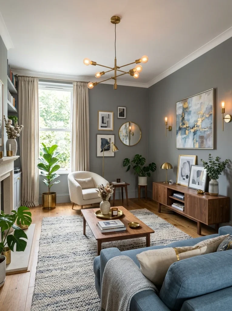
The Colors: Soft grey walls, dusty blue or slate blue secondary elements, white or pale grey large upholstery, warm wood accents to prevent coldness.
The Mood: Serene, polished, and genuinely calming. The grey and blue palette is the choice most associated with high-end, professionally designed living rooms because it communicates sophistication without effort and creates an environment that feels immediately relaxing.
Grey and blue work together in living rooms for the same reason they work in bedrooms — both colors have a naturally calming effect and share cool undertones that keep the palette cohesive. The combination has an inherent elegance that warmer palettes can suggest but rarely quite achieve. It suits formal living rooms, contemporary spaces, and rooms that receive generous natural light.
The risk with a grey and blue palette is coldness. An all-cool room — grey walls, blue sofa, white rug, chrome accessories — can feel clinical rather than calm, sterile rather than serene. The antidote is warmth through material choices. Warm wood tones — an oak coffee table, walnut shelving, a herringbone wood floor — introduce ground-level warmth that prevents the cool palette from tipping into discomfort. A warm-toned rug in soft camel or warm grey provides the same function at floor level.
Wall color recommendations: Farrow and Ball Mole’s Breath for a warm grey with complex undertones, Dulux Mineral Mist for a lighter versatile grey, Little Greene Gauze for a pale grey that reads almost as a neutral in good natural light.
Sofa color: A sofa in light grey, soft white, or warm dove grey works as the sixty percent dominant upholstered element. A dusty blue sofa is a bolder choice that moves blue from the secondary to the dominant position — this works well in rooms where the walls are kept very light or white, allowing the sofa to carry the palette’s primary color statement.
Rug: A rug in warm grey, soft navy, or a geometric pattern combining grey and white grounds the seating area. A rug with any warm tone — a camel border, a warm beige ground — provides the ground-level warmth that balances the cool palette above it.
Curtains: Soft grey linen, dusty blue velvet for a more formal and luxurious effect, or simple white linen for a lighter and more casual feel. Velvet curtains in dusty blue or soft slate add a richness and depth to the palette that lighter fabrics cannot provide, and they work particularly well in living rooms where the overall palette aims for sophistication rather than casual comfort.
Accent color at ten percent: Warm brass in light fixtures, picture frames, and small decorative objects is the single most effective accent choice for a grey and blue living room. The warm gold of brass against cool grey and blue creates a combination that feels both current and timeless. Dusty rose as a cushion accent introduces a soft warmth that suits rooms where the grey and blue palette needs a slightly more approachable and less formal quality.
Common mistake: Using too many cool tones with no warm counterbalance. Grey walls, blue sofa, white rug, silver accessories, and glass coffee table creates a room that looks impressive in photographs but feels unwelcoming in person. Introduce at least one warm material — wood, brass, a warm-toned textile — at every level of the room to maintain the balance between cool sophistication and genuine comfort.
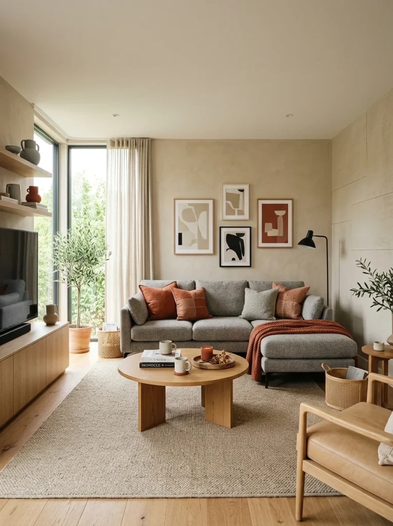
Living Room Color Palette 3: Earthy Warm Tones — Grounded, Natural, and Deeply Cozy
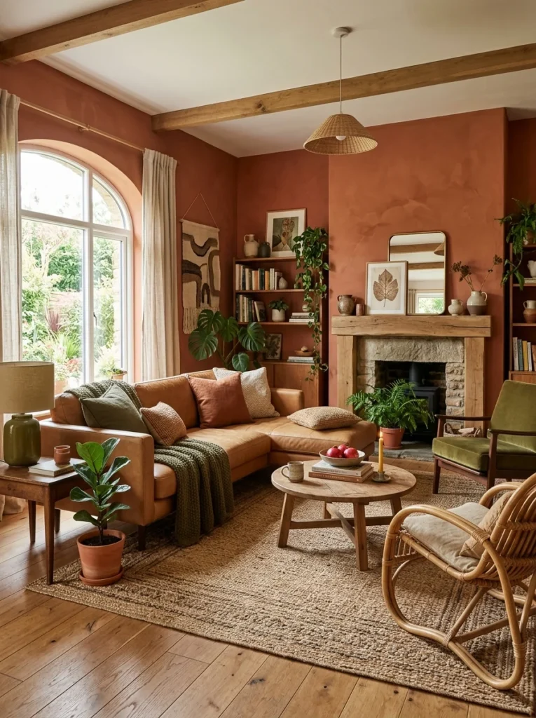
The Colors: Terracotta, warm rust, olive green, warm brown, and cream as a base throughout.
The Mood: Organic, grounded, and completely enveloping. The earthy palette creates living rooms that feel rooted in the natural world — spaces where the colors recall clay, stone, bark, and foliage rather than paint chips and fabric swatches.
The earthy palette has become the dominant trend in contemporary interior design over the past several years, and its continued relevance suggests that it has moved beyond trend into something more enduring. The reason for its sustained appeal is that it satisfies a genuine human desire for connection to natural materials and organic forms — a desire that has become more pronounced as daily life becomes increasingly digital and interior.
Earthy palettes are inherently warm, which makes them excellent choices for living rooms used primarily in the evening — rooms where artificial lighting predominates and where the warmth of the palette compensates for the absence of natural light. They are also forgiving palettes that accommodate a wide range of furniture styles, from vintage and antique pieces to contemporary designs with organic forms.
Wall color recommendations: Little Greene Tuscan Red at reduced saturation for a soft terracotta wall, Farrow and Ball Dead Salmon for a muted dusty pink-terracotta that reads as warm and sophisticated, Dulux Harvest Pumpkin at very reduced intensity for a soft warm ochre wall.
Sofa color: A sofa in warm camel, soft rust, deep olive, or warm chocolate brown places a rich earthy color at the dominant sixty percent level. A cream or off-white sofa works equally well as the neutral base from which the earthy accents are built — this approach is more flexible because the sofa remains neutral while the palette’s earthiness is carried through the rug, cushions, and accessories.
Rug: A rug in warm terracotta, faded rust, warm ochre, or a combination of earthy tones is central to the earthy palette. A Moroccan-style rug with geometric patterns in rust, cream, and brown, a vintage-style kilim in earthy tones, or a simple textured rug in warm camel all anchor the seating zone with the palette’s characteristic warmth.
Curtains: Linen curtains in warm rust, terracotta, or warm olive add a rich, saturated color at window height without the visual weight of velvet or heavier fabrics. Natural linen in an undyed or barely-dyed tone keeps the window treatment quieter and allows the earthier colors in the rug and cushions to carry the palette’s richness.
Accent color at ten percent: Warm mustard yellow as a cushion accent adds a bright, warm note that lifts the earthier tones without disrupting them. Deep forest green in a ceramic vase or a single cushion introduces a natural counterpoint to the warmer tones. Unfinished brass and aged bronze in metallic accessories suit the organic quality of the earthy palette more naturally than polished chrome or brushed nickel.
Common mistake: Taking earthy tones too dark across all surfaces in a smaller living room. Full-strength terracotta on all four walls combined with a dark rust sofa and a deep brown rug can make a small living room feel oppressive rather than cozy. In smaller rooms, use the deeper earthy tones in the accessories and textiles and keep the walls in a softer, lighter version of the palette — a warm cream, a pale terracotta, or a muted ochre — to maintain the palette’s warmth without reducing the room’s sense of openness.
Living Room Color Palette 4: Soft Green — Nature-Inspired and Quietly Beautiful
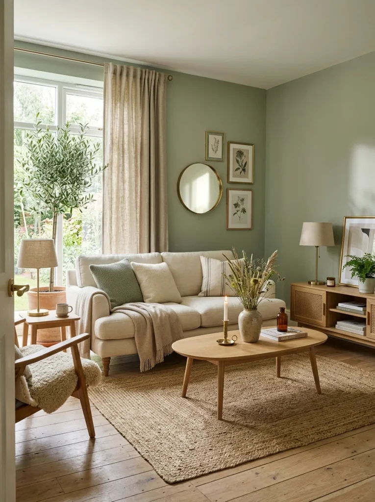
The Colors: Sage green or soft olive as the dominant color, warm white or cream as the secondary, natural wood tones throughout, warm brass as the metallic accent.
The Mood: Naturally calming, fresh without being energizing, and quietly beautiful. Green in its muted, grey-toned forms is the color that most effectively bridges the gap between the natural world and the interior environment, creating living rooms that feel genuinely organic without relying on actual plants or natural materials exclusively.
Sage green and olive green have become established as one of the most reliably beautiful living room palette choices because they occupy a unique position in the color spectrum — warm enough to feel comfortable and inviting, cool enough to feel calm and restful, and natural enough to feel timeless rather than trend-dependent. Unlike the brighter, more saturated greens that read as energetic and somewhat unsettling in interior spaces, sage and olive greens read as settled and resolved.
The palette works in living rooms of all sizes. In larger rooms, sage green walls create a sense of being surrounded by a color that feels inherently calming without the heaviness of darker hues. In smaller rooms, sage green walls open up in natural light and contract to a deeper, more intimate tone in artificial light — both effects are pleasing in a living room context.
Wall color recommendations: Farrow and Ball Mizzle for a complex, sophisticated sage that photographs beautifully and changes character dramatically between natural and artificial light. Little Greene Sage for a more straightforward and reliable sage green that suits traditional and transitional living rooms. Dulux Pistachio Cream for a lighter, softer sage that suits smaller rooms and spaces with limited natural light.
Sofa color: A sofa in warm cream, natural linen, or warm off-white allows the sage green walls to carry the palette’s primary color statement while the sofa remains a calm neutral anchor. A sofa in a deeper olive or a complementary warm terracotta makes a bolder statement by placing two earthy colors in relationship — this works particularly well in larger rooms where the contrast between sofa and wall can be appreciated.
Rug: A rug in warm cream, natural jute or sisal, or a soft geometric pattern in warm neutral tones grounds the seating area. A patterned rug that includes sage green alongside cream and warm brown creates a visual connection between the wall color and the floor level that makes the palette feel fully resolved.
Curtains: Natural linen in undyed or warm cream tones allows the sage walls to remain the primary color statement at wall level. Deeper olive or forest green curtains create a tonal layering within the green family — this is a more sophisticated approach that works well in rooms with enough natural light to prevent the layered greens from feeling too heavy.
Accent color at ten percent: Warm terracotta in a single cushion or a ceramic object adds an unexpected warmth that lifts the green palette toward something more dynamic. Dried botanicals — pampas grass, dried seedheads, eucalyptus — in natural tones complement the organic quality of the sage green palette without introducing competing colors.
Common mistake: Using sage green with cool-toned whites or grey-based furniture. Sage green has warm undertones and needs warm companions. A cool white sofa or a grey-toned wood coffee table against sage green walls creates a temperature conflict that is subtle but consistent. Keep all supporting elements warm-toned throughout.
Living Room Color Palette 5: Bold and Moody — For Rooms That Want Depth and Drama
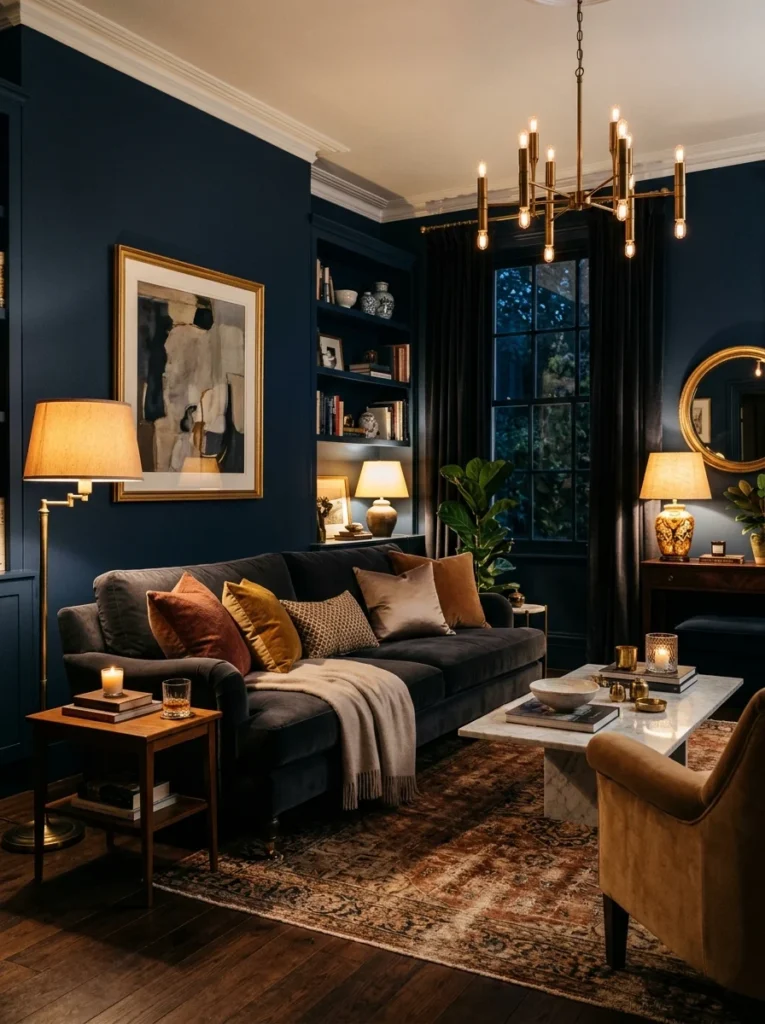
The Colors: Deep navy, forest green, or rich burgundy as the dominant wall or upholstery color, warm brass and gold metallics, rich textiles in complementary deep tones.
The Mood: Dramatic, intimate, and completely immersive. The moody palette creates living rooms that feel like deliberate destinations — rooms you walk into and feel immediately surrounded by atmosphere.
Moody living rooms are the least common palette choice because they require the most confidence in execution, but they are also among the most memorable and most admired interiors in residential design. A living room in deep navy with warm brass accessories, velvet cushions, and layered warm lighting is a room that leaves a lasting impression on everyone who experiences it.
The key to making a moody palette work in a living room — rather than simply making the room feel dark and oppressive — is warm, layered lighting. A moody room with cold overhead lighting looks grim. The same room with warm-toned lamps at multiple heights — floor lamps, table lamps, wall sconces — becomes something genuinely beautiful. The lighting is not a secondary consideration in a moody living room. It is the element that determines whether the darkness reads as atmospheric or simply dark.
Wall color recommendations: Farrow and Ball Hague Blue for a complex, sophisticated navy that changes from blue-green to blue-grey depending on the light. Little Greene Obsidian for a very dark charcoal that reads as near-black in lower light. Farrow and Ball Invisible Green for a deep forest green that creates an enveloping, botanical atmosphere.
Sofa color: In a room with dark walls, the sofa can be either a contrasting light tone — cream, soft white, or warm camel — which creates a bold contrast that feels luxurious and high-contrast, or a rich complementary dark tone — deep green, navy, or charcoal — which creates a more enveloping and fully immersive effect. Both approaches work. The choice depends on whether you want the sofa to stand out within the dark room or to blend into it.
Rug: A rug in deep jewel tones — forest green, burgundy, deep navy — creates a fully saturated floor that reinforces the moody quality of the palette. A warm-toned rug in deep camel, warm rust, or rich ochre provides contrast at floor level and prevents the room from becoming too uniformly dark.
Curtains: Full-length velvet curtains in a deep complementary tone add an extraordinary sense of luxury and warmth to a moody living room. Velvet’s light-absorbing quality suits the moody palette perfectly — it does not reflect light in the way that lighter fabrics do, which reinforces the intimate, enclosed atmosphere of the dark palette.
Accent color at ten percent: Warm brass and aged gold are the metallic accents that work most powerfully with moody deep palettes. The warmth of brass against a deep navy or forest green wall creates a combination that is simultaneously bold and elegant. Dusty rose or burnt orange in a single cushion introduces a warm accent that lifts the darkness without disrupting the palette’s dramatic quality.
Common mistake: Painting only one wall in the dark color while keeping the remaining three walls white. This approach — the feature wall interpretation of moody design — rarely achieves the atmospheric effect that deep colors create when used throughout the room. A single dark wall surrounded by white walls looks like an unfinished decision rather than a confident palette choice. For the full moody effect, commit to using the deep color on all walls or at minimum on three of the four walls.
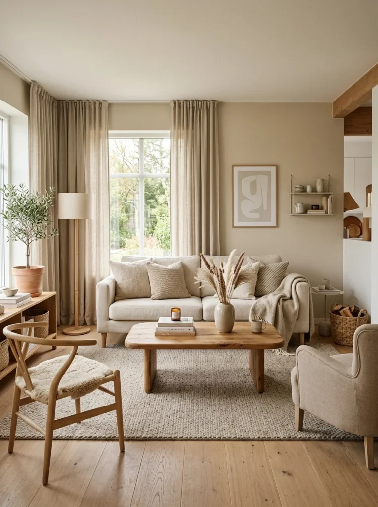
Living Room Color Palette 6: Light and Airy — Open, Fresh, and Effortlessly Calm
The Colors: All whites, soft pastels, natural wood, and plenty of natural light as the primary design tool.
The Mood: Open, serene, and effortlessly calm. The light and airy palette creates living rooms that feel like breathing space — rooms where the absence of heavy color creates a sense of openness and calm that other palettes achieve only partially.
The light and airy palette is most associated with Scandinavian design and coastal living, but its appeal extends far beyond these specific styles. Any living room that receives good natural light benefits from a palette that maximizes and celebrates that light rather than competing with it through stronger colors. The palette is particularly powerful in rooms where the architecture — high ceilings, large windows, generous proportions — provides the visual interest that color would provide in a smaller or less architecturally distinctive space.
The challenge with a light and airy palette is preventing it from feeling empty or characterless. When color is reduced to a minimum, texture and material quality become the primary sources of visual interest. Rough linen, smooth plaster, natural wood grain, woven wool, and glazed ceramic all contribute to the richness of a light palette in a way that painted color alone cannot.
Wall color recommendations: Farrow and Ball All White for a sophisticated warm white with grey undertones that prevents the room from feeling clinical. Dulux Timeless for a reliable, versatile warm white. Benjamin Moore Chantilly Lace for a bright, clean white that suits rooms with generous natural light.
Sofa color: A sofa in warm white, soft cream, or pale natural linen is the logical choice for a light palette. The sofa remains within the pale color family established by the walls, which reinforces the sense of openness and light.
Rug: A natural fiber rug — jute, sisal, or undyed wool — adds warmth and texture at floor level while remaining within the light, natural palette. A pale geometric or subtle pattern rug in cream and warm white adds visual interest without introducing a competing color.
Curtains: Sheer white or very pale linen curtains maximize the amount of natural light entering the room and add a soft, flowing quality to the window treatment. Floor-length sheers billow slightly with movement and contribute significantly to the airy, light-filled quality that this palette depends on.
Accent color at ten percent: Natural green from plants — a large fiddle leaf fig, a cluster of smaller plants in simple white pots — provides the living room’s color accent through genuinely natural sources rather than painted or manufactured ones. Warm wood tones in furniture legs, a wooden coffee table, and wooden shelving provide warmth within the pale palette.
Common mistake: Allowing the light palette to become flat by using a single white throughout without any variation in tone or texture. An all-white room with no textural variation reads as a blank canvas rather than a considered palette. Layer different whites — a slightly warmer white on the walls, a cooler white in the trim, a linen-toned white in the cushions — and vary the texture of every element throughout the room.
Living Room Color Palette 7: Classic Blue and White — Fresh, Timeless, and Always Elegant
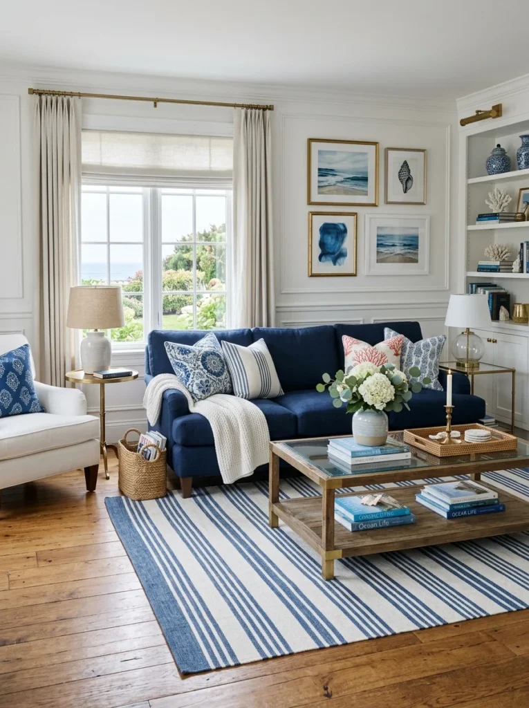
The Colors: Crisp white walls, navy or cobalt blue accents in upholstery and accessories, natural wood or warm rattan, brass or gold metallics.
The Mood: Fresh, classic, and completely timeless. The blue and white combination has been a foundation of interior design across cultures and centuries — from Dutch Delft tiles to French toile, from Greek island whitewash to traditional Chinese porcelain — because the contrast between clean white and clear blue creates a visual energy that never becomes dated.
In a living room, the blue and white palette creates a space that feels simultaneously lively and calm — the blue provides enough color energy to prevent the room from feeling flat, while the white keeps the palette fresh and prevents the blue from becoming heavy or oppressive.
Wall color recommendations: Crisp warm white walls — Farrow and Ball All White or Benjamin Moore White Dove — provide the clean backdrop against which blue accents read most clearly and most elegantly.
Sofa color: A sofa in navy, cobalt blue, or dusty French blue makes the boldest statement within this palette and places the primary color at the dominant sixty percent level. A white or cream sofa with blue cushion accents creates a quieter version of the palette where the white dominates and the blue appears primarily in the accessory layer.
Rug: A rug in navy and white, blue and cream, or a classic blue stripe pattern — such as a French-style ticking stripe — anchors the seating zone with the palette’s signature color combination at floor level.
Accent color at ten percent: Warm brass and aged gold provide the metallic warmth that prevents the blue and white combination from feeling too cool. A single warm accent — terracotta in a pot, mustard in a cushion — introduces an unexpected warmth that makes the palette feel more dynamic and less predictable.
Common mistake: Using too many different blues within the same palette. Navy, cobalt, dusty blue, and baby blue all in the same room creates a palette that feels confused rather than cohesive. Choose one primary blue and use it consistently throughout the room, varying only the material — a navy velvet cushion alongside a navy ceramic vase alongside a woven navy throw all in the same tone creates cohesion through material variation rather than color variation.
Testing Your Palette Before You Commit
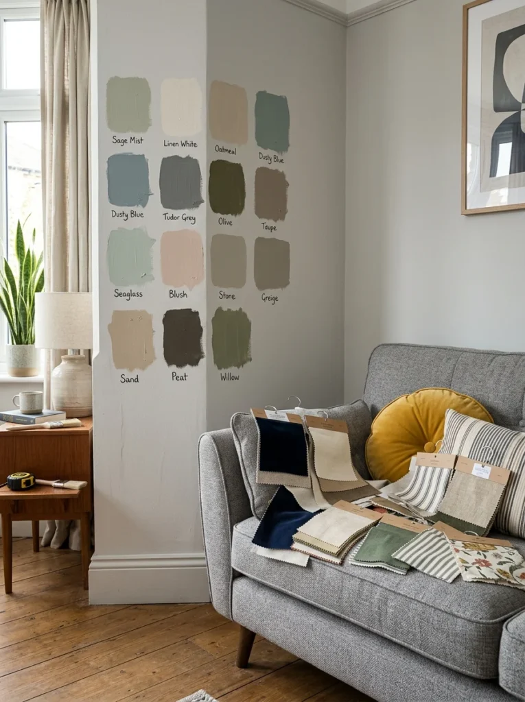
The only reliable way to evaluate a living room color palette before committing to it is to test every element physically in your actual room under your actual lighting conditions. Digital visualization tools and paint chips in a store are useful for narrowing down options but are never accurate enough to make a final decision from.
For wall colors, paint large swatches — at minimum twelve by eighteen inches — of your shortlisted colors directly on the wall and observe them for at least a week across different times of day and under different lighting conditions. Natural morning light, afternoon sun, evening lamplight, and nighttime artificial lighting all show the same color differently, and a color that looks perfect at midday can look entirely wrong by evening.
For upholstery and textile colors, order fabric samples or cushion samples in your shortlisted colors and place them on your existing sofa or on the floor in the room. Assess them in the same range of lighting conditions as the wall color samples.
Lay all your samples — wall color swatch, fabric samples, rug samples if possible, and any tile or flooring samples — together on the floor of the room and evaluate the complete palette as a system. This is the moment when a palette either works as a cohesive whole or reveals a conflict that individual samples did not show.
Conclusion
A living room palette that works is one where every element — walls, sofa, rug, curtains, cushions, and accessories — has been chosen in relation to every other element, with a clear direction, a defined color hierarchy, and consistent attention to color temperature throughout.
The seven palettes in this guide cover the full range of living room color directions, from the timeless warmth of soft neutrals to the dramatic confidence of moody deep tones. Each one is built on the same principles — a dominant color, a secondary color, an accent color, and a clear warm or cool direction that keeps every element within the same temperature family.
Choose the palette that matches the mood you want your living room to create, test every element physically before committing, and build the palette as a system from the beginning rather than assembling individual color choices one at a time.
The result will be a living room that feels complete — not because every element is expensive or impressive, but because every element belongs together.