
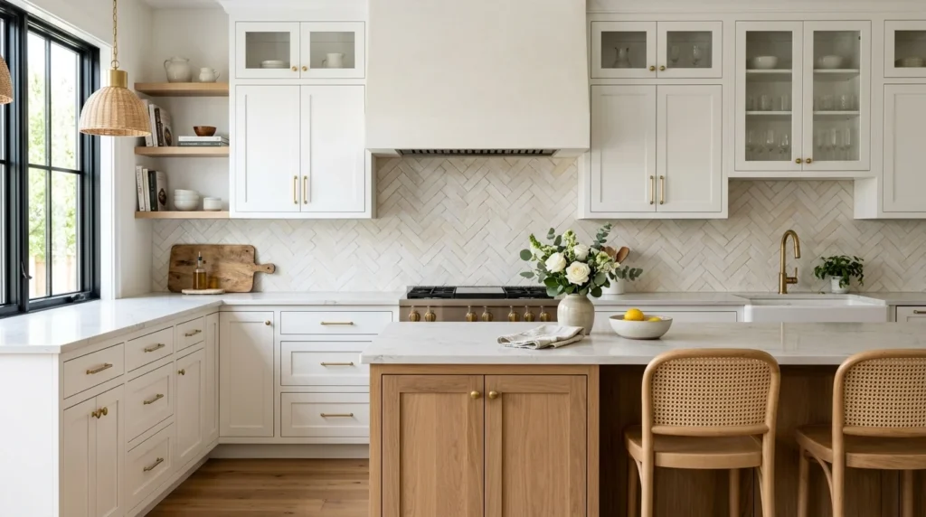
When we finally got to the backsplash stage of my kitchen renovation, after months of decisions about cabinets, countertops, and appliances, I genuinely thought it would be the easy part. White cabinets, I figured, would pair with almost anything, so I’d just pick something simple and move on. Instead, that supposedly easy decision ended up taking longer than almost any other choice in the entire project, mostly because I hadn’t realized just how differently the same white cabinets could read depending on which backsplash surrounded them, from clean and modern to warm and traditional to something entirely more dramatic, all with the exact same cabinetry underneath.
If you’re standing in front of your own white cabinets trying to settle on a backsplash, here are 21 ideas, each explained in detail, based on what I learned during my own decision process and what I’ve seen work beautifully in other white kitchens since.
1. Classic White Subway Tile
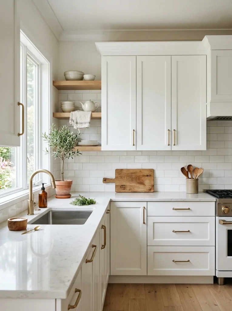
There’s a reason white subway tile remains the single most common backsplash choice for white kitchens, and after considering dozens of alternatives, I ultimately came back to it myself, appreciating how its clean, simple lines let the cabinetry and other design elements take center stage rather than competing for attention. The classic brick-pattern layout, with each tile offset by half a tile length from the row below, has a timeless quality that doesn’t feel tied to any particular design trend that might eventually feel dated. I chose a slightly larger format than the traditional three-by-six-inch subway tile, opting for four-by-eight-inch tiles instead, which reduces the number of visible grout lines and gives the wall a slightly more contemporary, streamlined feeling compared to the smaller traditional size. Grout color matters more than people often expect with this style, and I chose a warm white grout that nearly disappears against the tile itself, though a contrasting dark grout is an increasingly popular alternative that adds more visual definition and a slightly more graphic, modern quality to the same basic subway tile shape.
2. Herringbone-Patterned Subway Tile
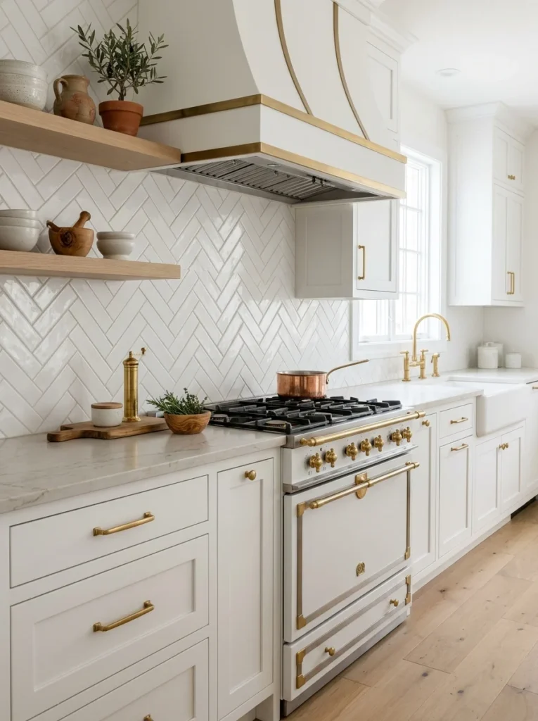
Taking the same basic subway tile shape but arranging it in a herringbone pattern rather than the traditional brick layout adds considerably more visual movement and sophistication while still working with the same familiar, relatively affordable tile material. A friend used this pattern throughout her white kitchen, and the diagonal, zigzagging arrangement genuinely elevates what would otherwise be a fairly standard subway tile choice into something that reads as considerably more custom and intentional. This pattern does require more precise cutting and installation work compared to a simple straight brick layout, particularly around the edges and corners of your backsplash area, so I’d recommend budgeting for a somewhat more involved and potentially more expensive installation process if you choose this route over the simpler traditional layout. The herringbone pattern works particularly well as an accent specifically behind the range or stove, even if the rest of your backsplash uses a simpler layout, giving you a focal point without the added cost and complexity of the more intricate pattern across your entire backsplash area.
3. Bold Colored Tile Against White Cabinets
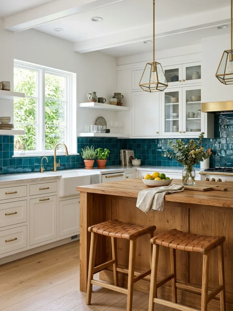
White cabinets provide an exceptionally versatile neutral backdrop that can handle genuinely bold, saturated backsplash colors without the overall kitchen feeling overwhelming, since the surrounding white cabinetry balances and grounds whatever bold color choice you make on the wall between them. I seriously considered a deep cobalt blue zellige tile for my own kitchen before ultimately choosing something more neutral, but a friend who did commit to a similarly bold teal tile in her all-white kitchen has a genuinely stunning result, with the backsplash reading as confident art against the surrounding restraint of her white cabinetry. This approach works particularly well if you’re not planning to change your cabinet color anytime soon, since the backsplash becomes the room’s clear focal point and any future color changes elsewhere would need to work around that established, more permanent bold choice. I’d recommend bringing large tile samples home and observing them against your actual cabinets in your kitchen’s specific lighting before committing to a genuinely bold color, since tile colors can shift somewhat dramatically once installed at full scale compared to how they appear in a smaller showroom sample.
4. Handmade Zellige Tile for Organic Texture
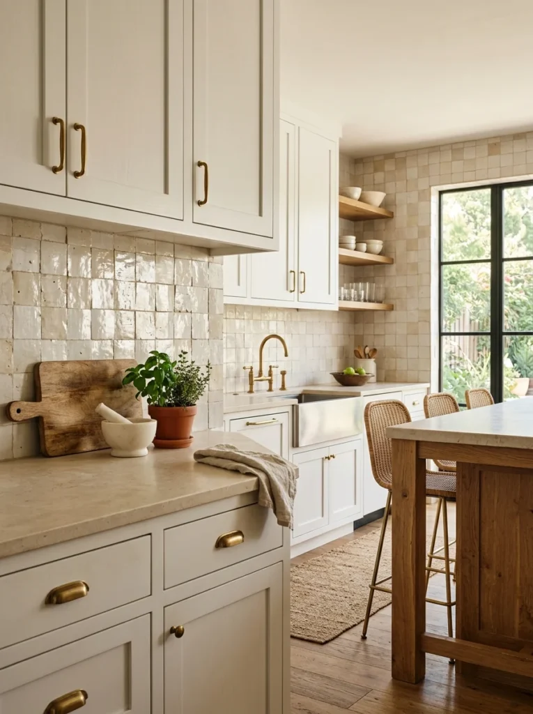
Zellige, a traditional Moroccan handmade tile technique, has become considerably more popular in recent kitchen design specifically because of the subtle variation and texture inherent in each individual tile, a quality that mass-produced, perfectly uniform tile simply can’t replicate. I ultimately chose a soft, warm white zellige tile for a portion of my own backsplash specifically behind the range, and the way light catches the tile’s slightly irregular, glossy surface adds a genuine handmade quality that’s become one of my favorite details in the entire kitchen. Because each tile is individually handmade, you’ll notice genuine variation in both color and surface texture across your installed backsplash, which is part of the appeal for anyone drawn to this style but might feel like an inconsistency to someone expecting the perfect uniformity of standard manufactured tile. I’d recommend this specifically if you’re drawn to that organic, artisanal quality and are comfortable with the tile’s naturally higher cost compared to standard subway tile, reflecting both the handmade production process and the material’s growing popularity in recent kitchen design trends.
5. Marble Slab Backsplash for a Seamless Look
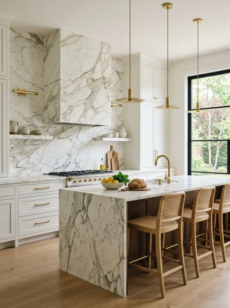
Rather than individual tiles, installing a single slab of marble as your backsplash, often cut from the same stone as your countertop for a genuinely seamless, continuous look, creates a particularly luxurious, high-end appearance that grout lines and tile seams inherently interrupt to some degree. A friend used this approach with a dramatic Calacatta marble slab matching her countertop exactly, and the visual continuity from countertop to backsplash genuinely reads as a considerably more elevated, custom kitchen design compared to a tiled alternative. This is one of the more expensive options on this entire list, both due to the material cost of natural stone slabs and the more specialized installation required for cutting and fitting a single continuous piece rather than smaller, more forgiving individual tiles. I’d recommend this specifically if your budget allows and you’re already planning a marble or marble-look countertop, since matching the two creates that particularly striking continuous effect, though a quartz slab in a marble-look pattern offers a more budget-friendly and lower-maintenance alternative that can achieve a visually similar result.
6. Warm Terracotta Tile for Contrast
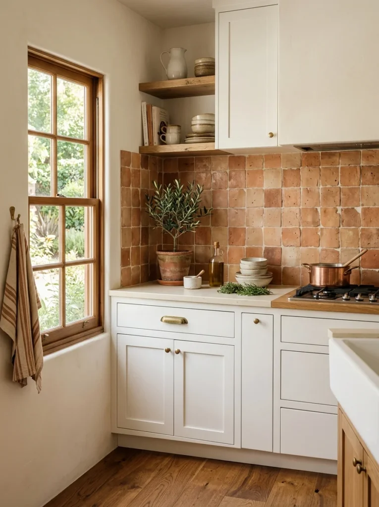
For white kitchens wanting to introduce genuine warmth without straying from a fundamentally neutral, earthy palette, warm terracotta or clay-toned tile creates a beautiful contrast against crisp white cabinetry, adding richness and depth that a purely white or grey backsplash doesn’t provide on its own. I considered this direction seriously during my own decision process, drawn specifically to how the warm clay tone would complement my wood floors and brass hardware, though I ultimately went a slightly different direction for my own specific kitchen’s lighting conditions. This combination works particularly well in kitchens with warm wood accents elsewhere, wood open shelving, a wood island, warm-toned hardware, since the terracotta reinforces and connects to those existing warm elements rather than introducing an isolated, unrelated color choice. I’d recommend this specifically for kitchens leaning toward a warm, earthy, Mediterranean-inspired overall aesthetic, since the terracotta’s warmth might feel slightly mismatched in a more strictly modern, cool-toned kitchen relying primarily on black and white or blue-grey accents throughout the rest of the space.
7. Geometric Patterned Cement Tile
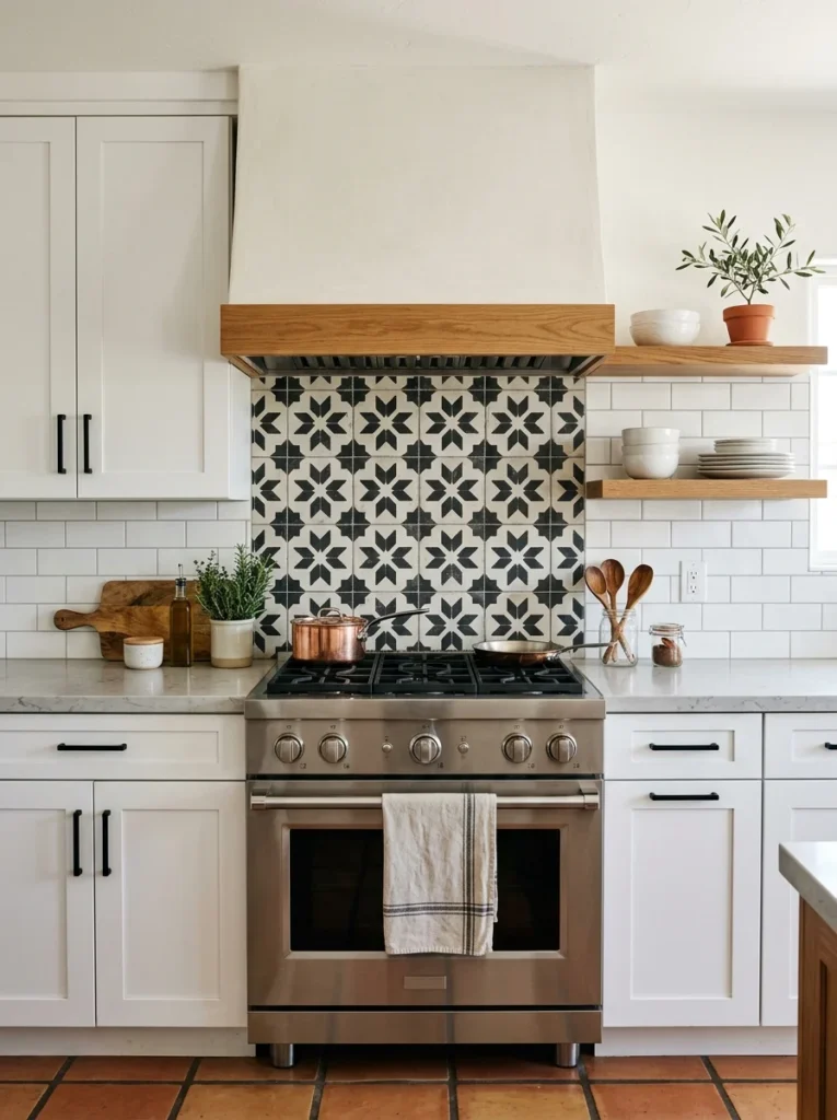
For a bolder, more graphic backsplash statement, patterned cement tile, often featuring intricate geometric or Moroccan-inspired designs in multiple colors, transforms the backsplash into genuine artwork rather than a purely neutral, supporting background element. A friend used a black and white geometric cement tile specifically behind her range, keeping the rest of her backsplash in simpler white subway tile, and that contained, focused use of the bolder pattern creates a genuine focal point without overwhelming her entire white kitchen in an intricate pattern from wall to wall. Cement tile requires proper sealing, both during initial installation and periodically afterward, since the material is naturally more porous than glazed ceramic tile and can stain if left unsealed, particularly in a kitchen environment with regular exposure to cooking splatter and spills. I’d recommend this specifically as a contained accent, behind just the range or within a smaller defined section, rather than across an entire backsplash, both for cost reasons given the tile’s typically higher price point and because a smaller, focused application tends to read as more intentional than an overwhelming pattern covering every available inch of wall space.
8. Fluted or Textured Tile for Subtle Dimension
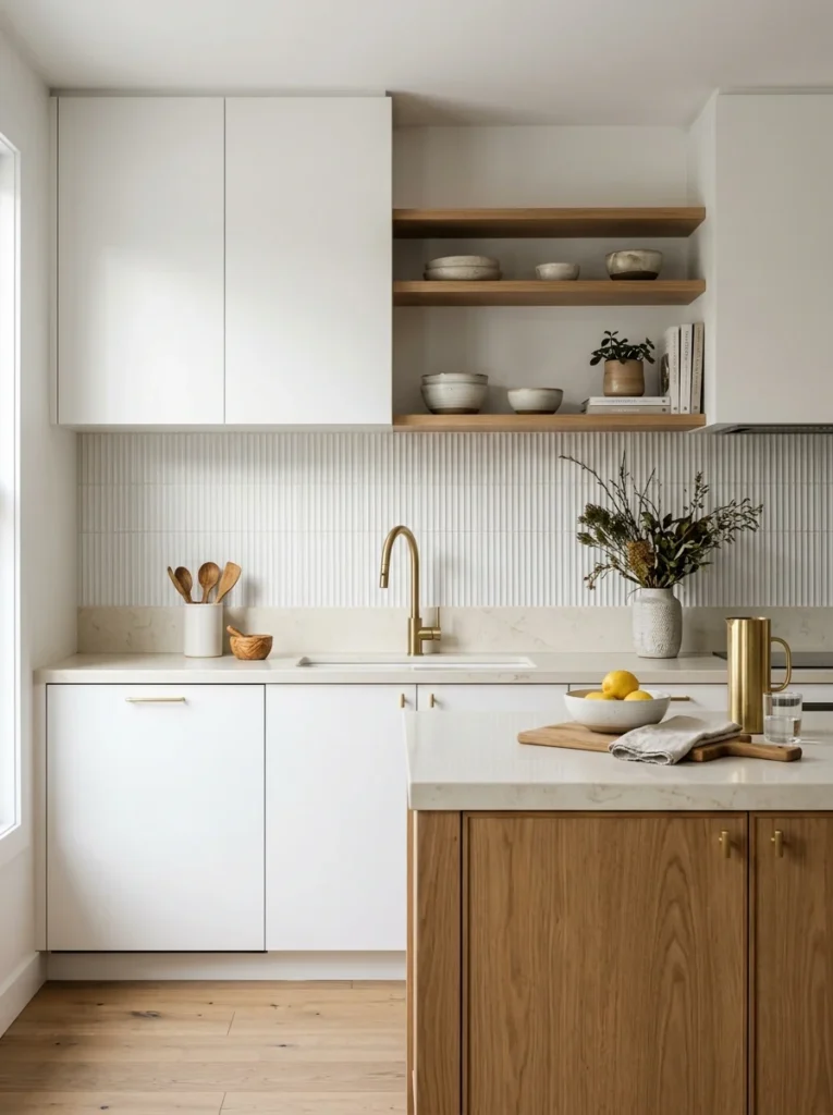
Rather than a flat, smooth tile surface, choosing a subtly textured or fluted tile adds dimension and visual interest that catches light differently throughout the day, creating shifting shadows and highlights across the backsplash without introducing any actual additional color beyond your base white or neutral tone. I’ve seen this used beautifully in a friend’s kitchen using a subtly ribbed, fluted white tile, and the resulting texture genuinely adds sophistication to what would otherwise be a very simple, flat white backsplash, all while maintaining that same clean, neutral color palette throughout the space. This approach works well for anyone who wants added visual interest beyond a completely flat, smooth tile but isn’t drawn to introducing a different color or bold pattern into their white kitchen, keeping the overall aesthetic restrained and monochromatic while still achieving genuine textural depth. I’d recommend viewing this style of tile in person under different lighting conditions before purchasing, since the textural effect depends heavily on how light interacts with the surface, and photos alone often don’t fully convey how dramatically the shadow and highlight pattern shifts throughout an actual day of natural light changes.
9. Extend the Backsplash to the Ceiling
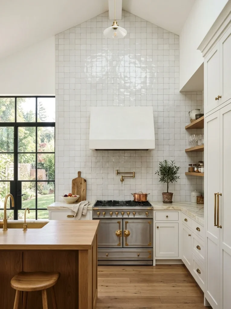
Rather than stopping your tile at the standard height just above your upper cabinets, extending your chosen backsplash material all the way to the ceiling creates a considerably more dramatic, intentional statement, particularly effective if you’re using open shelving rather than upper cabinets across at least a portion of that wall. I extended my zellige tile section behind the range all the way to the ceiling rather than stopping at the standard height, and the additional vertical coverage genuinely elevates that section of the kitchen into a clear focal point rather than a more modest, contained backsplash treatment. This approach does require more total tile material and installation time, adding to the overall project cost, but the visual impact of a full-height tile treatment, particularly in a kitchen with taller ceilings, is considerably more dramatic than a backsplash that stops abruptly partway up the wall. I’d recommend this specifically for any wall section without upper cabinetry blocking the view, since extending tile all the way to the ceiling only makes visual sense where that full expanse is actually visible rather than interrupted by cabinet doors partway up.
10. Choose a Contrasting Grout Color
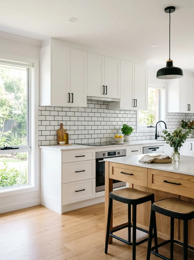
Even with a relatively simple white subway tile, choosing a contrasting grout color, charcoal, black, or a deep navy, transforms the overall appearance considerably, adding graphic definition and a more modern, architectural quality compared to matching white grout that lets individual tiles blend together into a more uniform, less distinctly patterned surface. I considered this approach seriously for my own subway tile before ultimately choosing a closely matching warm white grout, but a friend who chose black grout with the same basic white subway tile has a considerably more dramatic, contemporary-feeling backsplash despite using essentially the same base tile material I did. This is one of the lowest-cost ways to meaningfully change a backsplash’s overall character, since the grout itself represents a relatively small portion of the total project cost regardless of which color you choose, making this a particularly good option for anyone wanting more visual impact without a considerably larger material budget. I’d recommend testing both grout options, matching and contrasting, using small sample boards installed with your actual chosen tile before committing to your final grout choice, since this decision affects the backsplash’s overall character more significantly than its relatively low cost might initially suggest.
11. Add a Decorative Tile Border or Accent Strip
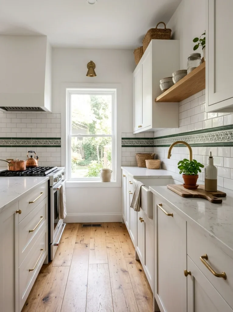
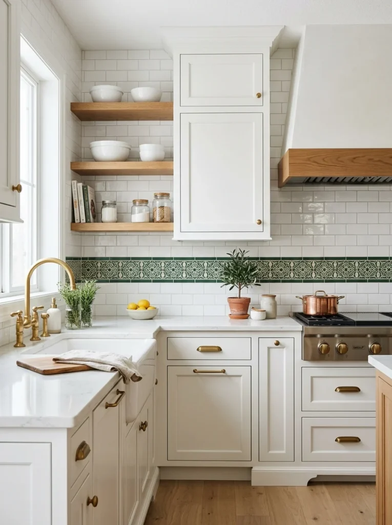
Rather than committing to a bold pattern across your entire backsplash, incorporating a decorative accent strip, a row of contrasting colored or patterned tile inserted as a border within an otherwise simple field tile, adds visual interest in a more contained, budget-friendly way. A friend added a single row of deep green patterned tile as a border running along the top edge of her otherwise simple white subway tile backsplash, and that relatively small design detail adds meaningful personality without the cost or commitment of a fully patterned backsplash throughout the entire wall. This approach works particularly well for anyone wanting to incorporate their kitchen’s accent color, whether that appears elsewhere in cabinet hardware, an island color, or open shelving accessories, tying that established color thread into the backsplash without fully committing an entire wall to that bolder choice. I’d recommend positioning this accent strip at a height that draws the eye naturally, either along the top edge just below your upper cabinets or as a horizontal band roughly at eye level, rather than somewhere it might go relatively unnoticed, like directly behind a stretch of counter typically obscured by small appliances.
12. Use Large-Format Tile for a Seamless Modern Look
Rather than smaller subway or mosaic tiles with numerous grout lines, choosing large-format tile, sometimes in pieces spanning two feet or more, creates a considerably more seamless, modern appearance with dramatically fewer visible grout lines interrupting the overall surface. I considered this direction for a more minimalist section of my kitchen, and a friend who chose large-format porcelain tile resembling natural stone throughout her entire white kitchen backsplash has a remarkably clean, uninterrupted look that reads as considerably more contemporary compared to smaller, more traditional tile options. This style requires more precise, skilled installation than smaller tile, since larger pieces are less forgiving of wall imperfections and require careful handling to avoid cracking during the actual installation process, generally making this a project best left to an experienced professional tile installer rather than an ambitious DIY attempt. I’d recommend this specifically for kitchens with a genuinely modern, minimalist overall design direction, since the clean, uninterrupted surface this style achieves particularly complements that broader aesthetic compared to a more traditional or eclectic kitchen where smaller, more detailed tile choices might feel more appropriate to the room’s overall character.
13. Incorporate Brass or Metal Tile Accents
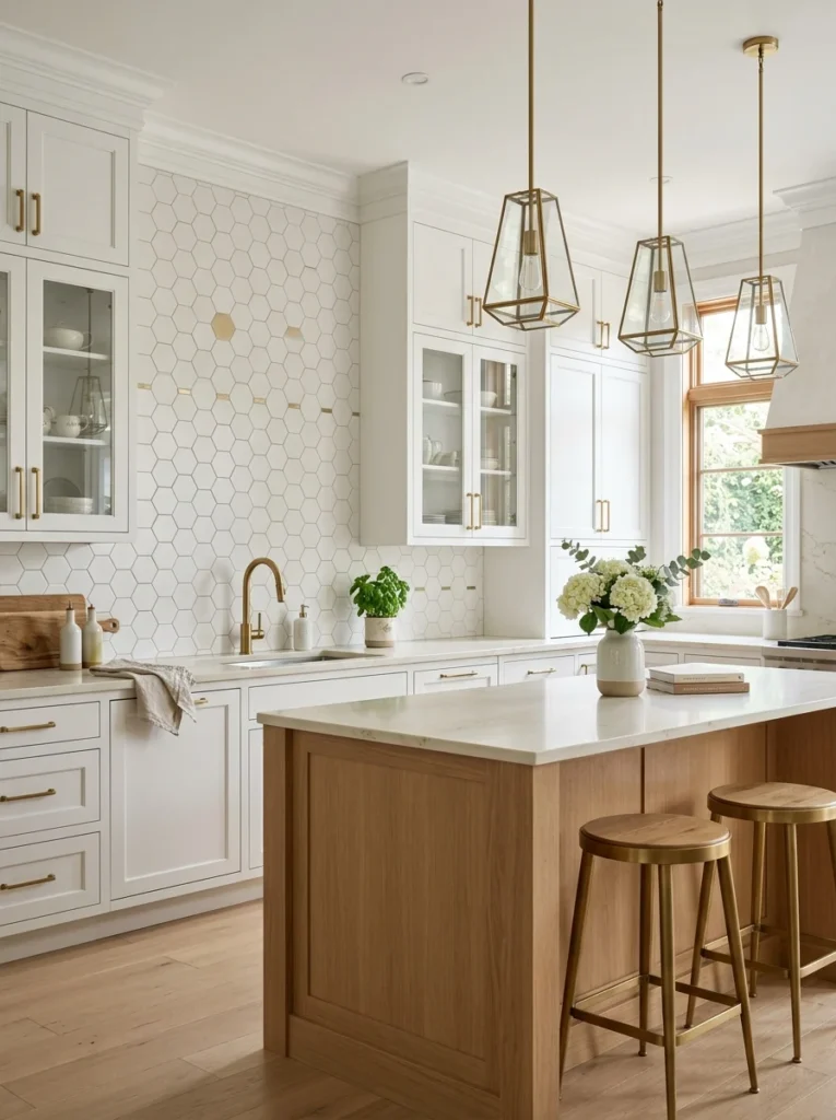
Metallic tile, whether used as a full backsplash material or incorporated as smaller accent pieces mixed among ceramic or stone tile, adds a reflective, warm quality that pairs particularly well with the brass or gold hardware increasingly popular alongside white kitchen cabinetry. A friend incorporated small brass hexagon tiles scattered among a field of white ceramic hexagon tiles, creating a subtle, shimmering effect that catches light differently depending on the viewing angle and time of day. This is a relatively bold, distinctive choice that works particularly well in kitchens already using brass hardware and fixtures elsewhere, since the metallic backsplash accent reinforces and echoes that established metal tone rather than introducing something entirely unrelated to the kitchen’s existing hardware choices. I’d recommend using metallic tile as an accent within a broader field of more standard ceramic or stone tile, rather than covering an entire backsplash exclusively in metallic material, since a small amount of shimmer and reflection tends to read as sophisticated and intentional while an entire wall of metallic tile can potentially feel overwhelming or overly glossy in a space you’re using daily for actual cooking.
14. Choose a Blue and White Combination
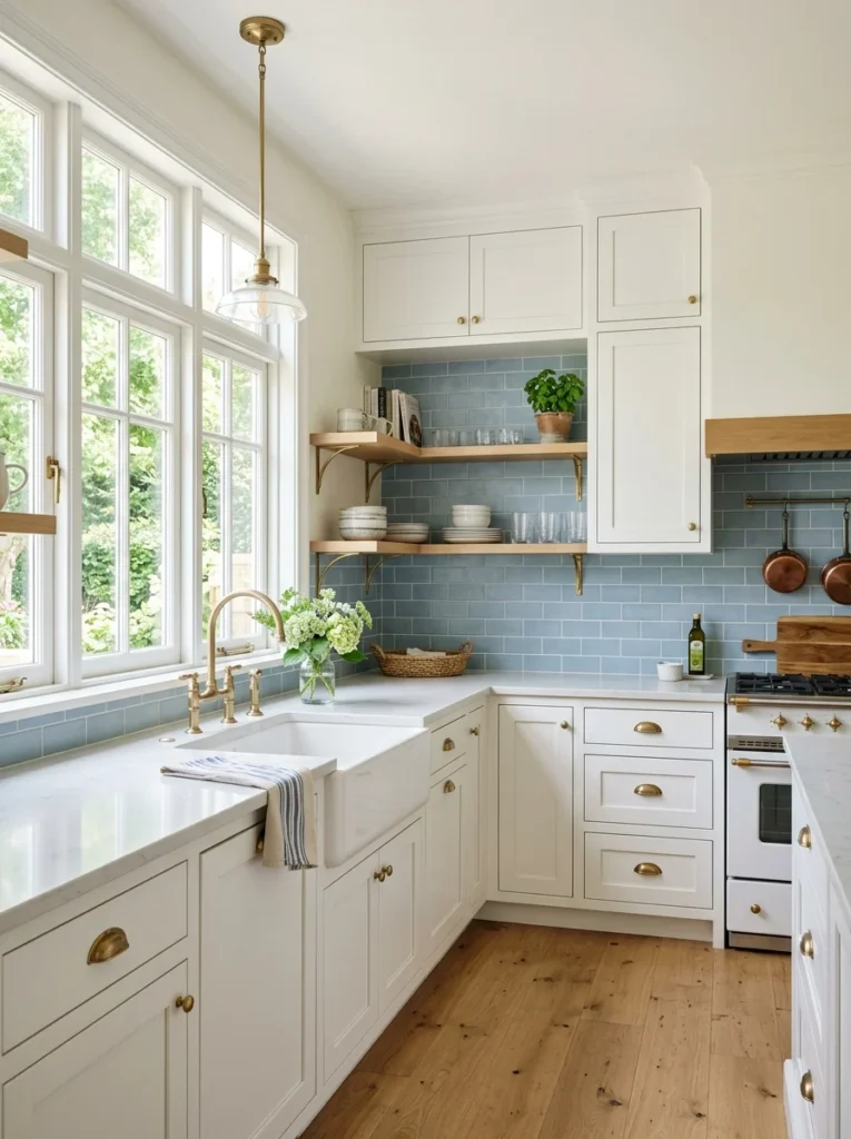
Blue and white together create one of the most enduringly popular color combinations in kitchen design, and a blue-toned backsplash against white cabinets, whether that’s a deep navy, a soft sky blue, or anything between, taps into a genuinely classic pairing that photographs beautifully and tends to feel fresh rather than dated regardless of changing broader design trends. I seriously considered a soft, pale blue subway tile for my own kitchen before ultimately choosing a more neutral direction, but I remain genuinely drawn to how that particular combination reads, crisp and clean but with just enough color to keep the space from feeling sterile or overly stark. This combination works across a considerably wide range of specific blue shades, from soft, muted pastels that read as gentle and coastal to deep, saturated navy that feels more dramatic and traditional, giving you flexibility to choose a specific tone that matches your kitchen’s broader intended mood. I’d recommend testing your specific chosen blue against your actual white cabinet color in person, since white cabinets themselves range from stark, cool whites to warmer, creamier tones, and the specific blue that complements each of those different white undertones can vary meaningfully.
15. Add Open Shelving Instead of a Traditional Upper Backsplash Area
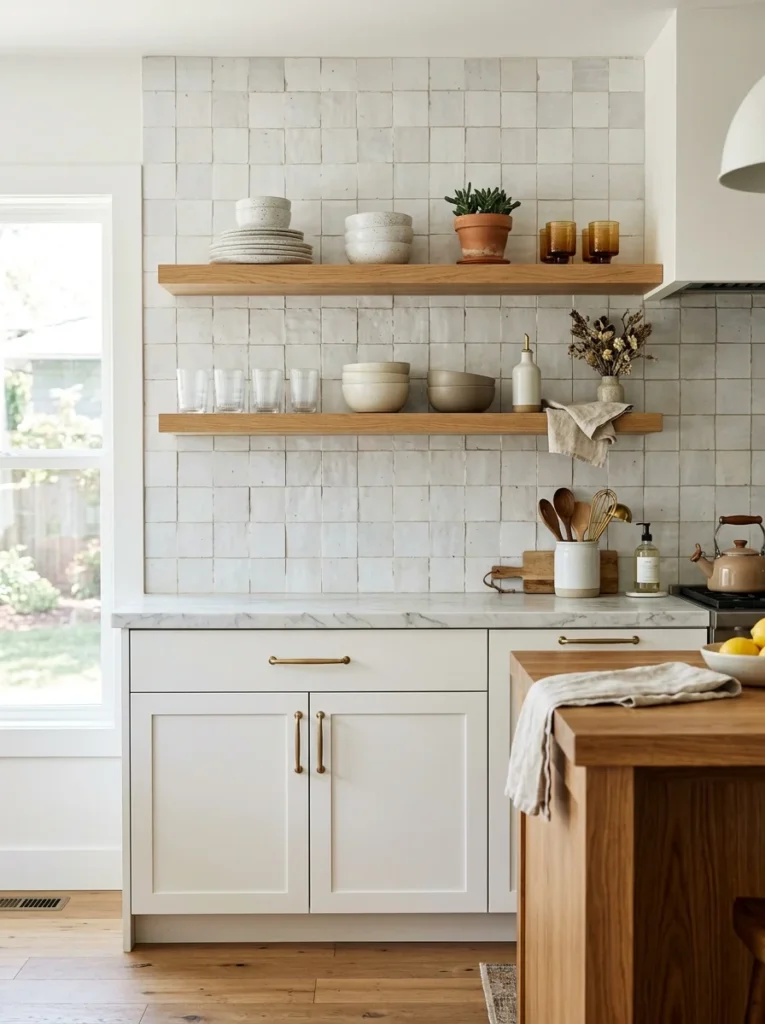
Rather than tiling the entire wall space between counter and upper cabinets, replacing at least a portion of that upper cabinetry with open shelving changes what’s actually visible against your backsplash, incorporating displayed dishware and objects as part of the overall visual composition rather than relying purely on the tile itself to carry the wall’s visual interest. I did this in one section of my own kitchen, and the combination of my zellige tile visible behind and around the open shelving, rather than hidden entirely behind closed cabinet doors, means that section of wall does double visual duty, both the tile itself and the curated objects displayed against it. This isn’t purely a backsplash decision in isolation, since it involves a broader layout choice about cabinetry, but it’s worth considering together with your tile selection specifically because the two decisions genuinely interact, and a backsplash material chosen assuming it would mostly be hidden behind cabinets reads very differently once it’s actually visible as the backdrop for open shelving display.
16. Use a Mosaic Tile for Intricate Detail
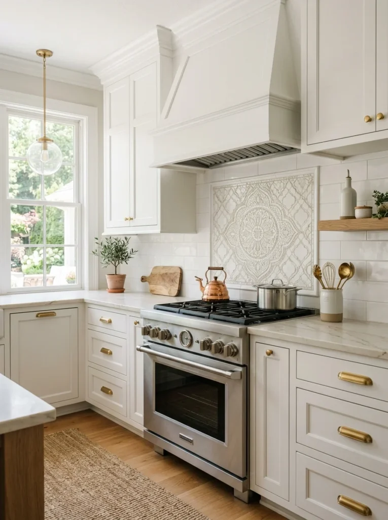
Small-format mosaic tile, whether in a single color or a blended, variegated palette, creates considerably more intricate visual texture and detail compared to larger subway or field tile, particularly effective in smaller kitchens or as a focused accent area where that additional detail can be appreciated up close rather than getting visually lost across a larger overall wall expanse. A friend used a soft, blended white and cream mosaic tile specifically behind her range as a focal accent, while keeping the surrounding backsplash in simpler large-format tile, giving that one section considerably more visual richness without extending the more labor-intensive mosaic installation across her entire kitchen. Mosaic tile does require more grout overall given the smaller individual tile size, which means more visible grout lines and, if not properly sealed, more potential points for staining over time, particularly in a kitchen environment with regular cooking splatter and general use. I’d recommend this specifically as a contained accent area rather than a full backsplash treatment for most kitchens, both for cost reasons given the typically higher price per square foot and because the intricate detail this style provides tends to have more visual impact when concentrated in one focal area rather than spread thin across an entire wall.
17. Choose Warm White or Cream Tile Rather Than Stark White
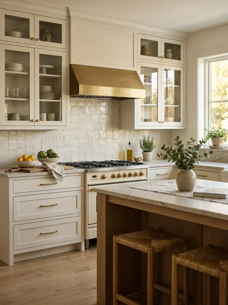
If you’re set on keeping your backsplash within the same general white color family as your cabinets, choosing a warm white or cream-toned tile rather than a stark, cool white creates a softer, more cohesive overall look, particularly if your cabinets themselves lean warm rather than cool in their specific undertone. I made sure to test my backsplash tile options specifically against my cabinet color in my kitchen’s actual lighting, since a mismatch between a warm white cabinet and a cooler, more stark white tile can look surprisingly jarring once both are actually installed together, even though they might seem like they’d obviously match when considered as a general category from a distance. This consideration matters more than people often expect precisely because both elements are technically “white,” which can create a false assumption that any white tile will automatically coordinate seamlessly with any white cabinet, when in reality the specific undertones involved, warm versus cool, matter just as much here as they do when pairing any other two supposedly matching colors throughout a room. I’d recommend bringing an actual cabinet door sample, or at minimum a precise paint chip matching your cabinet color, directly to the tile showroom for side-by-side comparison before finalizing your specific white or cream tile selection.
18. Incorporate Fish Scale or Scalloped Tile
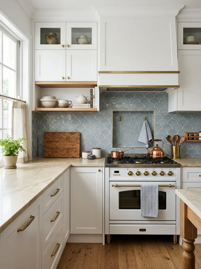
For a distinctive, slightly whimsical design choice, fish scale or scalloped tile, arranged in overlapping curved rows rather than traditional rectangular or square shapes, adds genuine visual movement and a softer, more organic quality compared to the straight lines of most standard backsplash tile options. A friend used a soft blue-grey scalloped tile as a focal backsplash section, and the curved, overlapping pattern genuinely stands out as a distinctive design choice compared to the straight-lined subway tile used throughout the rest of her kitchen. This style requires more precise cutting and installation around edges and corners compared to simpler rectangular tile shapes, given the curved geometry involved, making professional installation particularly advisable for this specific style rather than an ambitious DIY attempt. I’d recommend this specifically for kitchens wanting a genuinely distinctive, slightly more playful design element, since the curved, organic shape reads as considerably less conventional than most other options on this list, which can be exactly the point for anyone wanting their kitchen to feel distinctly personal rather than following more predictable, common design choices.
19. Match Backsplash Height to Your Range Hood Design
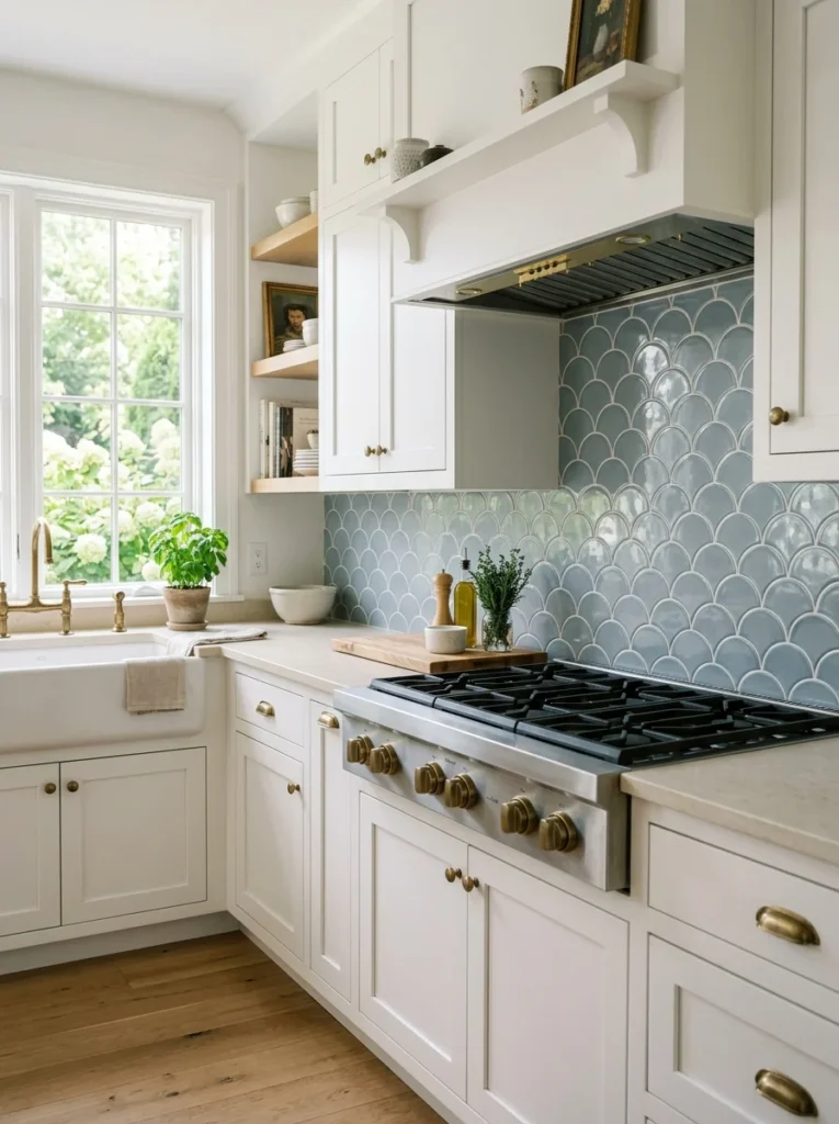
If your kitchen includes a statement range hood, whether custom plaster, wood, or a distinctive metal design, coordinating your backsplash tile specifically around and behind that hood, sometimes extending the tile all the way up behind the hood to the ceiling while keeping the rest of the backsplash at a more standard height, creates a deliberate focal point that draws the eye toward that combined feature. I did exactly this in my own kitchen, extending my zellige tile fully behind my range hood while keeping the surrounding backsplash at the more standard height beneath my upper cabinets, and that height variation genuinely emphasizes the cooking area as the kitchen’s clear visual centerpiece. This requires planning your backsplash and range hood decisions together rather than treating them as entirely separate choices made independently, since the two elements genuinely interact and benefit from being considered as one cohesive design decision covering that specific wall section. I’d recommend sketching out or at least visualizing this combined height variation before finalizing either your range hood style or your backsplash tile choice, ensuring the two work together intentionally rather than simply happening to occupy the same general area of the kitchen.
20. Consider Easy-Clean, Practical Materials for Heavy Use Areas
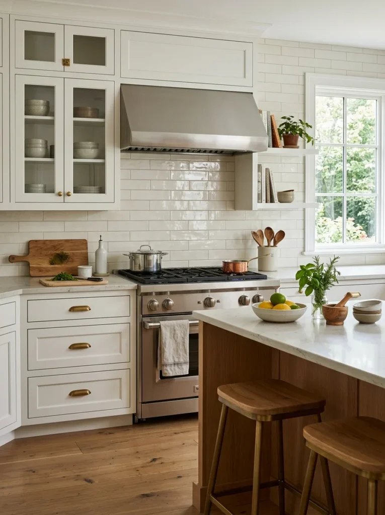
Beyond pure aesthetics, considering how much actual daily wear and splatter a specific section of backsplash will realistically face, particularly directly behind the range and stovetop, should influence material choice at least somewhat, favoring easier-to-clean, more stain-resistant materials in those higher-use zones even if you choose something more delicate or porous elsewhere in the kitchen. I specifically chose a glazed, easily wiped-down tile directly behind my range, saving my more textured, slightly more porous zellige tile for areas that see less direct cooking splatter and spill exposure. This is a practical consideration worth weighing alongside pure visual preference, since even the most beautiful backsplash material becomes a genuine daily frustration if it requires excessive care and cleaning effort specifically in the areas that see the heaviest actual use during regular cooking. I’d recommend discussing your household’s actual cooking habits honestly with your tile installer or designer, since a household that cooks intensively with a lot of oil and splatter genuinely benefits from prioritizing practical, easy-clean materials in those high-use zones more than a household that cooks more occasionally and lightly might need to.
21. Test Your Final Choice With a Full Sample Board;
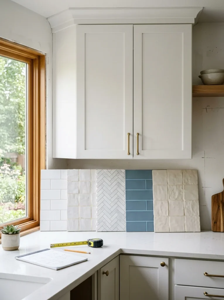
Regardless of which specific direction you’re leaning toward from this entire list, ordering a genuine sample board, ideally at least a square foot of your actual chosen tile installed with your intended grout color, and observing it directly against your actual cabinets in your kitchen’s specific lighting conditions throughout different times of day, remains the single most important step before committing to a full material order. I did exactly this before finalizing my own backsplash choice, and the sample board process actually changed my mind on my initial tile selection once I saw how differently it read in my kitchen’s specific north-facing light compared to how it appeared under the tile showroom’s considerably brighter, warmer overhead lighting. I’d recommend propping this sample board directly against your installed cabinets, rather than just holding it up briefly, and genuinely living with it in that position for at least a few days if possible, checking it during morning light, midday, and evening artificial lighting, since a tile that looks perfect under one specific lighting condition can read quite differently once your kitchen’s actual daily light changes throughout a full day’s cycle.
Final Thoughts
Looking back at how confidently I assumed the backsplash decision would be the easy, straightforward part of my renovation, it’s genuinely humbling how much more thought and research it actually required once I started seriously considering all the ways the same white cabinets could be transformed by such different backsplash choices. Between all 21 of these ideas, the underlying theme is really that white cabinets, precisely because of their neutral versatility, put considerably more design responsibility on the backsplash choice than a more distinctly colored cabinet might, since the backsplash often ends up defining the kitchen’s overall character and mood in a way that white cabinetry alone simply doesn’t.
If you’re still deciding on your own backsplash for white cabinets, I’d suggest starting with the sample board testing covered in the final idea before finalizing any specific direction, regardless of which style initially draws your attention most, since seeing your actual chosen material against your actual cabinets in your actual kitchen’s lighting genuinely changes the equation in ways that photos and showroom samples alone simply can’t fully predict. That extra step of patience, more than any single specific tile choice on this entire list, is ultimately what led me to a backsplash I’m still genuinely happy with every time I walk into my kitchen.