
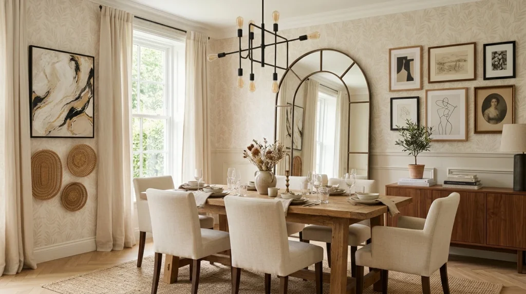
My dining room sat empty for almost a year after I moved in, not because I didn’t have furniture, but because the table and chairs arrived long before I had any idea what to do with the walls surrounding them. Every dinner during that stretch happened under bare, slightly yellowed builder-grade paint, and it wasn’t until a holiday gathering, when I suddenly noticed how unfinished the room looked in photos everyone was taking, that I finally sat down and actually planned out the walls properly. What followed was several months of trial, error, and a few returned purchases before the room finally felt like somewhere I wanted people to linger after dinner instead of just eat and leave.
If your dining room walls are still in that same undecorated limbo, here are 18 ideas, each explained in detail, drawn from what worked in my own space and a handful of other dining rooms I’ve watched come together over the years.
1. A Large-Scale Statement Mirror
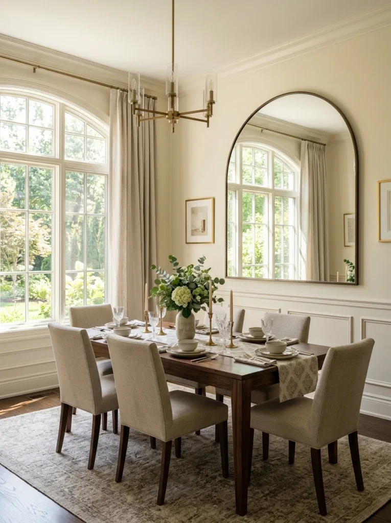
I hung an oversized arched mirror on the wall opposite my dining room window, and it remains the single change that made the biggest visual difference in the entire room. Beyond simply looking striking, it bounces natural light from the window back across the table, which matters enormously during dinner parties when you want the space to feel bright and welcoming rather than dim. Scale is everything with this idea: a small mirror gets visually lost on a large dining room wall, while an appropriately oversized one, at least two-thirds the width of your table, becomes a genuine focal point on its own. I chose a thin black metal frame to contrast against my lighter walls, though a gold or brass frame can add warmth if your dining room leans more traditional. The reflective surface also has the practical benefit of making a smaller dining room feel noticeably more spacious, since it visually doubles the depth of whatever’s reflected in it, an effect that’s especially useful if your dining area is on the tighter side.
2. A Curated Gallery Wall Behind the Buffet
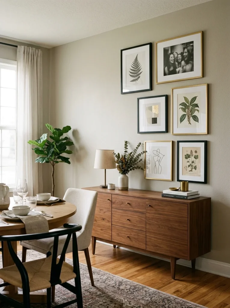
Above my sideboard, I built a gallery wall using six mismatched frames in complementary black and gold tones, filled with a mix of botanical prints, a black-and-white photograph, and a small abstract piece I found at a local art fair. Keeping the frame finishes limited to just two coordinating colors, rather than a completely random assortment, is what stops a gallery wall from looking chaotic and instead makes it feel like an intentional, curated collection. I laid every piece out on the floor first, adjusting the arrangement repeatedly until the spacing felt balanced, before committing to a single nail hole in the wall. This idea works particularly well positioned above a buffet or sideboard specifically, since the furniture below anchors the arrangement visually and gives your eye a natural stopping point rather than the gallery wall floating awkwardly in open space. If you’re nervous about spacing, painter’s tape outlines on the wall before hanging anything permanently can save you from unnecessary extra holes if you need to adjust the layout partway through.
3. Bold Wallpaper on an Accent Wall
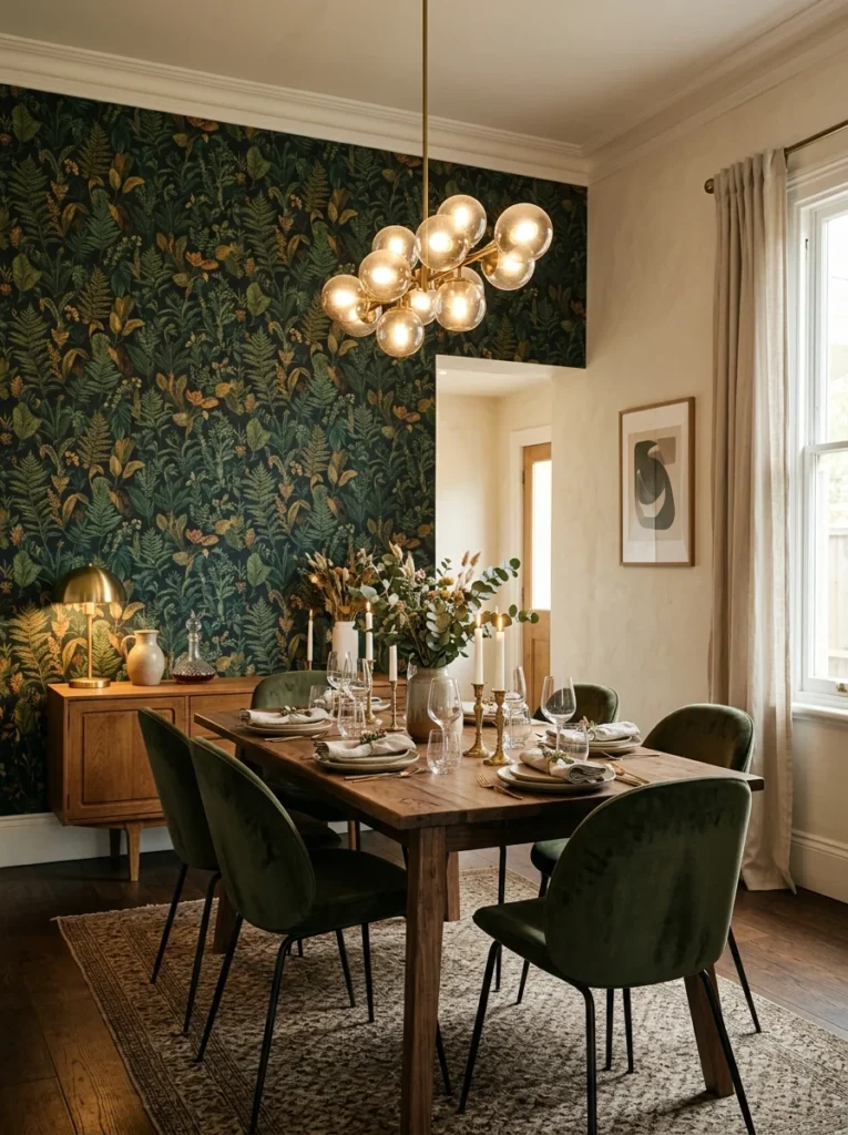
I wallpapered just the wall behind my dining table in a deep botanical print, leaving the remaining three walls a plain, complementary neutral, and the contrast gives the room a genuine sense of drama every time someone walks in for the first time. Dining rooms are actually one of the best spaces in a home to experiment with bold wallpaper, since you’re typically not spending hours at a time staring directly at the pattern the way you might in a bedroom or home office. I chose a peel-and-stick version specifically because it made the whole project reversible, which gave me the confidence to commit to a genuinely bold, saturated pattern I might have hesitated on with traditional wallpaper. Positioning the boldest pattern behind the table, rather than on a side wall, means it naturally becomes the backdrop in photos taken during dinners and gatherings, which is exactly the effect I was hoping for. If a full wall feels like too much commitment, wallpapering just the lower half with a chair rail dividing it from a painted upper wall is a slightly more restrained version of this same idea.
4. Plate Wall Displays
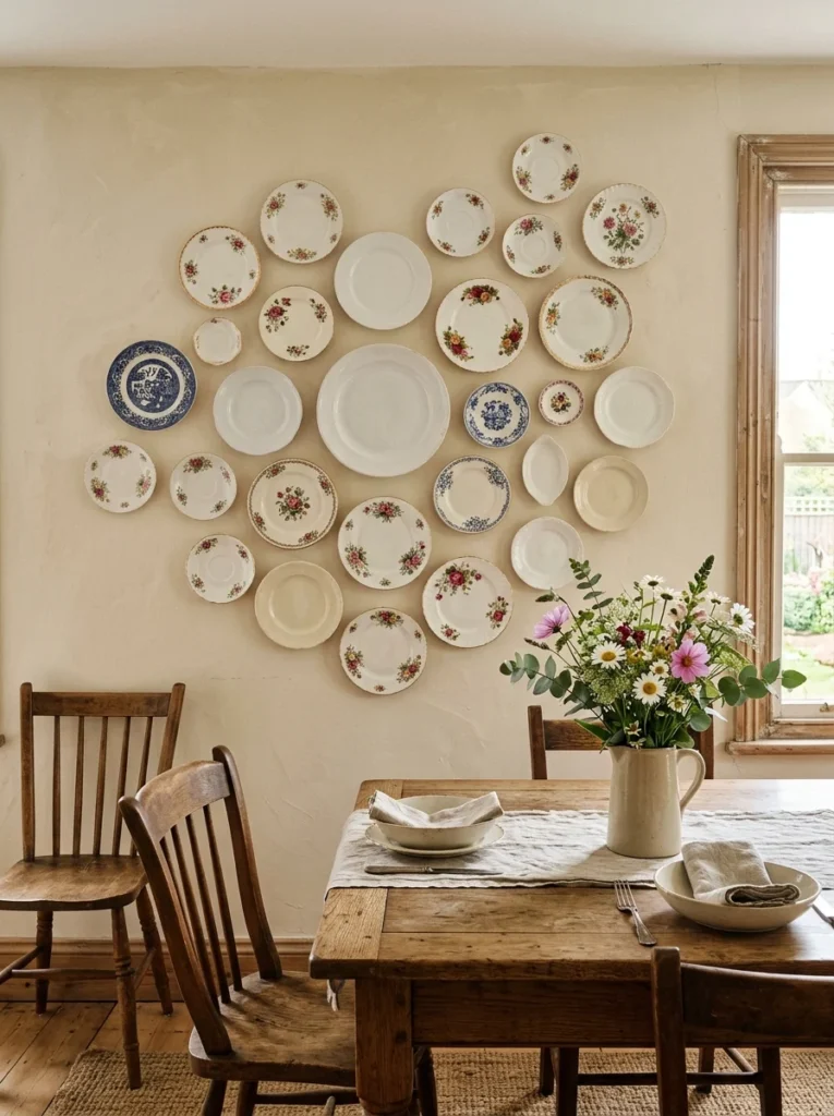
Hanging a cluster of decorative plates directly on the wall is a genuinely old design tradition that’s come back around, and I built mine using a mix of vintage floral plates I found at estate sales alongside a few plain white ones for visual breathing room between the more ornate pieces. Plate hangers, small metal clips that grip the plate’s edge, make this a completely reversible, low-commitment project, since nothing requires drilling into the plates themselves. Arranging the plates in a loose, organic cluster rather than a rigid grid tends to look more natural and collected over time, similar to the effect of a well-done gallery wall using art instead of dishware. This idea works especially well in a dining room with a vintage, eclectic, or farmhouse aesthetic, since the plates themselves carry a sense of history that more modern decor items simply don’t have. I’d recommend starting with just three or four plates and gradually adding more over time as you find pieces you genuinely love, rather than buying a full set all at once just to fill the wall quickly.
5. Floor-to-Ceiling Drapery
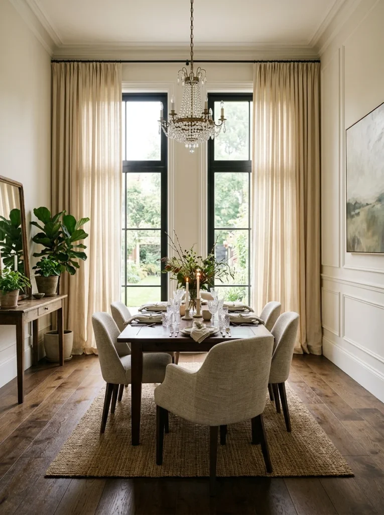
Extending curtains from just above the ceiling line all the way down to the floor, even over a window that’s much smaller than the curtain rod itself, made my entire dining room feel taller and more architecturally intentional than the actual dimensions of the room technically allow. I chose a heavy linen fabric in a warm cream tone, and beyond the visual impact, the extra fabric adds a noticeable softening effect to a room that otherwise had a lot of hard surfaces, wood table, wood floors, and plaster walls. This is one of those design tricks that photographs beautifully and genuinely changes how a room feels day to day, all for the relative cost of just fabric and a curtain rod. I’d recommend mounting the rod as close to the ceiling as your walls allow, rather than directly above the window frame, since that extra vertical space is really what creates the illusion of higher ceilings. Even in a dining room with minimal or no natural window light, drapery hung purely for its textural and dramatic effect around a non-functional space can achieve a similar visual outcome.
6. A Dramatic Statement Chandelier

While technically a lighting fixture rather than traditional wall decor, the chandelier hanging above my dining table draws so much visual attention that it functions almost like the room’s primary art piece, with the walls themselves playing a supporting role. I chose a black metal fixture with an organic, branch-like silhouette, which contrasts nicely against my lighter walls and adds a sculptural quality to the room even during the day when it’s not turned on. Scale matters enormously here, and a common mistake is choosing a fixture that’s too small for the table beneath it, leaving it looking underwhelming rather than like a genuine statement piece. A general guideline I’ve found useful is that the chandelier’s diameter should be roughly half the width of your table, which gives you a reasonable starting point for what tends to look proportionally correct in most standard dining rooms. Since the chandelier becomes such a dominant visual element, I’d recommend choosing your other wall decor to complement rather than compete with it, keeping surrounding pieces slightly more understated so the room doesn’t feel visually overcrowded.
7. Textile Wall Hangings
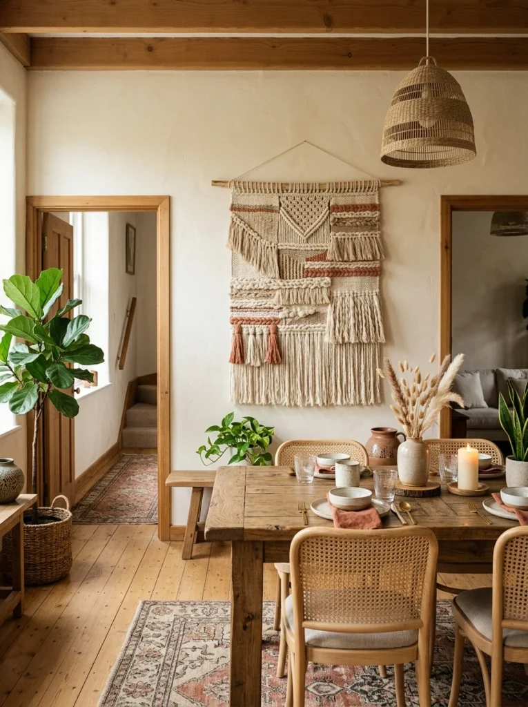
A large woven textile piece, hung directly on the wall much like a tapestry, adds warmth, texture, and a sense of craftsmanship that flat printed art simply can’t replicate, and mine has become one of the most commented-on pieces whenever I have guests over. I positioned it on the shorter wall of my dining room, a spot that would otherwise be a somewhat awkward, narrow stretch of blank space between two doorways. Textile pieces work particularly well in rooms that already lean toward a boho, global, or eclectic aesthetic, though even a single well-chosen textile can add an interesting textural contrast in a more modern, minimalist dining room as a single statement piece. Mounting is typically simple, either a dowel rod threaded through a fabric sleeve at the top or basic wall hooks, depending on the specific piece’s construction. I’d recommend choosing something with a color palette that complements your existing dining chairs or table linens, since that connection ties the piece into the room’s overall color story rather than feeling like an unrelated addition.
8. Open Wine or Glassware Display
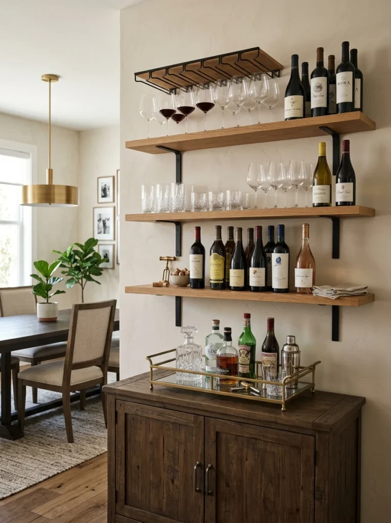
Building a small open shelving unit specifically for glassware and a few favored wine bottles along one dining room wall turned an otherwise blank stretch into a functional, genuinely beautiful display that gets used every time we host. I used simple black metal shelving brackets with wood shelves, keeping the glassware organized by type, wine glasses on one shelf, water glasses on another, rather than mixing everything together randomly. The subtle variation in glass shapes and the deep colors of wine bottles add visual interest and texture in a way that’s difficult to achieve with flat wall art alone. This idea works especially well positioned near a buffet or bar cart, creating a cohesive serving and display zone within the larger dining room rather than scattering these functional elements across unrelated parts of the space. I’d recommend keeping the shelving relatively open and uncluttered, resisting the urge to fill every available inch, since the negative space between items is actually what makes the display feel curated rather than crowded.
9. A Large-Scale Abstract Painting
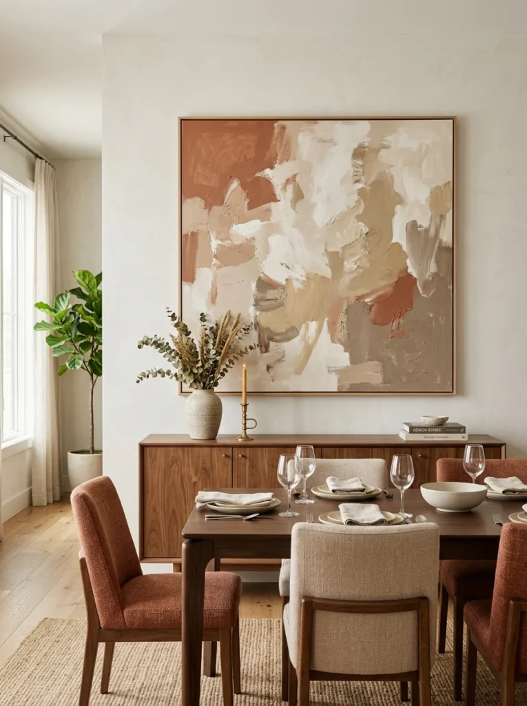
A single, oversized abstract painting above my buffet has done more visual work in the dining room than several smaller pieces combined ever did when I first tried filling that same wall. There’s something about one large, confident piece of art that reads as more intentional and higher-end than a cluster of smaller items, even when the actual cost is comparable. I chose a piece with warm terracotta and cream tones that pull directly from my dining chair upholstery, creating a color connection between the art and the furniture that ties the whole room together. If commissioning or buying an original piece isn’t in your budget, a well-printed, properly stretched canvas reproduction can achieve a very similar visual effect for considerably less money. Positioning is important here too, and I’d recommend centering the piece above the furniture beneath it, whether that’s a buffet or the dining table itself, rather than centering it on the wall as a whole if the wall extends beyond the furniture’s width.
10. Rattan or Wicker Wall Art
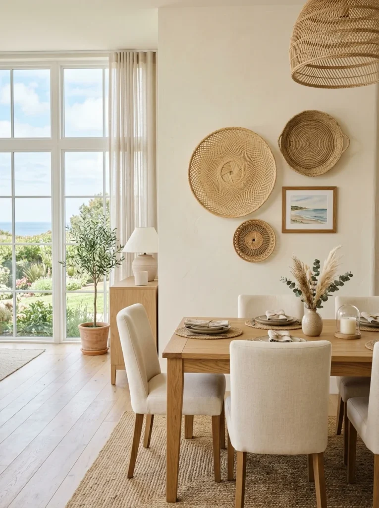
Circular rattan mirrors, woven wall discs, and even simple rattan chargers mounted directly on the wall add a natural, textural element that pairs beautifully with wood dining tables and warm, earthy color palettes. I clustered three different-sized rattan pieces in an asymmetrical arrangement on the wall beside my window, and the natural fiber texture softens what would otherwise be a fairly hard-edged combination of wood furniture and plaster walls. This idea is particularly budget-friendly, since rattan chargers and small woven discs are often available for just a few dollars each, making it possible to build a fairly substantial wall display without a large investment. Mixing rattan with a single framed piece of art or a small mirror within the same cluster prevents the arrangement from feeling one-note, adding just enough variety to keep the eye interested as it moves across the grouping. This works especially well in dining rooms with a coastal, boho, or Mediterranean-inspired aesthetic, where that natural, sun-bleached texture feels most at home alongside the room’s other design choices.
11. A Board and Batten Accent Wall
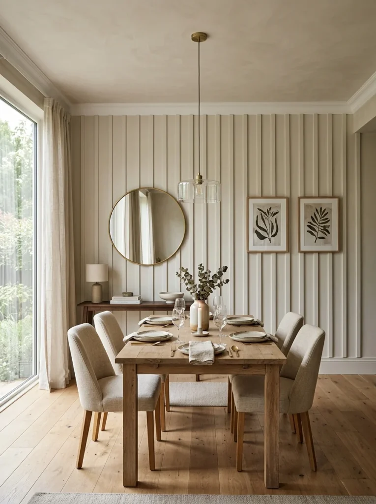
Adding vertical wood battens to the lower half of one dining room wall, painted the same color as the wall itself, gave the room a subtle architectural detail that reads as custom millwork rather than a weekend DIY project, which is honestly what it actually was. I painted the entire wall, battens included, a single warm white, which keeps the look cohesive and understated rather than creating stark contrast between the trim and the wall behind it. This type of textural, dimensional wall treatment adds visual interest without requiring any actual art or decor items, which makes it a particularly good option if you want a finished, intentional look without ongoing curation and styling decisions. The project itself is fairly approachable for a moderately handy homeowner, typically involving pre-primed wood strips, adhesive, and a level, though I’d recommend watching a few tutorials specific to your wall’s dimensions before starting, since spacing consistency matters a lot for the finished look. This idea pairs particularly well with a simpler overall dining room styling approach, since the wall treatment itself is doing a significant amount of the visual heavy lifting.
12. A Vintage Map or Travel-Themed Wall
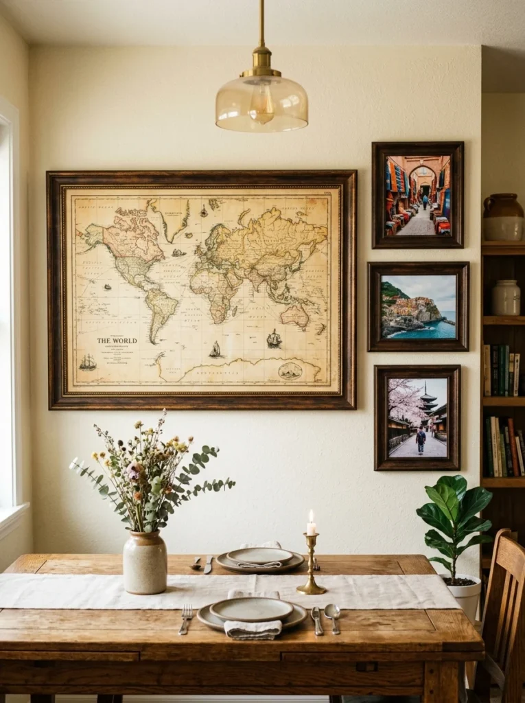
For dining rooms that double as a space for hosting friends and telling stories, a large vintage-style map or a cluster of travel photographs adds a personal, conversation-starting element that generic decorative art rarely achieves. I framed a large antique-style map of the region where I grew up, alongside three smaller travel photos from trips that meant something to me personally, and it’s become a genuine talking point during longer dinners when conversation naturally turns toward travel and memories. This idea works particularly well if you or your family have a genuine travel history to draw from, since the personal connection is really what elevates it beyond just decorative wallpaper with a map print. I’d recommend choosing a consistent frame style across the whole arrangement, even if the images themselves vary in size and subject, to keep the overall display feeling cohesive rather than like a random assortment of unrelated pieces. This concept also works well adapted to other personal themes beyond travel, family recipes, meaningful quotes, or milestone photographs, depending on what feels most authentic to your own household’s story.
13. A Built-In Wine Wall
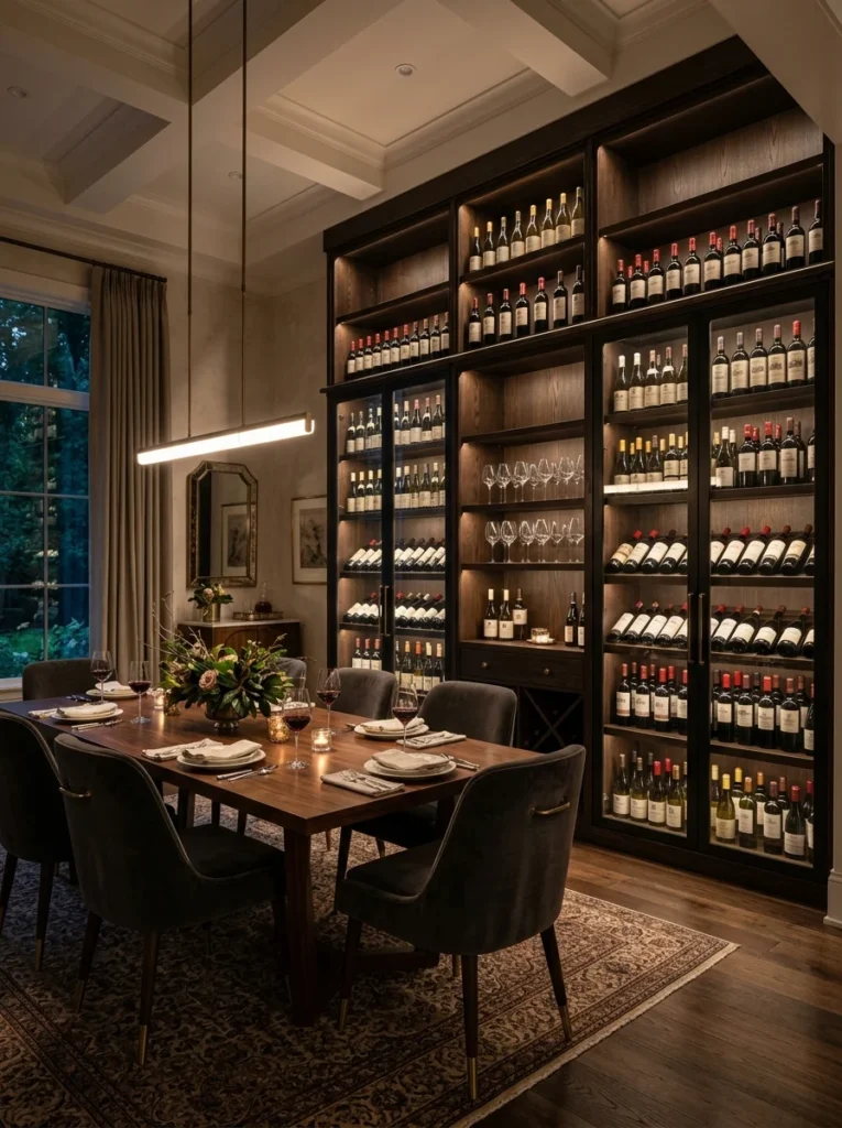
For dining rooms adjacent to a kitchen or with access to plumbing and electrical work, a built-in wine wall, essentially a floor-to-ceiling wine storage and display unit, transforms an entire section of wall into both functional storage and a genuine architectural feature. A neighbor of mine converted an unused closet directly off her dining room into exactly this, with glass-front storage and integrated lighting that highlights the bottles beautifully during evening dinners. This is admittedly one of the more involved and costly ideas on this list, typically requiring a contractor for proper ventilation and structural considerations, but for anyone already planning a larger renovation, it’s worth considering if you regularly host and enjoy wine as part of that hosting experience. The visual impact of a well-lit, organized wine display genuinely rivals traditional art in terms of how much attention it draws in the room, while also serving an obviously practical purpose beyond pure decoration. If a full built-in isn’t feasible, a smaller wall-mounted wine rack, similar to the open glassware shelving mentioned earlier, can achieve a scaled-down version of the same basic concept.
14. Layered Frames of Varying Depths
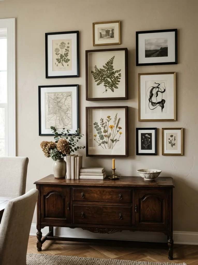
Rather than keeping every frame in a gallery wall flush against the surface, I mixed in a few deeper shadow box frames alongside standard flat ones, and the resulting variation in depth adds a subtle but noticeable three-dimensional quality to the whole arrangement that a completely flat gallery wall doesn’t have. The shadow boxes hold a few pressed botanical specimens I collected on a hike, while the flat frames hold traditional prints, and that combination of dimensional and flat elements keeps the eye moving across the wall in a more dynamic way. This is a relatively subtle technique that most guests probably won’t consciously notice, but it’s part of what makes a gallery wall feel more sophisticated and considered rather than like a straightforward grid of identical picture frames. I’d recommend limiting the deeper shadow box elements to just one or two pieces within a larger arrangement, since too many can start to look visually busy rather than adding the intended subtle depth. This idea works well for anyone who already has small three-dimensional keepsakes, pressed flowers, small collected objects, ticket stubs, that don’t quite work as standard flat framed art on their own.
15. A Built-In Banquette With Cushioned Backing
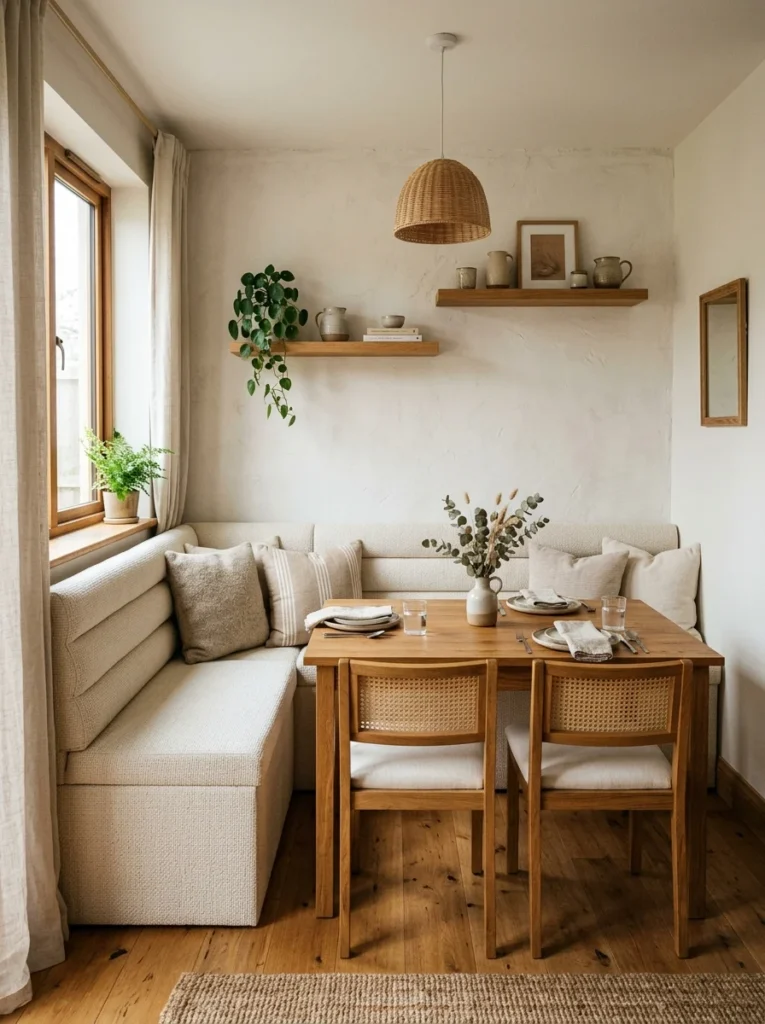
While primarily a seating solution rather than pure wall decor, a built-in banquette with an upholstered, cushioned back essentially turns one entire dining room wall into a soft, textured surface rather than plain painted drywall. I had a simple bench built along one wall of my dining room, upholstered in a durable woven fabric, and the cushioned backing against the wall adds both comfort and a completely different visual texture compared to the room’s other hard surfaces. This approach works particularly well in dining rooms where floor space is limited, since a banquette typically takes up less room than traditional chairs along that same wall while still comfortably seating multiple people. Choosing a fabric that can handle everyday wear, spills, and general use matters considerably here, and I’d recommend a performance fabric specifically rated for dining use rather than a delicate decorative textile that won’t hold up well over time. Beyond the practical seating benefit, the softened wall surface changes the acoustic quality of the room slightly too, absorbing some sound rather than letting conversation and clattering dishes echo off a hard, flat wall the way they would otherwise.
16. A Collection of Woven Wall Baskets in a Pattern
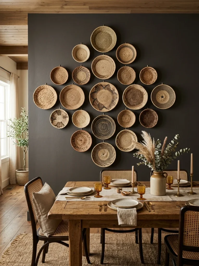
Similar in spirit to the rattan idea mentioned earlier but distinct in execution, arranging a large, symmetrical pattern of woven baskets, sometimes a dozen or more, across an entire dining room wall creates a bold, textural statement that functions almost like patterned wallpaper made entirely of natural materials. I’ve seen this done particularly well in a friend’s dining room, where she arranged nearly twenty small baskets in a diamond grid pattern covering almost the entire wall behind her table, and the effect is genuinely striking, especially with natural light hitting the varied textures throughout the day. This is a more involved, labor-intensive project than a small cluster of three or four baskets, requiring careful planning and measuring to keep the pattern symmetrical, but the resulting visual impact is considerably more dramatic. I’d recommend sketching out your intended pattern on paper first, accounting for the exact wall dimensions, before purchasing baskets or beginning to hang anything, since adjusting a large symmetrical pattern after the fact is far more difficult than planning it carefully from the start. This idea works best in a dining room that can support a strong boho or global-inspired aesthetic throughout the rest of the space, since it’s a fairly bold, committed design choice rather than a subtle accent.
17. A Mixed-Media Wall Combining Art and Function
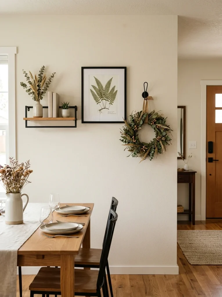
Rather than dedicating a wall entirely to either pure decoration or pure function, I combined a small floating shelf, a piece of framed art, and a single decorative hook for a seasonal wreath or bag storage all within the same section of wall near my dining room entrance. This layered, mixed-media approach means the wall is doing more than one job at once, providing visual interest while also offering genuinely useful storage and display space for items that change throughout the year. I’d recommend choosing elements that share a common color palette or material, in my case, black metal hardware and warm wood tones, so the mixed functions still read as one cohesive design moment rather than several unrelated things competing for the same wall space. This concept works particularly well near a dining room’s entry point, since that transitional space often needs to serve multiple practical purposes anyway, unlike the wall directly behind the table which typically has more freedom to be purely decorative. Layering function and decoration together like this is also a practical approach for smaller dining rooms where every wall genuinely needs to earn its keep rather than being purely ornamental.
18. Rotating Art With a Picture Ledge
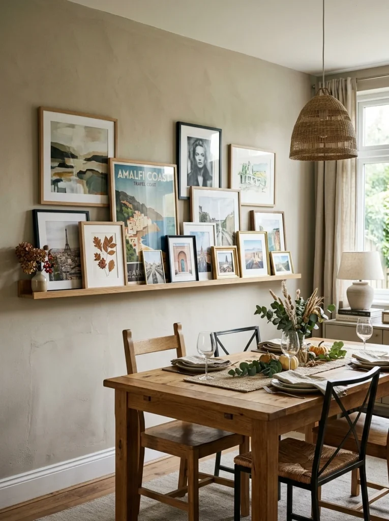
Rather than committing to permanently mounted art, I installed a simple picture ledge, a narrow shelf just wide enough to lean framed pieces against the wall, which lets me swap out artwork whenever I want without creating new nail holes each time. This has turned into one of my favorite dining room features specifically because it keeps the space feeling current, I’ll rotate in seasonal pieces, recent travel photos, or even just whatever new print I’ve picked up that I’m excited about at the moment. Leaning multiple pieces slightly overlapped on the same ledge, rather than displaying just one piece at a time, creates a layered, collected look that’s harder to achieve with traditionally mounted frames. I’d recommend choosing a ledge with at least a two-inch lip, deep enough to securely hold standard frame sizes without them slipping forward, especially if you’re leaning several pieces together at once. This is one of the lowest-commitment ideas on this entire list, and it’s a particularly good starting point if you’re still developing your dining room’s overall style and don’t want to commit to permanently mounted art before you’re confident in the final direction.
Final Thoughts
Looking back at that first year of bare, slightly yellowed walls, it’s strange to think how much of the room’s actual personality was missing simply because I hadn’t gotten around to the walls yet. Between all 18 of these ideas, the underlying theme is really about treating the dining room’s walls with the same intentionality as the table and chairs themselves, since that surrounding backdrop shapes how the entire space feels every time you sit down to eat.
If your own dining room walls are still waiting for attention, I’d suggest starting with just one anchor piece, a statement mirror, a single large painting, or even just a picture ledge you can build on gradually, rather than trying to finish the entire room in one weekend. That’s essentially how mine finally came together, one deliberate addition at a time, until the room stopped feeling like an afterthought and started feeling like somewhere people actually wanted to stay after the meal was finished.