
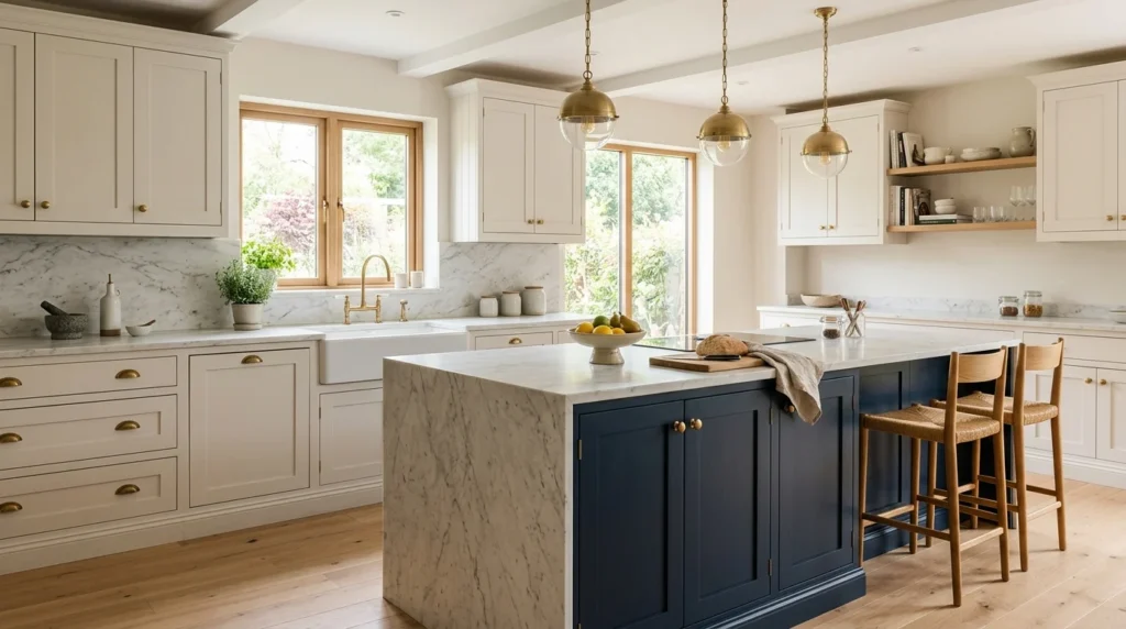
Somewhere around my fourth trip back to the paint store, holding yet another handful of sample chips against my kitchen’s existing cabinet doors, I finally understood why people say cabinet color is one of the most consequential decisions in an entire kitchen renovation. It’s not just a color choice, it’s the decision that every other element in the room ends up responding to, the countertop, the backsplash, the hardware, even the flooring you might not have thought was up for reconsideration until suddenly it looked wrong against your new cabinet color. What started as what I assumed would be a quick decision turned into weeks of genuine deliberation, and the process taught me more about how color actually functions within a room than I expected from what I’d initially treated as a fairly straightforward choice.
If you’re standing at the beginning of that same decision process, here are 20 kitchen cabinet color ideas, each explained in detail, based on what I learned during my own lengthy deliberation and what I’ve observed working beautifully in other kitchens since.
1. Warm White for Timeless Versatility
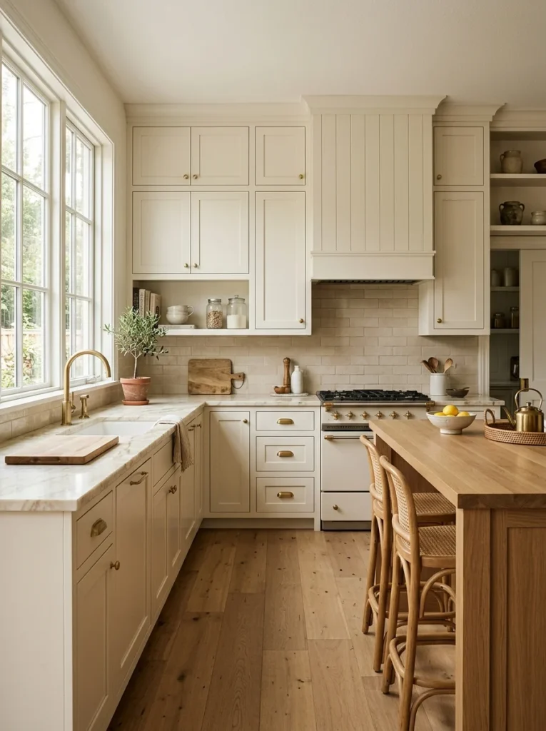
Warm white remains one of the most popular cabinet colors for good reason, offering a bright, clean foundation that pairs with virtually any countertop, backsplash, or hardware finish while avoiding the stark, slightly clinical quality that a cooler, more blue-toned white can sometimes bring to a kitchen. I seriously considered this direction for my own kitchen before ultimately choosing something bolder, but the warm white samples I tested genuinely brightened my kitchen’s relatively limited natural light in a way that felt immediately appealing. The specific undertone matters considerably here, and I’d recommend testing several different warm white options side by side, since some lean slightly yellow, others slightly beige or greige, and these subtle differences become considerably more apparent once painted at full scale across an entire kitchen’s worth of cabinetry rather than viewed as a small chip. This remains an excellent choice for anyone prioritizing resale value or simply wanting a genuinely timeless foundation that won’t feel dated as design trends inevitably shift over the coming years.
2. Deep Navy for Dramatic Sophistication
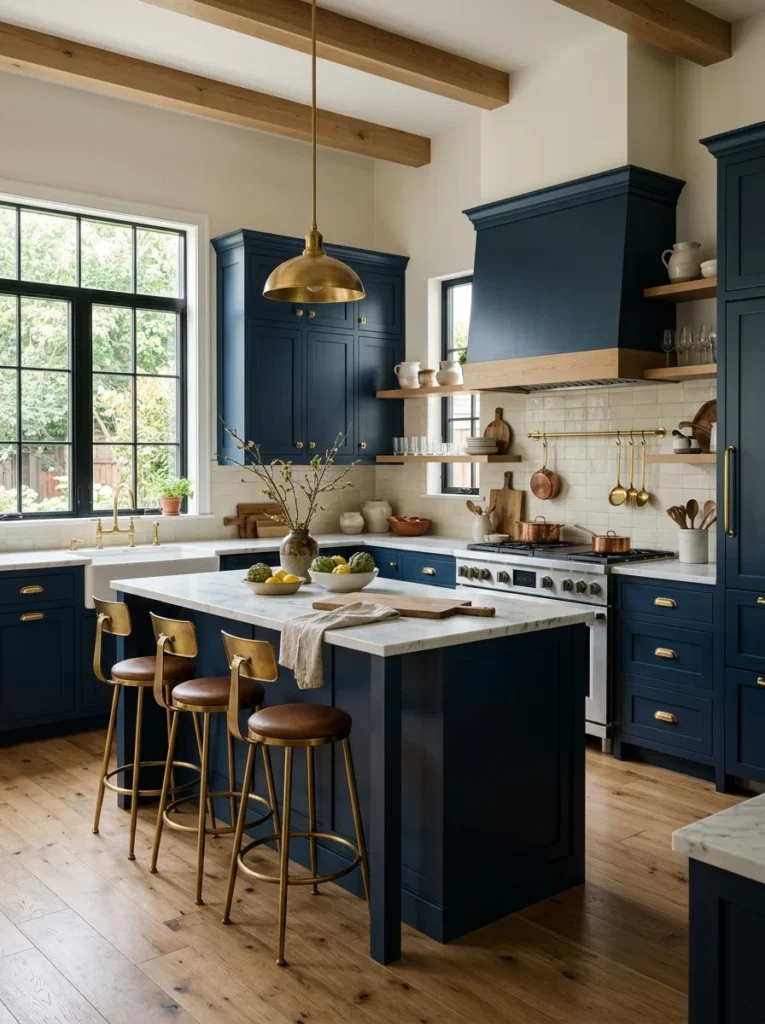
Navy blue cabinets have moved from a bold, somewhat daring choice a decade ago into a genuinely mainstream, sophisticated option that reads as classic rather than trend-chasing, and it’s ultimately the direction I chose for my own kitchen island specifically. The depth and richness of a good navy creates genuine visual drama without tipping into the starkness that pure black can sometimes bring to a smaller kitchen, striking a balance between boldness and warmth that I found genuinely appealing once I saw it painted at full scale. Navy pairs particularly beautifully with brass or gold hardware, the warm metal tones providing contrast against the cool, deep blue that creates a genuinely luxurious overall effect. I’d recommend this specifically for anyone wanting a bold statement that still feels timeless rather than tied to a particular passing trend, since navy has demonstrated remarkable staying power in kitchen design compared to some of the more fleeting bold color choices that have cycled through popularity over recent years.
3. Sage Green for Organic Warmth
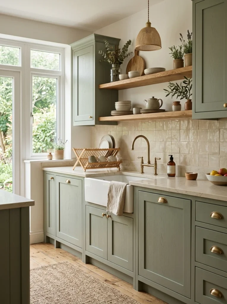
Sage green has become one of the defining kitchen cabinet colors of recent years, offering an earthy, calming quality that feels connected to nature without being as intensely saturated or potentially overwhelming as a deeper forest green might be in a smaller kitchen space. A friend chose this direction for her own kitchen renovation, and the soft, muted quality of her specific sage shade genuinely creates a calming atmosphere that she’s mentioned makes cooking feel considerably less stressful compared to her previous, more stark white kitchen. This color pairs beautifully with warm wood tones, brass hardware, and natural stone countertops, reinforcing that overall organic, earthy aesthetic throughout the room rather than existing as an isolated color choice disconnected from the kitchen’s other materials. I’d recommend testing several different sage shades specifically, since this color family ranges from nearly grey-green to considerably more saturated and yellow-leaning options, and the specific shade you choose meaningfully affects whether the final result reads as soft and muted or more vibrant and attention-grabbing.
4. Charcoal Grey for Modern Depth
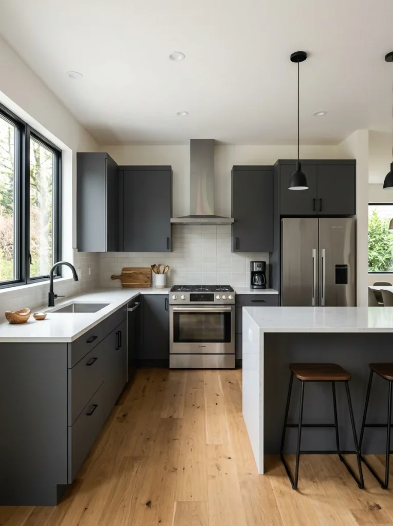
Charcoal grey cabinets offer nearly all the dramatic depth of black while maintaining slightly more warmth and softness, making this a popular choice for anyone wanting a bold, modern statement without the potential starkness or heaviness that pure black can bring to a kitchen, particularly one without abundant natural light. I tested a charcoal sample extensively during my own decision process, genuinely drawn to how sophisticated it looked against my stainless steel appliances, though I ultimately chose navy for the additional color dimension it provided beyond charcoal’s more purely neutral, tonal quality. This color works particularly well in kitchens with strong natural light, since the depth of charcoal can make a naturally darker kitchen feel even more enclosed, while a bright, sunlit kitchen handles that same depth beautifully without feeling oppressive. I’d recommend pairing charcoal specifically with lighter countertops and backsplash materials to maintain balance in the room, since an entirely dark color palette throughout every surface can tip a kitchen from dramatically sophisticated into genuinely too dim and heavy for comfortable daily use.
5. Warm Terracotta for Bold Personality
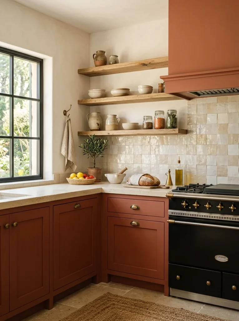
For anyone wanting genuine boldness beyond the now fairly common navy and sage options, warm terracotta cabinet color brings an entirely different, earthy warmth that feels distinctly Mediterranean or Southwestern-inspired, depending on how it’s paired with surrounding materials and finishes throughout the room. A friend used this bold direction throughout her entire kitchen, and the result feels genuinely distinctive and personal compared to some of the more common cabinet color choices I encountered while researching my own project, standing out in a way that clearly reflects her specific taste rather than following a more predictable, widely adopted trend. This color pairs particularly beautifully with warm wood accents, woven textures, and brass hardware, reinforcing that same earthy, warm palette throughout the kitchen’s other materials and finishes rather than existing as an isolated bold choice disconnected from everything surrounding it. I’d recommend this specifically for anyone genuinely drawn to a warmer, more unconventional color palette and comfortable with a kitchen that reads as distinctly personal rather than following more common, broadly appealing cabinet color choices.
6. Soft Blush for Unexpected Femininity
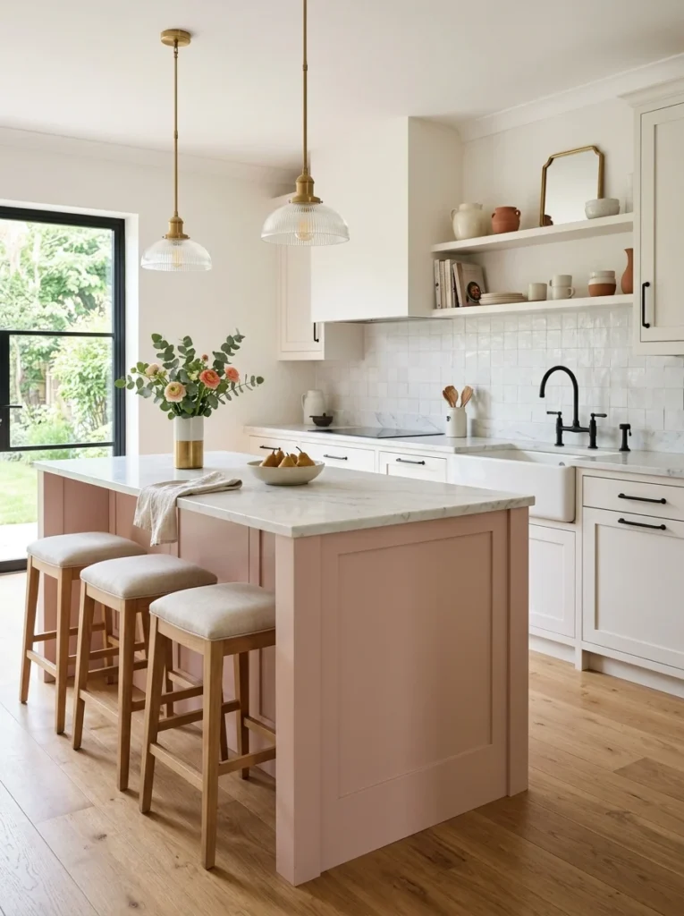
Soft blush or dusty pink cabinets represent one of the more unexpected, distinctive choices on this entire list, but when executed thoughtfully, paired with the right complementary materials, this color can create a genuinely sophisticated, unexpectedly elegant kitchen rather than reading as overly sweet or trend-driven. A friend used this color specifically for her kitchen island, keeping the surrounding perimeter cabinets in a more neutral white, and the resulting combination reads as genuinely chic and considered rather than overly precious or juvenile, largely due to how she balanced it with black hardware and a marble countertop that added sophistication and contrast. I’d recommend this specifically as an accent color, applied to an island or a smaller section of cabinetry rather than throughout an entire kitchen, since the boldness of committing an entire room to this particular color represents a considerably larger risk than incorporating it as one focused element within a broader, more neutral color scheme. This works particularly well paired with black or brass hardware and natural stone, both of which add the grounding sophistication that keeps blush from reading as overly soft or one-dimensional on its own.
7. Deep Forest Green for Rich Drama
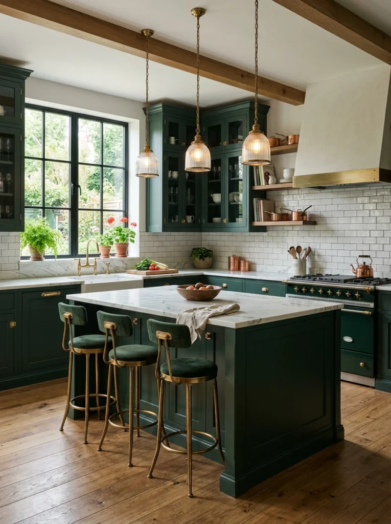
Beyond the softer, more muted quality of sage, a genuinely deep, saturated forest green cabinet color creates considerably more dramatic richness, working particularly well in larger kitchens or as a focused accent color on an island within an otherwise more neutral surrounding kitchen. A friend chose this deeper direction specifically for her kitchen, and the rich, jewel-toned quality against her brass hardware and marble countertops creates a genuinely luxurious overall effect that reads as considerably more dramatic than the softer sage green trend that’s become more broadly common in recent kitchen design. This color demands slightly more careful balance with surrounding materials compared to a softer, more muted color choice, since the saturation and depth can start to feel heavy or overwhelming if not properly balanced with lighter countertops, backsplash, and adequate natural or artificial lighting throughout the room. I’d recommend this specifically for kitchens with strong natural light or generous overall square footage, where the color’s genuine richness and depth can be fully appreciated without tipping the room toward feeling too dark or visually heavy for comfortable everyday use.
8. Warm Grey Greige for Understated Sophistication
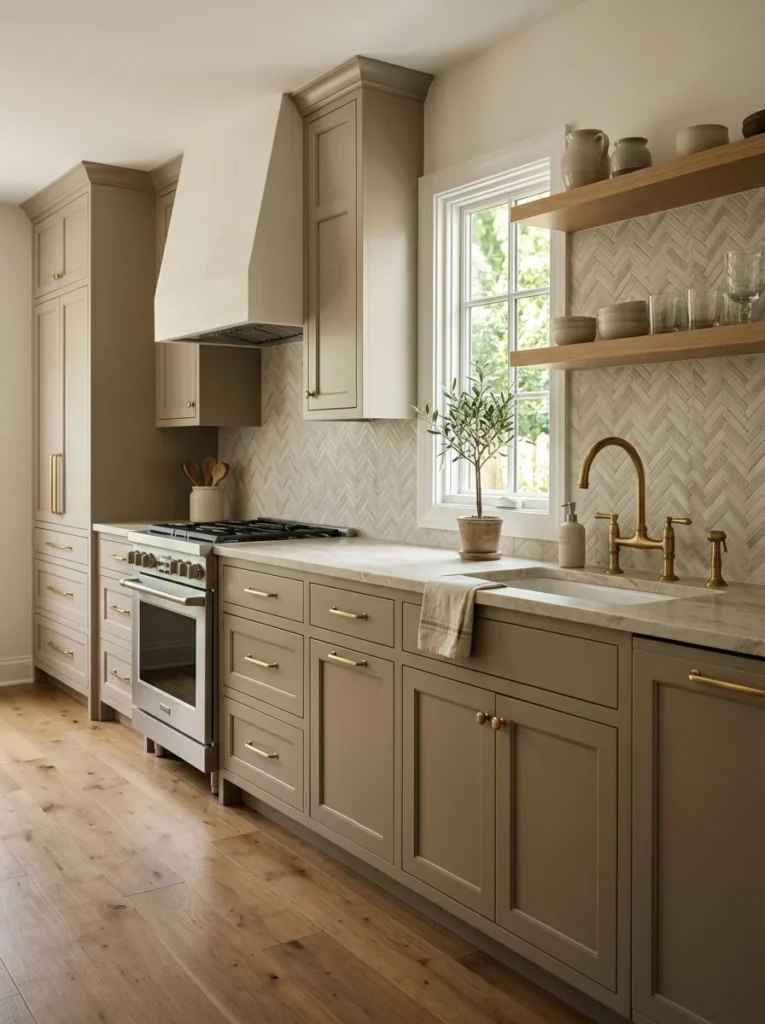
Greige, the popular blend between grey and beige, offers a genuinely versatile, understated cabinet color that provides more warmth and depth than a stark white while remaining considerably more neutral and broadly appealing than any of the bolder color choices elsewhere on this list. I tested several greige samples extensively during my own decision process, appreciating how the color shifted subtly throughout the day depending on the specific quality and angle of natural light entering my kitchen, reading slightly warmer in morning light and cooler as afternoon shadows lengthened. This color works particularly well for anyone wanting a genuine departure from stark white without committing to a distinctly bold statement color, offering a middle-ground option that still feels considered and intentional rather than purely default or safe. I’d recommend this specifically for kitchens with a lot of competing materials already in play, natural stone countertops with significant veining, patterned backsplash tile, since greige’s understated neutrality lets those other bolder elements take visual precedence rather than competing with an equally assertive cabinet color choice.
9. Black for Maximum Drama
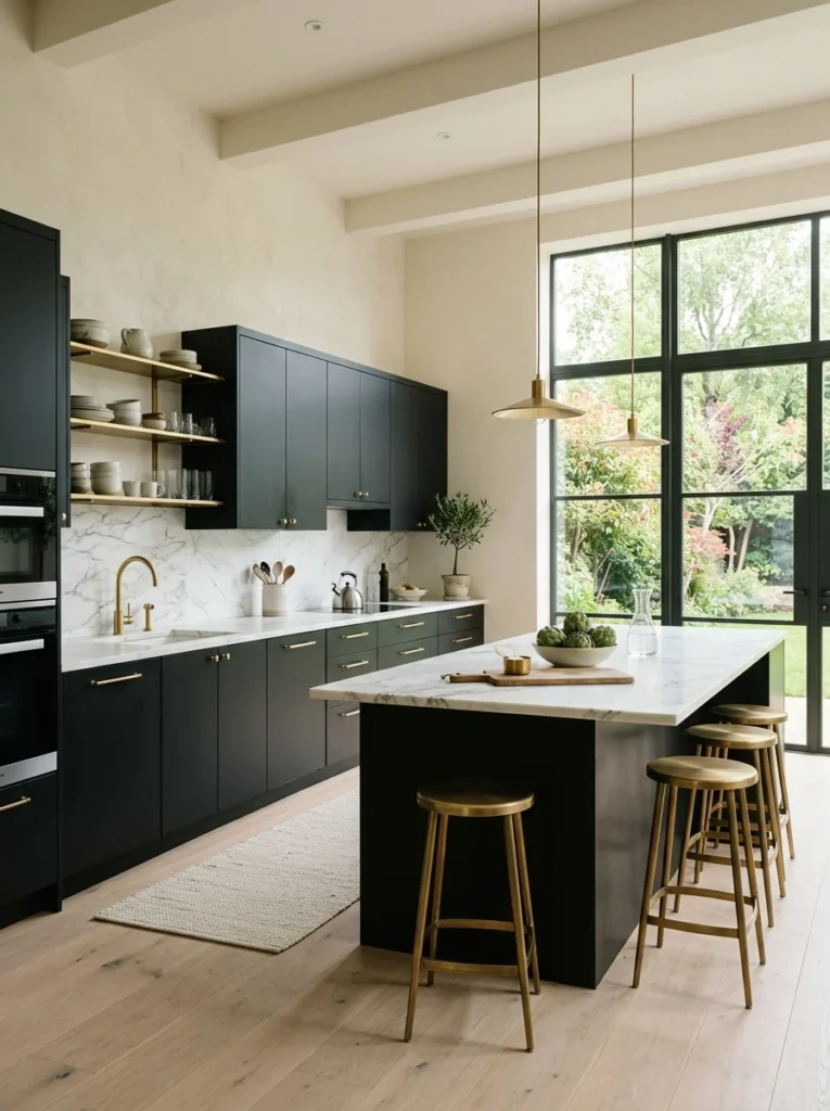
Black kitchen cabinets represent the boldest, most dramatic choice on this entire list, creating a genuinely striking, architectural statement that works particularly well in modern, minimalist kitchens with ample natural light to balance the color’s inherent depth and visual weight. A friend chose black cabinets throughout her entire kitchen renovation, and while I initially had reservations about how the color might feel in daily use, her kitchen genuinely reads as sophisticated and intentional rather than overly dark or oppressive, largely due to her kitchen’s abundant natural light and the careful balance she struck with lighter countertops and a considerable amount of brass hardware providing warm contrast throughout. This color choice demands more careful consideration of your specific kitchen’s existing natural light situation than almost any other option on this list, since a genuinely dim kitchen without much natural light exposure can feel considerably more cave-like with black cabinets than the same room would with a lighter color choice. I’d recommend this specifically for kitchens with strong, reliable natural light throughout the day, approaching this bold choice with genuine confidence rather than hesitation if your specific space can actually support it.
10. Two-Tone Combinations for Visual Interest
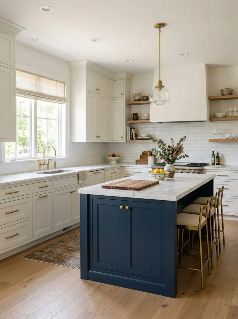
Rather than committing your entire kitchen to a single cabinet color, combining two complementary colors, a different tone for your island compared to your perimeter cabinets, creates visual interest and helps define different zones within your kitchen without the full commitment of an entirely bold single-color kitchen. I ultimately chose this exact direction for my own kitchen, navy on my island paired with warm white perimeter cabinets, and this approach let me experiment with a bolder color choice specifically on the island while keeping the surrounding cabinetry more neutral and broadly appealing. This combination approach genuinely offers the best of multiple worlds, the visual interest and personality of a bold color choice alongside the versatility and lower commitment risk of a predominantly neutral kitchen, making it a particularly good option for anyone drawn to bolder colors but nervous about committing their entire kitchen to that choice. I’d recommend researching this approach specifically in more detail if it appeals to you, since it offers genuine flexibility to experiment with color while maintaining a foundation that remains broadly appealing regardless of how your specific taste might evolve over time.
11. Warm Camel or Tan for Cozy Neutrality
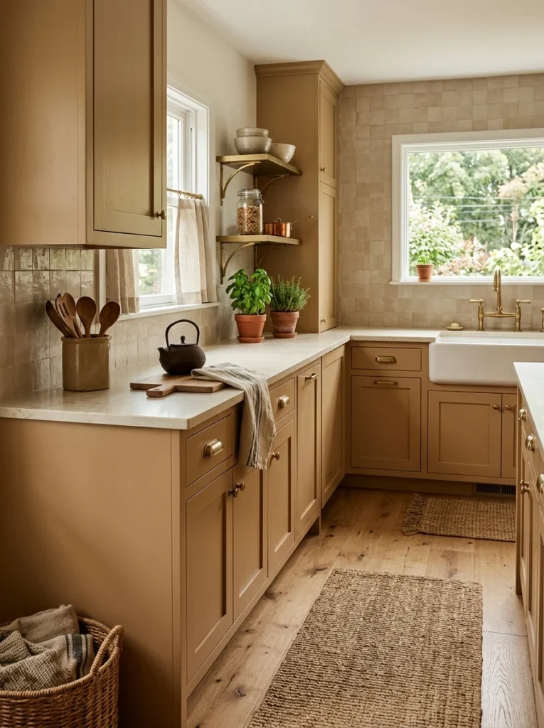
Warm camel or tan cabinet colors offer a genuinely cozy, inviting alternative to both stark white and the cooler grey family, bringing warmth reminiscent of natural leather or well-worn wood without the maintenance considerations that actual wood cabinetry might involve. A friend chose this direction for her kitchen specifically because she wanted something warmer than white but more neutral and broadly livable than some of the bolder jewel-toned options she’d also considered, and the resulting kitchen feels genuinely warm and inviting in a way that’s difficult to fully articulate but immediately noticeable upon walking into the room. This color pairs particularly well with warm wood flooring and brass or bronze hardware, reinforcing that same cozy, warm palette throughout the kitchen’s other materials rather than existing as an isolated warm element surrounded by cooler-toned surfaces. I’d recommend this specifically for anyone wanting warmth and coziness as the kitchen’s primary emotional quality, prioritizing that inviting feeling over the more dramatic visual statement that some of the bolder color choices elsewhere on this list are specifically designed to achieve.
12. Cobalt or Royal Blue for Vibrant Energy
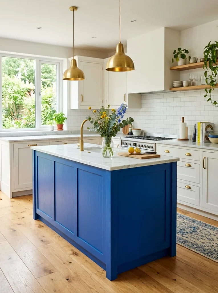
For a considerably more vibrant, energetic alternative to the deeper, more muted navy that’s become increasingly common, a genuinely saturated cobalt or royal blue cabinet color brings vivid, confident energy to a kitchen, working particularly well as a bold accent on an island within an otherwise more neutral surrounding space. A friend used this vibrant direction for her kitchen island specifically, and the confident, saturated blue against her white perimeter cabinets and marble countertops creates genuine visual excitement every time you walk into the room, feeling considerably more energetic and playful compared to the calmer, more subdued mood that deeper navy tends to establish. I’d recommend this specifically for anyone genuinely drawn to bold, saturated color and comfortable with a kitchen that makes a confident, energetic statement rather than the more subdued sophistication that some of the deeper, more muted color choices elsewhere on this list are designed to achieve. This color demands careful consideration of your other kitchen materials, generally pairing best with simpler, more neutral countertops and backsplash choices that let the vibrant cabinet color remain the room’s clear, unambiguous focal point.
13. Warm Butter Yellow for Cheerful Brightness
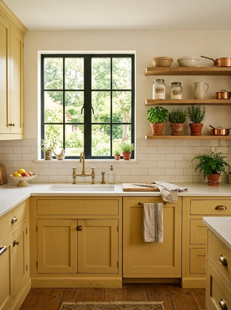
Soft, warm butter yellow cabinets bring genuine cheerfulness and brightness to a kitchen, working particularly well in spaces without abundant natural light, where the color’s inherent warmth and brightness can help compensate for a room that might otherwise feel somewhat dim or lacking in natural energy. A friend chose this direction specifically for a kitchen with limited north-facing natural light, and the soft yellow cabinets genuinely brighten the space throughout the day in a way that a cooler or more neutral color choice simply wouldn’t achieve in that same specific lighting situation. This color requires genuine confidence and comfort with a distinctly cheerful, less conventional overall kitchen aesthetic, since it represents one of the bolder, more unexpected choices on this entire list compared to the more common neutral or jewel-toned options that dominate current kitchen design trends. I’d recommend testing this color specifically in your own kitchen’s actual lighting before committing, since yellow can shift dramatically in appearance between warm and cool lighting conditions, and a shade that reads as soft and buttery under one lighting scenario might feel considerably more intense or even slightly sickly under different bulb temperatures or natural light conditions.
14. Deep Burgundy for Unexpected Richness
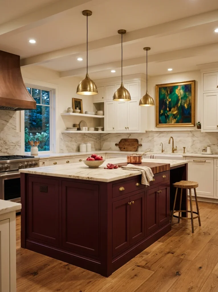
Deep burgundy or wine-toned cabinets bring a genuinely unexpected richness to kitchen design, offering jewel-toned depth similar to forest green or navy but with a warmer, more unusual quality that few kitchens actually incorporate, making this a distinctive choice for anyone wanting their kitchen to feel genuinely unlike most others they’ve seen. A friend used this bold direction specifically on a smaller kitchen island, and the deep, wine-colored cabinetry against her white perimeter cabinets and brass hardware creates a genuinely sophisticated, unexpected focal point that consistently draws comment from anyone visiting her home for the first time. This color pairs beautifully with warm wood tones and brass or copper hardware, echoing that same rich, warm quality throughout the kitchen’s other material choices rather than existing as an isolated bold color surrounded by cooler, unrelated tones. I’d recommend this specifically as an accent color applied to a smaller section of cabinetry, an island, a section of open shelving backing, rather than throughout an entire kitchen, given how genuinely bold and distinctive this particular color choice reads compared to more common cabinet color options.
15. Muted Dusty Blue for Coastal Calm
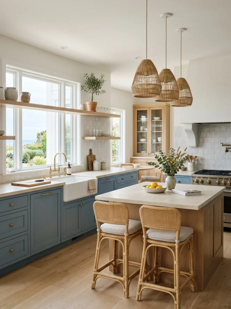
A softer, more muted dusty blue, distinct from both the deep drama of navy and the vibrant energy of cobalt, brings a genuinely calming, coastal-inspired quality to a kitchen, working particularly well in homes with a broader beach house or relaxed coastal design aesthetic throughout other rooms. A friend chose this softer blue direction for her entire kitchen, and the muted, slightly grey-leaning quality of her specific shade creates a genuinely serene atmosphere that feels connected to but distinctly different from the more common sage green that’s become popular for similar calming purposes in recent kitchen design. This color pairs particularly well with white oak or other lighter wood tones, woven natural textures, and brass or unlacquered metal hardware, reinforcing that same relaxed, coastal-inspired palette throughout the kitchen’s other materials and finishes. I’d recommend this specifically for homes with an established coastal or relaxed beach-inspired aesthetic elsewhere throughout the house, since choosing this particular color in isolation without that broader design context might feel somewhat disconnected from a kitchen’s surrounding rooms and overall design language.
16. Warm Chocolate Brown for Grounded Warmth
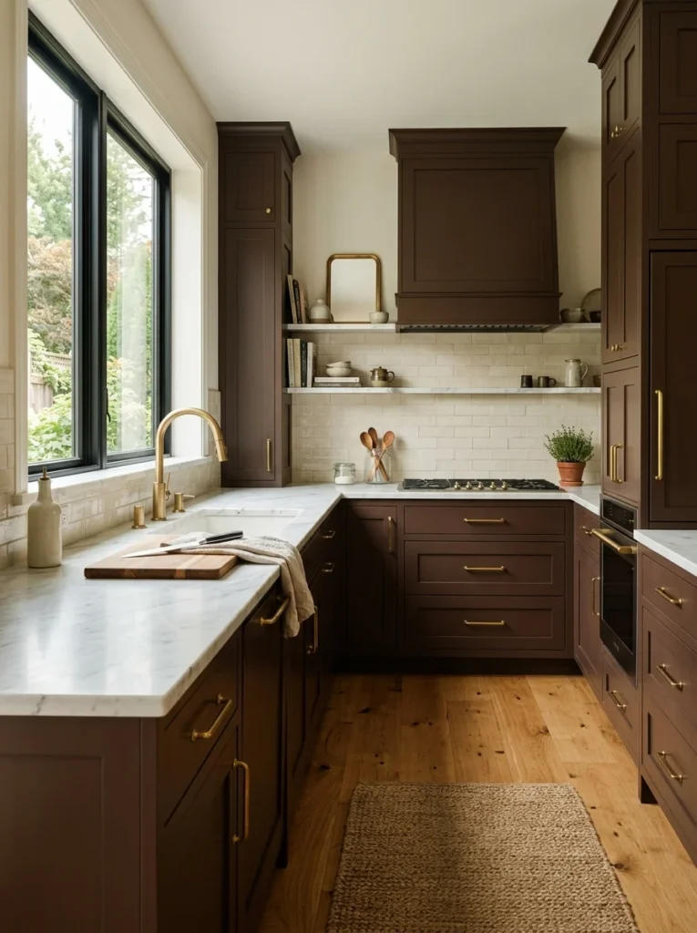
Deep, warm chocolate brown cabinets have made a notable comeback in recent kitchen design after falling out of favor for several years, offering genuine grounding warmth and richness that feels considerably more current than the honey-oak brown cabinets common in kitchens from previous decades, largely due to how this newer generation of brown pairs with more contemporary hardware and countertop choices. A friend embraced this comeback trend specifically, pairing deep chocolate cabinets with brass hardware and a white marble countertop, and the resulting combination genuinely reads as sophisticated and current rather than dated in the way brown cabinets sometimes carried a somewhat negative association from earlier design trends. I’d recommend this specifically for anyone drawn to warm, grounded tones but hesitant about committing to a more unconventional color like terracotta or burgundy, since brown offers a genuinely warm alternative that still feels more broadly familiar and approachable than some of the bolder, more unexpected color choices elsewhere on this list. This color pairs particularly well with warm metal hardware and light-colored countertops specifically, since pairing dark brown with equally dark or heavy countertop choices can tip the overall kitchen toward feeling too visually heavy and enclosed.
17. Soft Lavender for Subtle Uniqueness

Soft, muted lavender cabinet color offers one of the more genuinely unusual choices on this entire list, bringing a subtle uniqueness to kitchen design that few homeowners actually consider, largely because the color carries associations with nurseries or bedrooms rather than kitchens, an association a sophisticated, muted lavender shade can genuinely overcome when executed thoughtfully. A friend used this unexpected direction for a small butler’s pantry adjacent to her main kitchen, keeping her primary kitchen cabinets in a more conventional white, and the soft lavender in that secondary, smaller space reads as genuinely chic and considered rather than overly sweet, largely due to how she balanced it with black hardware and simple, unfussy cabinet door styling. I’d recommend this specifically as an unconventional accent choice for a smaller, secondary space rather than an entire primary kitchen, given how genuinely unusual this particular color remains within broader kitchen design trends, making it a lower-risk way to experiment with the color’s subtle uniqueness without the larger commitment of an entire main kitchen renovation.
18. Warm White With Black Accents for Timeless Contrast
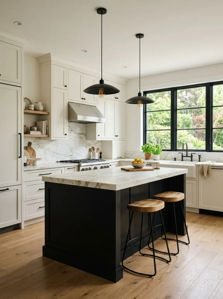
Rather than choosing a single bold cabinet color throughout, combining predominantly warm white cabinetry with strategic black accents, a black kitchen island, black open shelving brackets, black window frames, achieves genuine visual drama and contrast while maintaining the broad versatility and timelessness that warm white cabinetry provides as the kitchen’s overall foundation. This is essentially the two-tone approach mentioned earlier but specifically calling out black as the contrast color, since black paired with warm white represents one of the most consistently popular, broadly appealing combinations across a wide range of kitchen styles, from modern to farmhouse to transitional. I’d recommend this specifically for anyone wanting genuine visual drama and contrast without the risk of a bolder color choice feeling dated or overly trend-specific down the road, since this particular white-and-black combination has demonstrated remarkable staying power across many years of shifting broader design trends, unlike some of the more specific, singular bold colors elsewhere on this list that carry more inherent trend-cycle risk.
19. Consider Your Kitchen’s Natural Light Before Anything Else
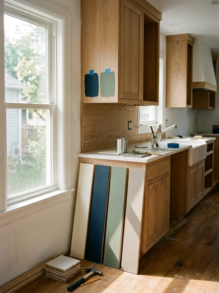
Before falling in love with any specific cabinet color based purely on inspiration photos, honestly assessing your own kitchen’s actual natural light situation, north-facing versus south-facing, how many windows, how much they’re potentially obstructed by nearby structures or trees, should meaningfully inform which colors will actually work well in your specific space rather than simply looking appealing in someone else’s differently lit kitchen. I learned this firsthand during my own testing process, watching how dramatically my sample paint boards shifted in appearance between my kitchen’s morning light and its considerably dimmer late afternoon conditions, a variation that genuinely influenced my final color decision toward something I knew would hold up reasonably well across that full range of lighting throughout the day. I’d recommend painting large sample boards of your top color choices and observing them specifically in your own kitchen across an entire day’s lighting cycle before finalizing any decision, since a color that looks stunning in a bright, south-facing kitchen in photos might read completely differently, sometimes disappointingly so, in your own more moderately or dimly lit space.
20. Choose a Finish, Not Just a Color
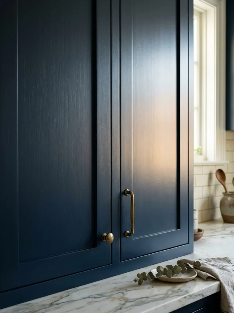
Beyond the actual color itself, the specific paint finish, whether matte, satin, semi-gloss, or high-gloss, meaningfully affects how that color ultimately reads once applied to your cabinets, with glossier finishes generally reflecting more light and appearing slightly brighter or more vibrant compared to the same exact color in a more matte, light-absorbing finish. I chose a satin finish for my own navy island specifically, appreciating the subtle sheen that catches light without the more obvious reflectivity of a full semi-gloss, which I felt would have made the deep navy color feel almost too shiny or plastic-like for the warmer, more organic overall kitchen aesthetic I was going for. I’d recommend testing your final color choice in your actually intended finish before committing to a full cabinet order, since the same paint color in different sheens can genuinely look like meaningfully different colors once you compare them directly side by side, an easily overlooked detail that matters considerably more once your cabinets are actually installed and living with you every day rather than existing only as a small sample chip.
Final Thoughts
Looking back at those repeated trips to the paint store, holding an ever-growing collection of sample chips against my existing cabinets, it’s genuinely remarkable how much more thought this single decision required compared to what I’d initially assumed would be a fairly quick, straightforward choice. Between all 20 of these color ideas, the underlying theme is really that cabinet color functions as the foundation every other decision in your kitchen ultimately responds to, making it worth the genuine time and consideration I initially underestimated before finally settling on my own final direction.
If you’re currently standing at the beginning of your own cabinet color decision, I’d suggest starting with the natural light assessment covered in the second-to-last idea before falling in love with any specific color from inspiration photos alone, since understanding how your own kitchen’s actual lighting will interact with any potential color choice genuinely changes which options will realistically work well in your particular space. From there, test large sample boards directly in your kitchen across a full day’s lighting, the same process that eventually led me to my own final navy and white combination, and trust that extra patience over rushing toward whatever color initially caught your eye in a photo taken in someone else’s differently lit kitchen entirely.