
Cabinet color is the single most powerful visual decision in any kitchen. Cabinets cover more surface area than any other element in the room — more than the walls, more than the floor, more than the countertops. Whatever color you choose for your cabinets sets the tone for the entire kitchen and determines what every other element needs to look like to work alongside it.
This is precisely why cabinet color is also the decision that causes the most anxiety. It feels permanent, it feels expensive to change, and there are an overwhelming number of options. A paint chip that looks perfect in the store looks completely different once it is covering forty square feet of cabinet frontage in your actual kitchen under your actual lighting conditions.
The anxiety is understandable, but it is also largely avoidable with the right framework. Cabinet color decisions become significantly easier when you understand two things. First, certain colors work reliably across a wide range of kitchen styles, sizes, and lighting conditions — these are the colors professional kitchen designers return to repeatedly because they deliver consistent results. Second, no cabinet color works in isolation. The color that looks beautiful is always the color that works in relationship with the countertop, the backsplash, the flooring, and the wall color alongside it.
This guide covers seven cabinet color families that interior designers and kitchen specialists recommend most consistently, with specific pairing guidance for each — countertop materials, backsplash options, hardware finishes, and wall colors that bring out the best in each choice. Read through all seven before making any decision, and test your shortlisted colors in your actual kitchen before committing to anything.
Understanding Cabinet Color Before You Choose
Three factors determine how a cabinet color will look in your finished kitchen, and all three need to be considered before you settle on any color.
The first factor is your kitchen’s natural light. A north-facing kitchen that receives limited direct sunlight reads colors significantly differently than a south-facing kitchen flooded with afternoon sun. Cool colors such as grey and blue look fresh and sophisticated in a well-lit kitchen but can feel cold and flat in a darker one. Warm colors such as cream, sage green, and warm wood tones perform well in both conditions because their warmth compensates for limited light.
The second factor is your kitchen’s size. In a small kitchen, cabinet color dominates the visual field more completely than in a large one, which means strong or dark colors have a more dramatic effect. Light colors make small kitchens feel more open. Dark colors in small kitchens create a more enclosed feeling that some people find intimate and others find oppressive — knowing which you prefer is important before choosing.
The third factor is the fixed elements you are keeping. If you are repainting cabinets rather than replacing them, your countertop, flooring, and any tiles you are keeping are already determined. Your cabinet color choice is constrained by the need to work with those existing elements. If you are designing a new kitchen from scratch, you have full flexibility to build the palette from the cabinet color outward.
With these three factors in mind, work through the seven color families below and identify which ones suit your light conditions, your kitchen size, and your existing or planned fixed elements.
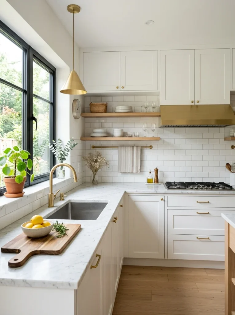
Cabinet Color 1: White — The Classic That Earns Its Dominance

The Color Family: Pure white, warm white, off-white, ivory, and cream. These are distinct colors with meaningfully different effects, not interchangeable variations of the same thing.
The Mood: Clean, open, timeless, and endlessly versatile.
White cabinets have been the most popular kitchen cabinet choice globally for decades, and this dominance is not arbitrary. White reflects light more effectively than any other color, which makes kitchens feel brighter, larger, and more open. White is neutral in the truest sense — it does not impose a style, which means it works with traditional, modern, transitional, farmhouse, coastal, and minimalist kitchens equally well.
The critical distinction within the white family is between cool whites and warm whites, and getting this wrong is the most common white cabinet mistake. Cool whites have blue or grey undertones and look crisp, clean, and modern — they suit kitchens with cool grey countertops, stainless steel appliances, and chrome hardware. Warm whites have yellow, pink, or cream undertones and look soft, welcoming, and timeless — they suit kitchens with wood elements, warm stone countertops, and brass or brushed gold hardware.
Mixing a cool white cabinet with warm-toned countertops and accessories creates a clash that is subtle but persistent — the kitchen feels slightly off without the reason being immediately obvious. Matching the temperature of your white to the temperature of every other element in the kitchen eliminates this problem entirely.
Specific color recommendations: Benjamin Moore Chantilly Lace for a clean, bright cool white. Farrow and Ball All White for a sophisticated warm white with grey undertones. Dulux Timeless for a reliable warm white that reads as neutral in most lighting conditions.
Countertop pairings that work: Warm white cabinets pair beautifully with warm grey quartz, butcher block wood, warm white marble with soft grey veining, and light limestone. Cool white cabinets pair best with cool grey quartz, white Carrara marble, concrete, and black granite.
Backsplash options: White subway tile is the most classic pairing and works reliably in any finish — gloss for a cleaner, brighter look, matte for a softer and more contemporary feel. White zellige tiles — the handmade Moroccan tiles with an irregular, reflective surface — add significant texture and visual interest while maintaining the white palette. For contrast, a dark grout with white tiles creates a graphic quality that suits more modern kitchen styles.
Hardware finish: Brushed nickel and chrome suit cool white cabinets. Brushed brass, unlacquered brass, and bronze suit warm white and cream cabinets. Matte black hardware works with both white families but reads as more contemporary and graphic.
When white cabinets look cheap: White cabinets look inexpensive when the cabinet doors are flat with no profile and the hardware is thin and lightweight. Adding a simple shaker profile to flat doors and replacing lightweight hardware with substantial, weighty pulls and knobs transforms the perception of quality immediately without requiring new cabinet boxes.
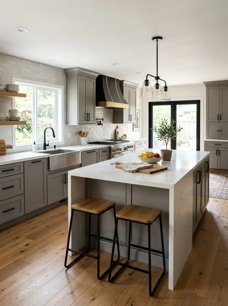
Cabinet Color 2: Grey — Modern, Sophisticated, and Genuinely Versatile
The Color Family: Light grey, mid-tone grey, dark grey, and greige (grey-beige). Each creates a meaningfully different result.
The Mood: Calm, modern, and refined. Grey sits between the neutrality of white and the warmth of beige, offering a sophistication that neither pure white nor cream quite achieves.
Grey cabinets became the dominant alternative to white cabinets in contemporary kitchen design for good reason. Grey reads as sophisticated and current without being overtly trendy. It works in both modern and traditional kitchen styles. It pairs naturally with a wide range of countertop and flooring materials. And unlike white, it does not show every fingerprint and mark — a practical advantage in busy family kitchens.
The grey family spans an enormous range, and the choice of tone matters significantly. Light greys create a soft, almost neutral effect that functions similarly to white but with more visual depth. Mid-tone greys are the most versatile — they read clearly as grey without being heavy or oppressive. Dark greys push toward drama and create a kitchen that feels anchored and bold. Greige occupies the territory between grey and beige, offering the warmth of beige with the sophistication of grey.
Specific color recommendations: Farrow and Ball Mole’s Breath for a warm, sophisticated mid-tone grey. Dulux Mineral Mist for a light, versatile grey that works in most lighting conditions. Little Greene Lamp Black diluted significantly for a dark grey with depth and complexity.
Countertop pairings that work: Light grey cabinets pair well with white quartz, light Carrara marble, warm wood, and pale concrete. Mid-tone grey cabinets pair beautifully with white quartz with subtle veining, butcher block wood for warmth, and light grey concrete. Dark grey cabinets pair best with white countertops for maximum contrast — white quartz, white marble, or white engineered stone — or with natural wood to soften the darkness.
Backsplash options: White subway tile in a classic brick pattern creates clean contrast against grey cabinets. White hexagon tile adds geometric interest. For a more contemporary result, large format white or light grey porcelain tiles with minimal grout lines create a seamless, sophisticated background. A mirrored or metallic glass tile backsplash adds reflective light to grey kitchens that feel slightly dark.
Hardware finish: Brushed nickel and polished chrome suit cool grey cabinets and reinforce the clean, contemporary quality. Brushed brass and aged brass bring warmth to grey cabinets and prevent the palette from feeling cold — this combination is particularly popular in transitional kitchens that blend modern and traditional elements. Matte black hardware creates a graphic, high-contrast effect that suits more modern and industrial kitchen styles.
Common mistake: Using grey cabinets with grey countertops and grey flooring. An all-grey kitchen without any warm counterbalance feels clinical and flat. Introduce at least one warm element — a wood countertop section, a warm brass hardware finish, a terracotta or warm-toned backsplash tile — to give the palette life and prevent the room from feeling like a car park.
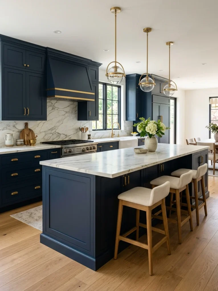
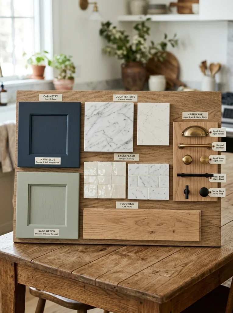
Cabinet Color 3: Navy Blue — Bold, Sophisticated, and Endlessly Elegant
The Color Family: True navy, midnight blue, deep indigo, and soft navy with grey undertones.
The Mood: Confident, refined, and timeless. Navy blue is the cabinet color that consistently appears in high-end kitchen design because it communicates quality and intention in a way that few other colors achieve.
Navy blue cabinets have moved from a niche designer choice to a mainstream option over the past decade, and their popularity shows no sign of declining. The reason is that navy sits in a unique position in the color spectrum — it is bold enough to make a clear statement while being dark enough to feel sophisticated rather than playful. It works in traditional kitchens, coastal kitchens, and contemporary kitchens with equal effectiveness.
Navy reads differently depending on the light in your kitchen. In good natural light, navy cabinets appear rich and vibrant, with depth and complexity that changes as the light shifts through the day. In limited natural light, navy can feel heavy — a risk that is managed through the right countertop choice, adequate artificial lighting, and keeping upper cabinets lighter if the layout allows.
Specific color recommendations: Farrow and Ball Hague Blue for a complex, sophisticated navy with green undertones that photographs beautifully. Little Greene Smalt for a cleaner, truer navy. Dulux Midnight Storm for a more affordable option that delivers strong results.
Countertop pairings that work: The most timeless pairing for navy cabinets is white marble or white quartz countertops with soft grey or gold veining. The contrast between the deep navy and the bright white countertop is visually striking and feels luxurious. Warm white quartz with subtle movement in the stone creates a softer version of this contrast. Butcher block wood countertops pair beautifully with navy and bring warmth that prevents the kitchen from feeling too formal. Avoid grey countertops with navy cabinets — the two cool tones together flatten the palette and reduce the visual impact of the navy.
Backsplash options: White subway tile is the classic and reliable choice — it provides clean contrast and keeps the focus on the cabinet color. White zellige tiles add texture and handmade quality that elevates the navy further. For a more dramatic result, a dark veined marble tile or a deep green ceramic tile creates a jewel-box effect that is particularly effective in larger kitchens with good light.
Hardware finish: Brushed brass and unlacquered brass are the hardware choices that work most powerfully with navy cabinets. The warm gold tone of brass against deep navy is one of the most consistently admired combinations in kitchen design. Polished nickel creates a cooler, more formal look that suits traditional kitchen styles. Matte black hardware creates a graphic, contemporary effect.
Using navy in a small kitchen: The concern about dark colors making small kitchens feel smaller is legitimate but manageable. In a small kitchen, use navy on lower cabinets only and keep upper cabinets white or a light cream. This grounds the kitchen with the rich navy color while keeping the upper portion of the room light and open. Alternatively, use navy on all cabinets but ensure the countertop is white or very light and the backsplash is reflective — glass or glossy tile — to bounce light back into the space.
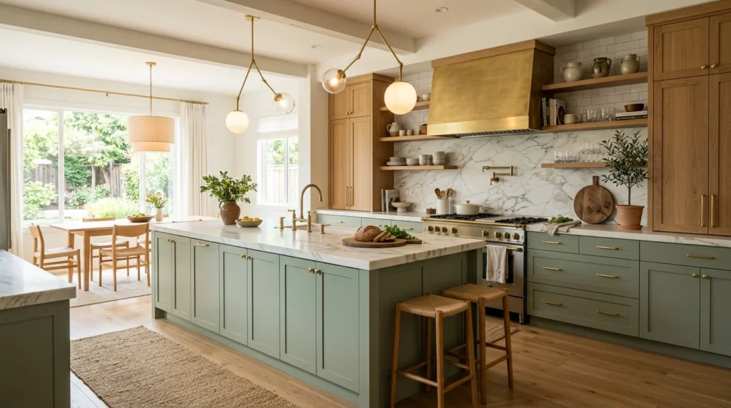
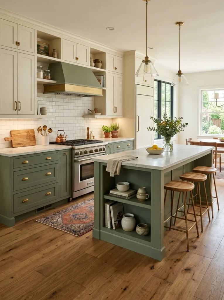
Cabinet Color 4: Sage Green — The Color That Changed Kitchen Design
The Color Family: Sage green, soft olive, muted eucalyptus, and dusty jade. All share the quality of being green with grey undertones that soften and mute the color into something quieter and more sophisticated than pure green.
The Mood: Natural, calming, fresh, and quietly beautiful. Sage green is the cabinet color that has most significantly shifted kitchen design trends over the past five years, appearing in everything from high-end custom kitchens to accessible flat-pack designs.
The reason sage green has captured such widespread enthusiasm is that it occupies a unique emotional position. It brings genuine color to the kitchen without the energy or assertiveness of brighter hues. It connects the interior to the natural world through its association with foliage and growing things. And it is warm enough — because of its grey and brown undertones — to work in kitchens that struggle with limited natural light.
Sage green works across a remarkable range of kitchen styles. In a shaker-style kitchen with wooden worktops and brass hardware, it creates a classic English country aesthetic. In a flat-fronted, handleless kitchen with stone countertops and minimalist fittings, it creates a clean, contemporary Scandinavian-influenced look. In a farmhouse-style kitchen with open shelving and a ceramic sink, it feels completely at home.
Specific color recommendations: Farrow and Ball Mizzle for a complex, sophisticated sage with yellow-green undertones that works beautifully in good light. Little Greene Sage for a more straightforward, classic sage green. Dulux Pistachio Cream for a lighter, softer sage that suits smaller kitchens and rooms with limited light.
Countertop pairings that work: The most natural and beautiful pairing for sage green cabinets is a warm wood countertop — solid oak, walnut, or a good quality wood-effect laminate. The combination of sage and wood reads as organic and grounded in a way that feels genuinely timeless. White quartz or white stone countertops create a fresher, more contemporary effect that suits modern kitchen styles. Warm cream or off-white stone countertops create a softer, more traditional look that suits country and farmhouse kitchens.
Backsplash options: A simple white ceramic tile — subway or square — keeps the focus on the sage cabinets without competing. Cream or off-white metro tiles soften the palette further and suit country and traditional style kitchens. For a more contemporary effect, a large format stone-effect porcelain tile in warm beige or cream creates a sophisticated background.
Hardware finish: Brushed brass is the hardware finish most consistently paired with sage green cabinets, and for good reason — the warm gold of brass against the muted green creates one of the most satisfying combinations in kitchen design. Aged brass and unlacquered brass both work beautifully, with the aged version creating a more traditional and antique quality. Brushed nickel is a cooler alternative that suits more contemporary sage green kitchens. Ceramic knobs in white or cream work exceptionally well in country-style kitchens.
Common mistake: Choosing a sage green that is too bright or too saturated. Pure green without sufficient grey in the undertone reads as energetic and slightly jarring in a kitchen — it looks more like a sports field than a sophisticated interior. Always choose a sage green that reads as muted and slightly dusty rather than vivid and saturated. If you are unsure, test the color at various times of day. A true sage green should look slightly grey in lower light and soften to a beautiful muted green in natural light.
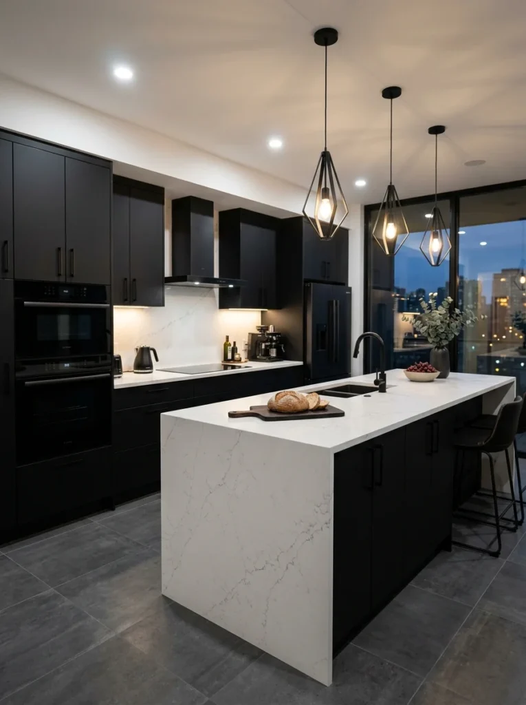
Cabinet Color 5: Black — For Kitchens That Want Maximum Drama
The Color Family: Matte black, soft black with warm undertones, off-black, and very dark charcoal that reads as black.
The Mood: Dramatic, sophisticated, and completely uncompromising. Black kitchen cabinets make a definitive statement and create a kitchen that is impossible to walk past without noticing.
Black cabinets are the most commitment-heavy choice in kitchen design, which is precisely why they deliver such a strong visual result when done correctly. A kitchen with black cabinets, executed well, looks more deliberate and more considered than almost any other palette. It communicates a confidence in design decisions that creates an impressive and lasting impression.
The concern most people have about black cabinets — that they will make the kitchen feel dark and claustrophobic — is addressed through the same principle that applies to all dark cabinet colors. Black cabinets need a light counterbalance somewhere in the palette, adequate natural or artificial light, and careful material choices that prevent the room from absorbing more light than it reflects.
Specific color recommendations: Farrow and Ball Pitch Black for a true, sophisticated black with slight warm undertones. Little Greene Obsidian for a slightly softer black that reads more like a very dark charcoal in certain light. Dulux Polished Black for a reliable and affordable option.
Countertop pairings that work: The countertop choice is the single most important decision in a black cabinet kitchen because it provides the primary light counterbalance. White quartz or white engineered stone creates the most striking and graphic contrast — the combination of black cabinets and white countertops is bold, contemporary, and extremely effective. Natural wood countertops bring warmth and softness to what could otherwise be a very cold palette. Light concrete creates an industrial quality that suits black cabinets beautifully.
Backsplash options: White subway tile provides clean, reliable contrast. For a more dramatic and cohesive look, a dark backsplash tile — deep green, navy, or black — creates a monochromatic effect where the kitchen reads as one rich, dark palette with variation in texture rather than color. This is a more advanced design move but produces extraordinary results in the right setting.
Hardware finish: Matte black hardware on black cabinets creates a tonal, monochromatic effect that is currently very popular and genuinely beautiful. Brushed brass on black cabinets creates a sharp contrast that feels luxurious and high-end. Polished chrome creates a more utilitarian look that suits industrial-style kitchens.
All-black versus partial black: For kitchens where all-black cabinets feel like too significant a commitment, a two-tone approach offers the drama of black with a lighter overall palette. Black lower cabinets with white or cream upper cabinets is the most common and most successful version of this approach — the black grounds the kitchen visually while the light upper cabinets keep the room feeling open above counter height.
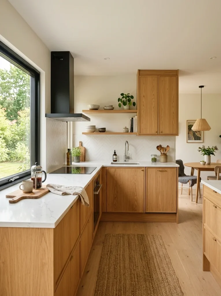
Cabinet Color 6: Warm Wood Tones — Natural, Timeless, and Coming Back Strongly
The Color Family: Light oak, warm walnut, natural birch, honey-toned maple, and dark espresso wood.
The Mood: Warm, natural, and grounded. Wood-tone cabinets connect the kitchen to the natural world in a way that no painted color quite replicates, creating spaces that feel genuinely organic and lived-in rather than designed and staged.
Wood-tone cabinets went through a period of being associated with dated 1990s kitchens, and this association caused many designers and homeowners to avoid them for years. That era is firmly over. Contemporary wood-tone kitchen design has completely reinvented how natural wood looks in a kitchen by pairing it with modern hardware, clean-lined cabinet profiles, and sophisticated complementary materials that have nothing in common with the heavy, ornate wood kitchens of thirty years ago.
The key distinction in contemporary wood-tone kitchen design is between warm-toned wood and dark-stained wood. Light and medium warm-toned woods — natural oak, honey maple, warm birch — create kitchens that feel Scandinavian, natural, and calming. Dark-stained woods — espresso, dark walnut, ebony — create kitchens that feel more dramatic and formal, with a quality that approaches the visual impact of black cabinets.
Countertop pairings that work: Light wood cabinets pair beautifully with white or light grey quartz, warm white stone, concrete, and even a contrasting dark countertop for dramatic effect. Warm walnut cabinets pair well with white quartz, warm cream stone, and light concrete. Avoid matching the wood tone of the countertop directly to the cabinet wood — when two wood tones are close but not identical, the result looks like a mistake rather than a choice. Use clearly contrasting countertop materials with wood cabinets.
Backsplash options: White or cream ceramic tile keeps the focus on the wood and prevents the palette from feeling too busy. A simple white metro tile suits modern wood-tone kitchens. For a more natural and textural effect, a stone or travertine tile backsplash creates a beautiful all-natural material palette.
Hardware finish: Matte black hardware creates a strong, contemporary contrast with light wood cabinets that is extremely popular in Scandinavian-influenced kitchen design. Brushed brass adds warmth and suits kitchens where the wood tone is the warmer, honey-toned variety. Minimal or integrated handles — push-to-open mechanisms or recessed finger pulls — suit handleless kitchen designs that want the wood to be the only visual element.
Mixing wood cabinets with painted cabinets: One of the most effective contemporary kitchen techniques is using wood-tone cabinets in one zone and painted cabinets in another. A kitchen island in natural oak paired with painted perimeter cabinets in white or sage green creates a beautiful visual distinction between zones while keeping the overall palette cohesive.
Cabinet Color 7: Two-Tone Combinations — When One Color Is Not Enough
The Concept: Two-tone kitchen cabinets use two different colors — typically one for the upper cabinets and a different one for the lower cabinets, or one for the perimeter cabinets and a different one for the island.
The Mood: Dynamic, layered, and more complex than a single-color kitchen. When done with intention and clear rules, two-tone cabinets create kitchens that feel more interesting and more considered than single-color alternatives.
Two-tone cabinets have become one of the most popular kitchen design approaches because they solve a problem that single-color kitchens sometimes create — the feeling that the palette is too flat or too simple. By introducing a second color, the kitchen gains visual hierarchy and depth. The two zones read as distinct elements within a cohesive whole.
The most successful two-tone combinations:
Upper white, lower navy: The most classic and widely used two-tone combination. The white upper cabinets keep the kitchen light and open while the navy lower cabinets add weight, color, and sophistication at counter level.
Upper white or cream, lower sage green: A softer and more organic version of the upper-light, lower-dark principle. This combination suits farmhouse, country, and transitional kitchen styles particularly well.
Perimeter in painted color, island in natural wood: Using a contrasting island in wood while the surrounding cabinets are painted is one of the most effective ways to visually define the island as a distinct feature of the kitchen.
Upper in lighter shade of same color, lower in deeper shade: A tonal two-tone approach where both colors belong to the same family — light grey uppers with dark grey lowers, cream uppers with warm taupe lowers — creates cohesion with visual depth.
Rules for two-tone that looks intentional: The two colors must have a clear relationship — same temperature family, complementary undertones, or a deliberate contrast in tone. The division between the two colors should happen at a natural architectural break — the countertop line is the most common and most successful. The hardware finish should be consistent across both cabinet colors to tie the two zones together.
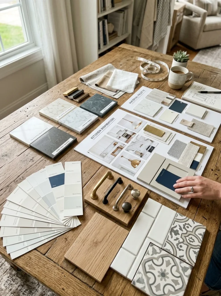
How to Test Cabinet Colors Before You Commit
Paint large swatches of your shortlisted cabinet colors on pieces of card or MDF and prop them against your actual cabinets. Live with them for at least a week, observing how the color looks at different times of day and under different lighting conditions — morning natural light, afternoon sun if your kitchen faces that direction, evening artificial light, and nighttime under just the task lighting.
Order countertop samples and place them directly below the painted cabinet swatches. This is the most important test — the relationship between cabinet color and countertop material is the foundation of the entire kitchen palette. Hold hardware samples against both the cabinet swatch and the countertop sample simultaneously to assess the complete combination.
Never make a final cabinet color decision based on a small paint chip or a digital image alone. Colors look profoundly different at scale, in your specific lighting conditions, and in combination with your specific fixed materials. The investment of time in testing properly is insignificant compared to the cost and disruption of making the wrong choice.
Conclusion
The right cabinet color is not the most fashionable color, the safest color, or the color that looks best on a social media feed. It is the color that works in relationship with your specific kitchen — its size, its light conditions, its fixed materials, and the style of cooking and living that happens in it every day.
Start with your light and your fixed elements. Determine whether you need warmth or coolness, lightness or depth, neutrality or character. Then identify which of the seven color families in this guide best serves those requirements. Test your shortlist thoroughly in your actual space before committing to any final decision.
A well-chosen cabinet color transforms a kitchen from a functional room into a space that feels genuinely beautiful — and does so for every year you live in the home.