
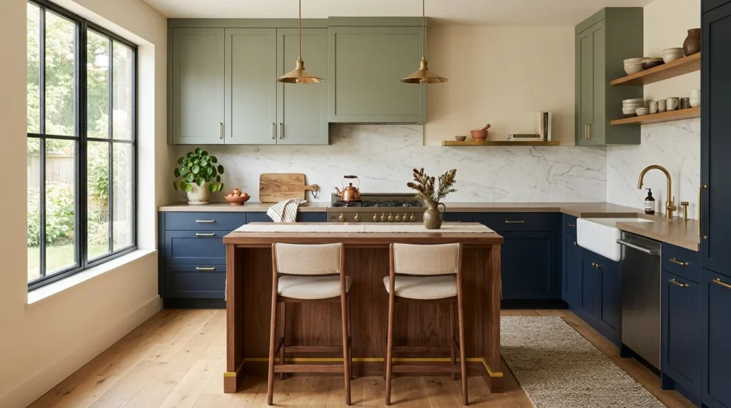
I repainted my kitchen four times in three years. Not because I couldn’t commit to a color, but because I kept choosing paint the same way most people do — picking a shade off a tiny sample card under fluorescent hardware store lighting, then being genuinely surprised when it looked completely different once it covered four walls under my own kitchen’s lighting. Somewhere around the third repaint, I started actually talking to a friend who works as an interior designer, and the way she thinks about kitchen color turned out to be almost nothing like how I’d been approaching it, which was frankly a little humbling given how confident I’d felt walking into the paint aisle each of those first three times. This list is a mix of what she’s told me over several long conversations and what I’ve since confirmed the hard way in my own kitchen.
1. Warm White Instead of Stark White
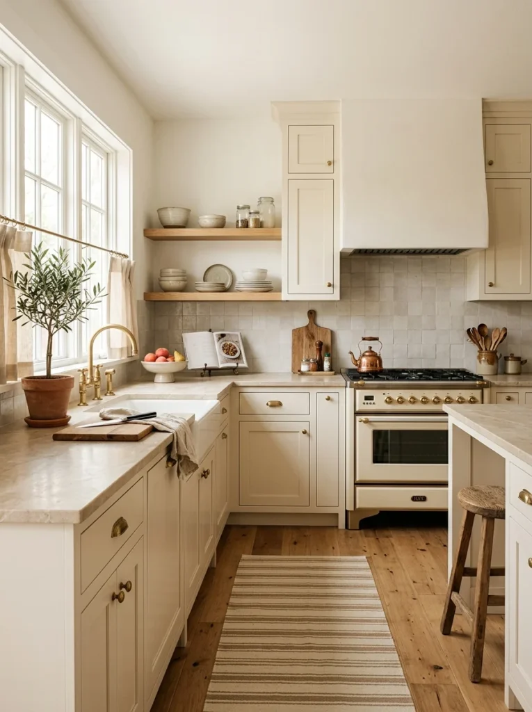
My first kitchen “white” leaned cool and slightly blue-toned, which made the room feel clinical rather than clean. Switching to a warmer white with a hint of cream underneath softened the whole space without sacrificing that bright, open feeling I wanted.
2. Sage Green for a Calm, Grounded Feel
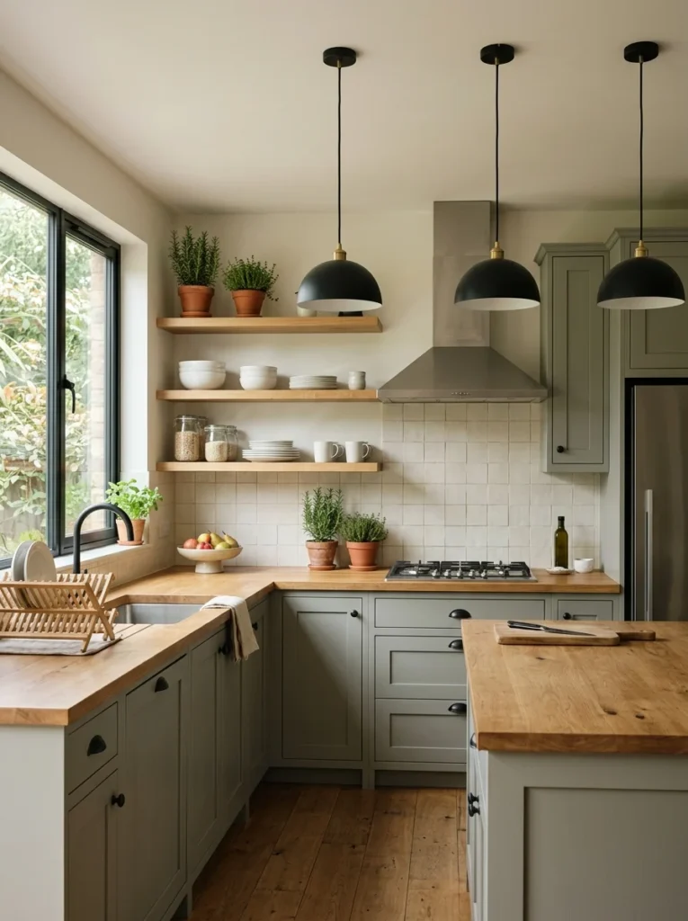
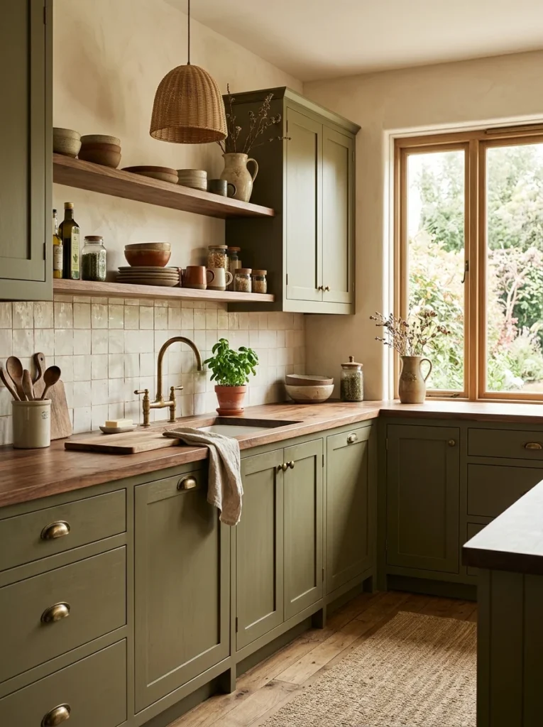
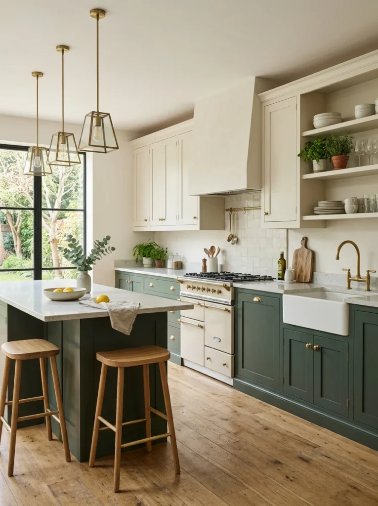
I was hesitant about green in a kitchen, worried it would feel overly trendy and date quickly. A muted, grayed-down sage has held up well over two years now, and it pairs easily with both warm wood tones and cooler stainless steel appliances.
3. Deep Navy on Lower Cabinets Only
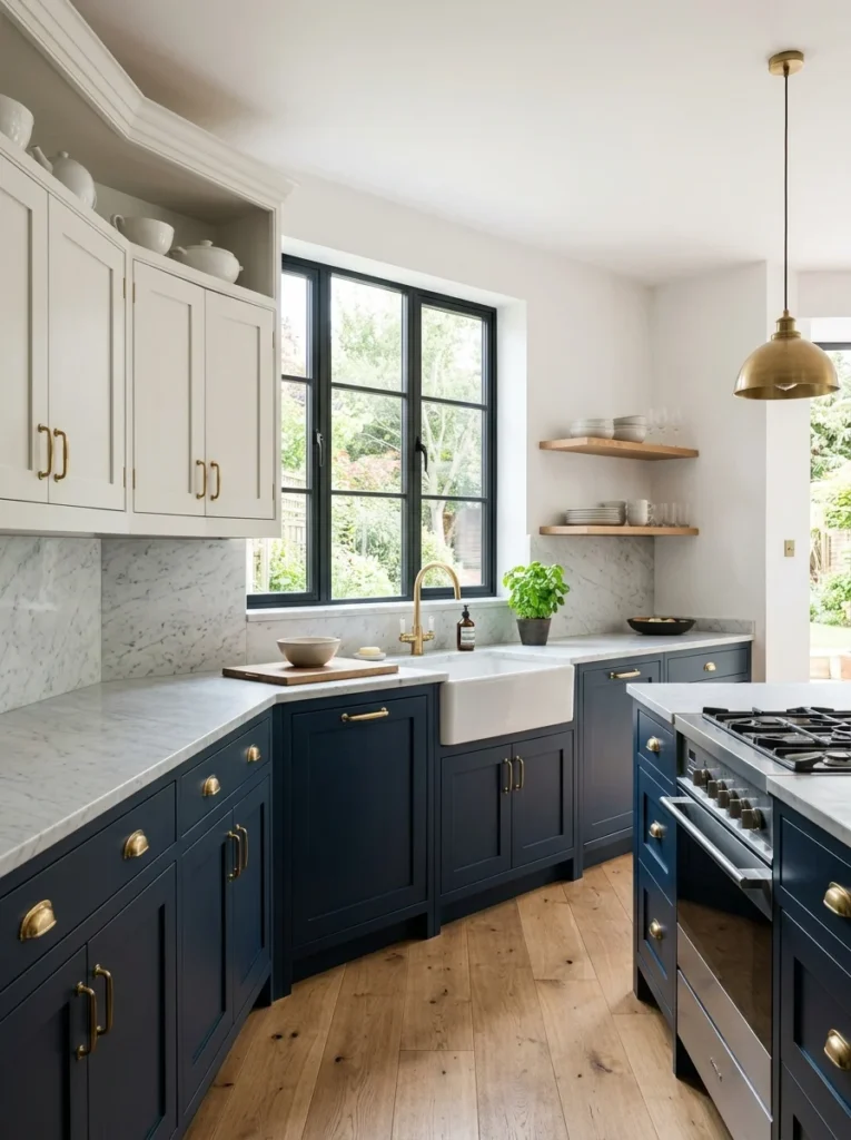
Painting an entire kitchen navy felt like too big a commitment, but using it just on the lower cabinets while keeping the upper cabinets a lighter tone gave the room depth and contrast without making the space feel smaller or heavier overall.
4. Terracotta as an Accent Wall Color
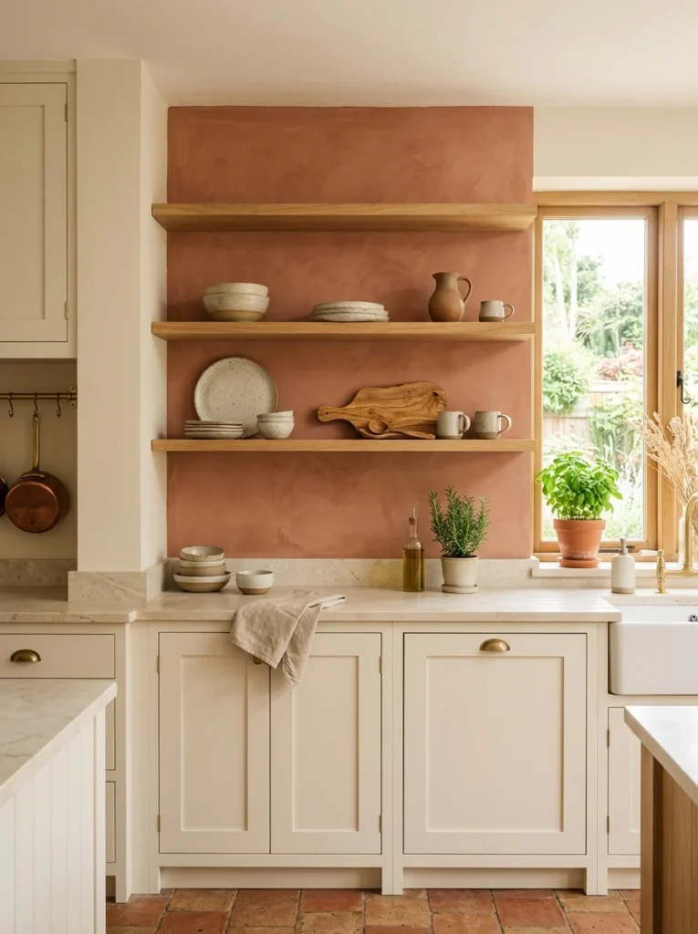
A single terracotta accent wall behind our open shelving added warmth to a kitchen that had otherwise leaned quite neutral. It’s a bold choice on its own, but contained to one wall, it read as intentional rather than overwhelming.
5. Soft Gray-Green for Cabinets
This is close to sage but slightly cooler and more muted, and it’s become one of the most requested cabinet colors my designer friend gets asked about. It reads as more neutral than sage in different lighting, which makes it easier to pair with a wider range of countertop materials.
6. Buttery Yellow in Small Doses
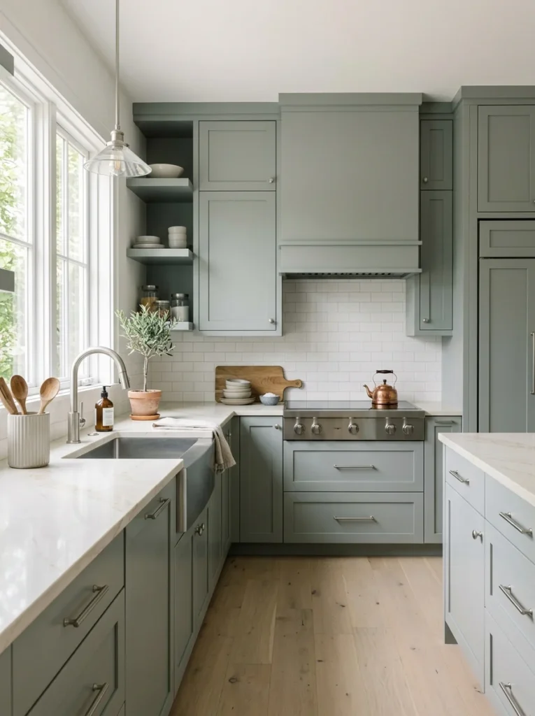
A full yellow kitchen can feel overwhelming fast, but a small dose, like on an island or a single wall, adds warmth and personality without dominating the room. I tried this on our island specifically and it’s consistently the first thing guests comment on.
7. Charcoal for a Moody, Dramatic Kitchen
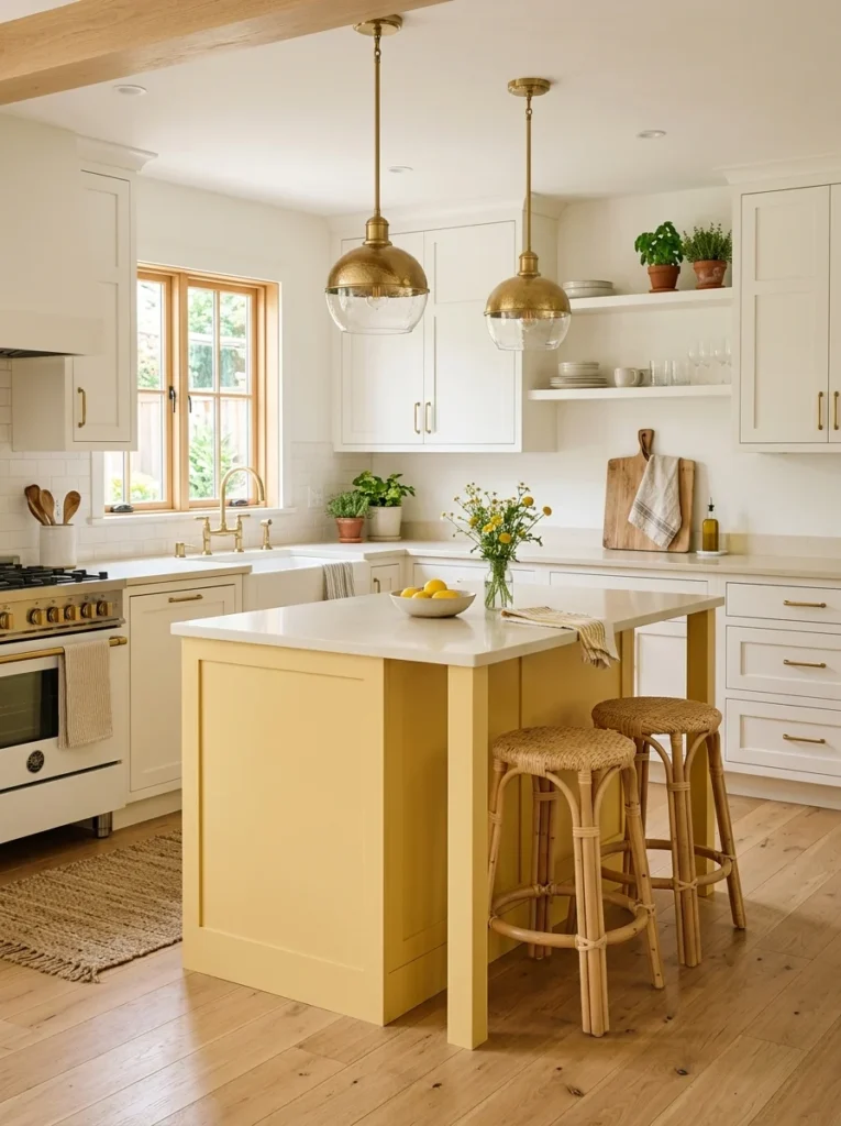
Charcoal walls paired with brass hardware and warm wood open shelving gave a friend’s kitchen a genuinely dramatic, restaurant-like feel that I hadn’t expected to like as much as I did once I saw it in person rather than in photos.
8. Dusty Blue for a Softer Alternative to Navy
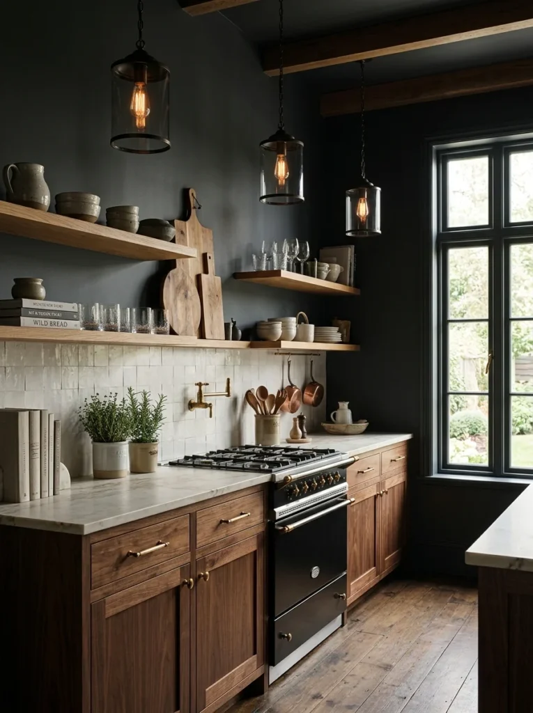
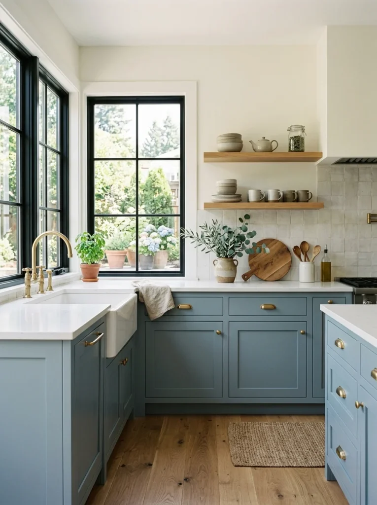
For anyone wanting the calming effect of blue without the intensity of navy, a dusty, slightly grayed blue offers a softer version of the same mood. It photographs beautifully in natural light, which matters if your kitchen gets a lot of daytime sun.
9. Warm Taupe for a Neutral That Doesn’t Feel Boring
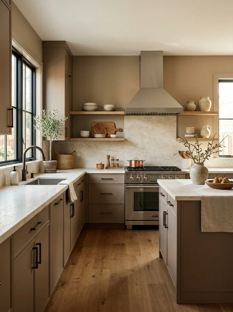
I repainted one of my early attempts, a flat beige, with a warmer taupe instead, and the difference in how “considered” the room felt was bigger than expected from such a subtle color shift. Taupe reads as more intentional than plain beige without straying into bold territory.
10. Black Cabinets With Light Walls
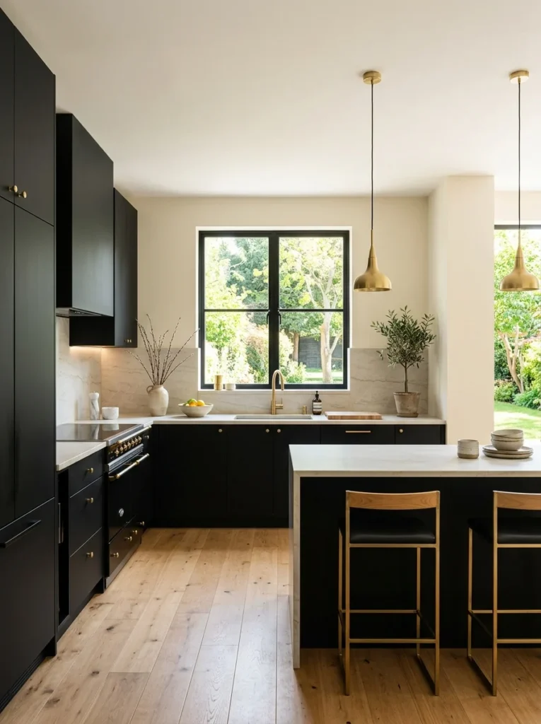
Fully black cabinets sound intense, but paired with light, warm walls, they become a striking contrast rather than an overwhelming one. It’s a combination my designer friend says clients are requesting more than any other dramatic option this year.
11. Muted Olive for an Earthy, Grounded Kitchen
Olive is trickier to get right than sage since it can lean too yellow or too brown depending on the specific formulation. Testing several samples directly on the wall before committing, which I hadn’t bothered doing on my earlier repaints, made all the difference in landing on the right olive tone.
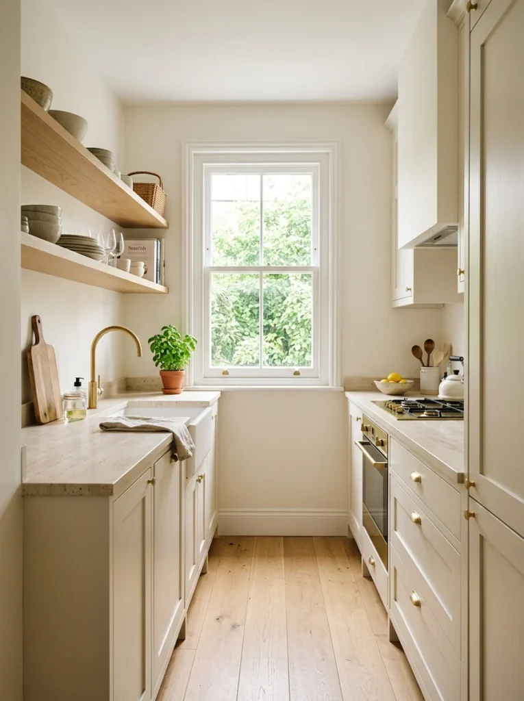
12. Off-White With a Warm Undertone for Small Kitchens
In a smaller kitchen, a true off-white with warm undertones keeps the space feeling open and bright without the sterile edge that a cooler white can create in a tight room with limited natural light.
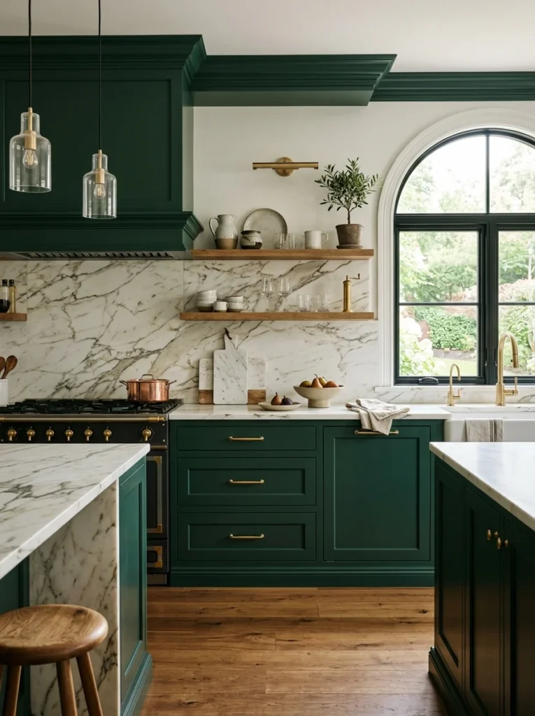
13. Rich Forest Green for Cabinetry
A deeper, more saturated green than sage, forest green on cabinets creates a bold, jewel-toned look that pairs particularly well with brass fixtures and marble countertops. It’s a commitment, but one that’s held up in style longer than some of the brighter greens that were popular a few years ago.
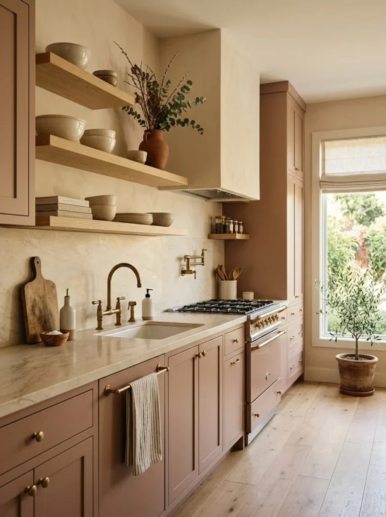
14. Clay Pink for a Subtle Warmth
This isn’t a bright or obviously pink shade, but a muted, dusty clay tone that reads more neutral than pink in most lighting. It adds a subtle warmth that’s harder to achieve with typical neutrals, and it’s become a quiet favorite among the more adventurous clients my designer friend works with.
15. Two-Tone Cabinets for Visual Interest
Rather than picking one single cabinet color, pairing a darker tone on lower cabinets with a lighter tone above has become one of the more requested approaches this year. It adds visual interest without needing bold color choices, and it works well in kitchens of almost any size.
16. Warm Gray for a Balanced, Timeless Base
Gray can feel cold if it leans too blue or too cool, but a warmer gray with slight brown undertones gives a timeless, balanced backdrop that doesn’t compete with countertops or backsplash choices, which is part of why it’s remained a steady recommendation rather than a passing trend.
17. Mustard as a Bold Island Color
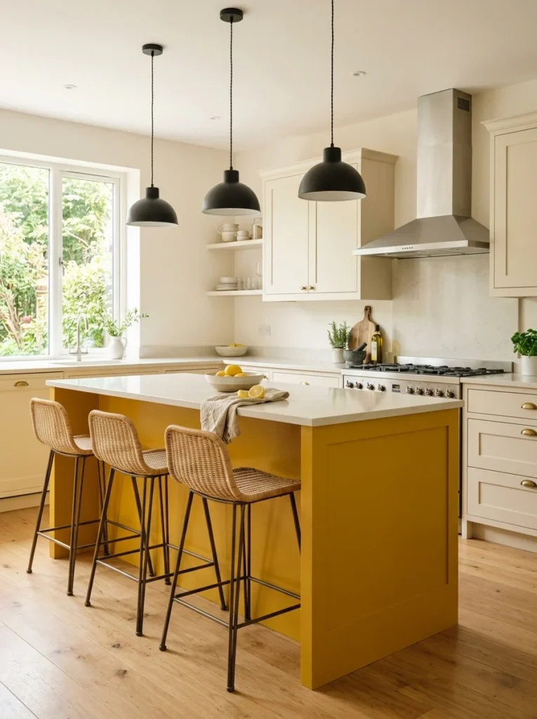
Similar to the buttery yellow idea, but more saturated and confident, mustard works particularly well when contained to just an island rather than the full kitchen. It gives the room a focal point of color while letting the surrounding walls stay neutral and calm.
18. Classic Cream for a Kitchen That Won’t Feel Dated
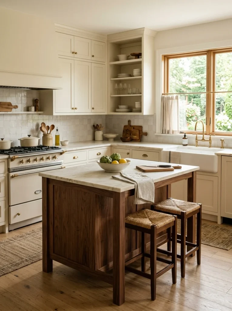
When in doubt, a true cream, warmer than white but lighter than beige, is the color my designer friend says she recommends most often to clients who are worried about picking something that will look dated in five years. It’s a safer choice, but a genuinely good one, and it’s the color I finally landed on for my own kitchen after three failed attempts at something bolder.
Why Fluorescent Store Lighting Lies to You
This is something my designer friend explained in a way that finally made sense after three failed attempts of my own. Most hardware stores use fluorescent lighting that has a cooler, flatter color temperature than what most kitchens actually get from a mix of natural daylight and warm-toned bulbs at home. A paint chip that looks perfectly balanced under that store lighting can shift noticeably warmer or cooler once it’s sitting on your actual walls, especially if your kitchen gets strong afternoon sun or relies heavily on warm overhead lighting in the evening. She now tells every client to take sample cards home and hold them up against their cabinets and countertops before even buying a sample pot, just to catch the more obvious mismatches early, before spending money on paint that might not work anyway.
How Long a Full Repaint Actually Takes
For anyone considering this kind of project, it’s worth knowing what the time commitment actually looks like beyond just the painting itself. Between taping off trim, cleaning grease and grime off the walls near the stove, which took far longer than I expected the first time, applying primer, and then two coats of the actual paint color, a full kitchen repaint realistically takes a full weekend even for a fairly small, single-color kitchen. Adding a two-tone approach or accent wall extends that timeline slightly, since you’re taping and cutting in an extra line somewhere in the room. None of my four repaints took less than two full days once you count drying time between coats, which is worth factoring in if you’re planning around hosting anything in the kitchen shortly afterward.
What I Got Wrong Three Times Before Getting It Right
My first repaint was a trendy sage green I’d seen all over home design accounts, chosen without testing a sample on my actual walls first. It looked noticeably more yellow in my kitchen’s north-facing light than it had in any photo I’d seen. The second attempt was a stark white meant to fix the “too colorful” problem, which swung too far in the other direction and made the room feel cold and clinical, especially in the evenings under artificial light. The third was a gray that tested fine on a small sample card but turned distinctly lavender once it covered the full walls, a shift I genuinely didn’t see coming and still don’t fully understand.
By the fourth attempt, I’d finally learned to paint large sample swatches, at least two feet by two feet, directly on multiple walls of the actual kitchen, and to look at them at different times of day before committing to a full repaint. That warm cream from the list above is what I landed on, and it’s the first color in this kitchen that’s looked the same in the morning as it does in the evening, which turned out to be the actual thing I’d been missing the whole time.
The One Piece of Advice That Changed Everything
My designer friend’s biggest piece of advice, repeated to me more than once during those long conversations, was to stop trusting sample cards entirely and always test paint directly on the wall in the room where it will actually live. It sounds almost too simple to be the fix for three failed repaints, but it genuinely was. Lighting, existing finishes, and the specific angle of your windows all affect how a color reads in ways a small card under store lighting simply can’t predict, and no amount of researching trending colors matters if you skip that one step. Four repaints in, that’s the single sentence I wish someone had said to me before I ever opened the first can of sage green paint.