
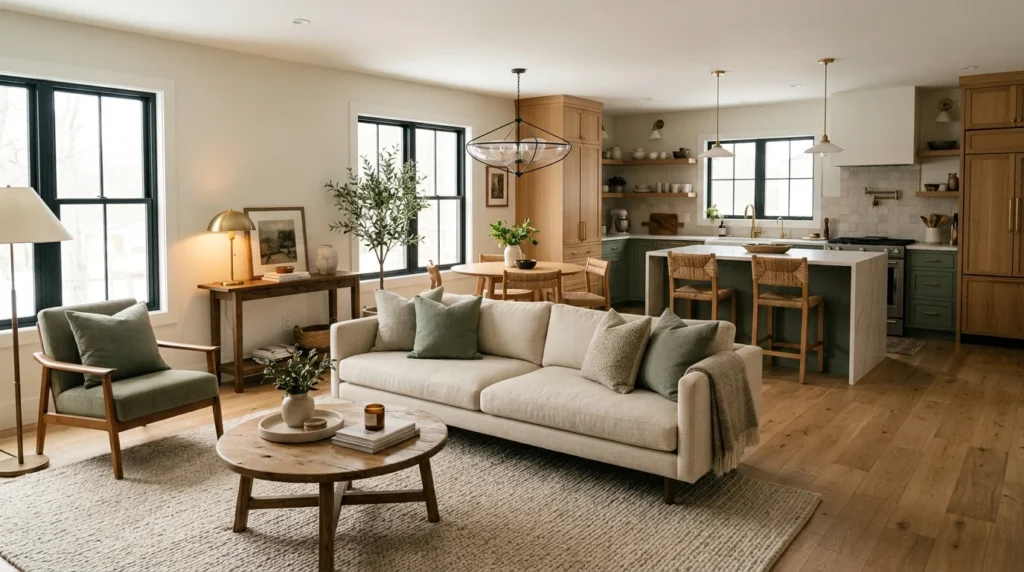
A friend of mine once described her open-concept kitchen and living room as “one big room pretending to be two,” and honestly, that line stuck with me because it captured exactly what I struggled with when I moved into my own open-plan space two years ago. On paper, an open floor plan sounds simple — knock down the wall, let the light in, done. In practice, I spent the better part of six months rearranging furniture, second-guessing paint colors, and generally feeling like my kitchen and living room existed in the same square footage without actually belonging together. What finally worked wasn’t one big change, but a series of smaller decisions that, together, made the space feel like a single, connected room instead of two zones awkwardly sharing a floor. Looking back, almost none of those decisions were the ones I expected to matter most going in — I assumed paint color and furniture style would carry the whole project, when in reality the fixes that actually worked were quieter and more structural than that.
Start With Traffic Patterns, Not Furniture
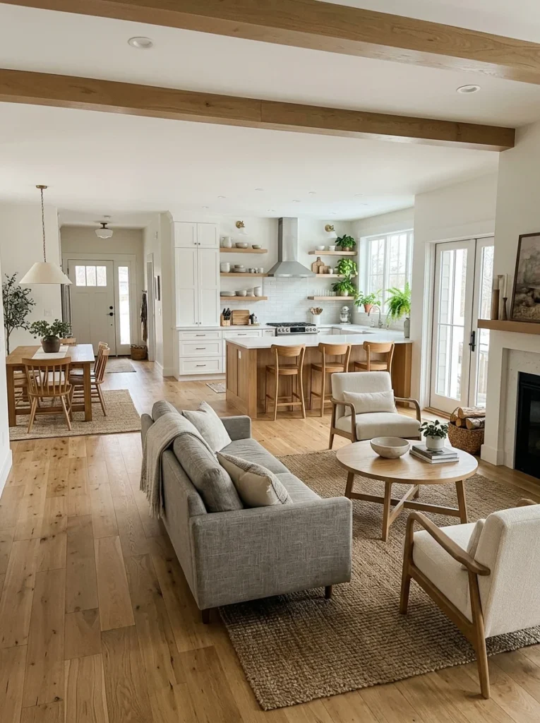
Before I bought a single new item, I spent a weekend just watching how I actually moved through the space — from the front door to the kitchen, from the couch to the fridge, from the dining area back to the sink. I hadn’t realized how much my original furniture arrangement was forcing me to walk around the coffee table every time I went to grab something from the kitchen. Once I mapped out the paths I used daily and rearranged furniture to keep those routes clear, the whole space immediately felt less cramped, even though nothing had actually gotten bigger.
Use a Rug to Define the Living Room Zone
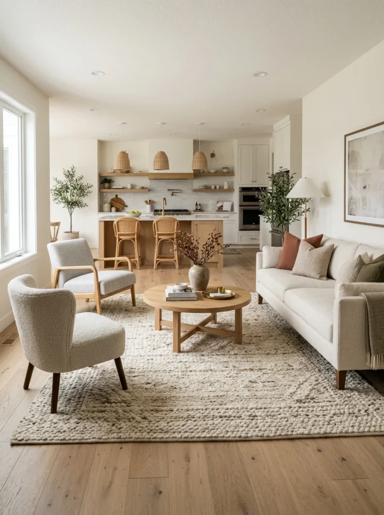
Without a wall separating the two areas, I found that a large rug under my living room furniture did more to define “this is the living room” than anything else I tried. It gave the seating area a visual boundary that the eye could register instantly, even from across the room near the stove. I made the mistake early on of buying a rug that was too small, which left the front legs of my furniture hanging off the edge and made the whole zone look unanchored. Sizing the rug so that at least the front legs of every major piece sit on it made a noticeable difference.
Keep a Consistent Flooring Material Throughout
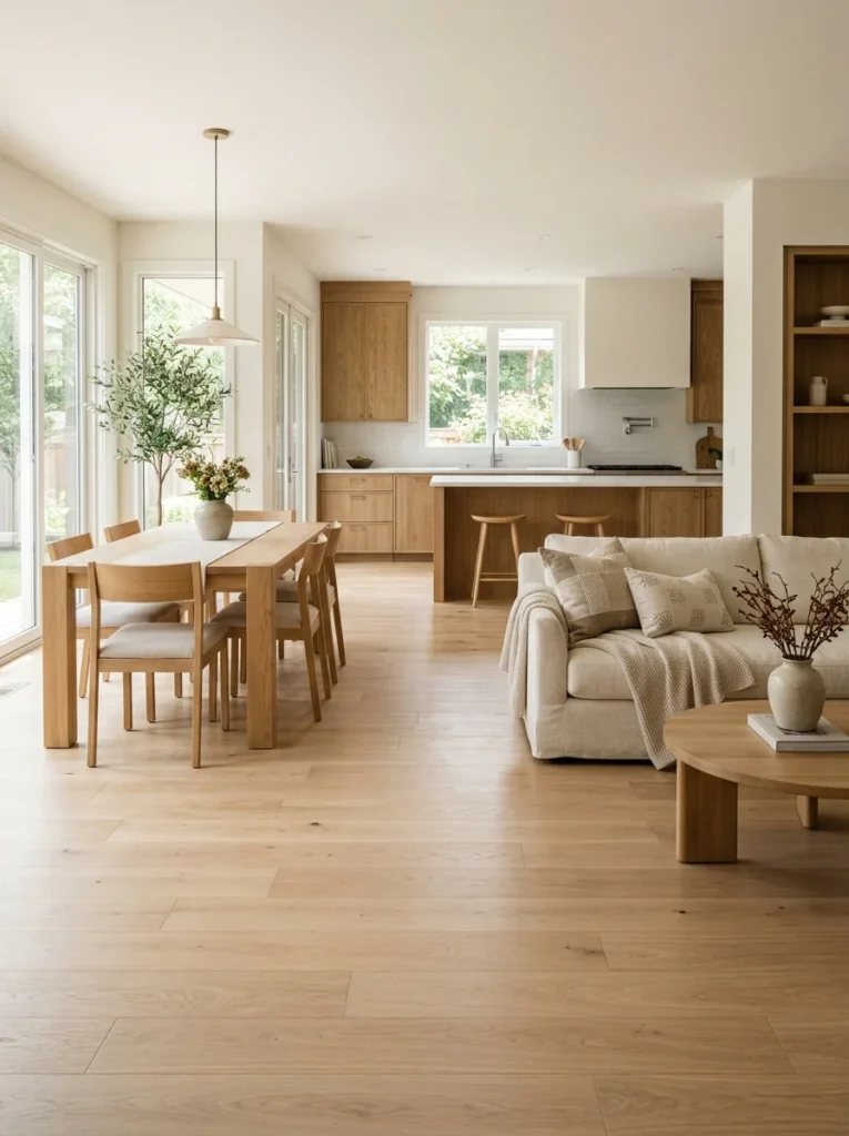
My apartment had the same flooring running through both the kitchen and living room already, and it wasn’t until I visited a friend’s place with a hard tile transition right at the kitchen’s edge that I understood how much that consistency had been doing for my space without me realizing it. The visual break where her tile met her living room flooring made the two areas feel more separate than the layout probably intended. If you have any say in flooring choices, keeping one material flowing through both spaces goes a long way toward making them read as one room.
Repeat a Color or Material Between the Two Areas
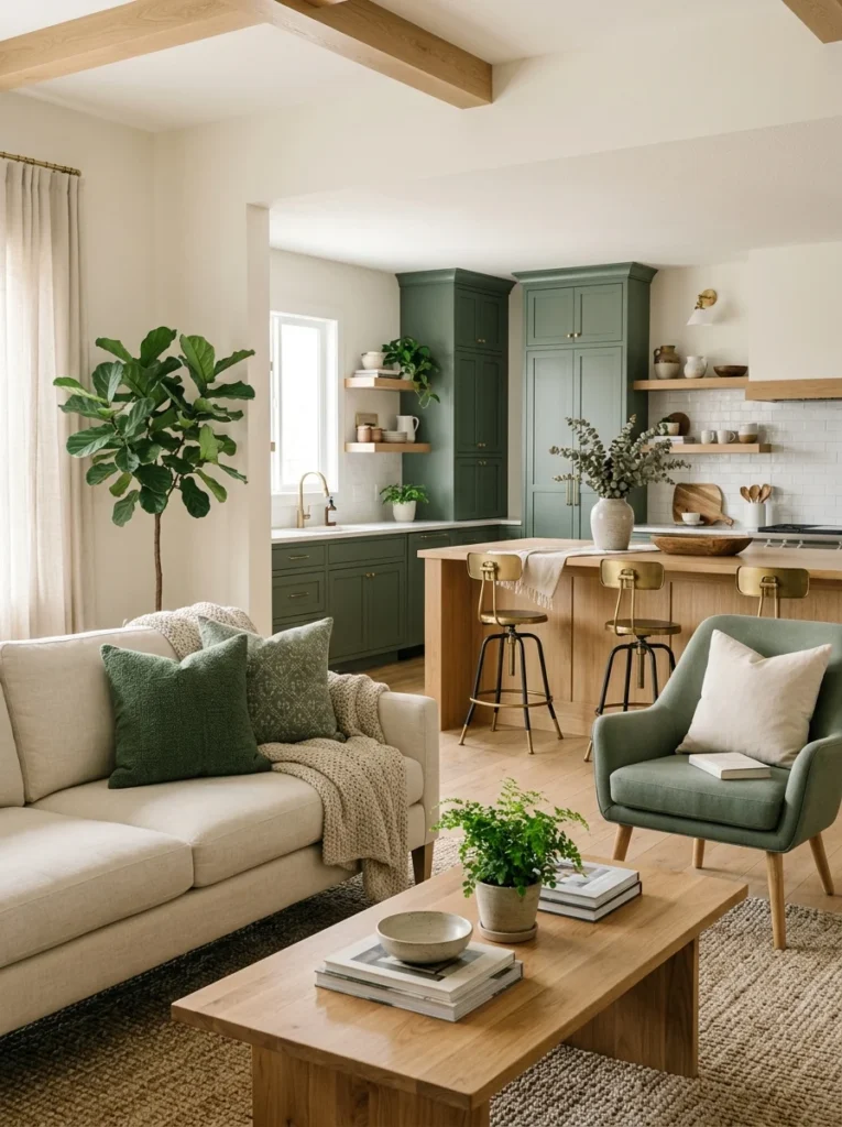
I painted my kitchen cabinets a deep sage green and, almost as an experiment, brought that same green into the living room through a couple of throw pillows and a small accent chair. That small, deliberate repetition tied the two areas together in a way that felt intentional rather than coincidental, and it’s a trick I now recommend to almost anyone dealing with an open floor plan. It doesn’t need to be a dominant color — even a subtle, repeated accent is often enough to link the spaces visually.
Let the Kitchen Island Act as a Soft Divider
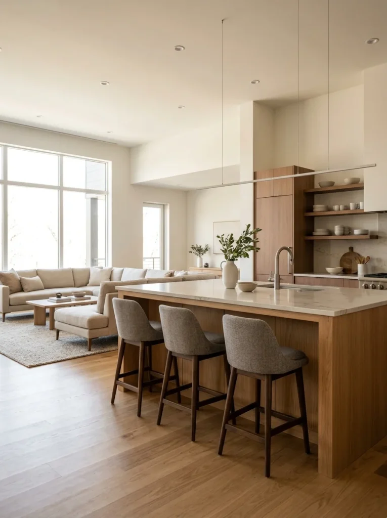
My kitchen island ended up doing more work than I originally gave it credit for. Positioned at the edge where the kitchen meets the living room, it created a natural boundary without blocking sightlines or conversation between someone cooking and someone sitting on the couch. Before I had the island, that boundary didn’t exist at all, and the kitchen counter clutter was constantly visible from the couch in a way that made the whole space feel messier than it actually was.
Pay Attention to Sightlines From the Couch
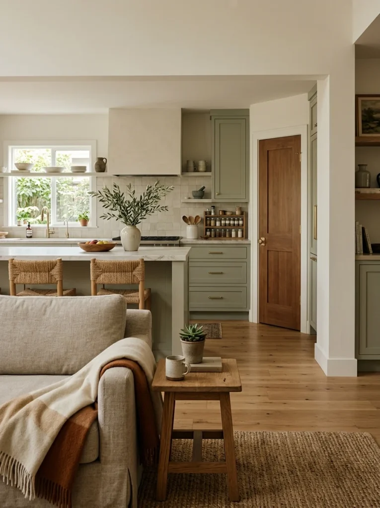
I didn’t think about this until a guest mentioned that from my couch, she could see directly into my pantry every time the door swung open. Small sightline issues like this are easy to miss when you’re standing in the kitchen but become obvious the moment you sit down in the living room for an extended period. I ended up rearranging a shelf and repositioning where I stood most often while cooking, and it made a genuine difference in how tidy the space felt from a seated position.
Vary the Lighting Between Zones, Even in One Room
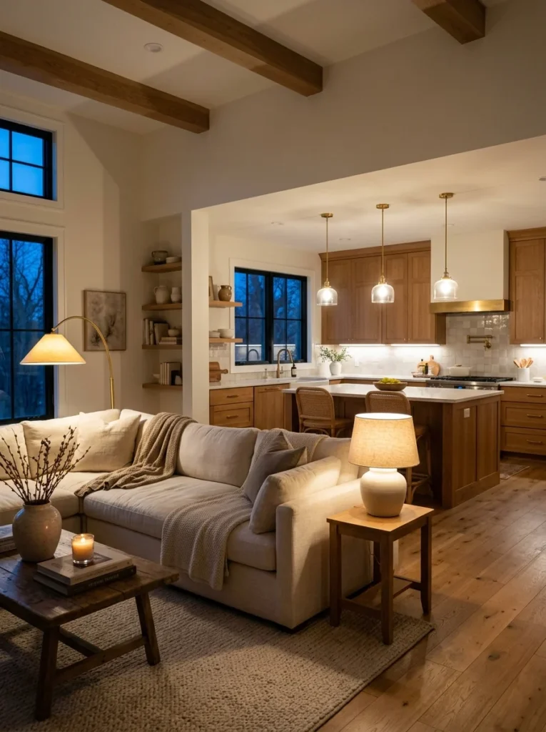
Even though the kitchen and living room share the same open space, I treat their lighting completely differently, and that contrast actually helps define the zones rather than confusing them. The kitchen runs on brighter, cooler-toned task lighting for actual cooking, while the living room area uses warmer lamps and a dimmer overall glow for evenings. Switching between the two lighting moods, rather than lighting the whole open space uniformly, reinforced the sense that I was moving from one “room” to another despite there being no wall between them.
Choose Furniture That Doesn’t Block the View Between Spaces
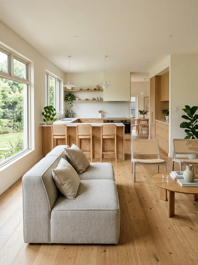
My first couch was a tall-backed sectional that, in hindsight, essentially built an invisible wall between the kitchen and the rest of the living room. Swapping it for a lower-profile sofa opened up sightlines across the whole space, and suddenly conversations could happen between someone cooking and someone relaxing on the couch without either person needing to raise their voice or lean around furniture.
Coordinate, Don’t Match, Your Furniture and Cabinetry
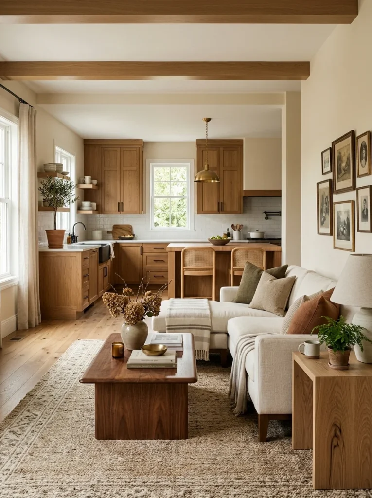
I initially assumed my living room furniture needed to closely match the wood tone of my kitchen cabinets to feel cohesive, and the result felt oddly matchy, almost like a furniture showroom display rather than a lived-in home. What worked better was choosing tones that complemented each other without being identical — a slightly different but harmonious wood tone on my coffee table, for instance, rather than an exact match to the cabinets across the room.
Use a Console Table or Bookshelf as a Gentle Boundary
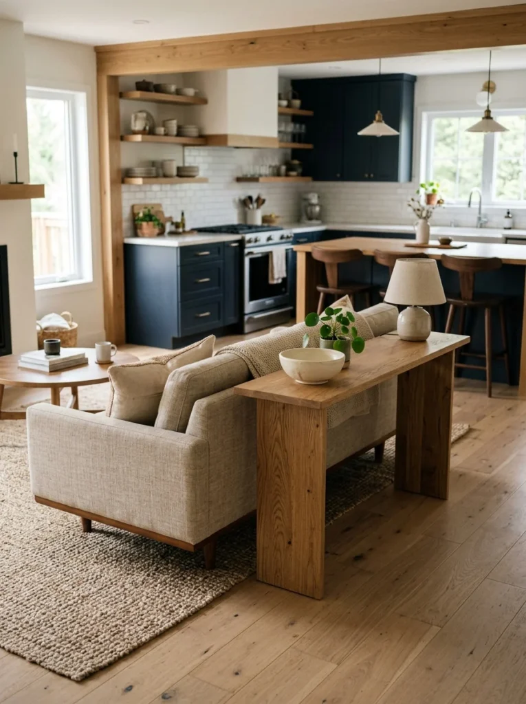
Instead of a hard divider, I placed a narrow console table behind my couch, facing the kitchen, which created a subtle sense of separation without blocking the openness of the floor plan. It also gave me a spot to set down mail or a bag of groceries on the way through, which turned out to be more functional than I initially planned for.
Keep the Ceiling in Mind, Not Just the Floor
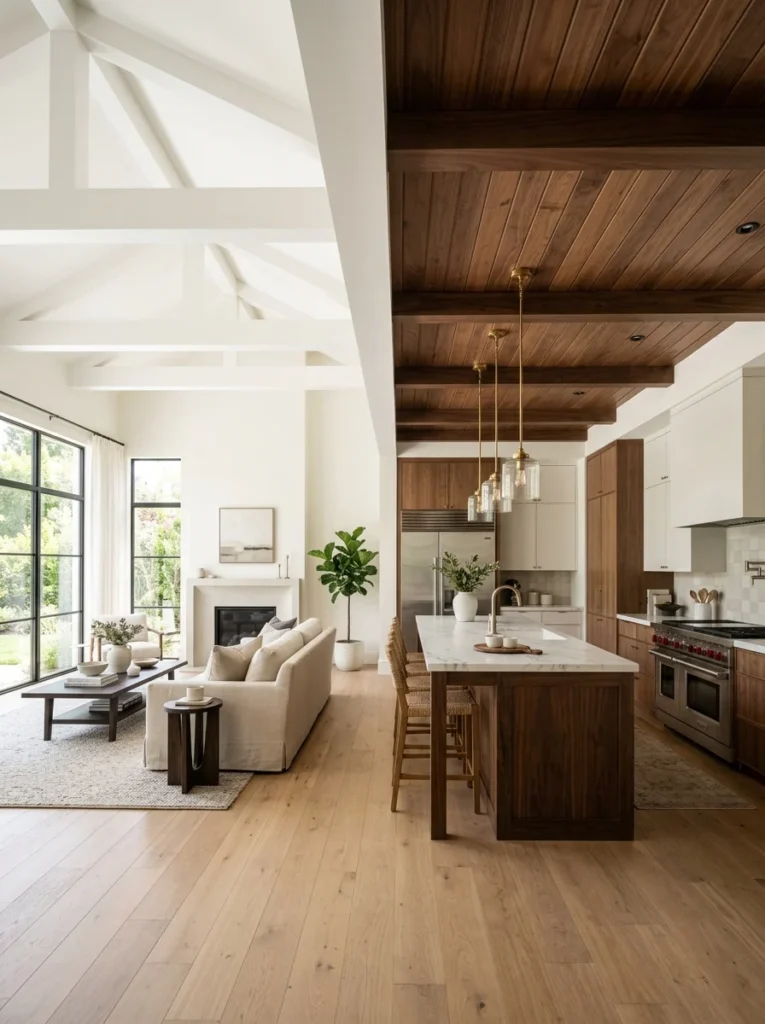
I hadn’t considered ceiling treatment until I noticed how a friend used a slightly different paint color on the ceiling above her kitchen versus her living room to subtly signal the shift between spaces, even though the walls below flowed together seamlessly. I tried something similar with a change in ceiling texture between a lowered section above my kitchen and the higher, open section above my living room, and it added a layer of definition I hadn’t gotten from floor-level changes alone.
Don’t Let the Dining Area Get Lost in Between
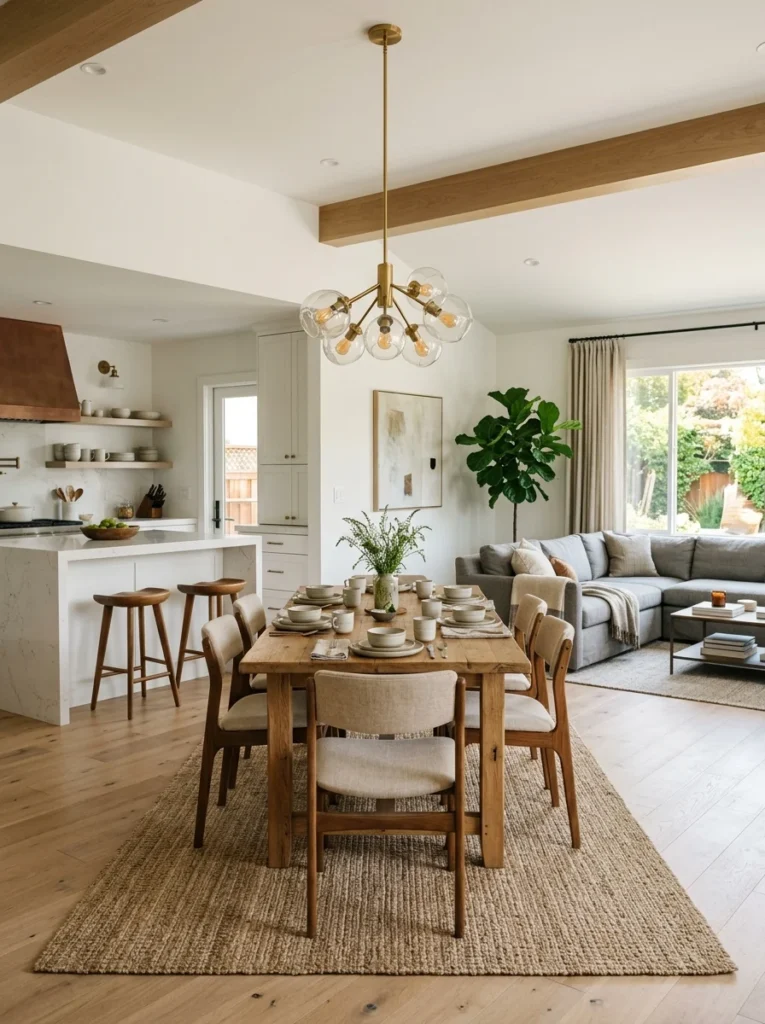
In my layout, the dining table sits between the kitchen and living room, and for a long time it felt like a leftover space rather than its own zone, since it wasn’t clearly part of either room. Adding a pendant light directly above the table and a rug beneath it, similar to what I’d done for the living room, finally gave that middle area its own identity instead of feeling like an afterthought squeezed between the two main zones.
Keep Storage Visually Calm in Both Areas
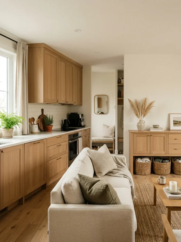
Open floor plans make clutter in one area visible from the other in a way a closed kitchen never would. A messy counter is now visible from my couch, and a cluttered coffee table is visible from the stove. I’ve had to be more consistent about closed storage — cabinets instead of open shelving in the kitchen, baskets instead of loose piles in the living room — simply because there’s no door to close on the mess anymore.
Test the Layout Before Committing to Anything Permanent

Before painting or buying new furniture, I rearranged my existing pieces into the new layout I was considering and lived with it for about two weeks. It’s a small step, but it saved me from painting an accent wall in a spot that, once I actually lived with the furniture rearranged, turned out to be the wrong focal point for the room entirely.
Float Furniture Instead of Pushing It Against Walls
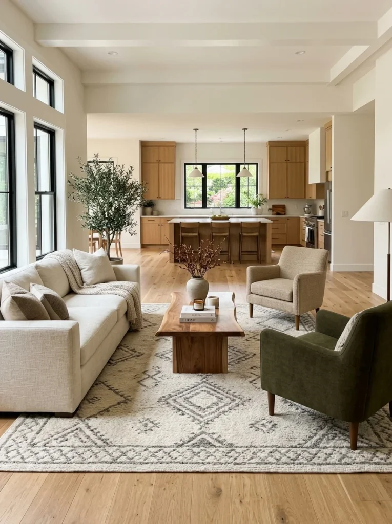
One habit I had to unlearn from living in smaller, closed-off rooms was pushing every piece of furniture against a wall to “save space.” In an open floor plan, that instinct actually works against you, because it leaves a large, undefined gap of empty floor in the middle of the room with no clear purpose. Pulling my couch and armchairs away from the walls and angling them toward each other, floating in the room rather than hugging its edges, created a much more defined seating area and made the connection between the kitchen and living room feel more natural rather than like two rooms bolted together with a gap in between.
Give Each Zone a Distinct but Related Focal Point
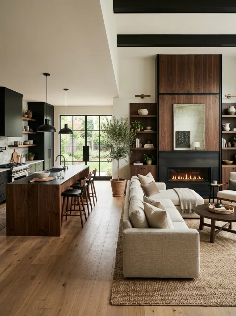
For a while, my living room’s focal point was the TV and my kitchen’s focal point was, by default, the stove, and the two areas felt like they were competing for attention rather than complementing each other. I eventually treated the fireplace as the anchor for the living room side and let the island stand as the anchor for the kitchen side, then made sure both anchors shared a similar material palette, dark wood and matte black accents in both spots, so that even with two separate focal points, they read as part of the same design story rather than two disconnected choices.
Watch How the Space Feels at Different Times of Day
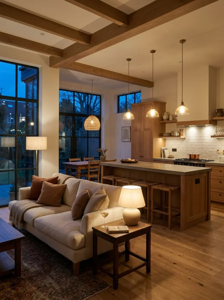
One thing I didn’t fully appreciate until I’d lived in the space for a full year was how differently it reads depending on the time of day. In the morning, with natural light pouring in from the kitchen windows, the whole open area feels bright and energetic, and the boundary between kitchen and living room barely registers at all. By evening, with the sun down and only lamps and pendant lights active, the two zones separate much more clearly because of the deliberate lighting contrast I mentioned earlier. I used to think a single “finished” layout should look consistent all day, but I’ve come around to the idea that a space genuinely shifting character between morning and evening is actually a sign the lighting and zoning decisions are working as intended, not a flaw to fix.
A Quick Look at Where This Space Started
It’s worth mentioning what this room actually looked like eight months into living here, because I think it’s easy to read a list like this and assume the end result came together quickly. My first attempt had mismatched furniture pulled from a previous apartment, a rug that didn’t fit any of the zones properly, and lighting that was either too bright everywhere or too dim everywhere depending on which single switch I flipped. None of the individual pieces were wrong exactly, but nothing had been chosen with the other zone in mind, and it showed. The turning point wasn’t a single dramatic change but slowly applying each of the ideas above, one at a time, over a period of months, checking in after each change to see whether the space actually felt more connected or just different.
What I’d Do Differently If I Started Over
If I were designing an open kitchen and living room from scratch again, I’d focus on traffic patterns and sightlines before anything related to color or style. Nearly every change that made a real difference in my space came from understanding how I actually moved through and looked across the room, not from a specific paint choice or furniture trend. The color coordination and lighting details mattered, but they were refinements on top of a layout that already worked functionally — trying to fix a bad layout with better decor never quite gets you there.
An open floor plan isn’t really about removing a wall and calling it done. It’s about replacing that wall with a handful of subtler cues — a rug, a lighting shift, a repeated color, a well-placed piece of furniture — that do the same job of defining separate spaces, just without actually dividing the room. It took me longer than I expected to understand that, but once I did, my kitchen and living room finally stopped feeling like two rooms sharing an address and started feeling like one space that genuinely worked together. If you’re standing in your own open-plan space right now feeling like something’s slightly off but can’t quite name it, my honest suggestion is to start with the rug and the traffic paths before touching anything else — those two changes alone did more for my space than every other decision on this list combined.