
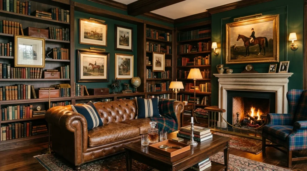
I first fell in love with that classic, English-countryside-meets-American-prep aesthetic on a trip to a friend’s family cabin years ago, long before I understood it had a name or a whole design philosophy built around it. Leather armchairs, tartan throws, brass lamps, and walls lined with framed equestrian prints made the whole place feel like it had been furnished over generations rather than decorated in a single weekend. I remember sitting in that living room thinking it looked like it belonged in a magazine, yet somehow still felt completely comfortable to actually live in, worn in exactly the right places rather than staged for a photo shoot. When I finally started redoing my own living room and study, that same polished, old-money-inspired look became my north star, even working with a much smaller budget than the antiques and heirloom pieces that inspired it.
Over the past few years, I’ve slowly built that aesthetic into my own home, piece by piece, and helped a couple of friends bring a similar feel into their spaces too. None of us own a single item actually purchased from a Ralph Lauren showroom, and yet the look translates surprisingly well using more accessible furniture and a handful of very deliberate styling choices. Below are 16 ideas that capture that classic, tailored, luxury feel, explained in real depth so you can understand not just what to buy, but why each choice works the way it does within this particular aesthetic.
1. Deep Hunter Green Walls in a Study
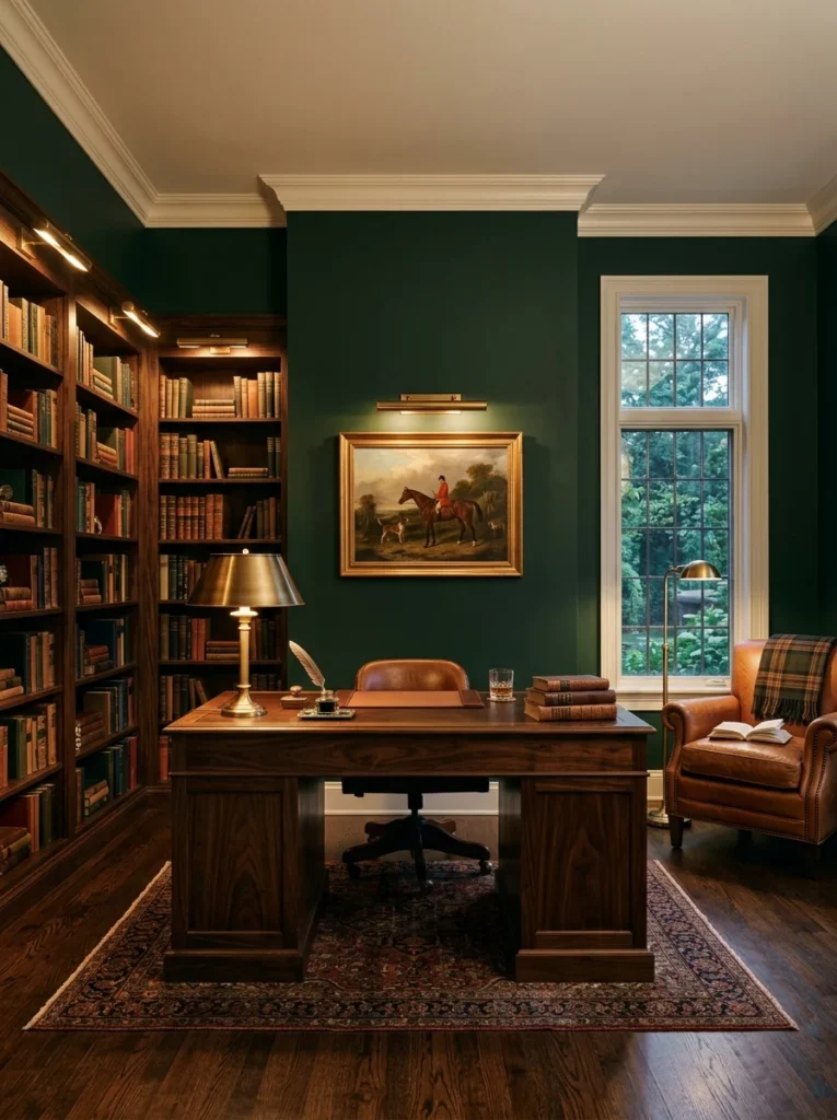
Painting my home office a deep hunter green completely changed how the room felt, giving it an enclosed, library-like warmth that a lighter neutral never could. Before this change, the room had a fairly standard off-white on the walls, and while it was perfectly pleasant, it never felt like a space with any real character or point of view. The moment the green went up, everything shifted, and the room started to feel like somewhere with history, even though it was a brand new coat of paint on drywall that had only ever seen white before.
Choosing the right shade of green took more trial and error than I expected. I tested four different swatches on the wall before landing on one that read as a true hunter green rather than tipping too far toward forest black or a brighter, more modern emerald. Lighting mattered enormously in that decision, since the same swatch looked completely different under the room’s warm lamp light in the evening compared to the cooler daylight coming through the window in the morning, and I ended up choosing based on how it looked in the evening, since that’s when I actually use the room most.
Deep green pairs remarkably well with the warm wood tones and brass accents that define this whole style, which is part of why it shows up so often in classic libraries and studies. The color has enough depth to feel serious and grounded without tipping into feeling cold or gloomy the way a true black or navy sometimes can in a smaller room. It also does a great job of making brass fixtures and gold picture frames pop, since the warm metallic tones read as almost glowing against that dark, saturated backdrop.
One detail I’d pass along to anyone considering this is to keep the ceiling and trim lighter than the walls. I kept my ceiling a soft white and left the crown molding and baseboards in the same tone, which created enough contrast that the room still feels appropriately sized rather than closing in on itself. Going dark on every surface in a smaller room can tip from cozy into cramped fairly quickly, and that trim contrast is really what kept my study feeling intentional rather than overwhelming.
2. Leather Chesterfield-Style Seating
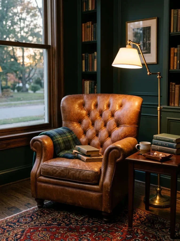
A tufted leather chair, even a more affordable reproduction rather than a genuine vintage piece, anchors a room in that classic, clubby feel almost instantly, in a way that very few other single furniture choices can match. When I was furnishing my study, I spent a long time debating between a fabric wingback and a leather chesterfield-style chair, and ultimately the leather won out because of how naturally it fits into this particular aesthetic without needing anything else in the room to support it.
Mine is a mid-range reproduction rather than a genuine antique, since real vintage chesterfield chairs in good condition tend to carry a significant price tag, especially from recognizable furniture houses. What surprised me is how quickly the reproduction started to develop its own character once it saw regular use. The leather has softened noticeably over the two years I’ve owned it, and a couple of small creases have formed exactly where my arm rests most often, giving it a lived-in quality that a brand-new piece simply doesn’t have on day one.
Color choice matters a lot here too. I went with a deep cognac brown rather than black or a lighter tan, since cognac tends to read as the most classic option within this style and pairs beautifully with both the green walls and the mahogany side table nearby. Black leather can work, but it tends to feel more modern and severe, which pulls slightly away from the warm, traditional feeling this aesthetic is built around.
Placement also matters more than people often expect. I positioned my chair at a slight angle near the window rather than facing straight into the room, which makes it feel more like a genuine reading nook than a piece of furniture arranged purely for visual symmetry. A small brass floor lamp positioned just behind the chair completes the setup, giving it enough focused light for actually reading in the evening without relying on the room’s main overhead fixture, which tends to feel too bright and modern for this kind of cozy, tailored corner.
3. Tartan and Plaid Throw Blankets
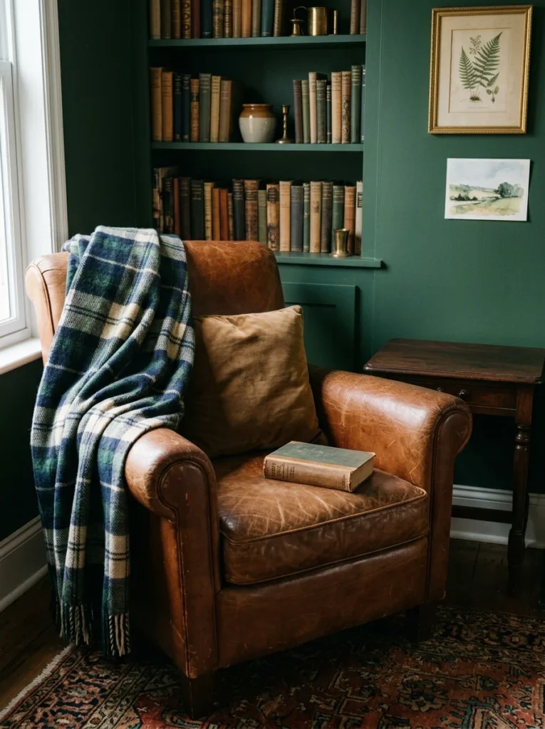
Layering a wool tartan throw over the arm of a leather chair or the foot of a bed is one of the simplest, most affordable ways to bring in that classic prep feel, and it’s genuinely one of the first changes I’d recommend to anyone just starting to explore this aesthetic without wanting to commit to a full furniture overhaul. A single throw blanket costs a fraction of what any of the larger furniture pieces on this list would run, and yet it does a surprising amount of visual work toward establishing the mood of a room.
I rotate mine seasonally, using heavier wool plaids in winter, when the thicker weave and richer colors feel appropriate against the darker evenings, and switching to a lighter cotton check version in warmer months, when a heavy wool throw would feel out of place draped over furniture in the middle of summer. This seasonal rotation also means the throws don’t get as worn from constant use, and it gives me a small, easy way to refresh the room’s feeling twice a year without any real cost or effort involved.
Color coordination took some thought as well. My main tartan throw uses the same hunter green as my study walls as its dominant tone, with thin lines of navy and a warm cream woven through, which ties it directly into the room’s existing palette rather than introducing a completely unrelated color scheme. When choosing a plaid or tartan pattern, I’d recommend picking one where at least one dominant color already exists somewhere else in the room, whether that’s the wall color, the upholstery, or even just a picture frame, since that repetition is what makes a bold pattern feel intentional rather than randomly dropped into the space.
Texture matters just as much as pattern here. A genuine wool weave, even a relatively affordable one, has a noticeably different look and feel than a printed pattern on a synthetic fabric, and that difference is visible even from across the room. The slight texture and weight of real wool drapes differently over furniture, falling into natural folds rather than lying flat, which contributes meaningfully to that collected-over-time, heirloom quality this whole aesthetic depends on.
4. Brass Picture Lights Over Framed Art
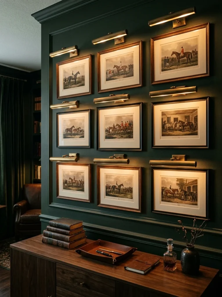
Small brass picture lights mounted above framed prints give a gallery-like quality to even a modest art collection, and they’re one of those details that most visitors don’t consciously register but that make an enormous difference to how finished and intentional a wall feels. In my study, a simple brass picture light over a set of vintage-style equestrian prints turned an otherwise plain wall into what feels like the most curated corner of the room, despite the prints themselves being fairly affordable reproductions rather than original artwork.
Installation was more involved than I initially expected, mostly because getting the light positioned correctly relative to the artwork below took some careful measuring. The light needs to sit close enough to properly illuminate the print without casting an obvious shadow line or creating harsh glare on the glass if the piece is framed with glazing. I ended up choosing prints with a matte finish rather than glossy glass specifically to avoid that glare issue, which made a noticeable difference once the lights were actually turned on.
The warm, slightly amber quality of light from a brass picture light also plays an important role here, distinct from the cooler white light many modern LED fixtures produce. That warmth flatters both the artwork and the brass fixture itself, creating a cohesive glow that ties into the room’s overall warm color palette rather than introducing a stark, clinical light source into an otherwise traditional space.
Beyond the practical lighting function, picture lights also signal a level of intentionality about the artwork itself. A print or painting with its own dedicated light source reads as something the room was genuinely built around, rather than simply hung on a wall as an afterthought. Even with relatively inexpensive prints, that dedicated lighting elevates the whole display, which is part of why this detail shows up so consistently in higher-end interiors that lean into this classic aesthetic, regardless of how much the actual artwork itself cost to acquire.
5. Navy and Cream Striped Upholstery
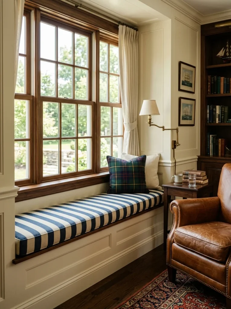
A navy and cream striped fabric on a bench or accent chair brings in a nautical, preppy note without tipping into a full coastal theme, which is a balance that took me some experimenting to get right. I used this pattern on a window seat cushion in my living room, and it’s become one of the most photographed spots in my house, largely because the crisp, clean lines of the stripe contrast so well against the room’s warmer, more textured elements like the leather chair and wood furniture nearby.
Stripe width made a real difference in how the pattern read within the room. I initially considered a very thin pinstripe, but once I saw a fabric sample against the other elements in the room, it felt too subtle and almost got lost visually. A slightly wider stripe, roughly an inch and a half, gave the pattern enough presence to register as an intentional design choice from across the room, rather than reading as a nearly solid fabric from a distance.
The specific shade of navy also mattered more than I expected going in. A true navy, rather than a lighter or more muted blue-gray, kept the fabric feeling crisp and classic rather than drifting toward a softer, more casual coastal palette. Pairing that navy with a warm cream, rather than a stark white, helped the stripe feel cohesive with the room’s other warm tones instead of introducing a colder, more contrasting element that would have fought against the leather and wood surrounding it.
Fabric weight and durability were practical considerations too, since a window seat sees regular use from both people and, in my case, an enthusiastic dog who considers that cushion prime real estate. I chose a heavier cotton canvas rather than a lighter linen blend specifically because it holds up better to daily wear and is easier to spot-clean, which matters enormously for any striped upholstery placed in a high-traffic spot rather than a purely decorative accent chair that sees less regular use.
6. Rich Mahogany or Walnut Furniture
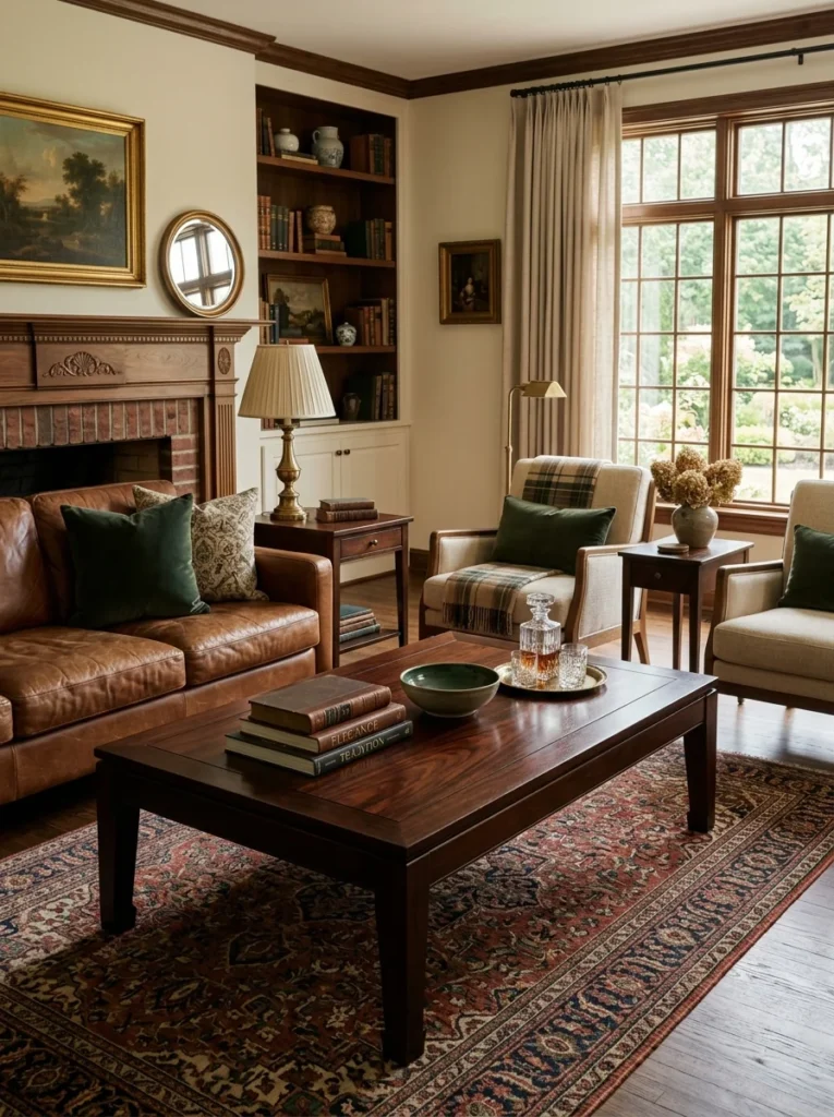
Swapping lighter wood furniture for pieces in a deeper mahogany or walnut tone made an enormous difference in how “classic” my living room felt, more than almost any other single change I made throughout the whole process. Before this shift, most of my furniture had been a fairly standard light oak, which is popular in a lot of newer furniture lines but reads as considerably more modern and casual than the deep, rich wood tones this aesthetic depends on.
Even a single piece, like a coffee table or a bookshelf, in that deep wood tone helps ground a room in this aesthetic, and I’d recommend starting with whichever piece sees the most visual attention in your specific room rather than trying to replace every wood surface at once. In my case, that meant starting with a mahogany coffee table, since it sits at the center of the room and anchors the eye more than a side table or bookshelf tucked against a wall would.
Sourcing genuine mahogany or walnut furniture at a reasonable price took patience. New furniture in these wood tones, particularly from recognizable design houses, tends to carry a significant premium, so I turned to estate sales and consignment shops instead, where solid wood furniture in these deeper tones is often available for considerably less than an equivalent new piece, especially since lighter, more contemporary wood tones have been more fashionable in recent years, making the darker vintage pieces somewhat less competitively priced at resale.
Maintenance is worth mentioning too, since deep wood furniture shows dust, water rings, and scratches differently than lighter finishes do. I’ve learned to keep a small tin of appropriate wood polish on hand and to use coasters more diligently than I probably would with a more casual, lighter finished table, since water marks show up noticeably against the dark, glossy surface. That extra bit of care, though, is part of what keeps the furniture looking genuinely well-maintained rather than worn down, which matters for an aesthetic built so heavily around the idea of well-cared-for, heirloom-quality pieces passed down and used for decades rather than replaced every few years.
7. A Well-Stocked, Styled Bookshelf
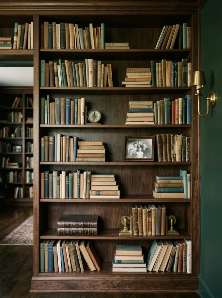
Books, arranged both upright and stacked horizontally with the occasional small object or framed photo tucked in between, are central to this look, and getting that arrangement right took more thought than I expected when I first started rearranging my own shelves. I made a point of keeping our actual reading collection visible rather than hiding it away in a closet or storage bin, since the slightly imperfect, well-loved quality of real books used often is part of the appeal that distinguishes this aesthetic from a more sterile, purely decorative shelf styled entirely with matching objects.
Organizing by color, a popular trend in some design circles, actually works against this particular aesthetic in my experience, since it tends to read as overly styled and impersonal rather than genuinely collected over time. Instead, I grouped books loosely by subject and size, letting natural variation in spine color and height create visual interest rather than forcing an artificial rainbow gradient across the shelves.
Mixing in objects between the books matters just as much as the books themselves. I tucked a small brass compass, a framed black-and-white photo, and a leather-bound box into different sections of my shelving, spaced out so no single shelf felt too crowded or too sparse. These small breaks in the rows of books give the eye somewhere to rest and reinforce that collected, personal quality, as though each object has a genuine story behind it rather than being placed there purely for decoration.
Height variation across the whole shelving unit also plays a role in how finished the display feels. Rather than filling every single shelf completely, I left a bit of breathing room on a couple of shelves and used bookends to create small, intentional groupings elsewhere. That variation between fuller and more open sections keeps the whole wall from reading as one flat, uniform block, which is a mistake I made in my first attempt at styling the shelves, before pulling several books back out and rearranging everything with more deliberate spacing.
8. Equestrian-Themed Artwork
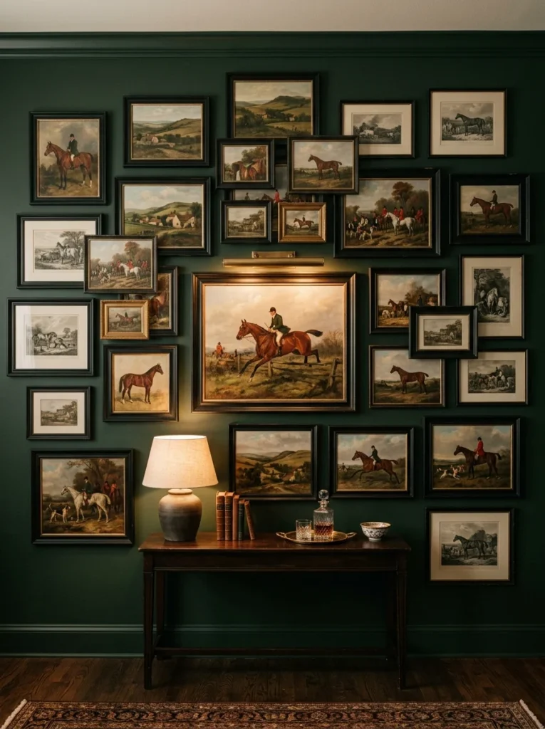
Framed prints or paintings featuring horses, riding scenes, or countryside landscapes are a signature element of this style, and they’re one of the more recognizable visual shorthand elements people associate with this whole aesthetic. I found several affordable vintage-style prints online and had them framed in simple black frames, which gave the collection a cohesive, gallery-wall feel without requiring an enormous investment in either the original artwork or elaborate custom framing.
Choosing the right subject matter took some consideration beyond simply picking anything with a horse in it. I gravitated toward prints depicting riding scenes and hunting-adjacent countryside imagery rather than more literal, competition-style equestrian photography, since the softer, more painterly quality of those prints fit better with the overall traditional, slightly romanticized feeling of the room compared to a sharp, modern photograph of a specific competitive event.
Frame consistency mattered more than I expected once the pieces were actually hung together. My original plan involved a few different frame styles and finishes, but once I saw them grouped on the wall, the inconsistency felt more chaotic than intentional. Switching to a matching set of simple black frames, varied only slightly in size to accommodate the different print dimensions, gave the whole grouping a far more polished, gallery-like presentation while still allowing each individual print to stand out on its own merit.
Placement height and grouping pattern also required some trial and error. I initially hung the prints in a strict grid, evenly spaced, which looked correct on paper but felt a bit stiff and impersonal once installed. Adjusting to a slightly looser, salon-style arrangement, with varying gaps between frames and a mix of larger and smaller pieces, gave the wall a more organic, collected-over-time quality that better matched the rest of the room’s aesthetic, even though the actual prints themselves hadn’t changed at all.
9. A Wingback Chair in a Bold Plaid
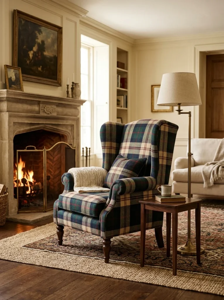
A single wingback chair upholstered in a bold plaid or check fabric became the unexpected focal point of my living room, and it’s a piece that consistently draws comments from anyone visiting for the first time. It’s a bolder move than a solid color, but keeping the surrounding furniture more neutral let the chair stand out as an intentional statement rather than feeling like too much pattern all at once competing for attention in the same space.
Choosing the fabric itself took the longest of any decision in this whole room. I ordered nearly a dozen fabric swatches before settling on a specific plaid, since the scale of the pattern mattered enormously once translated onto actual furniture rather than a small sample square. A pattern that looked appropriately bold on a swatch card sometimes felt overwhelming once imagined across an entire chair, while others that seemed subtle in miniature actually read beautifully once scaled up to full furniture size.
The wingback silhouette itself carries a lot of the traditional weight in this piece, independent of the fabric choice. Those tall, structured wings and the deep seat give the chair a formal, substantial presence that a more casual, low-profile chair simply couldn’t match, regardless of what fabric covered it. That silhouette is part of why this particular chair style has remained a staple of classic, tailored interiors for centuries, well before this specific aesthetic had a name attached to it.
Placement within the room required some thought too, since a chair this visually bold needs enough space around it to actually be appreciated rather than getting crowded by other furniture. I positioned mine at a slight angle facing the fireplace, with a reasonable gap between it and the nearest piece of furniture, which gives it room to breathe visually and reinforces its role as a genuine statement piece rather than just another seat squeezed into the existing furniture arrangement.
10. Brass and Leather Bar Cart
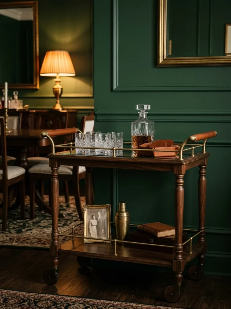
A small bar cart combining brass hardware with leather-wrapped handles brought that clubby, sophisticated feel into our dining area, and it’s become one of the more functional pieces on this entire list, genuinely used on a regular basis rather than serving a purely decorative role. Styled with a few crystal glasses and a leather-bound tray, it’s become a piece that also does a lot of visual work in the room while still earning its keep as an actual serving surface during dinners and gatherings.
Finding the right proportions took some searching, since many bar carts on the market lean toward a more modern, minimalist aesthetic with thin metal frames that don’t fit this particular style especially well. I eventually found a slightly heavier frame with turned wood legs and brass accents, which felt more substantial and traditional than the sleeker, more contemporary options that dominate a lot of current furniture catalogs.
Styling the cart itself required some restraint, since it would have been easy to overcrowd such a small surface with too many items. I settled on a curated selection: a set of four crystal glasses, a single crystal decanter, a small leather tray for coasters, and one framed photo tucked onto the lower shelf. That relatively sparse arrangement leaves enough visual breathing room that each item can actually be appreciated, rather than blending into a cluttered display that would undercut the elegant, tailored feeling the piece is meant to convey.
Maintenance became part of the routine too, since brass hardware exposed to regular handling tends to show fingerprints and tarnish more visibly than it would in a lower-touch location elsewhere in the house. I keep a soft polishing cloth in a nearby drawer and give the hardware a quick wipe every couple of weeks, which keeps the piece looking properly maintained rather than allowing it to develop an uneven, neglected patina that would undercut the polished feeling the rest of the room works to establish.
11. Monogrammed Throw Pillows
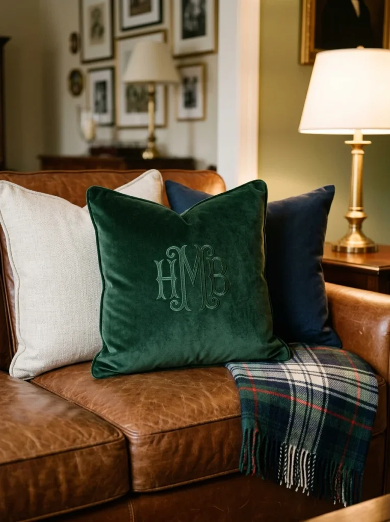
A subtle monogram on a linen or velvet throw pillow adds a personal, heirloom-style touch that feels distinctly part of this aesthetic, and it’s a detail that consistently surprises guests once they notice it, since a monogram reads as a small but meaningful signal that the room was designed with real intention rather than furnished entirely from a single catalog order. I had a simple set embroidered locally rather than buying anything pre-made, which kept the cost reasonable while still achieving that custom, tailored look this style depends on.
Choosing the monogram style itself required some research, since there are several traditional formats, from a classic three-letter arrangement to a simpler single-initial design. I ultimately went with a traditional three-letter monogram using a slightly ornate serif font, which felt more in keeping with the overall vintage, heirloom character of the room than a more modern, minimalist single-letter approach would have.
Fabric choice mattered as much as the monogram itself. I chose a heavier linen for two of the pillows and a rich velvet for a third, both because the mix of textures adds visual interest and because embroidery tends to sit and catch light slightly differently depending on the base fabric. The velvet pillow in particular shows the monogram beautifully under lamp light, with the thread catching a subtle sheen that a flatter linen surface doesn’t produce in quite the same way.
Placement and thread color also took some consideration. Rather than using a stark white or black thread that would have made the monogram the most dominant visual element on the pillow, I chose a thread color close to the pillow’s own fabric tone, just slightly lighter, so the monogram reveals itself more gradually as something to notice up close rather than announcing itself immediately from across the room. That subtlety felt more in line with the understated, quietly confident quality this whole aesthetic tends to favor over anything too loud or attention-seeking.
12. Wood-Paneled Walls in a Library or Den
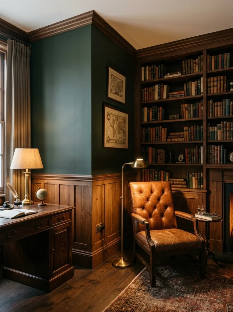
Wood paneling, even a partial wainscoting treatment rather than a full floor-to-ceiling application, brings an instant sense of tradition and warmth to a den or study, and it was one of the more involved projects on this entire list, requiring genuine carpentry work rather than a simple styling change. I used a simpler board-and-batten style rather than full raised paneling, which kept the cost manageable while still achieving that classic, layered wall texture associated with this aesthetic.
Deciding on the height of the paneling took some experimentation using painter’s tape to mock up different options directly on the wall before committing to anything permanent. I initially planned for a fairly standard chair-rail height, around three feet, but once I saw it taped out, it felt slightly too short relative to the room’s ceiling height. Raising it to just over four feet gave the paneling a more substantial, intentional presence without overwhelming the room the way a full floor-to-ceiling treatment might have in a space this size.
Wood species and stain color required their own round of decisions. I chose a relatively affordable pine for the actual boards, since it takes stain well and is considerably more budget-friendly than a hardwood like oak or walnut would have been for a project covering this much wall area. The stain itself went through several test patches before I landed on a medium walnut tone, dark enough to read as rich and traditional but not so dark that it made the room feel smaller, especially combined with the deep green paint used above the paneling on the upper portion of the wall.
Installation details mattered enormously to the finished look as well. Ensuring consistent spacing between each vertical batten, and carefully planning the layout around the room’s corners and any electrical outlets, took considerably more measuring and planning than I expected going in. Rushing that layout stage would have resulted in awkward, uneven spacing that undercuts the whole point of the treatment, since precise, evenly spaced woodwork is really what separates a genuinely traditional, well-executed paneling job from something that reads as a rougher, more amateur DIY attempt.
13. Antique Brass Hardware on Cabinetry
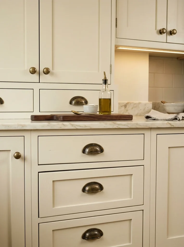
Swapping out plain modern cabinet pulls for antique-style brass hardware throughout my kitchen and bathroom made a surprisingly large impact on the overall feel of those rooms, especially considering how relatively small and inexpensive a project it turned out to be compared to almost everything else on this list. It’s a relatively affordable update that ties even simple, modern cabinetry into this more traditional aesthetic without requiring a full cabinet replacement.
Selecting the right finish took some research, since “brass” as a category actually covers a wide range of specific tones and treatments. I ultimately chose an unlacquered brass finish rather than a shinier, more uniform polished brass, specifically because unlacquered brass develops a natural patina over time with handling and exposure to air, gradually taking on a warmer, slightly aged appearance that fits this aesthetic’s emphasis on pieces that improve and deepen in character the longer they’re actually used.
Hardware style mattered just as much as finish. Rather than simple, minimalist bar pulls common in more contemporary kitchens, I chose a more traditional design featuring subtle detailing along the edges, along with classic cup pulls for a few of the lower drawers. That extra bit of detail work, while more expensive per piece than the simplest modern options, reads as noticeably more traditional and considered once installed across an entire kitchen’s worth of cabinetry.
Installation itself required careful attention to existing hole placement, since not every new hardware option matched the spacing of what had been there before. In a couple of spots, I had to fill and touch up old holes to accommodate a different spacing pattern for the new pulls, which added some extra time to what might otherwise have been a purely cosmetic, quick-turnaround project. That extra effort, though, meant every single piece of hardware installed cleanly and consistently, without any visible gaps or mismatched holes that would have undercut the polished, put-together quality this whole update was meant to achieve.
14. A Well-Dressed Four-Poster Bed
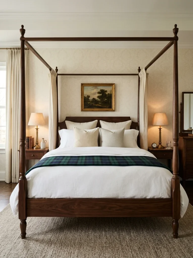
A four-poster or canopy bed frame, dressed in crisp white linens with a tailored plaid or striped duvet layered on top, brings that classic bedroom feel without needing an entire room full of antiques. Mine is a simple, modern reproduction rather than a genuine antique, and it still reads as timeless, largely because the silhouette itself carries so much of the traditional character regardless of how recently the actual frame was manufactured.
Choosing the right proportions relative to the room’s ceiling height took careful measuring before ordering. A four-poster frame that’s too tall for a lower-ceilinged room can feel cramped and overwhelming rather than grand, so I specifically looked for a frame with a slightly shorter post height than the most dramatic options available, which suited my particular bedroom’s more modest ceiling far better than a taller, more traditional four-poster would have.
Layering the bedding itself became almost as important as the frame. I start with crisp white sheets and a simple white duvet cover as the base layer, then add a folded plaid or striped blanket across the foot of the bed, along with a mix of solid and patterned throw pillows arranged against the headboard. That layering approach, rather than a single matched bedding set, gives the whole bed a more collected, intentional appearance, similar to the mixing principle that applies throughout the rest of this aesthetic.
Fabric choice for any curtains or drapery attached to the frame itself required some thought too, since not every four-poster bed comes with hanging fabric, and adding it after the fact meant sourcing a coordinating linen separately. I chose a simple, unlined linen in a soft cream to hang from two of the four posts rather than curtaining the entire frame, which gives a suggestion of that classic canopy look without fully enclosing the bed, keeping the room feeling open and functional for everyday use rather than overly formal or theatrical.
15. Leather-Bound Accessories
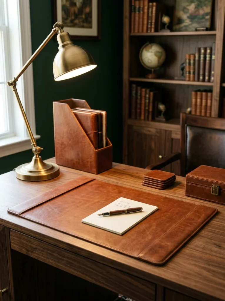
Small leather accessories, from a desk blotter to a magazine holder to a set of coasters, add texture and that signature refined feel in places where a larger furniture piece wouldn’t make sense, and they’re genuinely some of the most affordable ways to bring this aesthetic into a room without a major purchase. I’ve slowly collected a handful of these pieces over time rather than buying them all at once, which fits naturally with the broader philosophy of letting a room accumulate its character gradually.
The desk blotter was one of the first pieces I added, mostly because I work from home and wanted my desk to feel more considered than a bare wood surface with a laptop sitting on top of it. Beyond the visual benefit, it also serves a genuinely practical purpose, protecting the desk’s finish from scratches and providing a defined, contained space for a notepad and pen, which keeps the desktop looking tidier day to day than it otherwise would.
Sourcing quality leather accessories on a reasonable budget took some searching across a few different retailers before I found options that balanced genuine leather construction against a price point that made sense for what are, ultimately, fairly small accent pieces. Full-grain leather, while more expensive, develops a noticeably richer patina over time compared to bonded or faux leather alternatives, which matters considerably for an aesthetic so invested in the idea of materials that age well and gain character through use rather than staying static and new-looking indefinitely.
Color coordination across these smaller pieces mattered more than I initially expected too. I kept every leather accessory in the same cognac brown family as my chair, rather than mixing in black or a lighter tan, which creates a subtle but noticeable sense of cohesion across the room even though these pieces are scattered across different surfaces rather than grouped together in one obvious display. That consistency is part of what makes a collection of small, individually inexpensive items read as a deliberate, considered choice rather than a random assortment of unrelated objects.
16. A Gallery Wall of Vintage-Style Portraits
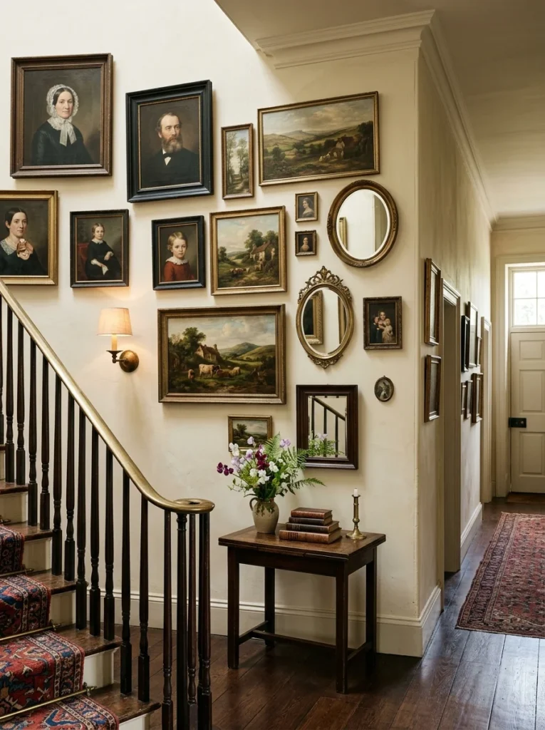
A cluster of framed vintage-style portraits and landscapes, mixed with a few mirrors for visual variety, gave one hallway in my house that layered, collected-over-time feeling this style relies on, and it turned what had been a fairly forgettable transitional space into one of the more visually interesting corners of the entire house. Mixing frame styles slightly, rather than using all identical frames, made the wall feel more authentically assembled rather than purchased as a matching set from a single source.
Sourcing the actual portraits and landscape prints took some patience, since I specifically wanted pieces that felt appropriately aged and traditional rather than obviously modern reproductions. Estate sales, secondhand shops, and a few online vintage print marketplaces all contributed pieces to the final collection, and that variety in sourcing is part of why the wall doesn’t feel like it came from any single catalog or curated collection, but rather like it had genuinely been assembled over years of collecting.
Planning the actual layout before hanging anything permanently saved me from a lot of unnecessary nail holes in the wall. I laid every frame out on the floor first, arranging and rearranging the grouping until the balance of sizes, orientations, and subject matter felt right, then traced the arrangement onto large sheets of paper that I temporarily taped to the wall to confirm spacing and alignment before committing to any actual hardware.
Including a couple of mirrors within the grouping, rather than filling the whole wall exclusively with framed art, added both visual variety and a practical function, helping bounce a bit more light down what would otherwise be a fairly dim hallway. The reflective surfaces also break up what could otherwise become a visually heavy wall of similarly toned, similarly framed pieces, giving the eye periodic relief as it moves across the whole arrangement, which is a detail I only appreciated after living with the finished wall for a few months and noticing how much the mirrors contributed to keeping the overall effect feeling balanced rather than overwhelming.
Frequently Asked Questions
Do I need to buy actual Ralph Lauren furniture to get this look? Not at all. None of the furniture in my own home came from an official Ralph Lauren collection, and the aesthetic translates well using more accessible brands, vintage finds, and even DIY elements like the monogrammed pillows I had made locally. What matters most is the color palette, materials, and styling choices rather than any specific brand name attached to the individual pieces themselves.
Is this style too formal for a family with young kids? I was worried about the same thing before committing to leather and tartan in a house with kids, but durable materials like leather actually hold up remarkably well to daily use and only look better with a little wear over time. I’d recommend saving the most delicate pieces, like antique lamps, for lower-traffic rooms while using sturdier versions in busier family spaces where daily wear and tear is simply part of everyday life.
What’s the easiest way to start incorporating this style on a small budget? Based on my own experience, start with textiles: a tartan throw, a striped pillow, and a set of brass picture lights are all relatively inexpensive changes that immediately shift the mood of a room, even before any larger furniture investments come into play down the line.
How do I avoid this style feeling like a themed room instead of a real home? The biggest safeguard against that, in my experience, is mixing genuinely old or secondhand pieces in with anything new, and resisting the urge to buy a fully matching set of furniture in one purchase. Rooms that feel collected over time, with slight variation in wood tones, frame styles, and fabric patterns, read as far more authentic than a space where every single item was clearly bought together from the same catalog.
Final Thoughts
Looking around my study now, full of leather, brass, and plaid that took years rather than a single weekend to bring together, it’s clear that this aesthetic rewards patience far more than a big one-time budget. What started as an admiration for a friend’s family cabin turned into a genuinely personal collection of pieces, some inherited, some found secondhand, and a few bought new, that together capture that same timeless, tailored feeling without ever costing what the original inspiration pieces would have.
If you’re drawn to this look yourself, my honest advice is to resist the urge to buy everything at once. Start with one or two anchor pieces, a leather chair or a rich wood-toned table, and build outward gradually with textiles and accessories as you find pieces that genuinely feel right for your space. That slower, more considered approach is really what makes a room feel like classic luxury rather than a themed set purchased in a single afternoon, and it’s the same approach that turned my own house from a collection of individually nice rooms into a home that finally feels like it belongs to me.