
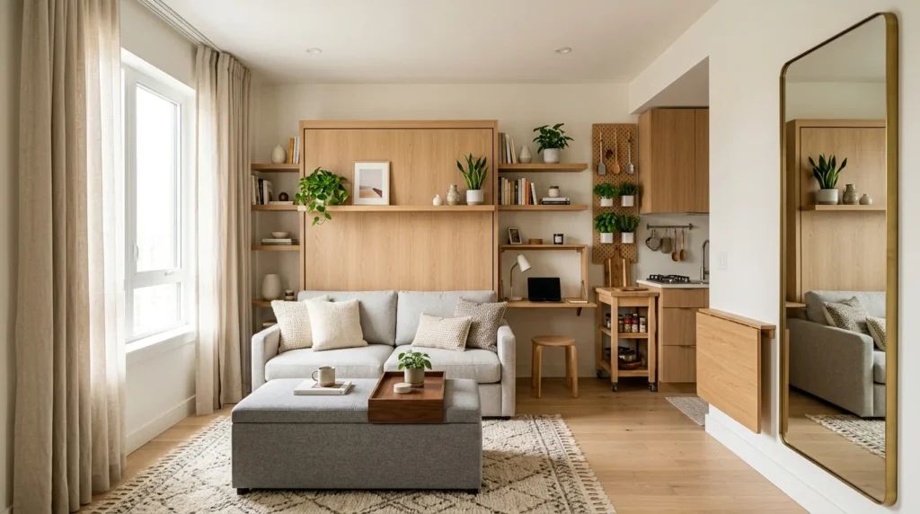
My first apartment on my own was 430 square feet, a single room with a kitchenette along one wall and a bathroom barely big enough to turn around in. I remember standing in the middle of it on move-in day, surrounded by boxes, genuinely unsure how I was going to fit a bed, a desk, somewhere to eat, and somewhere to actually relax into a space that small. For the first few months, I lived with furniture pushed randomly against whichever wall had room, and the apartment felt chaotic and cramped no matter how little I actually owned.
Everything changed once I stopped thinking about the apartment as one space to be filled and started thinking about it as a series of overlapping zones, each one doing double or triple duty depending on the time of day. Over the two and a half years I lived there, and in the two smaller apartments I’ve helped friends organize since, I picked up a long list of strategies that actually made a genuine difference, as opposed to the generic advice about mirrors and light colors that gets repeated everywhere without much real explanation of why or how to apply it. Here are 18 of them, explained in enough depth that you can actually apply the reasoning to your own space rather than just copying a photo.
1. Furniture That Serves at Least Two Functions
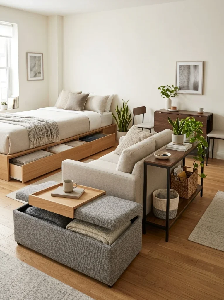
The single biggest shift in how my apartment functioned came from committing to a rule that every major piece of furniture had to serve at least two purposes. My coffee table wasn’t just a coffee table, it was a storage ottoman with a removable tray top, holding extra blankets and off-season clothes inside while still functioning as a surface for drinks and a laptop during the day. My bed frame had built-in drawers underneath rather than sitting on simple legs, which gave me the equivalent of a small dresser’s worth of storage without needing to find floor space for an actual dresser.
Finding genuinely well-made multi-function furniture took more research than I expected, since a lot of pieces marketed this way sacrifice quality or comfort for the sake of the added function. I learned to read reviews specifically looking for complaints about stability or comfort before purchasing anything, since a storage ottoman that wobbles when you sit on it, or a sofa bed with an uncomfortable mattress, ultimately fails at both of its intended jobs rather than succeeding at either one.
Beyond obvious examples like storage ottomans and bed frames, I found less common multi-function pieces made a real difference too. A narrow console table behind my sofa worked as both a plant display and a spot to drop keys and mail near the door, since the apartment’s layout meant the sofa back doubled as an entryway boundary. A dining table that extended to seat four when needed, but collapsed down to a narrow console width for daily use, meant I wasn’t sacrificing floor space to a full-size table that only occasionally got used at its largest capacity.
The mental shift mattered as much as the furniture itself. Once I started evaluating every potential purchase against the question of whether it could serve a second function, I naturally stopped buying purely decorative pieces that took up valuable square footage without earning their keep, which kept the apartment from accumulating the kind of clutter that makes small spaces feel even smaller than they actually are.
2. Wall-Mounted Shelving Instead of Freestanding Units
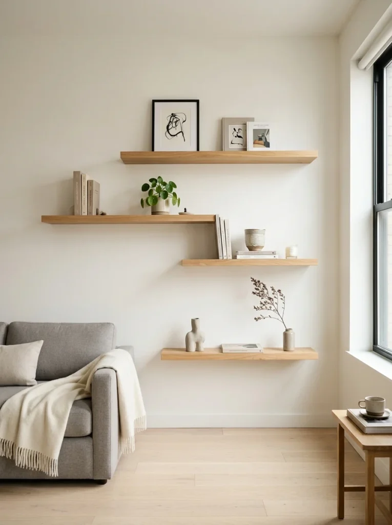
Replacing a bulky freestanding bookshelf with wall-mounted floating shelves freed up a genuinely surprising amount of visual and physical floor space in my living area. A traditional bookshelf, even a narrow one, has a footprint that eats into usable floor area and creates a visual boundary that makes a room feel more divided and cramped. Wall-mounted shelves, by contrast, appear to float, and the floor space beneath them remains fully open and usable.
Installation required more care than a freestanding piece would have, since finding wall studs and ensuring proper weight distribution mattered enormously for shelves meant to hold books and heavier decorative objects. I invested in a stud finder and took the time to properly anchor each shelf rather than relying on drywall anchors alone, which gave me confidence loading the shelves with genuinely heavy items rather than needing to keep them nearly empty out of fear they’d pull away from the wall.
Staggering shelf heights rather than installing them in a perfectly even row also made a meaningful difference in how the wall read visually. I placed shelves at varying heights, closer together in some spots and with more breathing room in others, which created a more dynamic, gallery-like arrangement rather than a rigid grid that emphasized just how little wall space I actually had to work with in the first place.
Choosing what to display on open shelving versus what to store in closed cabinets elsewhere in the apartment took some ongoing calibration too. I learned that overloading open shelves with too many small objects made the whole wall feel cluttered and busy, working against the sense of openness the shelving was meant to create in the first place. Keeping the displayed items relatively curated, with some genuine negative space left between groupings, kept the shelving feeling intentional rather than like an overflow zone for anything that didn’t have another home.
3. A Murphy Bed for Flexible Floor Space
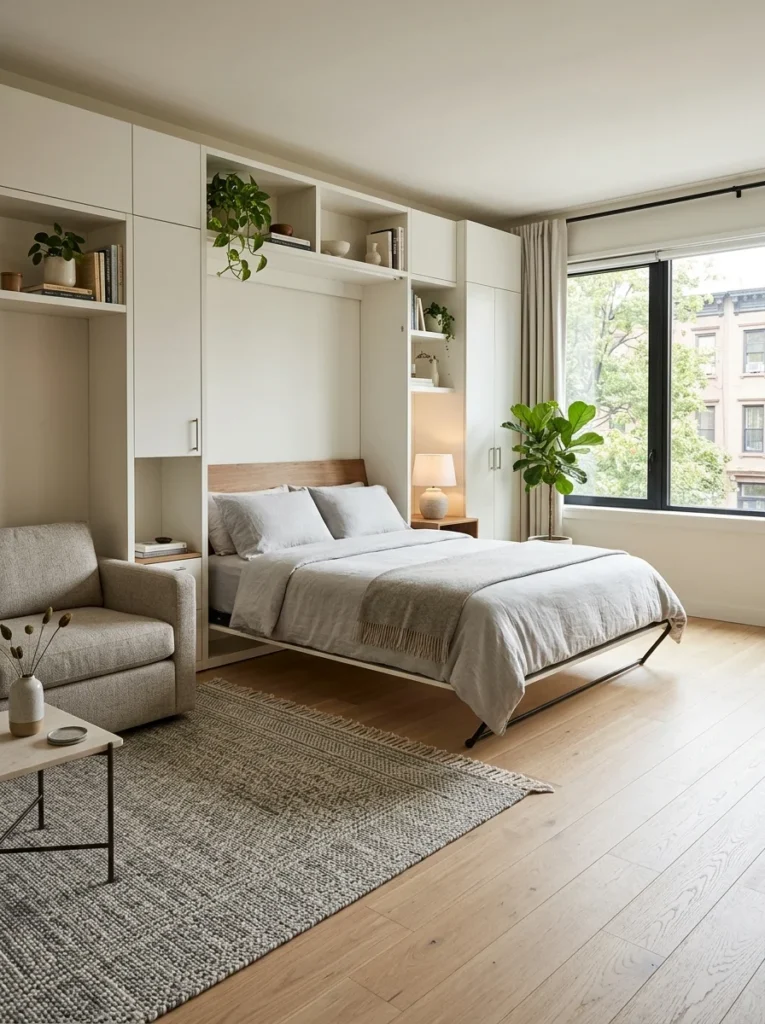
Installing a wall-mounted Murphy bed in my studio completely transformed how the apartment functioned during the day, since folding the bed up against the wall each morning gave me back nearly a third of my total floor space for the hours I wasn’t actually sleeping. Before the Murphy bed, my regular bed frame sat permanently in the middle of the main living area, which meant the space always read as a bedroom first and a living room second, regardless of what furniture I arranged around it.
The installation itself was a bigger project than most of the other changes on this list, requiring professional installation to ensure the mechanism was properly anchored and safely balanced. I’d strongly recommend against attempting this as a purely DIY project unless you have genuine experience with the specific hardware involved, since a poorly installed Murphy bed carries real safety risks that aren’t worth the cost savings of skipping professional help.
Mattress choice mattered more than I initially expected too. A standard, thicker mattress designed for a traditional bed frame doesn’t fold as easily or safely into a Murphy bed mechanism, so I opted for a slightly thinner memory foam option specifically designed for this kind of application. It required an adjustment period in terms of comfort compared to my previous mattress, but the tradeoff felt entirely worth it given how much daily functional space the setup returned to me.
Living with a Murphy bed also required a shift in daily habits, since the routine of folding the bed away each morning and back down each night needed to become second nature rather than an occasional afterthought. Within a couple of weeks, it genuinely did become automatic, similar to any other daily habit, and the payoff in usable daytime space made that small routine adjustment feel like an easy trade.
4. Vertical Storage in the Kitchen
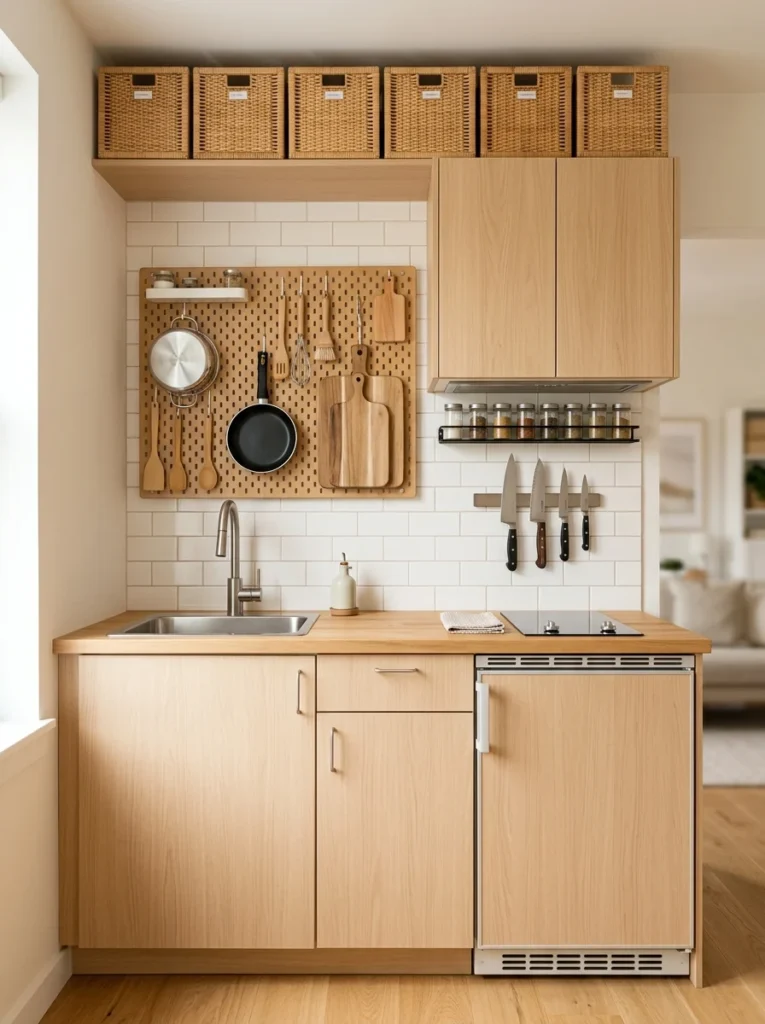
My small apartment’s kitchen had almost no cabinet space, so I turned to the walls to make up the difference, installing a pegboard above the counter for pots, utensils, and cutting boards, along with a hanging rail for spices just below the upper cabinets. That vertical approach let me store a genuinely full set of cooking tools despite having barely any traditional cabinet or drawer space to work with in the first place.
Choosing what actually went on display versus what stayed hidden in the limited cabinet space I did have required some thought. I kept frequently used items, like my primary cooking pot and everyday utensils, on the pegboard where they were immediately accessible, while less frequently used specialty items, like a particular baking pan I only used a few times a year, stayed tucked in the one small cabinet I had, out of daily sight but still reachable when needed.
A magnetic knife strip mounted on the wall solved another common small-kitchen problem, eliminating the need for a bulky knife block taking up counter space. It also, somewhat unexpectedly, became one of the more visually interesting elements of the kitchen once I had a full set of knives displayed in a clean row, giving the wall genuine visual interest rather than feeling purely utilitarian.
Overhead storage above the cabinets, a space that often goes completely unused in small kitchens, became home to a rotating collection of items I needed only occasionally, stored in matching baskets that kept the area looking tidy rather than like an overflow dumping ground. That top-of-cabinet space, easy to overlook, ended up providing a meaningful amount of extra storage capacity once I actually started using it deliberately rather than leaving it empty out of habit.
5. A Fold-Down Desk for a Home Office Corner
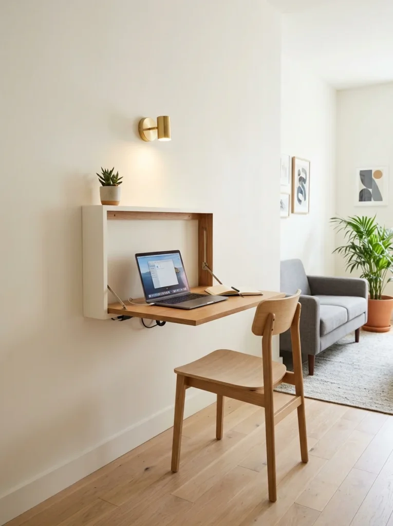
Working from home in a studio apartment meant I needed a genuine desk setup without permanently sacrificing floor space to a piece of furniture only in use during work hours. A wall-mounted fold-down desk solved this perfectly, providing a full-size work surface when unfolded and collapsing flat against the wall the moment the workday ended, returning that section of floor to open space for the evening.
Choosing the right mounting height and desk depth required some careful planning before installation, since I needed enough surface area for a laptop and some paperwork without the desk protruding so far into the room that it created an obstacle when folded down. I settled on a depth of about eighteen inches, enough for genuine productivity without overwhelming the narrow section of wall where it needed to fit.
Cable management became a bigger consideration than I initially anticipated, since a desk that folds away each day can’t accommodate the same tangle of visible cords a permanent desk might get away with. I ran my charging cables and a small power strip through a cable clip mounted to the underside of the desk itself, which kept everything tucked neatly away and prevented cords from dangling awkwardly whenever the desk folded up against the wall.
Lighting also needed rethinking once the desk became a fold-down rather than fixed piece, since I couldn’t rely on a permanent desk lamp sitting in one spot. I installed a small battery-powered wall sconce directly above the desk’s mounting bracket, providing adequate task lighting whenever the desk was in use without needing a cord or fixture that would interfere with the folding mechanism when the desk collapsed back against the wall each evening.
6. Sliding or Pocket Doors Instead of Swinging Doors
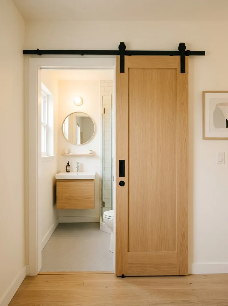
Replacing my bathroom’s standard swinging door with a sliding barn-style door reclaimed a surprising amount of usable floor space that had previously been dedicated purely to the door’s swing radius. A standard door, even in a small bathroom, needs a full arc of clear floor space to open and close properly, space that’s otherwise completely unusable for anything else, which felt like an obvious waste once I actually thought about how much square footage that swing radius consumed.
Installation required mounting a track above the doorway, which meant confirming there was adequate wall space beside the door frame for the door to slide into when open. In my case, that meant sacrificing a small section of wall that might have otherwise held a picture or shelf, a tradeoff I considered well worth it given how much more functional the bathroom felt with the door sliding flat against the wall rather than swinging into the room.
Sound and privacy considerations came up during the decision process too, since sliding doors don’t seal quite as tightly as a traditional swinging door with a proper frame and latch. I addressed this with a door that included a basic privacy lock and some simple weatherstripping along the edges, which handled both concerns adequately for a bathroom, though I’d think more carefully about this tradeoff for a bedroom or other space where sound isolation matters more significantly.
Beyond the bathroom, I later applied the same idea to my apartment’s single closet, replacing bifold doors with a sliding option that eliminated the awkward dead space bifold doors typically require to fold open properly. That change alone made the closet’s interior noticeably easier to access fully, since I was no longer working around a door mechanism eating into the usable opening every time I needed something from the back corners of the space.
7. A Loft Bed to Free Up the Floor Below
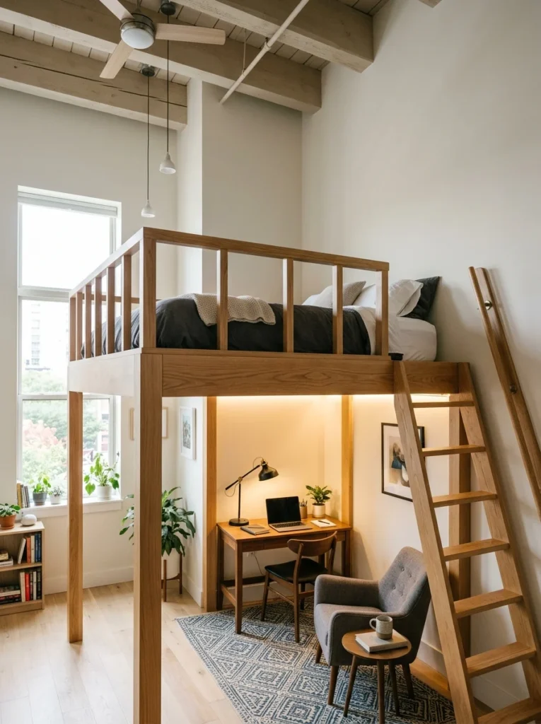
In a friend’s even smaller studio, we installed a loft bed frame that elevated her sleeping area entirely, opening up the full floor space beneath it for a small desk and a compact seating area. Unlike a Murphy bed, which folds away entirely, a loft bed keeps the bed permanently accessible while still freeing that valuable floor space underneath for other genuine daily use, which made it a better fit for her specific routine and preference for not dealing with a daily folding ritual.
Ceiling height became the primary limiting factor in whether this approach was even feasible. Her apartment had unusually tall ceilings for the building’s era, which made a loft bed comfortable rather than cramped, since there was still enough headroom while seated on the bed itself. I’d strongly recommend measuring ceiling height carefully and accounting for both the mattress thickness and frame height before committing to this option, since a loft bed in a room with standard eight-foot ceilings can feel genuinely oppressive rather than functional.
Access to the elevated bed also required some thought, since a permanent ladder takes up its own bit of floor space and can become an obstacle if not positioned thoughtfully. We chose a frame with an angled ladder rather than a completely vertical one, which felt more comfortable and stable to climb, and positioned it in a corner where it interfered least with the desk and seating area established underneath.
Styling the space beneath the loft bed to feel like a genuine, intentional room rather than an awkward leftover space required some effort too. Adding a small area rug beneath the desk and seating area, along with proper task lighting since the loft bed itself blocked some of the room’s natural overhead light from reaching that lower zone, made the space feel like its own defined room rather than simply the empty floor beneath a bed frame.
8. Mirrors Positioned to Reflect Natural Light
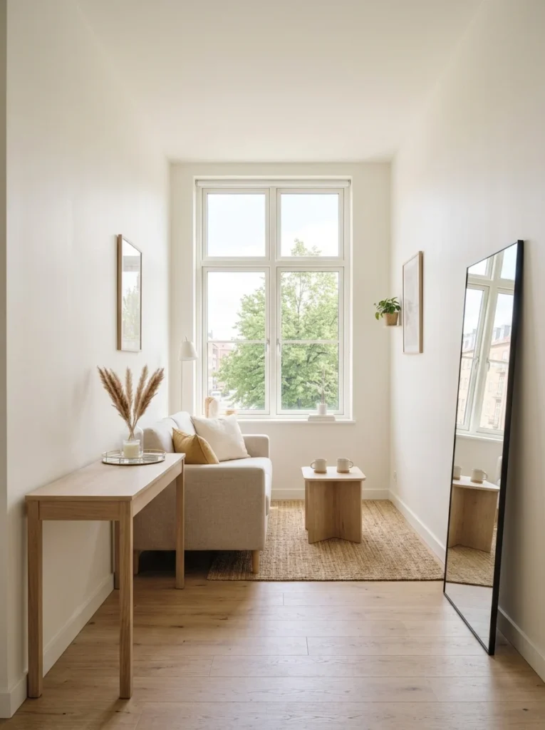
Beyond the generic advice to simply add mirrors to a small space, the specific placement and angle of a mirror relative to a window made a much bigger difference than I initially expected. I positioned a large mirror directly across from my apartment’s single window, angled slightly to catch and reflect the incoming natural light back across the room rather than simply hanging it flat against the wall without consideration for the light source.
Testing different positions before committing to permanent hardware saved me from a mistake I nearly made. My first instinct was to hang the mirror on the wall perpendicular to the window, which seemed logical but actually did very little to amplify the natural light, since it mostly reflected the opposite wall rather than the window itself. Moving the mirror to directly face the window made an immediate, noticeable difference in how bright the apartment felt throughout the day.
Mirror size and frame style also factored into the overall effect. I chose a genuinely large mirror, nearly the height of the wall it hung on, rather than a smaller decorative piece, since a larger reflective surface amplifies more light and creates a more convincing sense of expanded depth than a small mirror ever could manage on its own. The frame itself I kept simple and thin, since a heavy, ornate frame would have drawn more attention to the mirror as an object rather than letting it do its job of visually expanding the room.
Beyond the single large mirror, I later added a smaller mirrored tray on my console table and a mirrored closet door, both of which contributed additional smaller pockets of reflected light throughout the apartment. The cumulative effect of several strategically placed reflective surfaces, rather than relying on just one large mirror alone, made a genuinely noticeable difference in how open and bright the whole small space felt by the end of the day compared to how dim and closed in it had felt before I started paying attention to this detail.
9. Curtains Hung Higher Than the Window Frame
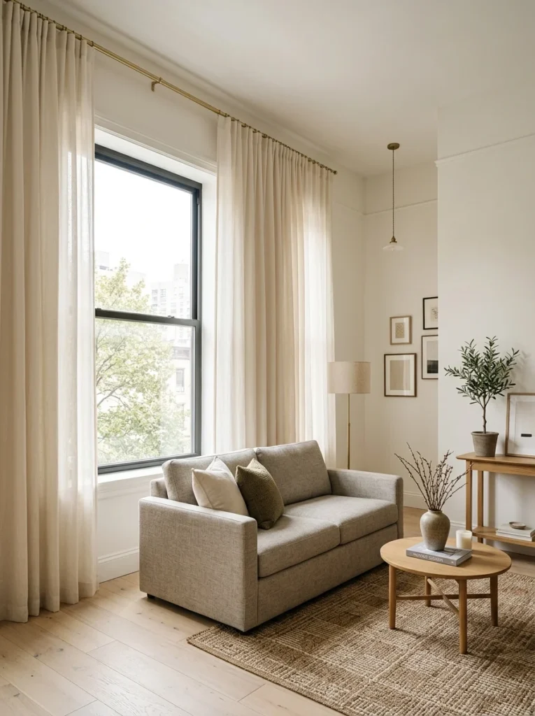
Mounting curtain rods several inches above my actual window frame, rather than directly on top of it, made my apartment’s ceilings feel noticeably taller than their actual height, a trick that took very little effort or cost to implement but delivered one of the more disproportionately large visual improvements of anything I tried in the whole apartment. The eye reads the top of the curtain as the effective top of the window, so raising that visual boundary closer to the actual ceiling elongates the entire wall.
Choosing curtain length correctly mattered just as much as the mounting height. I made sure the curtains extended all the way to the floor, rather than stopping a few inches short, since curtains that end mid-wall break up that elongating visual line and undercut much of the benefit gained from the higher mounting position in the first place. Getting the length precisely right required careful measuring, accounting for the higher rod position rather than simply reusing a standard curtain length designed for a rod mounted directly above a standard window frame.
Fabric weight and color also played a role in the overall effect. I chose a lightweight, semi-sheer fabric in a pale color close to my wall color, which kept the curtains from creating a visually heavy block of color that would have worked against the sense of openness I was trying to achieve elsewhere in the apartment. A heavier, darker fabric can work in this same higher-mounting approach, but it shifts the mood toward something more dramatic and enclosed rather than the airy, expansive feeling I was specifically going for in a small space.
Rod placement relative to the window’s width required attention too, extending several inches beyond each side of the window frame rather than mounting the rod at exactly the window’s width. That wider mounting allowed the curtains to fully clear the glass when opened during the day, letting in maximum natural light rather than the curtain fabric itself blocking a portion of the window even when pulled back, which is a detail that’s easy to overlook but makes a real difference in how much daylight actually reaches the room.
10. A Single Statement Rug to Define Zones
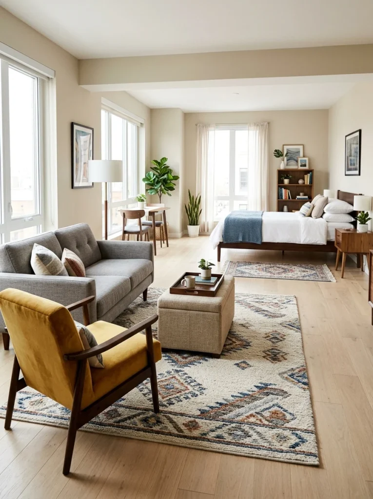
Without walls to separate my studio’s sleeping area from the living space, a single, well-chosen area rug became the primary tool for visually defining where one zone ended and another began. Rather than a small rug that looked more like an afterthought, I invested in a rug large enough to anchor the entire seating area, with all the furniture legs at least partially resting on it, which is a rule of thumb I learned only after making the opposite mistake with a too-small rug in my very first attempt.
Choosing the rug’s boundary and orientation relative to the rest of the apartment’s layout took real planning before purchase. I measured out the intended seating arrangement first, using painter’s tape on the floor to mark where the rug’s edges would need to fall in order to properly anchor the sofa, coffee table, and accent chair I planned to place on it, rather than guessing at a size and hoping it worked out once everything arrived.
Color and pattern choice mattered for the zone-defining function specifically. I chose a rug with a bold enough pattern and color contrast against my flooring that the boundary between “living room zone” and “bedroom zone” registered clearly and immediately to anyone entering the apartment, rather than a subtle, low-contrast rug that would have blended into the floor and failed to create that clear visual distinction between the two areas sharing the same open room.
A second, smaller rug near my bed area performed a similar zone-defining function on the other side of the apartment, using a different but complementary pattern that still felt intentionally coordinated with the main living area rug rather than randomly mismatched. That pairing of two distinct but related rugs did more to make the studio feel like it contained genuinely separate rooms than almost any other single change I made throughout the whole apartment.
11. Nesting Tables Instead of a Fixed Coffee Table
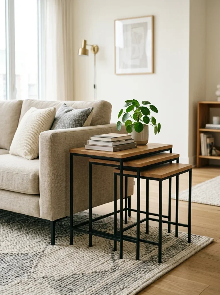
Swapping a single, fixed-size coffee table for a set of nesting tables gave me far more flexibility for a space that regularly needed to accommodate anywhere from one to four people, depending on whether I was relaxing alone or hosting friends for dinner on the floor since a full dining table wasn’t practical in my particular layout. The smallest table nests neatly under the largest one during everyday use, keeping the footprint minimal, while pulling the additional tables out during gatherings instantly created more surface area exactly when it was actually needed.
Material and weight mattered for genuine daily practicality, since tables that needed to be moved and rearranged regularly couldn’t be so heavy that shifting them became a chore each time. I chose a lightweight wood and metal combination rather than solid marble or heavier stone options, which let me reconfigure the tables easily without straining or risking scratches to my floor from dragging something too heavy across it.
Styling the nested arrangement during everyday use, when only the largest table was in view, required some thought too, since I wanted the visible table to look intentional and complete rather than obviously like it was missing pieces tucked away underneath. Keeping a small stack of books and a single plant on the main table’s surface gave it a complete, purposeful look on its own, regardless of whether the smaller tables were currently nested beneath it or pulled out for extra use elsewhere in the room.
The nesting concept extended beyond just the coffee table setup once I started paying attention to the underlying principle. A set of nesting storage baskets in my closet and stackable, nesting mixing bowls in my kitchen followed the same logic, providing full capacity when needed while collapsing down to a minimal footprint during the much larger stretches of time when I didn’t need that full capacity available at once.
12. Under-Bed Storage Bins
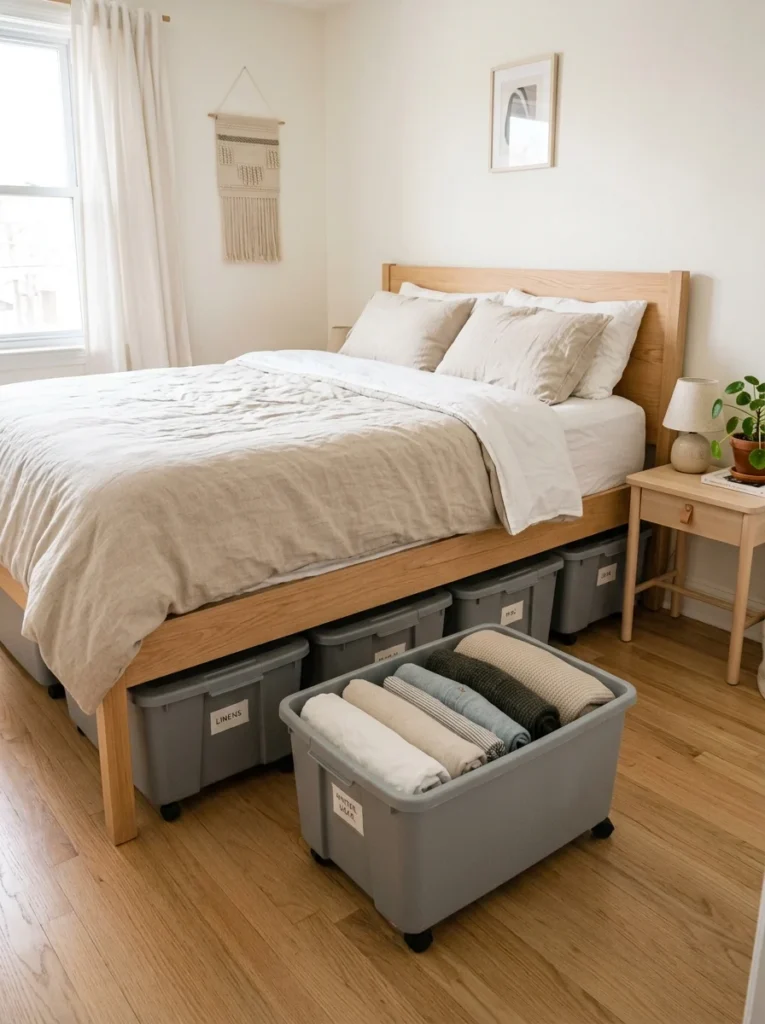
The space beneath my bed frame represented a significant chunk of unused square footage until I started using it deliberately with a set of low-profile, wheeled storage bins sized specifically to fit the clearance beneath my particular bed frame. Off-season clothing, extra bedding, and a few boxes of belongings I wasn’t using regularly all found a home in that previously wasted space, freeing up my one small closet for items I actually needed daily access to.
Measuring the exact clearance beneath my bed frame before purchasing any bins prevented what could have been a frustrating mismatch, since bed frame clearance varies considerably between different models and I’ve seen friends purchase bins that turned out to be just slightly too tall to actually slide underneath their specific frame. I measured the clearance in several spots, accounting for the fact that some frames aren’t perfectly level, before settling on a bin height with a bit of margin to spare.
Choosing wheeled versus non-wheeled bins depended on how frequently I anticipated needing access to the contents. For items like off-season clothing that I only needed to swap out twice a year, simple non-wheeled bins worked fine, since the infrequent access didn’t justify the added cost of wheels. For anything I needed more regular access to, wheeled bins made pulling them out and sliding them back a much smoother, less frustrating daily task.
Labeling each bin clearly, even though they were tucked out of sight beneath the bed, saved me considerable time compared to my original system of vaguely remembering which bin held which category of items. A simple label on the end of each bin, visible even while it remained tucked beneath the frame, meant I could identify the right bin at a glance rather than needing to pull each one out individually to check its contents whenever I needed something specific.
13. A Narrow Rolling Kitchen Cart for Extra Counter Space
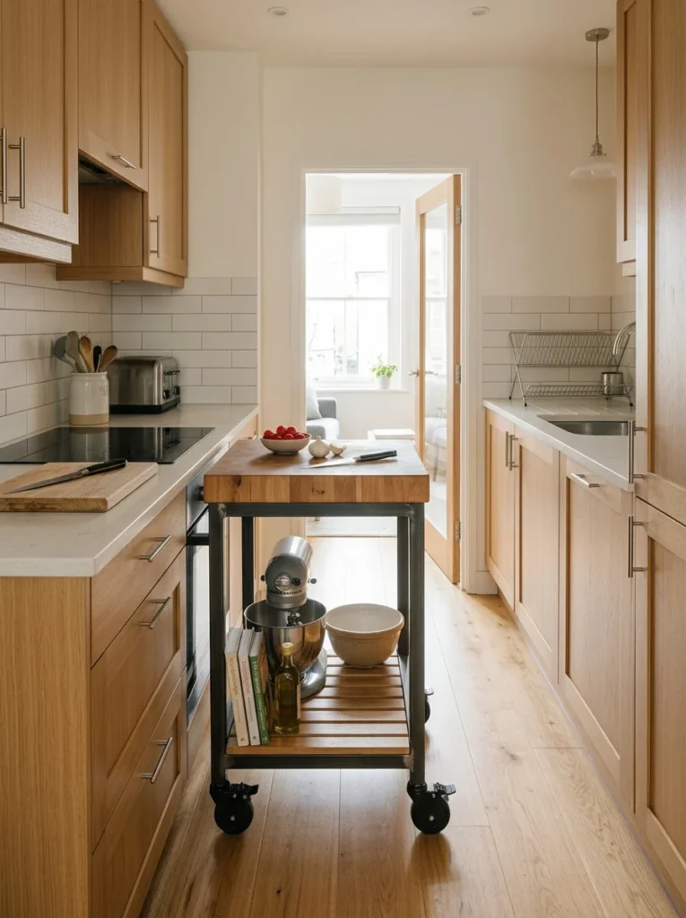
My kitchen’s counter space was limited enough that food prep regularly felt cramped, so I added a narrow rolling cart that could be pulled out for extra prep surface during cooking and then tucked against the wall or into a corner the rest of the time. Unlike a fixed island or extra counter, which would have permanently consumed floor space regardless of whether I was actively cooking, the rolling cart provided that extra surface only when genuinely needed.
Choosing a cart narrow enough to fit through my apartment’s tight kitchen doorway, while still wide enough to provide meaningfully useful prep space, took some careful measuring against both the doorway width and the available floor space where it would live when not actively in use as a prep surface. A cart too wide for the doorway would have been useless for the flexible, movable function I specifically needed it to serve.
Adding a lower shelf to the cart’s design turned it into additional storage as well as extra counter space, holding small appliances I didn’t use daily, like a stand mixer, that would have otherwise taken up valuable fixed counter or cabinet space if stored anywhere else in the small kitchen. That dual function meant the cart earned its place in an already tight apartment far more convincingly than a single-purpose prep surface would have.
Wheel quality mattered more than I initially expected for genuine daily usability. My first cart came with cheap plastic casters that stuck and caught on the slight unevenness in my apartment’s older flooring, making it frustrating to actually move whenever I needed the extra space. Upgrading to a cart with sturdier, rubber-coated wheels solved that issue completely, and made the whole cart feel like a genuinely convenient daily tool rather than an obstacle I dreaded wrestling with every time I wanted to use it.
14. Over-the-Door Storage for Bathroom and Closet Items
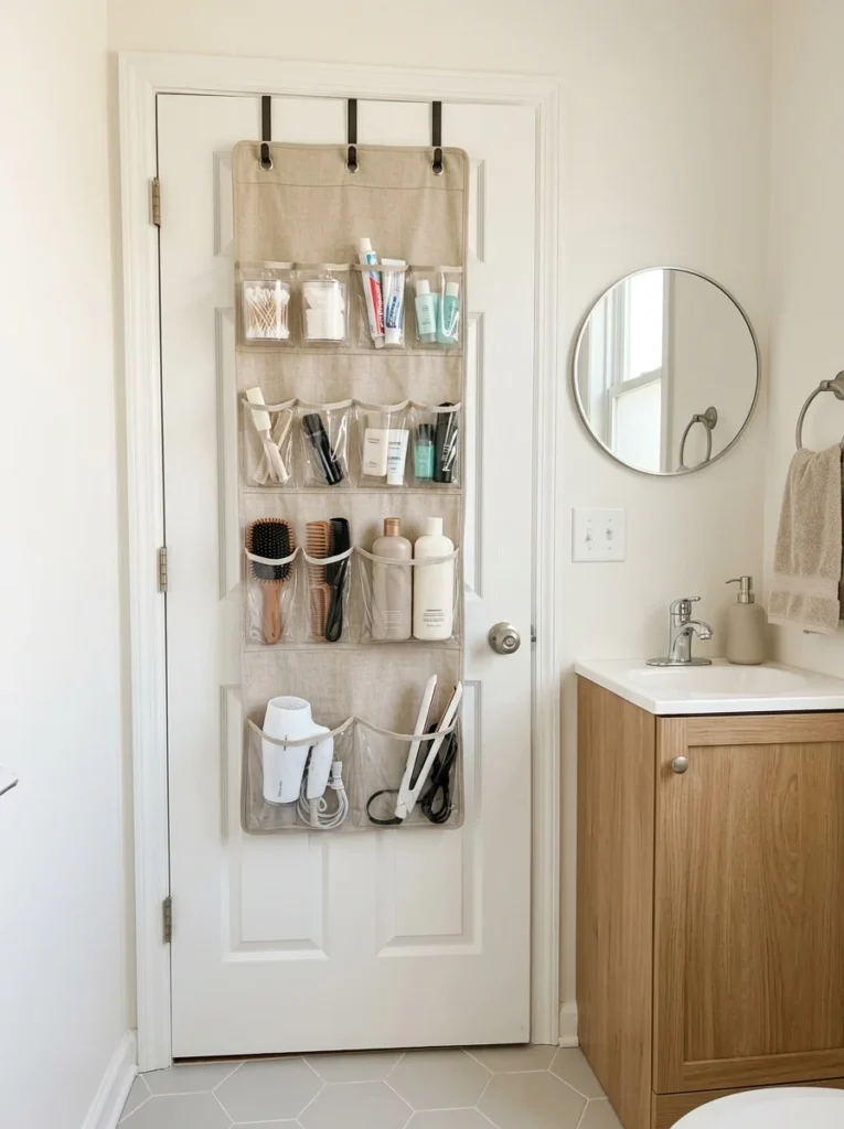
The back of both my bathroom door and my single closet door represented completely unused vertical space until I added simple over-the-door organizers designed to hang from the top of a standard door without any drilling or permanent installation required. In the bathroom, a clear pocket organizer held toiletries and hair tools that would have otherwise needed to compete for the very limited counter and cabinet space available in that particular room.
Weight distribution across the organizer’s pockets required some thought to avoid putting excessive strain on the door hinges or the organizer’s mounting hooks themselves. I kept heavier items, like a hair dryer, in the lower pockets closer to the ground, while lighter items filled the upper pockets, which both improved the organizer’s overall stability and made the heavier items easier to access without needing to reach as high on the door.
In the closet, a similar over-the-door system held shoes, which had previously been piled loosely on the closet floor and made it difficult to actually find a matching pair without digging through the whole pile. Organizing shoes by category, athletic shoes in one section, dress shoes in another, made the daily process of getting dressed noticeably faster and less frustrating than it had been with the previous unsorted floor pile approach.
Door weight and hinge quality became a practical consideration too, since a heavily loaded over-the-door organizer adds real weight that older or lighter hollow-core doors, common in many apartment buildings, aren’t always built to handle gracefully over time. I checked my specific door’s hinges periodically after installing the organizers and made sure not to overload either one beyond what felt like a reasonable, sustainable weight for the door itself to bear across months and years of regular daily use.
15. Light, Cohesive Color Palette Throughout
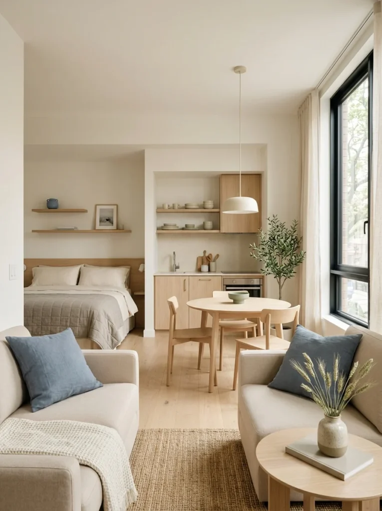
Keeping a consistent, light color palette across my walls, furniture, and larger textiles throughout the entire studio apartment, rather than treating each section as a separate design decision, made the whole space read as noticeably larger and more open than a more visually chopped-up, high-contrast approach would have. Because there were no walls physically separating my zones, maintaining that visual consistency became the tool doing the work that architecture would otherwise have handled in a larger, multi-room home.
Choosing the specific palette required some genuine restraint on my part, since I initially wanted to introduce a lot more bold color and pattern than ultimately made sense for the space’s actual size. I settled on warm whites and soft, muted neutrals as the dominant palette, reserving bolder colors and patterns for smaller accent pieces, like a single patterned throw pillow, rather than larger surfaces like walls or major furniture pieces that would have visually fragmented the small space if rendered in strong, contrasting colors.
Flooring consistency mattered just as much as wall and furniture color in maintaining this sense of visual continuity. My apartment came with the same flooring throughout the entire unit, which worked in my favor, but for anyone dealing with mismatched flooring between different zones of a studio, a large area rug spanning across the transition point can help visually unify the floor and minimize the jarring effect of an abrupt material change partway through an otherwise open room.
Testing paint and fabric samples together in the actual apartment, rather than choosing each element separately based on how it looked in isolation, prevented several near-mismatches that would have undercut the cohesive effect I was aiming for. Holding a fabric swatch up against an actual wall paint sample under the apartment’s real lighting conditions revealed a few pairings that looked fine independently but clashed once placed together, information I wouldn’t have caught without that direct side-by-side comparison before committing to any of the final purchases.
16. A Fold-Flat Dining Table Against the Wall
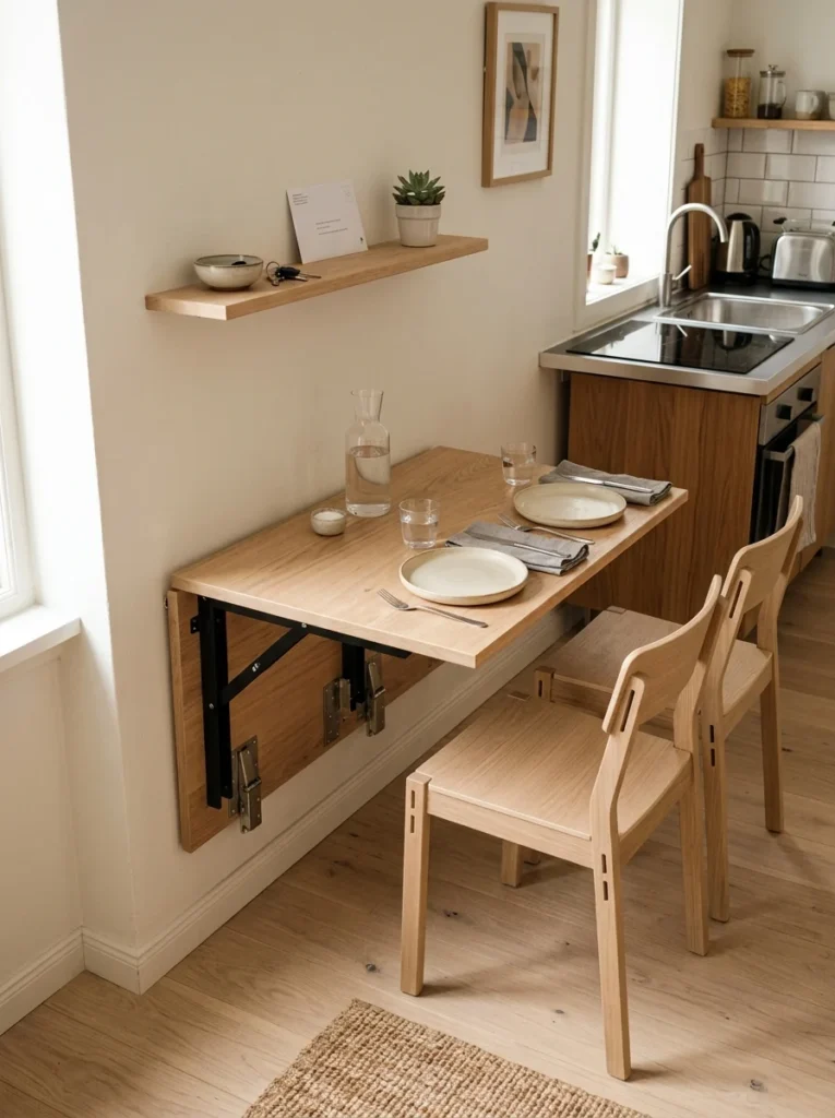
Rather than dedicating permanent floor space to a full dining table I only used during actual meals, I installed a fold-flat table mounted to the wall that could be raised for dining and folded completely flat against the wall the rest of the day. That flexibility meant I got the full benefit of a real dining surface when I actually needed one, without the table’s footprint permanently eating into my already limited living space for the many hours each day when I wasn’t sitting down to eat.
Weight capacity became an important consideration when selecting the specific mounting hardware, since a table meant to fold up and down regularly needs a mechanism genuinely rated to support real dinner plates, serving dishes, and the weight of actually leaning on the table’s edge while seated, rather than a decorative mechanism only designed to support very light use. I made sure to check the hardware’s weight rating carefully before purchase, since a mechanism that failed under normal daily use would have been a genuinely frustrating and potentially dangerous problem to discover after installation.
Chair storage required its own solution once the table itself became a fold-flat option, since I still needed somewhere to keep dining chairs when the table wasn’t in use. I chose a set of stackable, lightweight chairs that could be tucked into a narrow gap beside my kitchen cabinets when not needed, rather than folding chairs that would have needed their own separate storage closet or corner, which my apartment simply didn’t have room to spare.
Using the folded-down table surface for something functional during the hours it wasn’t hosting an actual meal helped it feel less like wasted wall space and more like an integrated part of the apartment’s daily function. I hung a small shelf just above the folded table specifically for mail and keys, so even in its folded position, that section of wall continued doing useful daily work rather than simply waiting, unused, for the next mealtime to arrive.
17. Vertical Herb Garden for Kitchen Greenery
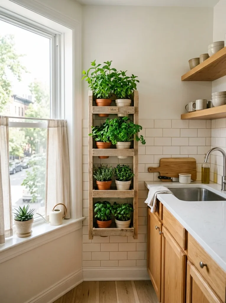
Wanting fresh herbs without sacrificing any of my extremely limited counter space, I installed a small vertical planter system on the wall beside my kitchen window, which let me grow a genuine variety of cooking herbs using zero floor or counter footprint at all. It became one of the more unexpectedly satisfying additions to the whole apartment, both for the practical benefit of fresh herbs on hand and for the bit of greenery and life it brought to what had otherwise been a fairly utilitarian section of wall.
Choosing the right herbs for my apartment’s specific light conditions took some research and a bit of trial and error before I settled on a reliable rotation. My kitchen window faced east, providing decent morning light but relatively little direct sun later in the day, which ruled out some sun-hungry herbs I initially wanted to grow and led me toward more shade-tolerant options like mint and parsley that actually thrived in those specific conditions rather than struggling and eventually dying off.
Watering logistics for a vertical system required more attention than a standard countertop herb pot would have, since water naturally wants to run downward through a vertical planter rather than staying evenly distributed across all the tiers. I learned to water more carefully and in smaller amounts more frequently, rather than a single large watering session, which prevented the lower tiers from becoming oversaturated while the upper tiers dried out too quickly in between waterings.
Beyond the herbs themselves, the vertical planter’s presence changed how the whole kitchen felt on a daily basis, adding a genuine sense of life and color to a small, otherwise fairly plain galley-style space. It became something I found myself glancing at and tending to regularly, which added a small daily ritual to an apartment that otherwise didn’t have much room for the kind of gardening hobby I’d always wanted but assumed I had no space for in such a small unit.
18. Corner Shelving for Otherwise Wasted Space
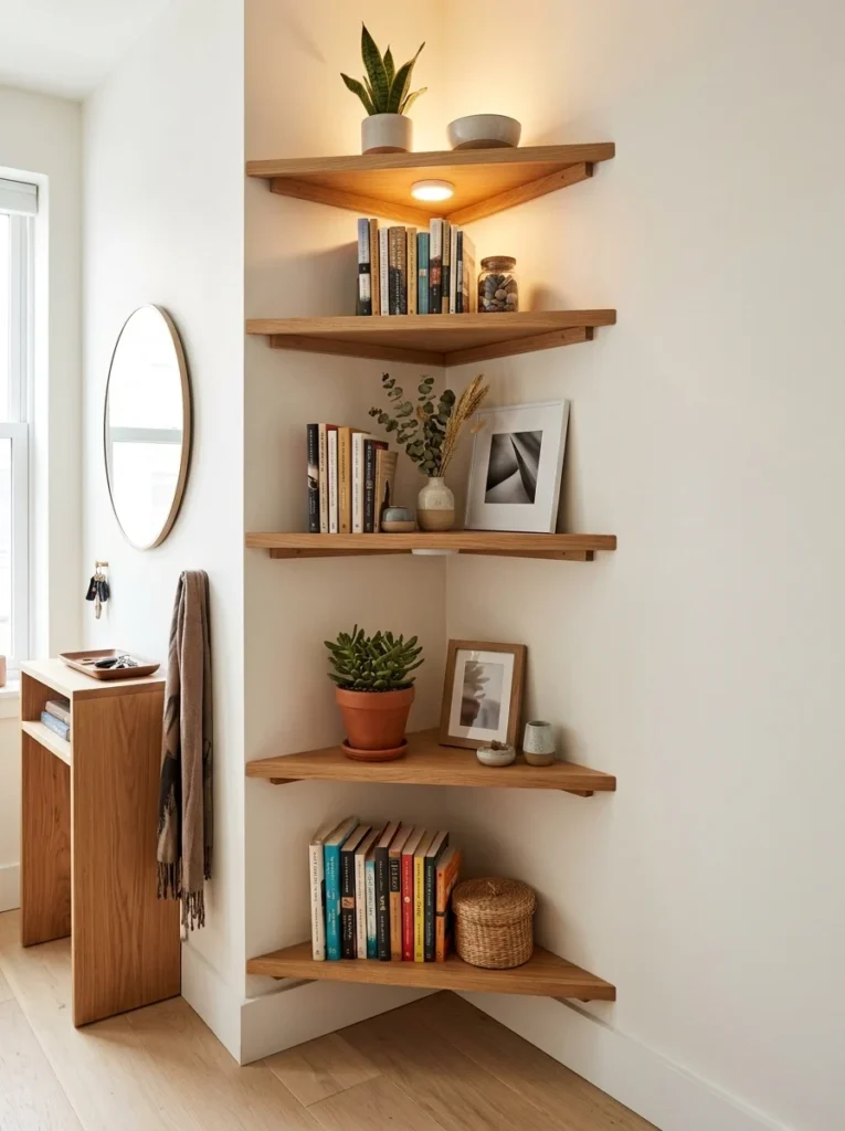
Every small apartment seems to have at least one awkward corner that’s too small or oddly shaped for standard furniture but too large to simply ignore, and mine was no exception, with a narrow triangular corner near my entry that sat empty and unused for the first several months I lived there. Custom-cut corner shelving, fitted precisely to that specific angle, finally turned that dead zone into genuinely useful storage and display space.
Getting the angle and dimensions exactly right required actual measuring of the corner itself rather than assuming a standard pre-made corner shelf would fit properly. I had a local hardware store cut the shelves to my specific measurements rather than purchasing an off-the-shelf unit, which cost only slightly more than a generic option but resulted in a far more precise, seamless fit against both walls forming that particular corner.
Deciding what to actually display or store on the finished corner shelves took some thought, since the awkward shape meant not every item worked well in that particular space. Taller, narrower objects like books stood upright and used the vertical space efficiently, while wider or bulkier items tended to look and feel cramped crammed into the same footprint, so I gravitated toward a mix of books, a few small plants, and a couple of framed photos rather than trying to force larger decorative objects into a space that simply wasn’t proportioned for them.
Lighting the corner appropriately made a real difference in whether it read as an intentional design feature or continued to feel like a slightly forgotten, dim afterthought despite the new shelving. A small battery-powered puck light tucked onto the underside of the top shelf illuminated the display below it, giving the whole corner a warm glow in the evening that finally made it feel like a genuine, considered part of the apartment rather than simply the least awkward solution I could find for an oddly shaped patch of wall.
Final Thoughts
Looking back at that first, chaotic version of my studio apartment, furniture pushed randomly against whichever wall had room, it’s hard to believe how much more functional and genuinely comfortable the same 430 square feet became once I started approaching every decision with real intention rather than just filling gaps as they appeared. None of these individual changes required a huge budget or dramatic renovation, but layered together, they transformed a space that once felt cramped and chaotic into one that consistently surprised guests with how much it actually held and how calm it felt to actually live in day to day.
If you’re working with a small space of your own, my honest advice is to resist the urge to implement everything on this list at once. Start with whichever idea addresses your most pressing daily frustration, whether that’s a lack of counter space, nowhere to work from home, or simply too much clutter with nowhere to put it, and build outward from there. That’s exactly how my own apartment came together, one deliberate change at a time, and it’s still the approach I recommend to every friend who tells me they’re moving into a small space and don’t know where to even begin.